Amplify: Erin Keane

 
Erin+Keane_Encaustic+Journals.jpg
 

For this week’s Amplify, I wanted to feature another good friend of mine and wonderful artist, Erin Keane.

Erin is an encaustic and book artist who lives just outside of Asheville, North Carolina. Originally from Cincinnati, Ohio, Erin moved to western North Carolina originally as an art teacher and spent many years teaching middle school art in Brevard, just southwest of Asheville.

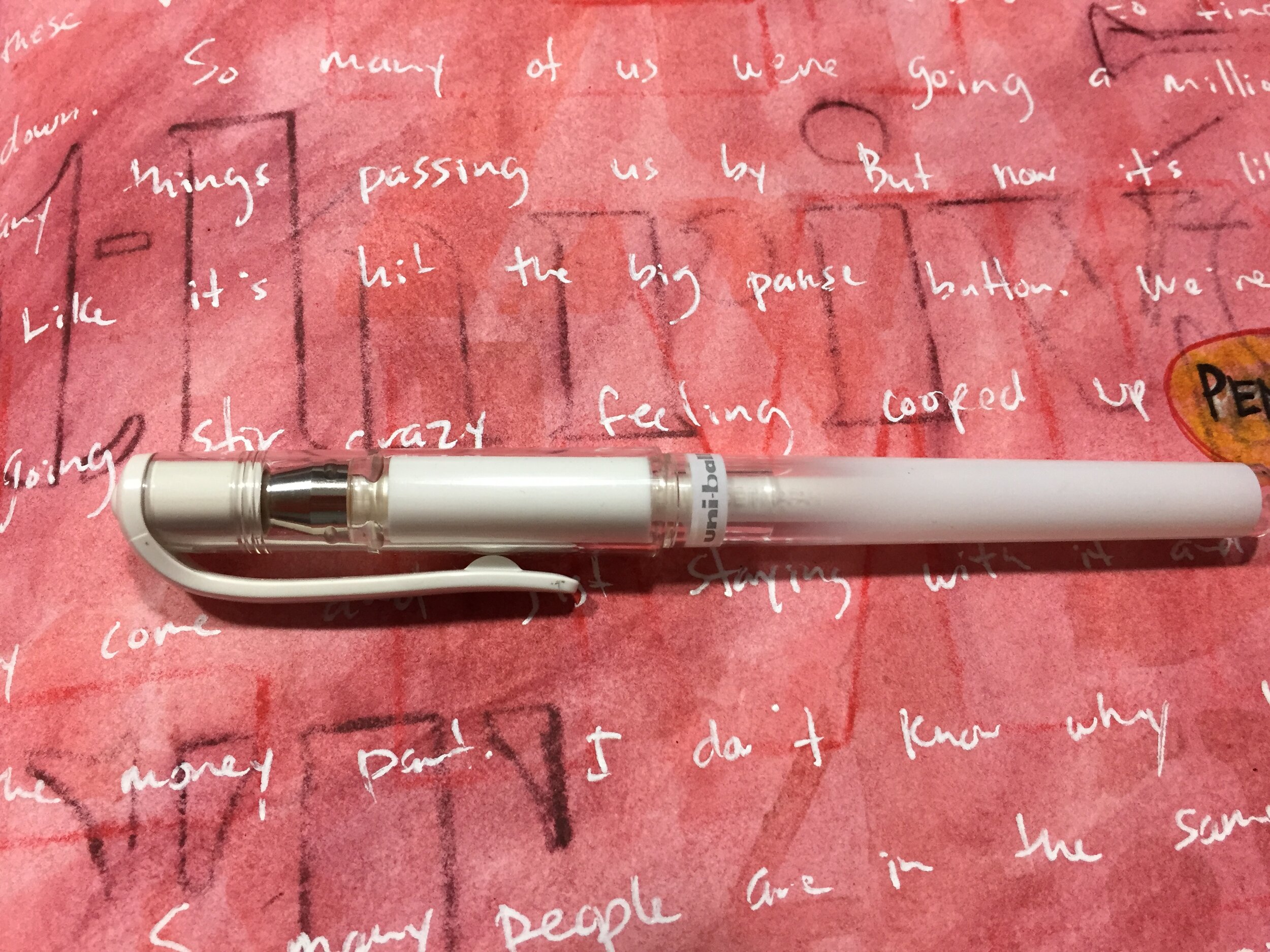
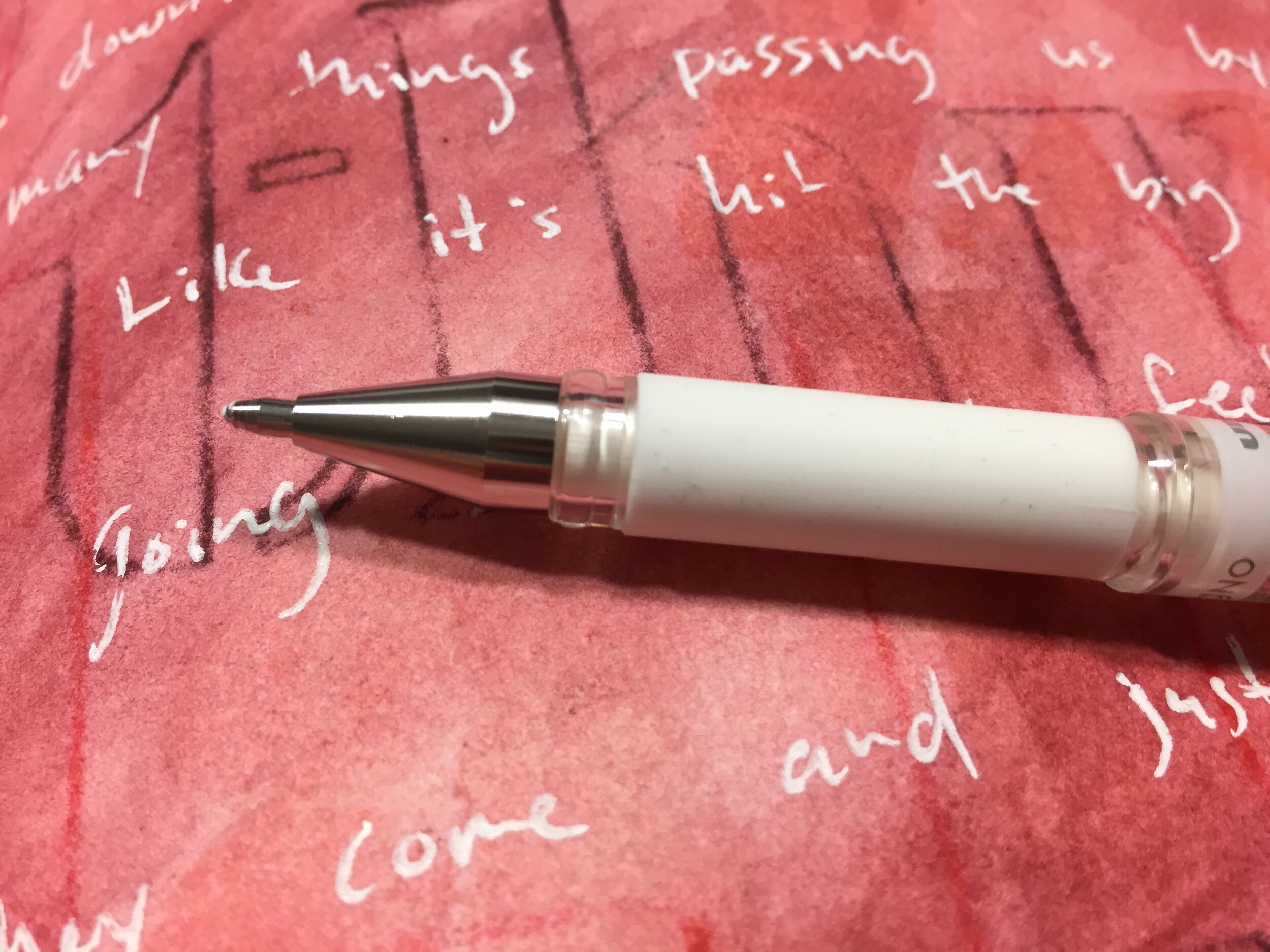
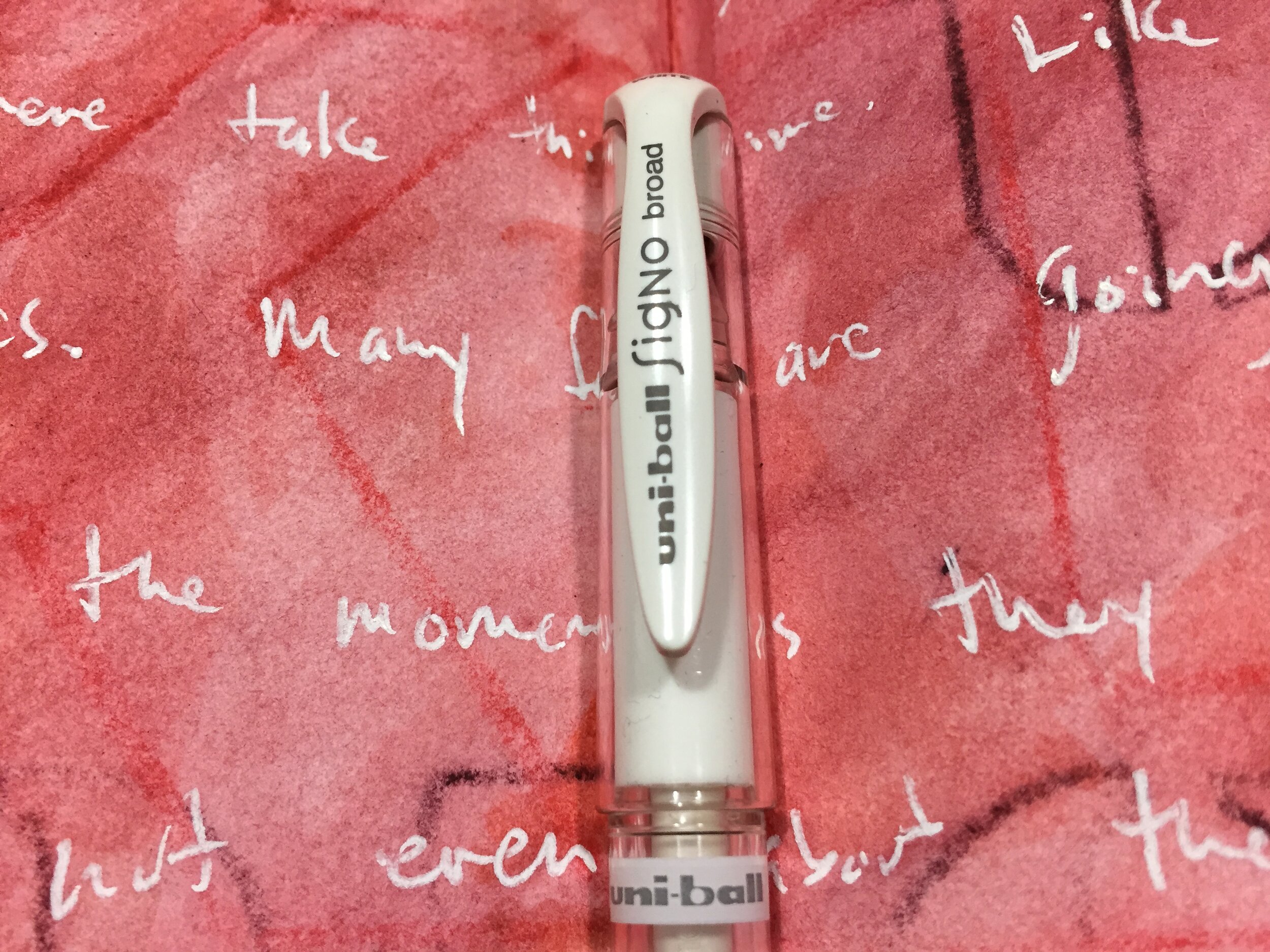
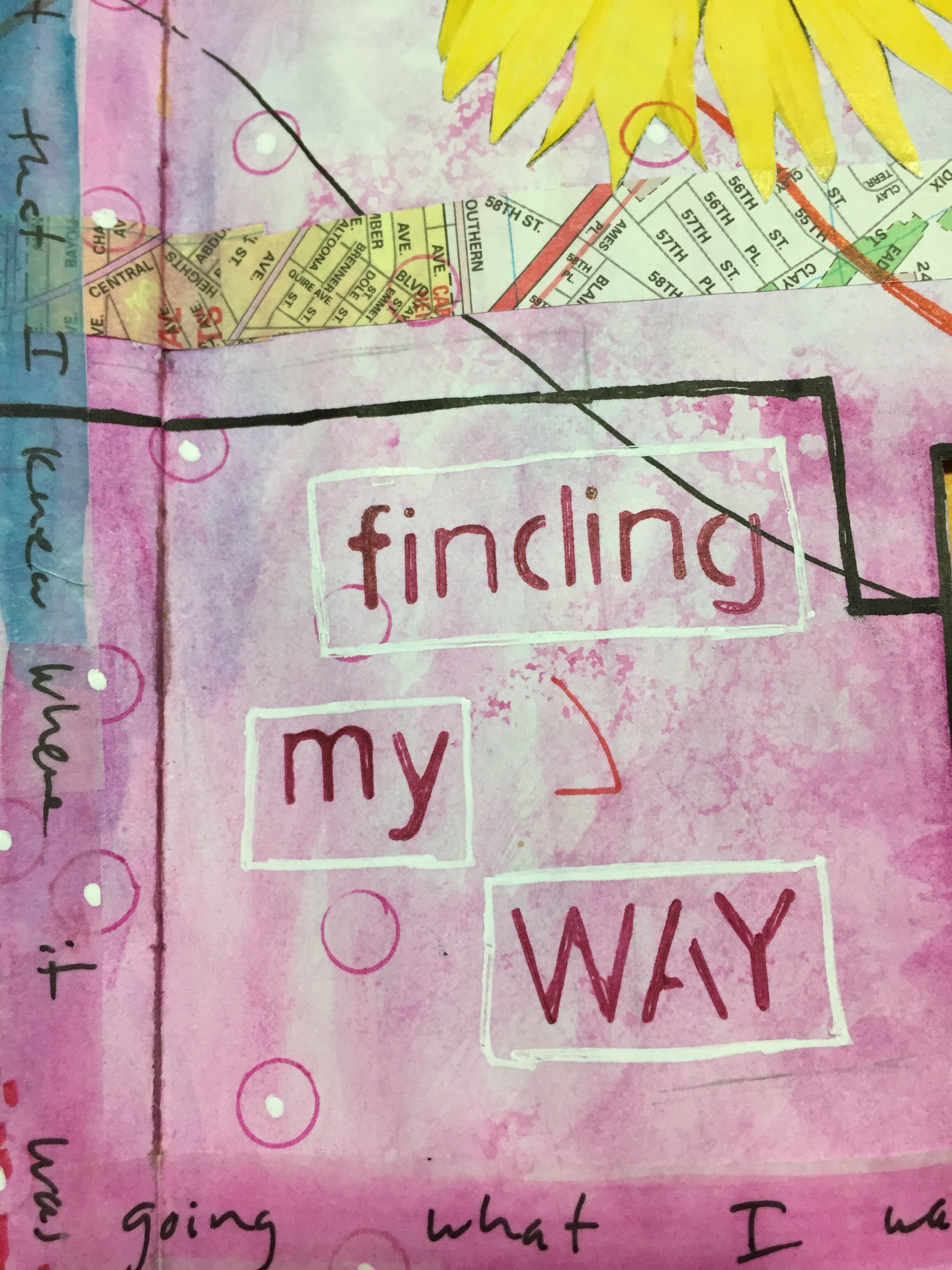
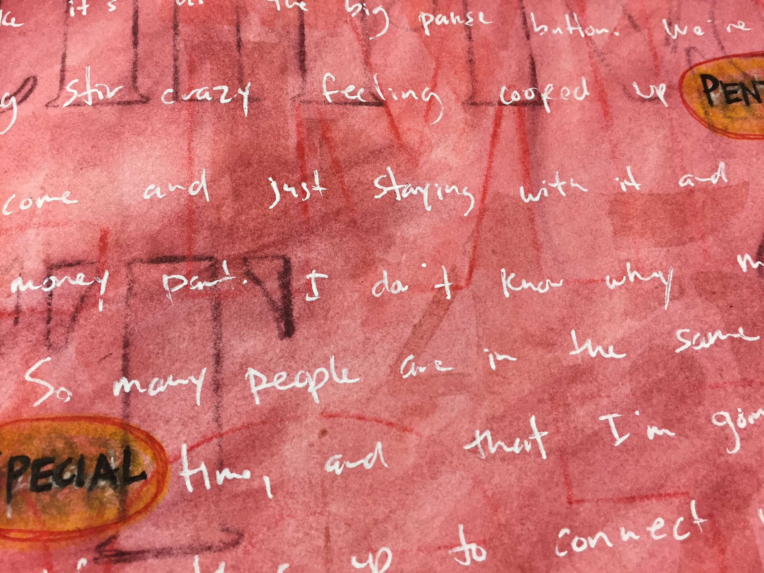
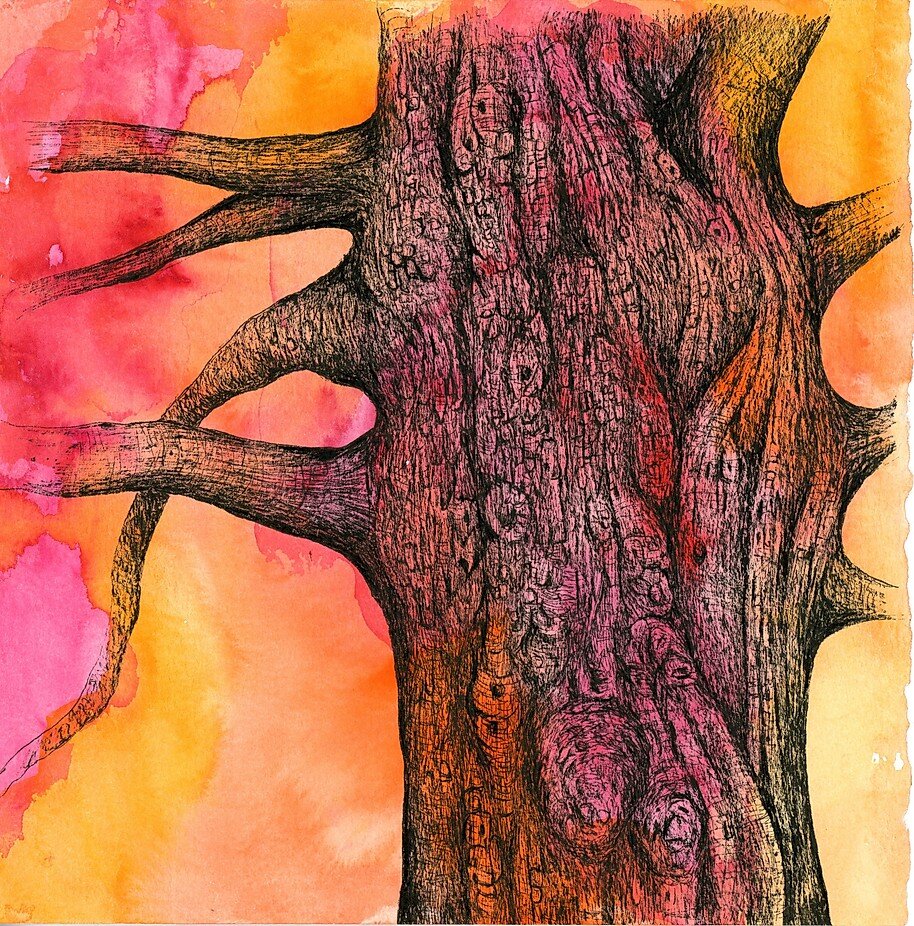
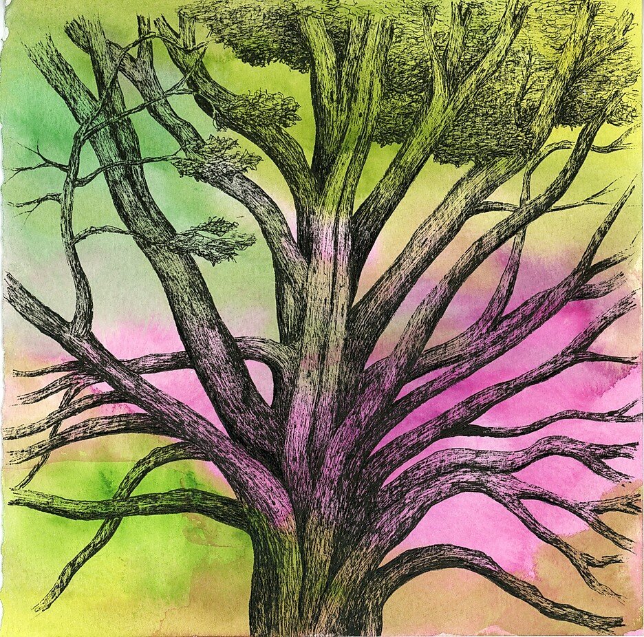
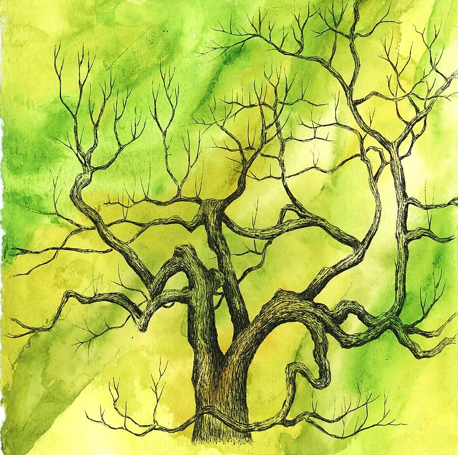
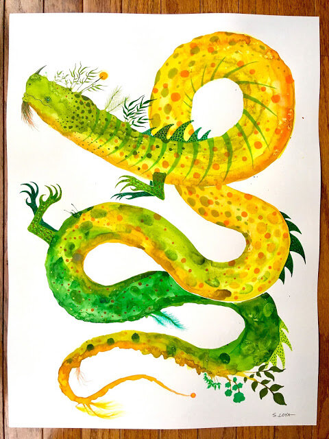
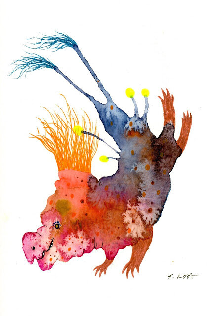
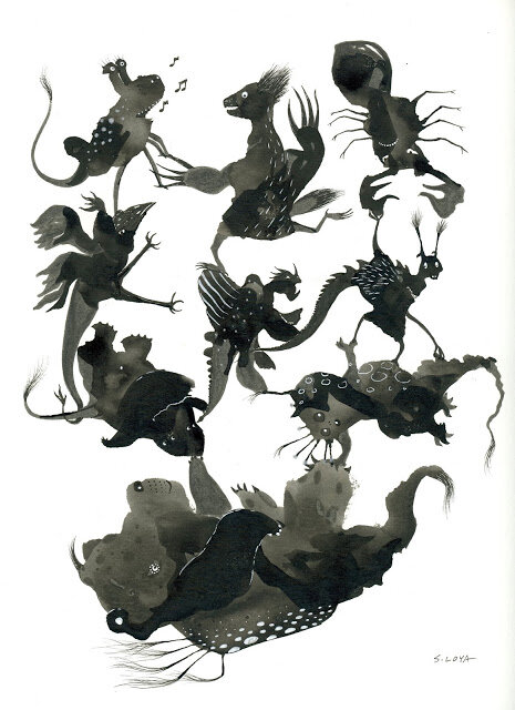
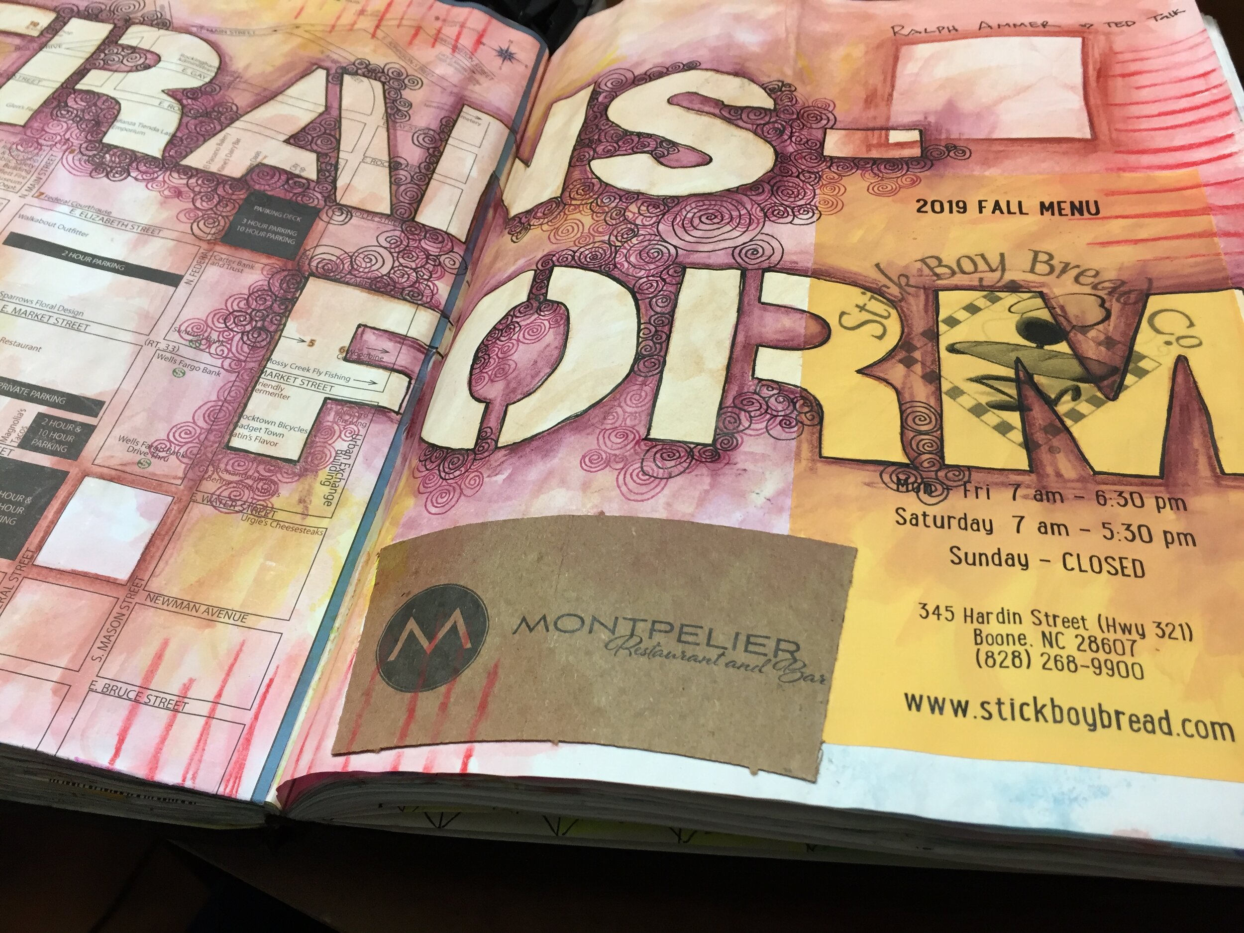
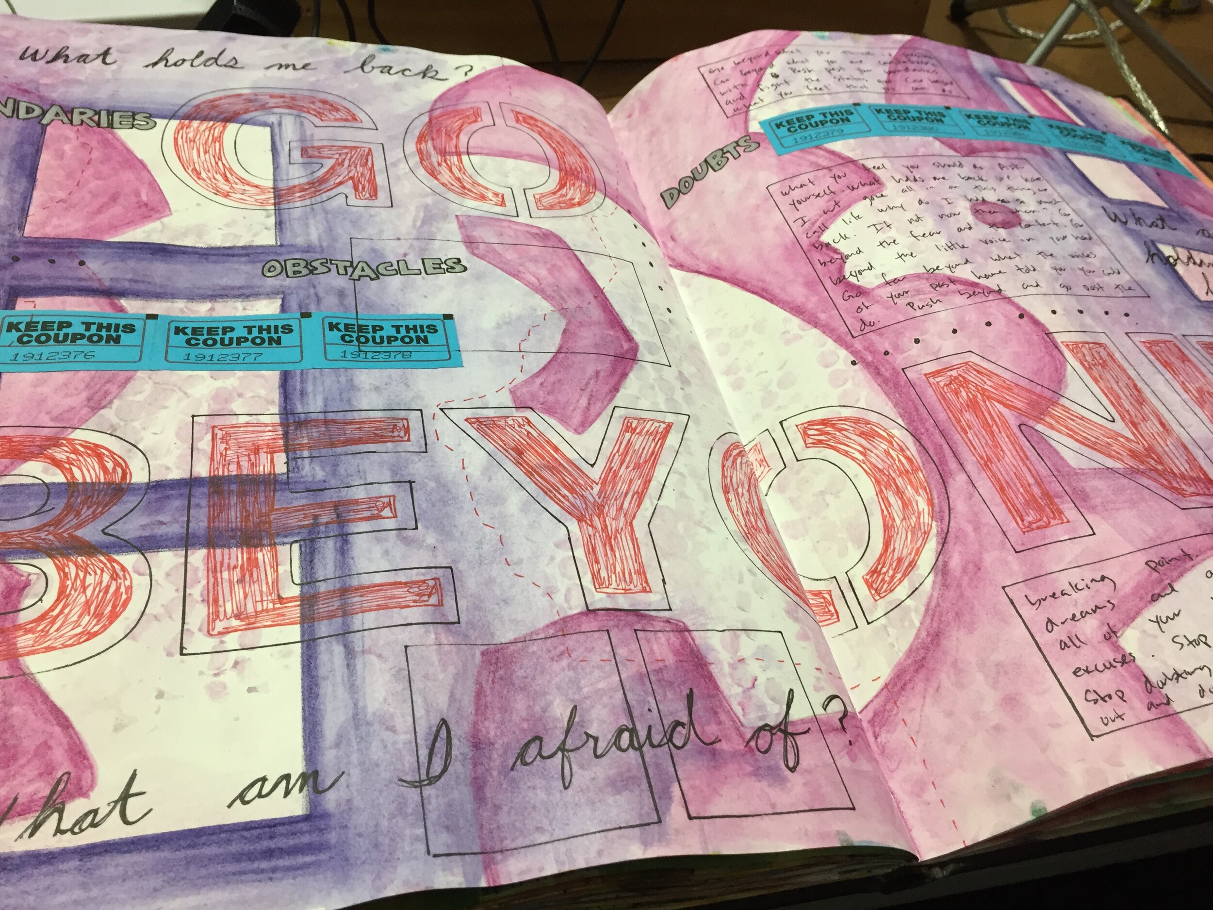
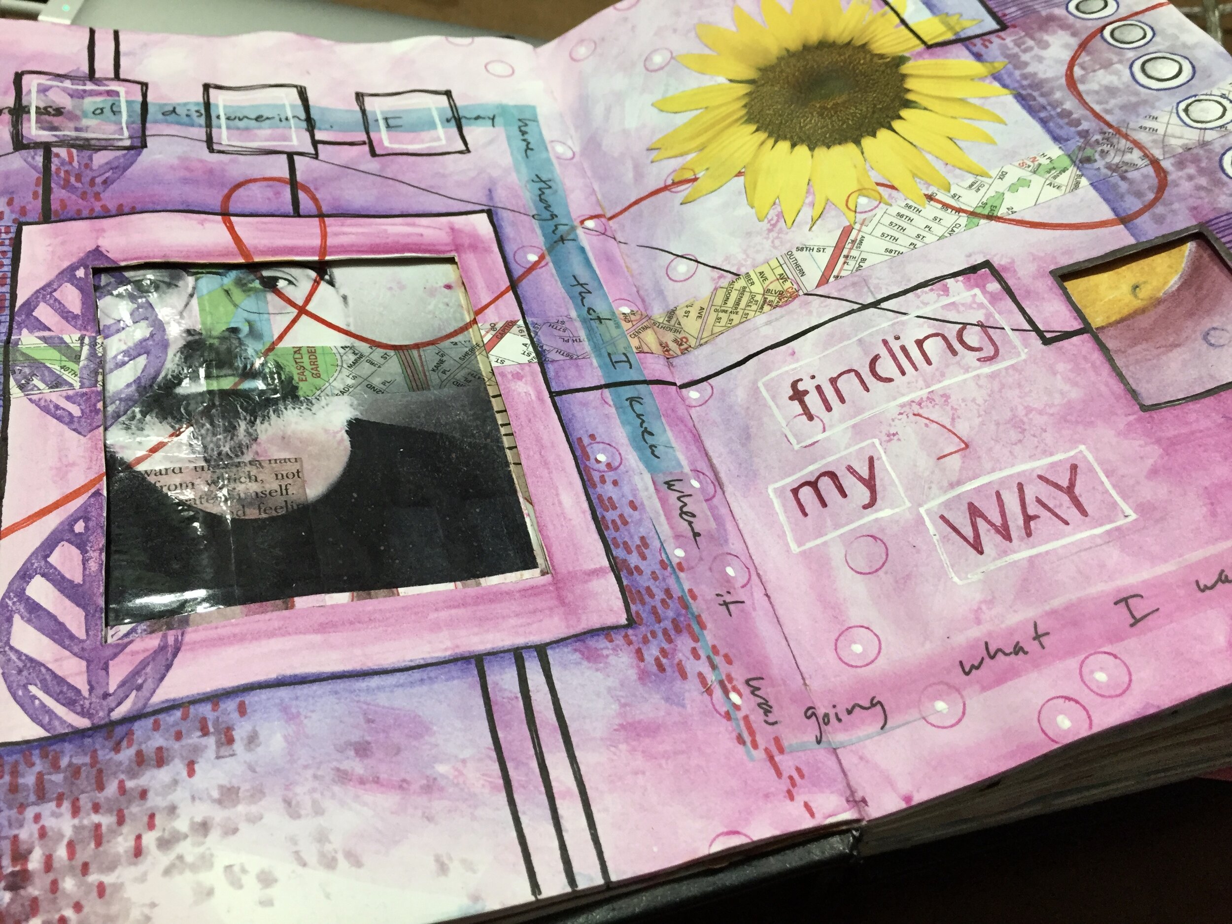
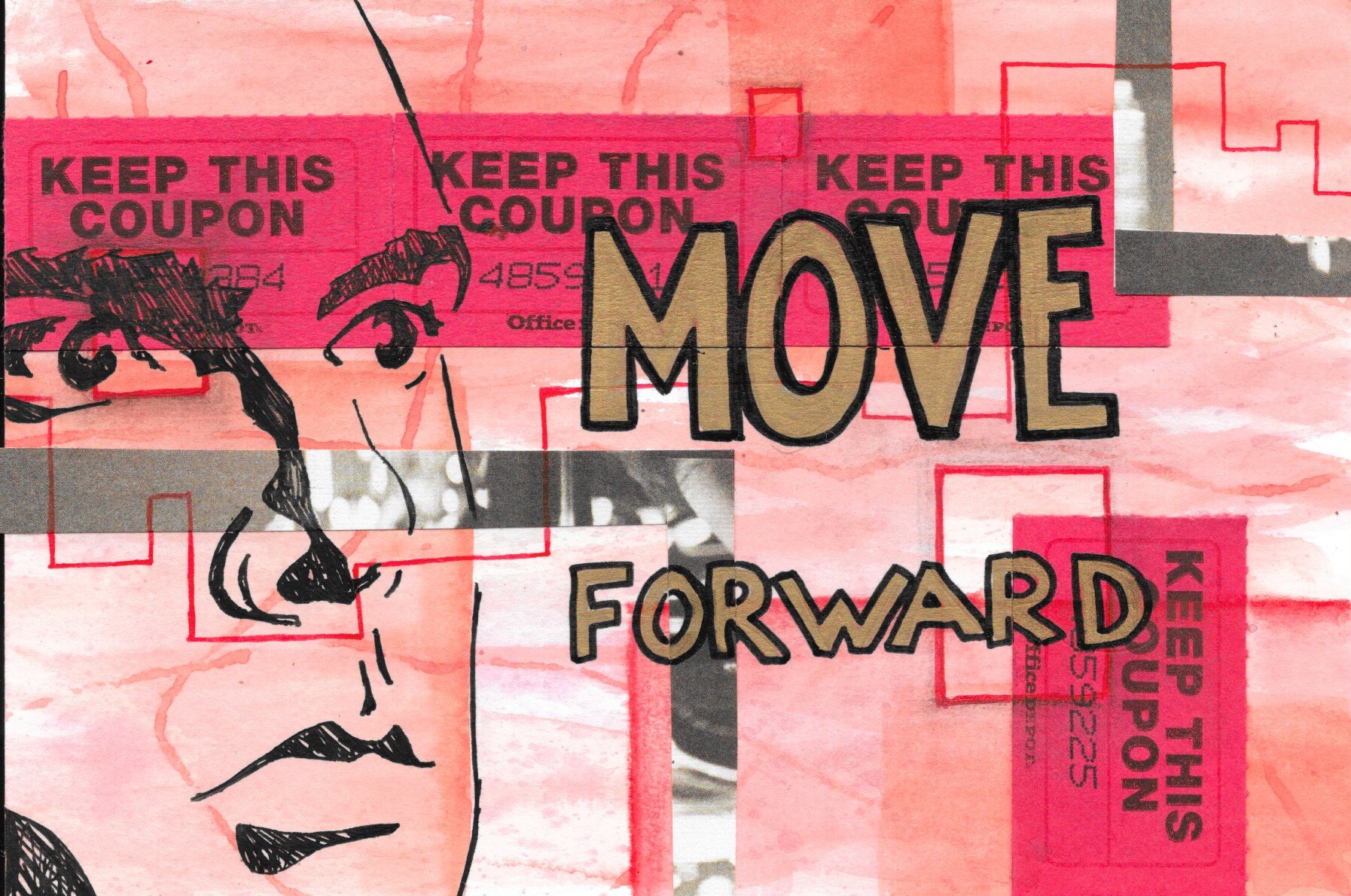
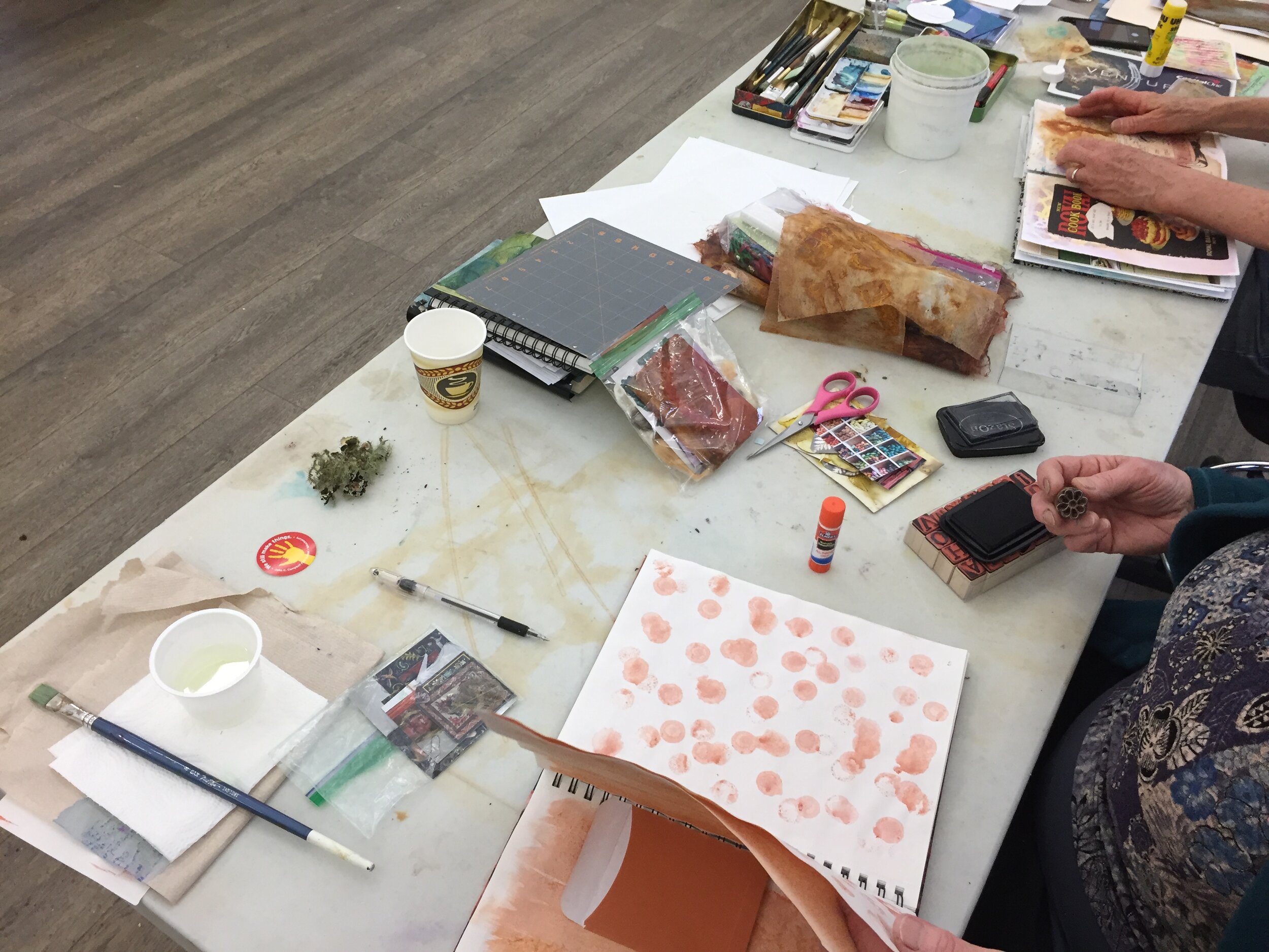
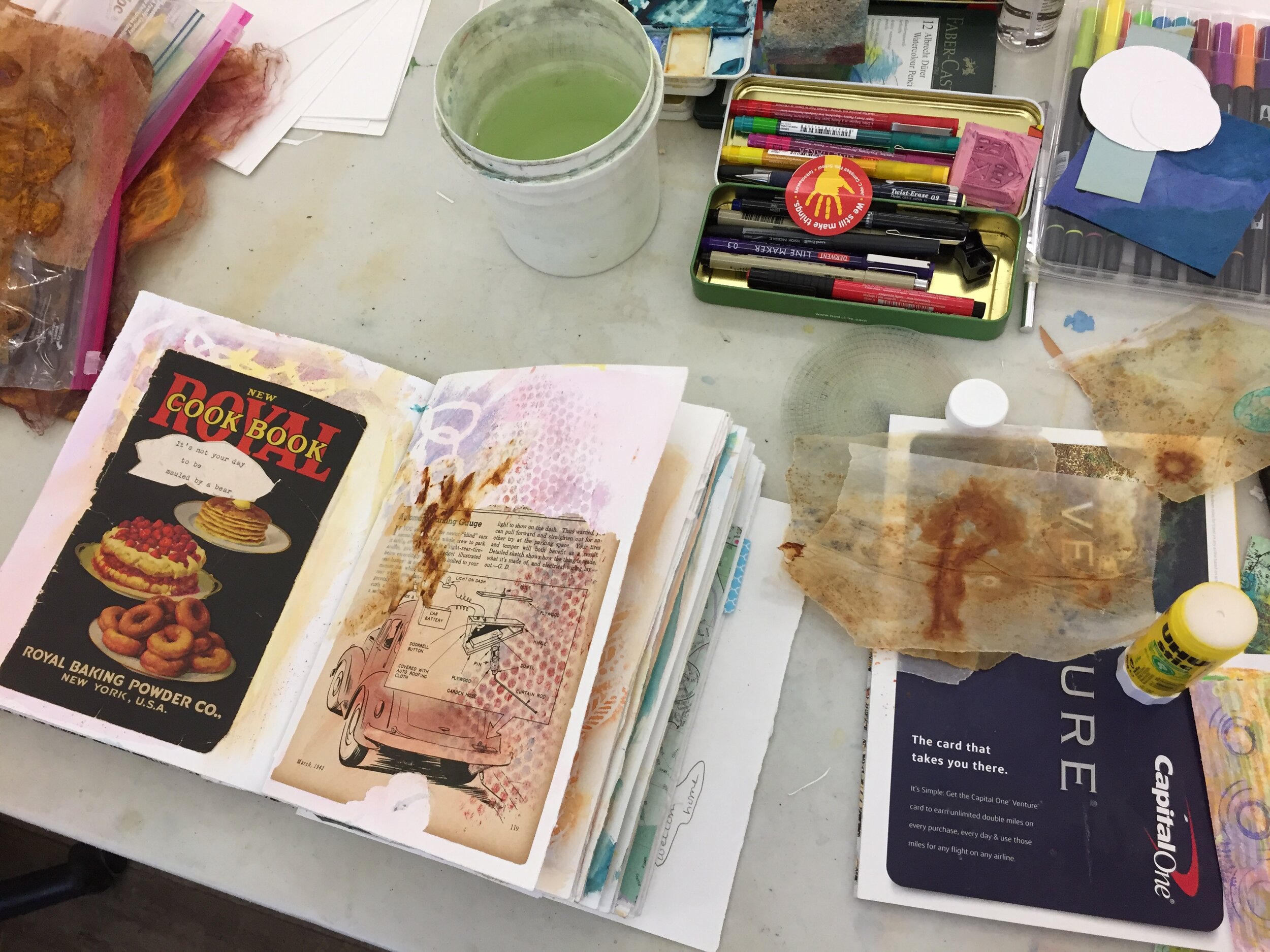
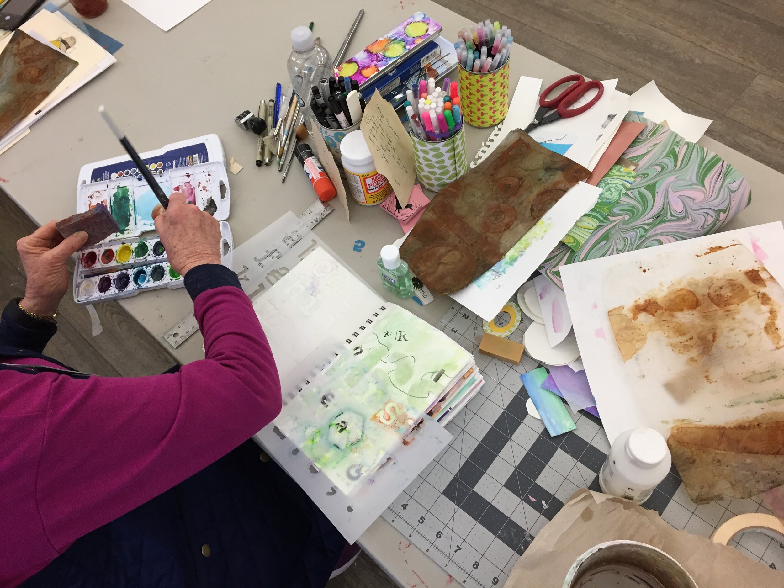
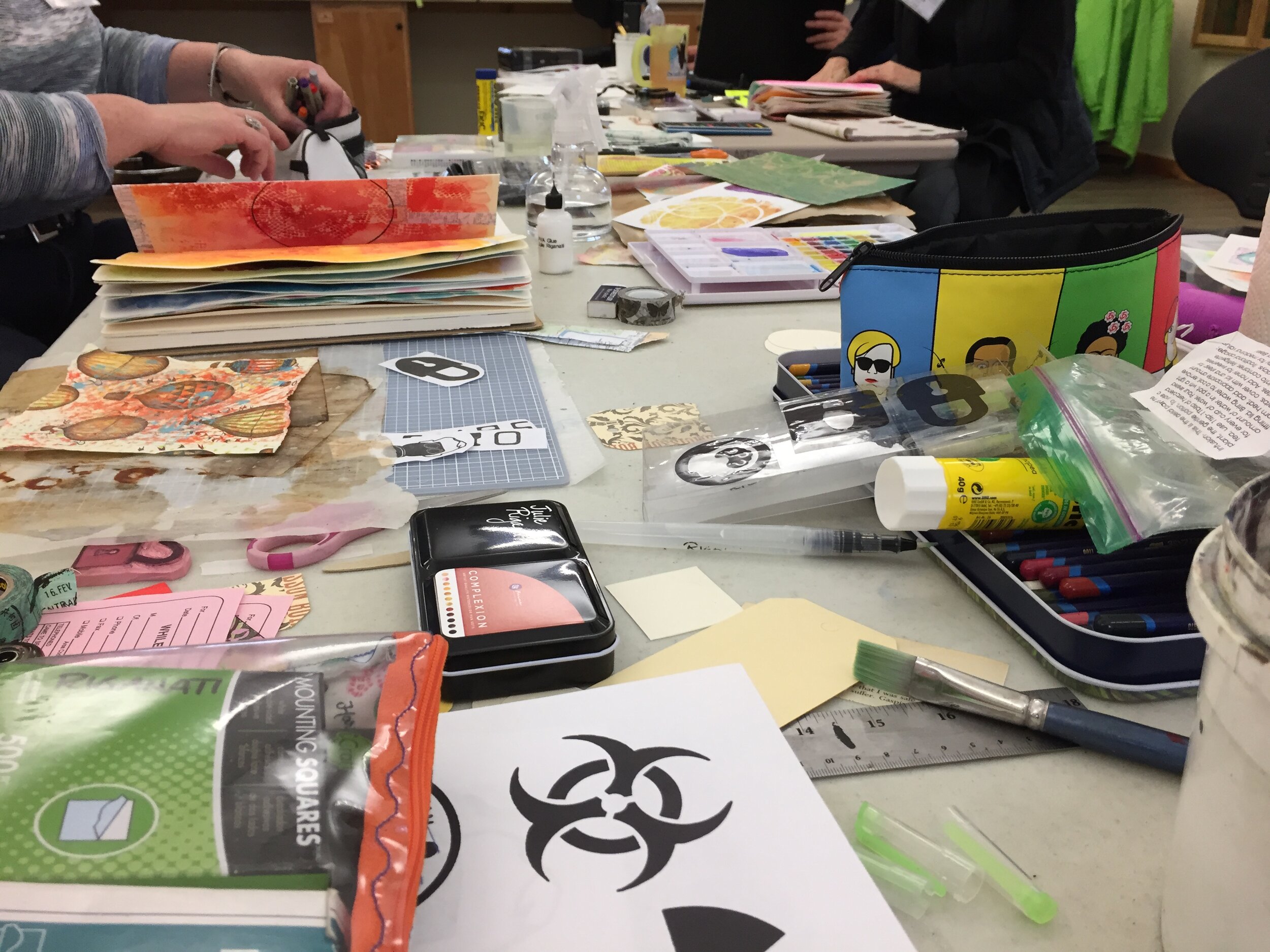
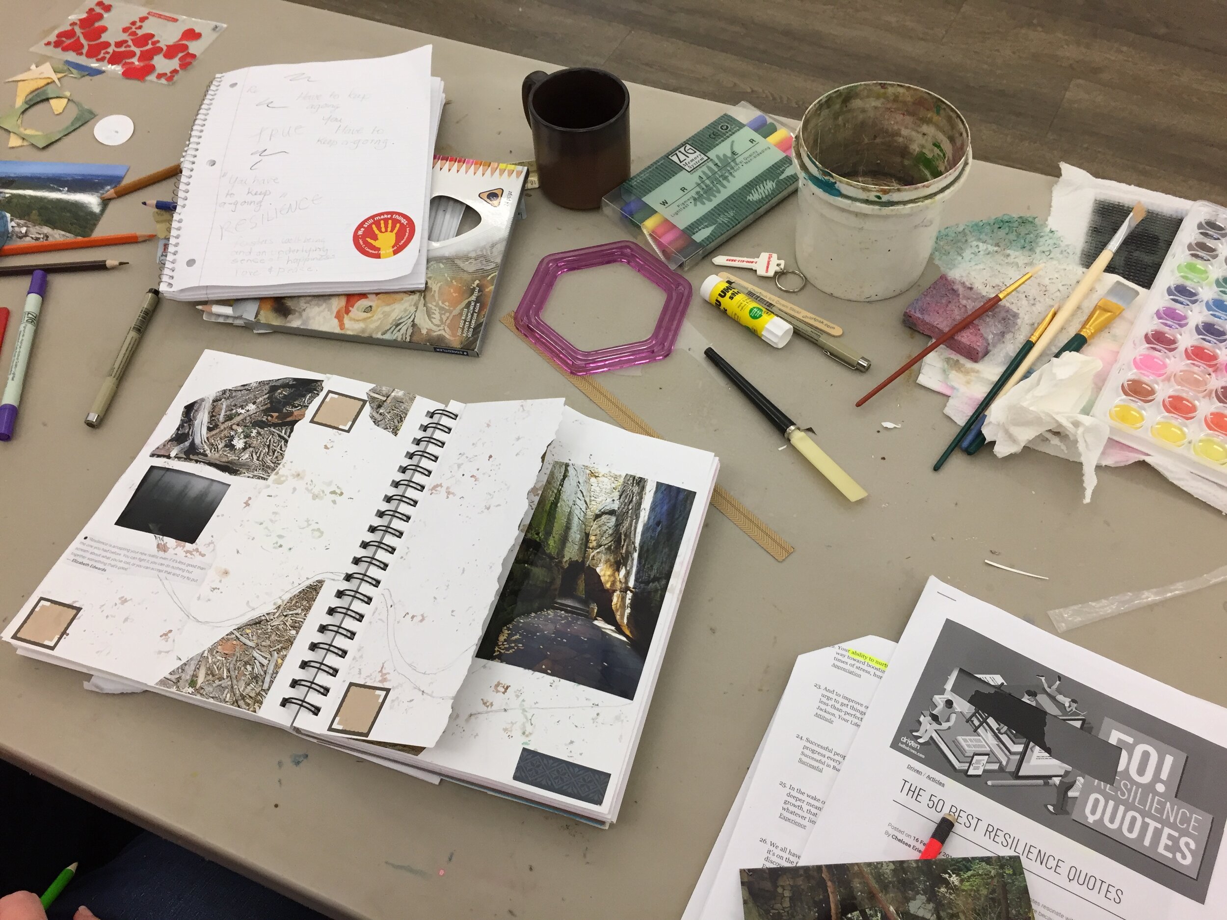
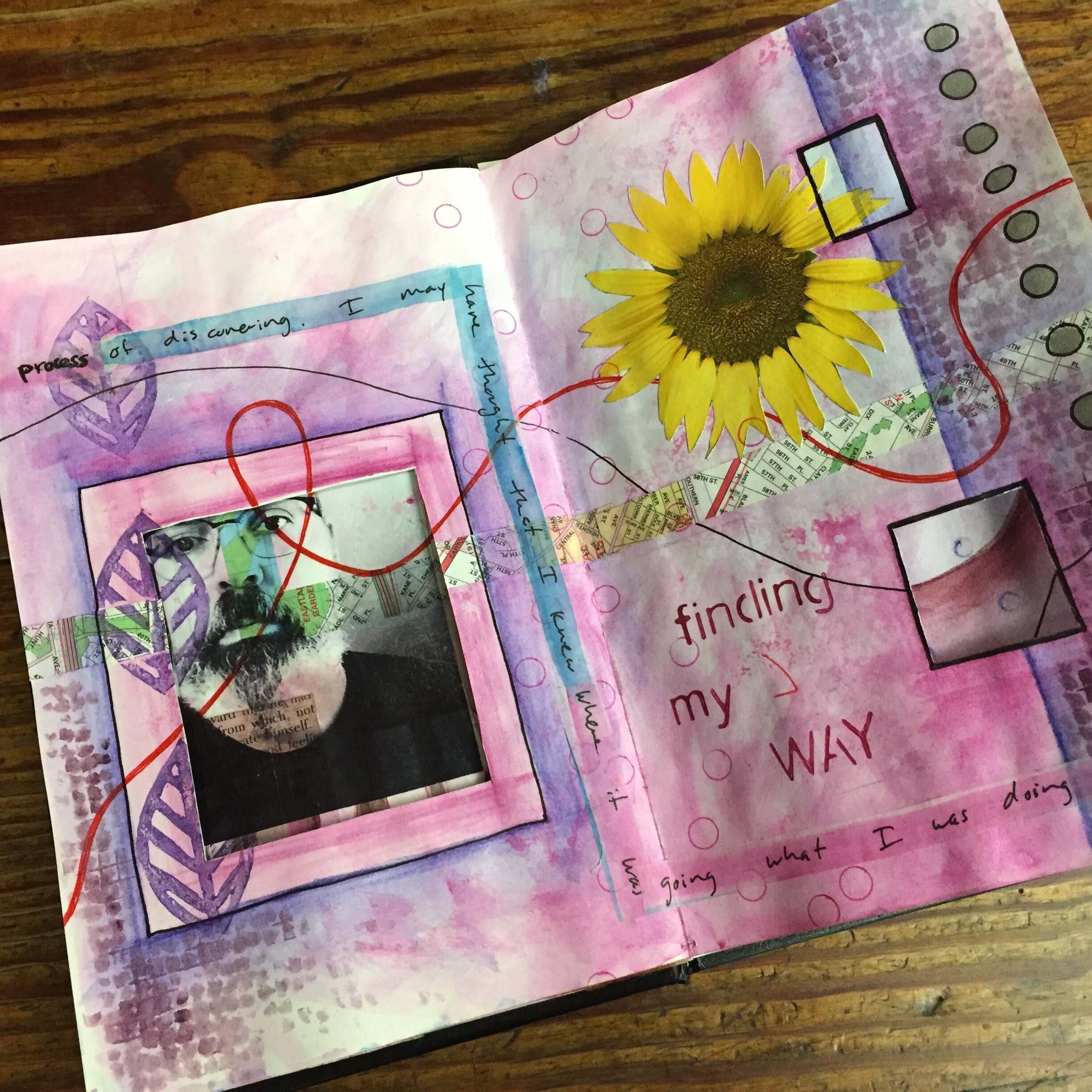
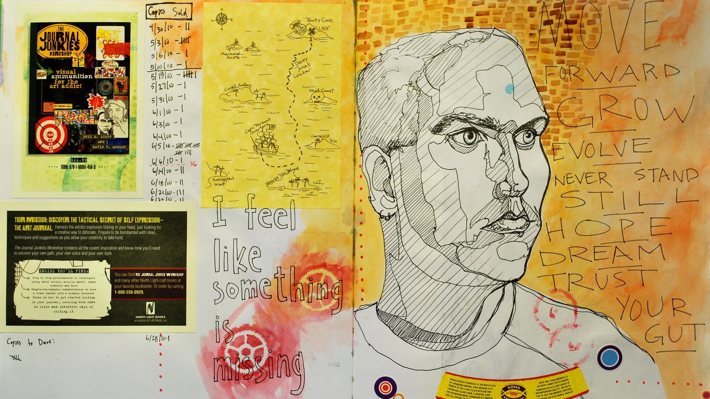
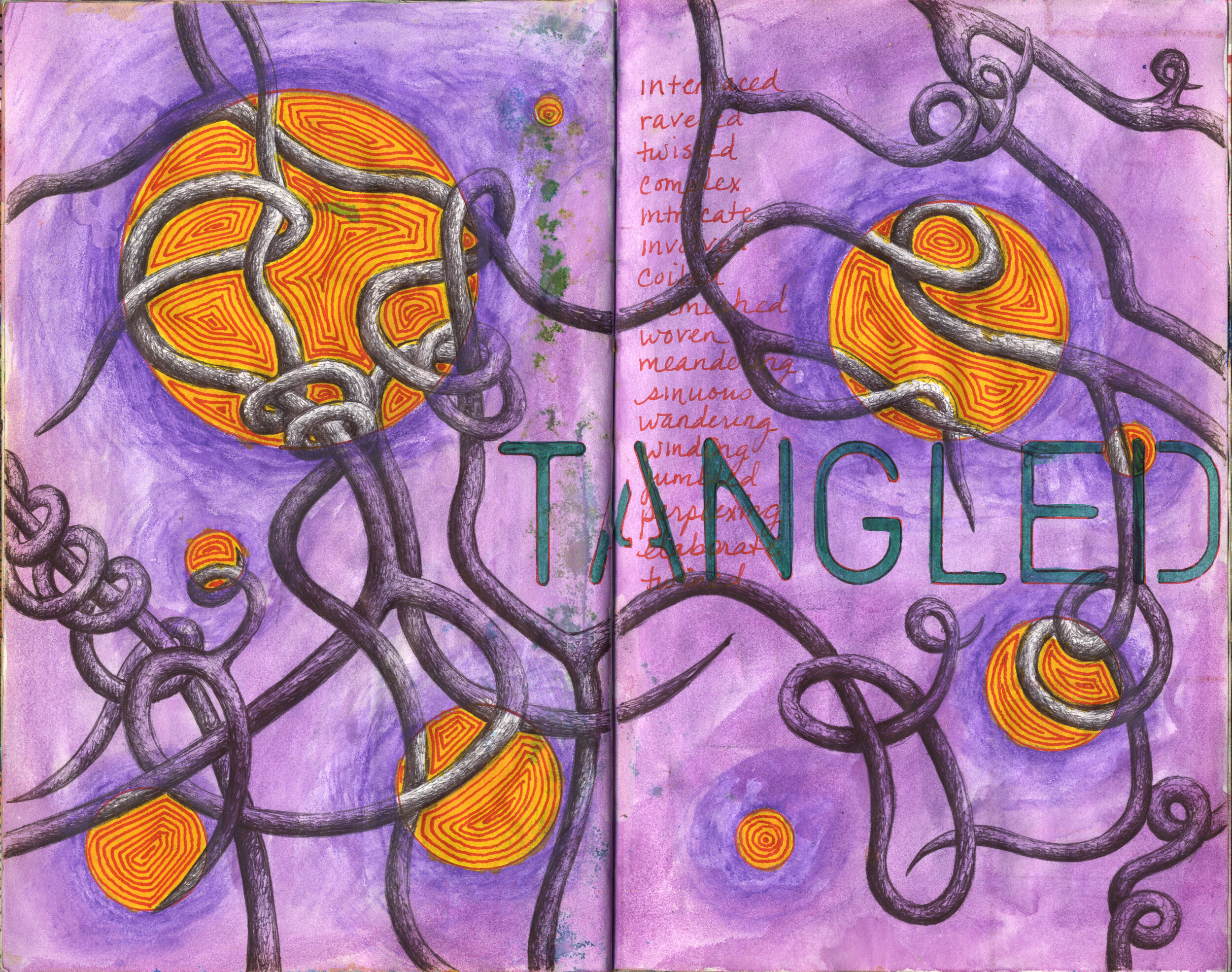
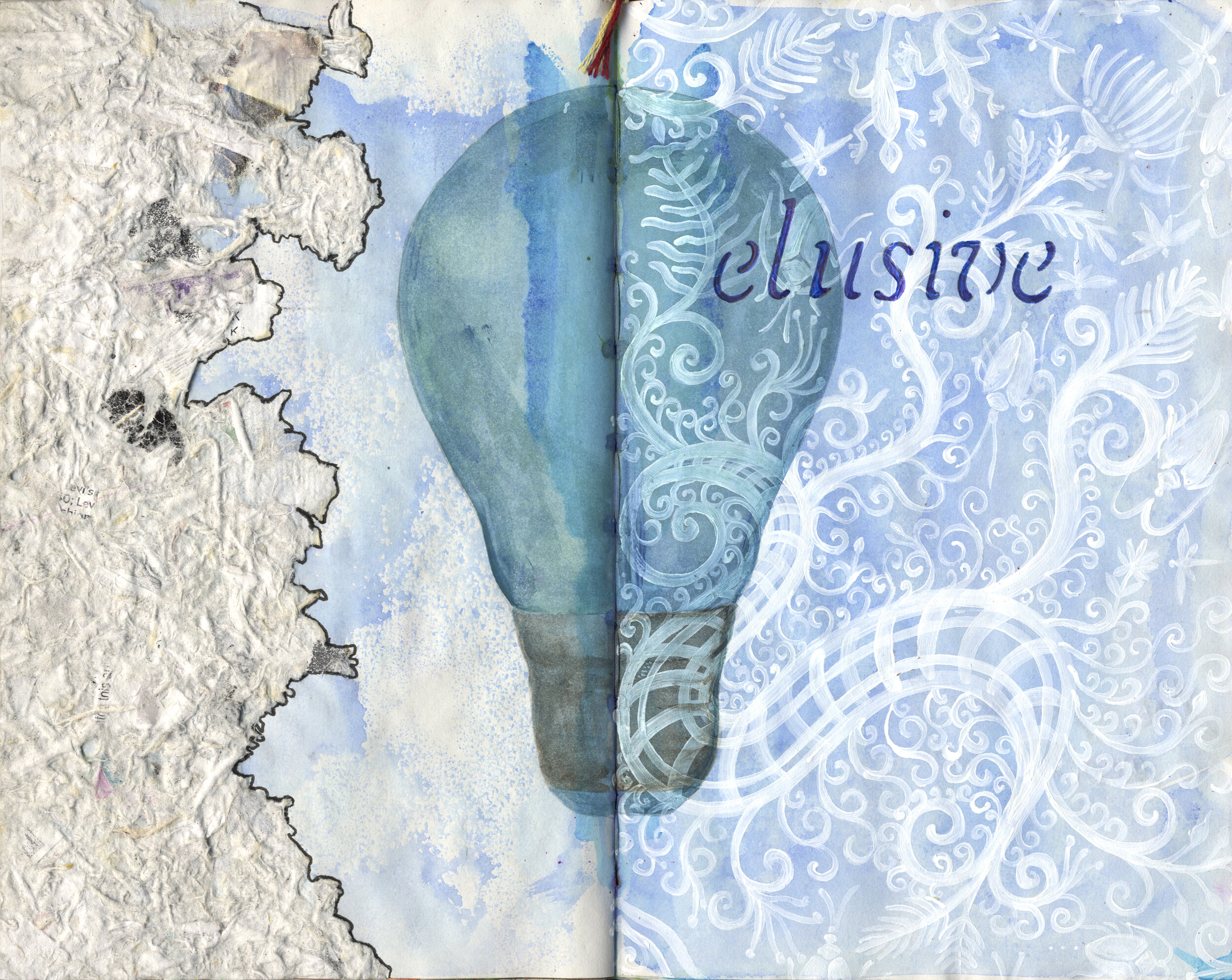
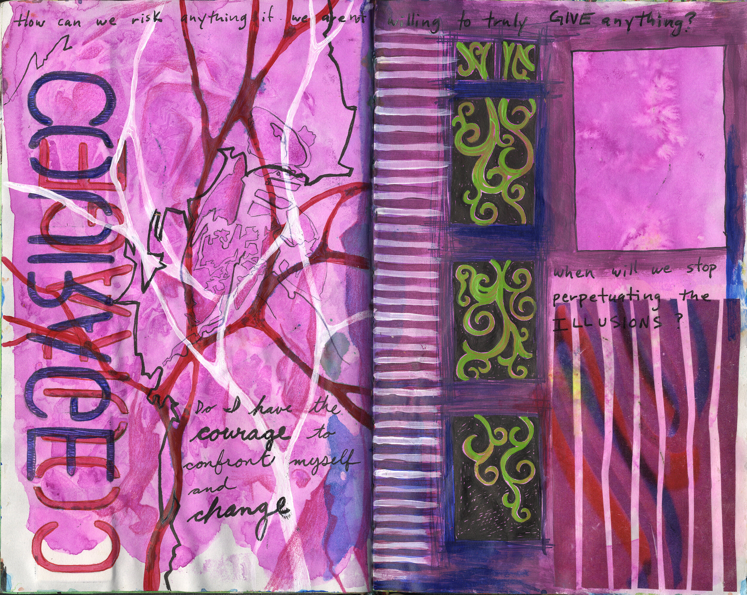
I first met Erin more than a decade ago when she took part in a five-day seminar that I was teaching with my fellow Journal Fodder Junkie David Modler at the North Carolina Center for the Advancement of Teaching in Cullowhee, NC. Like many art teachers, Erin had lost touch with her own art and wanted to reconnect with it. Dave and I were teaching about the visual journal, and it fit well into this drive to get back to her art. Erin and I stayed in touch over the next several months by working in a collaborative journal. We mailed a small sketchbook back and forth and took turns adding to the pages in a completely collaborative way as a way of inspiring each other and keeping the artmaking going. Check out the images below.

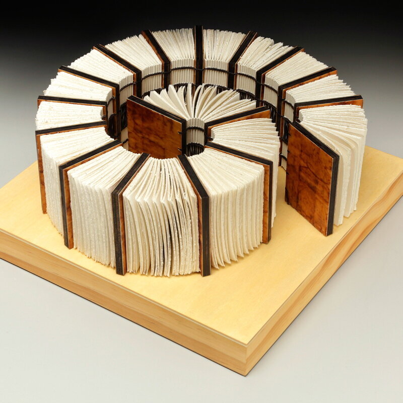
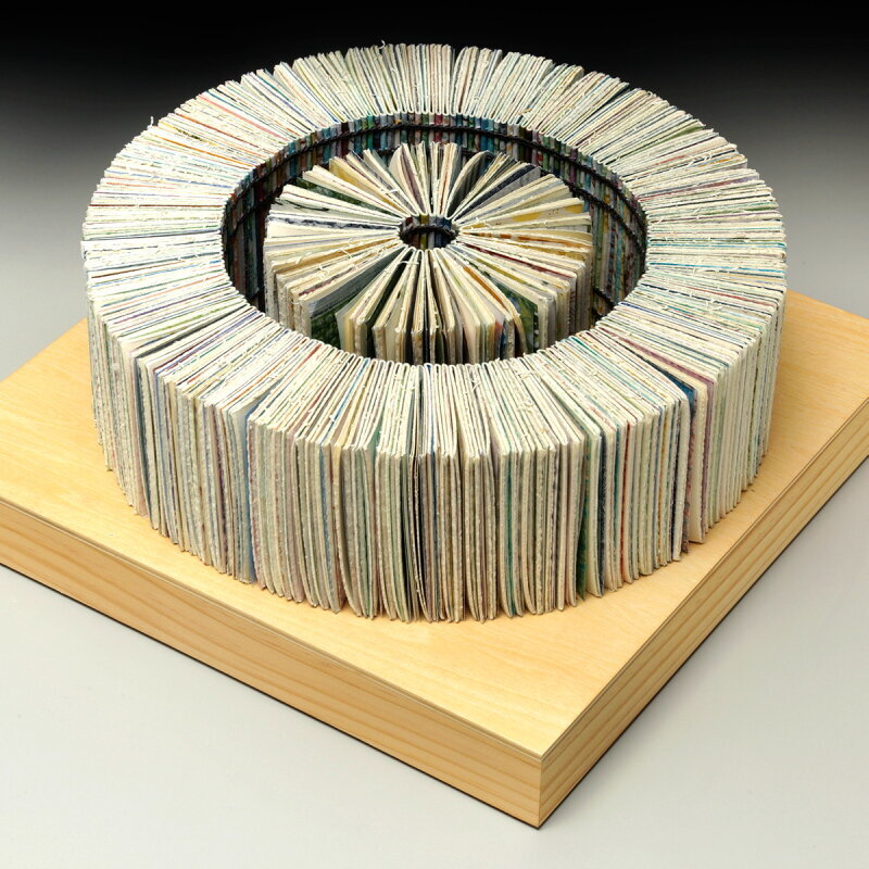
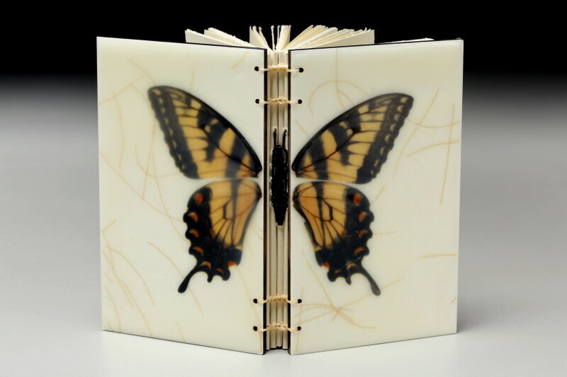
Erin eventually left teaching in the public schools and began pursuing her art full time. She apprenticed with a local book artist and fell in love with bookbinding, and around the the same time she discovered the art of encaustic. These two art forms would be separate veins of her work for awhile, but eventually Erin brought the two together and began to create encaustic journals and sculptural books.

Here are a couple of her sculptural designs.

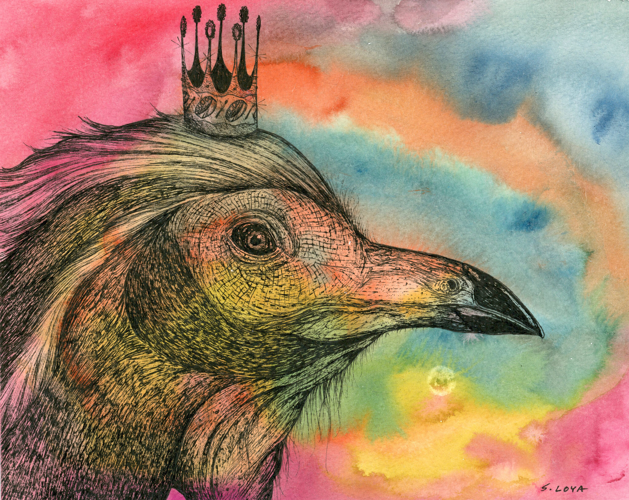
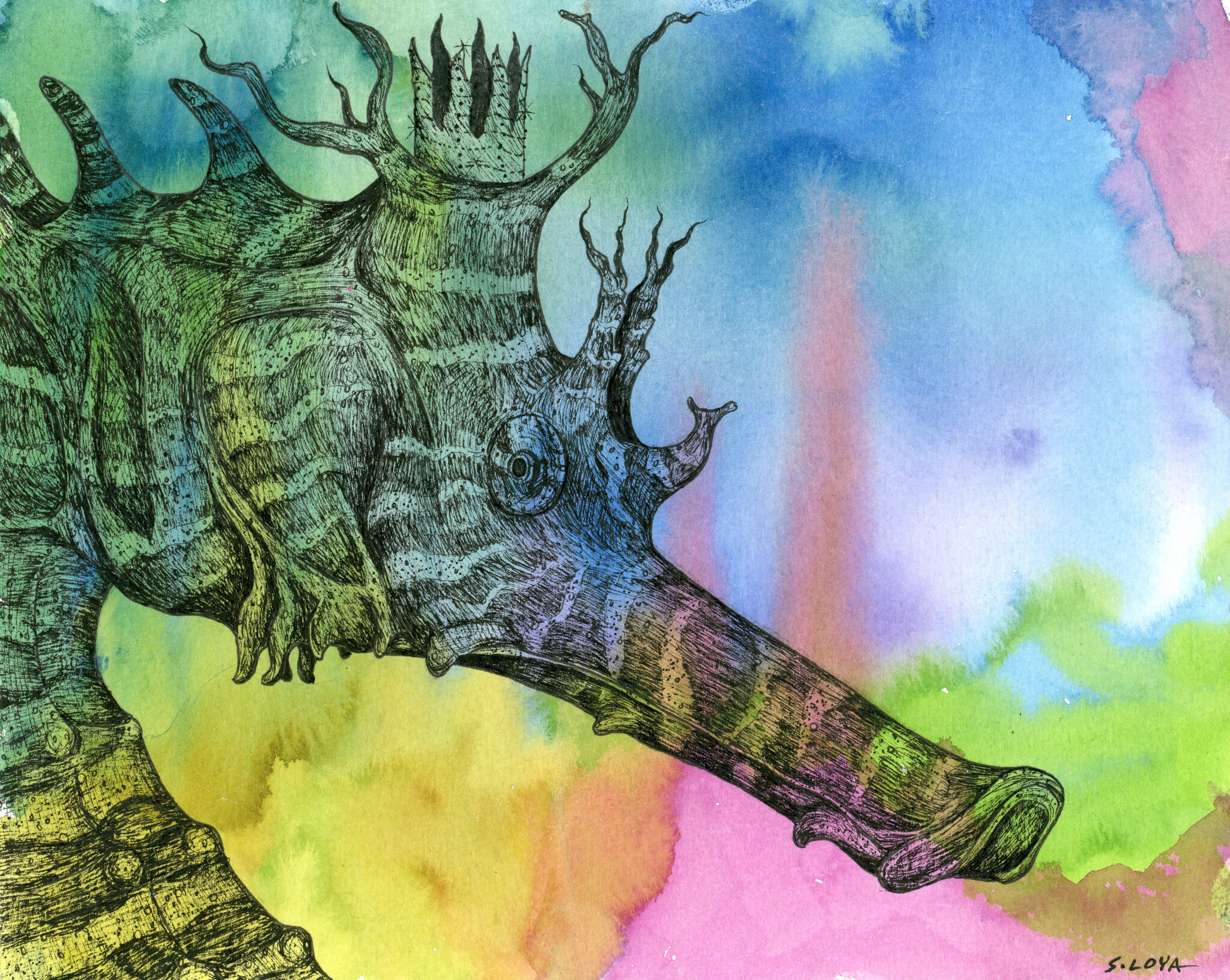
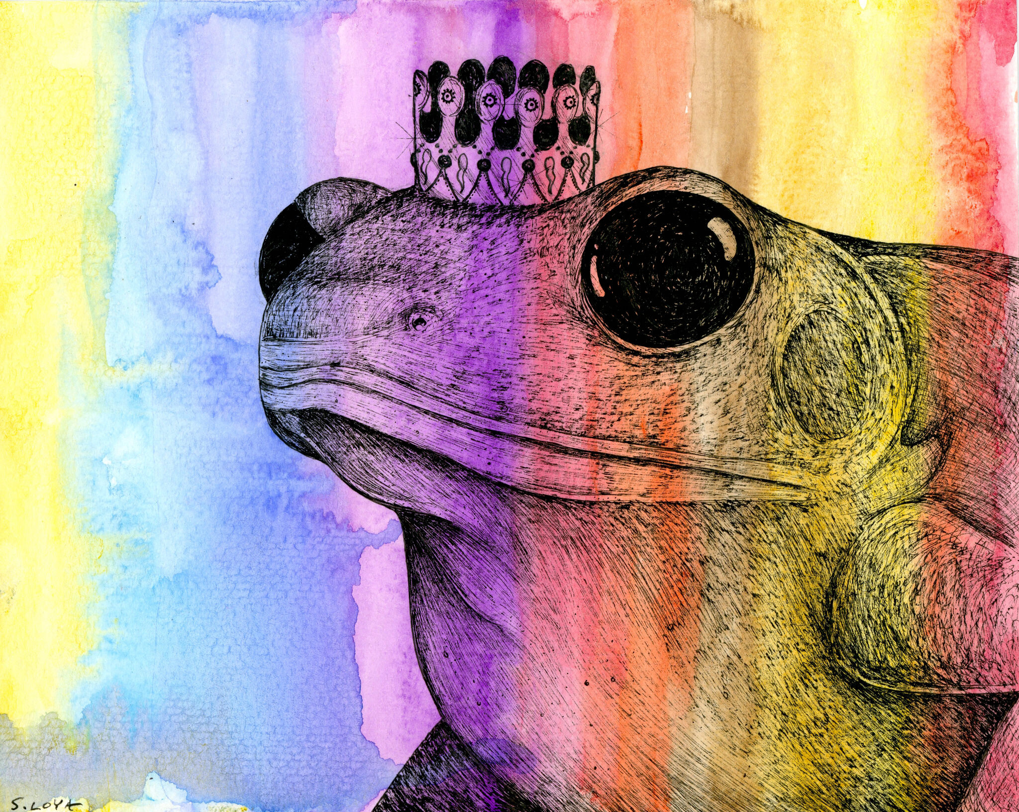
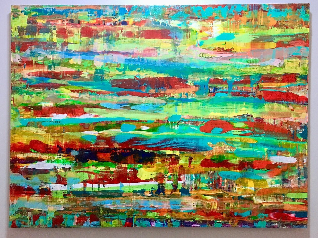
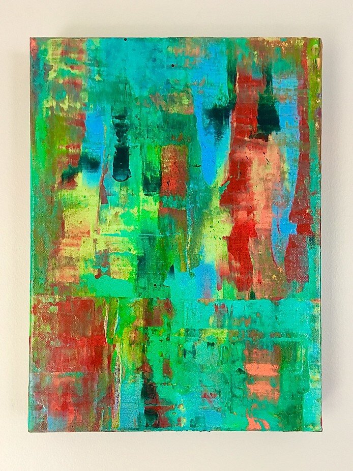
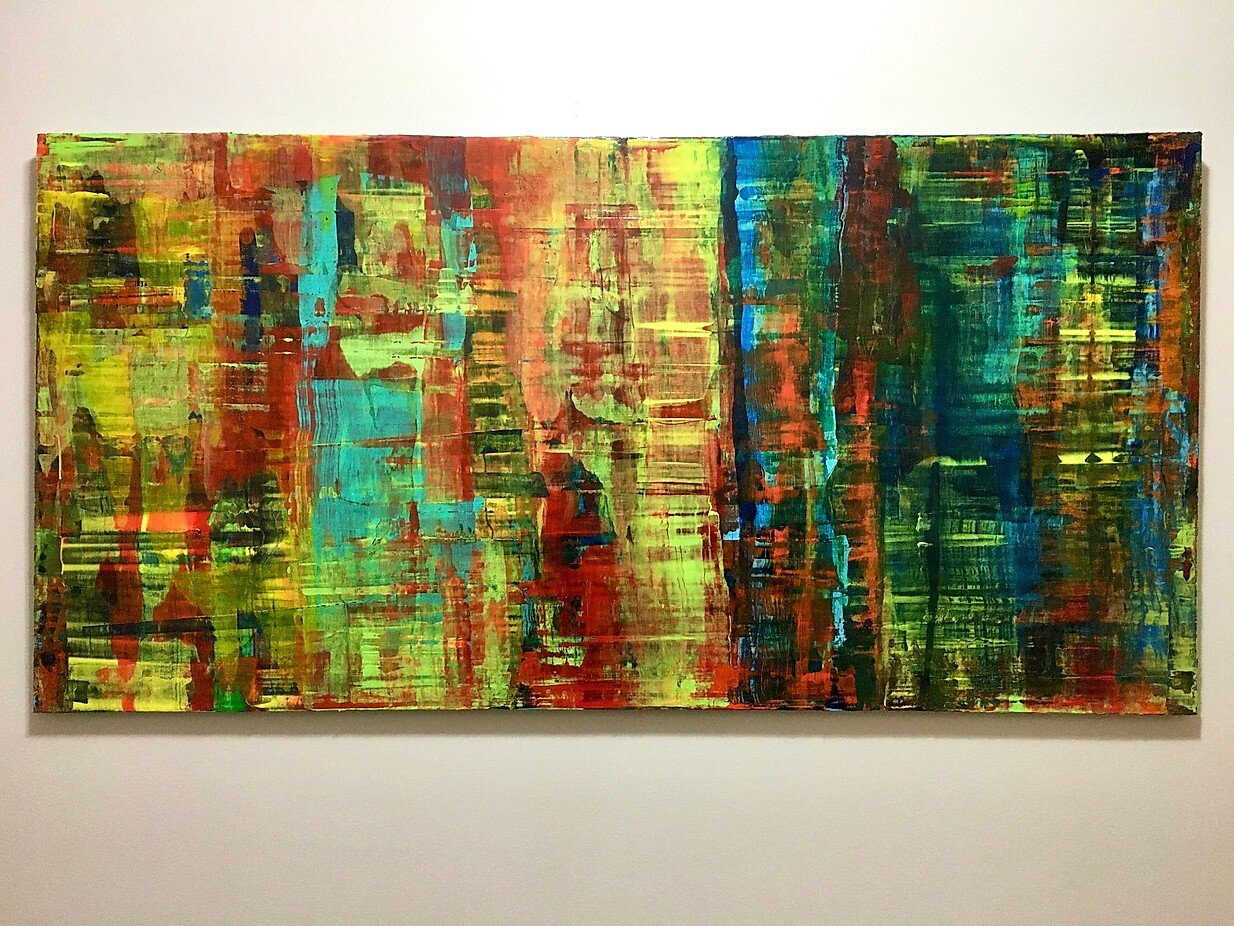
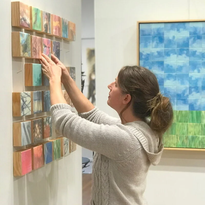
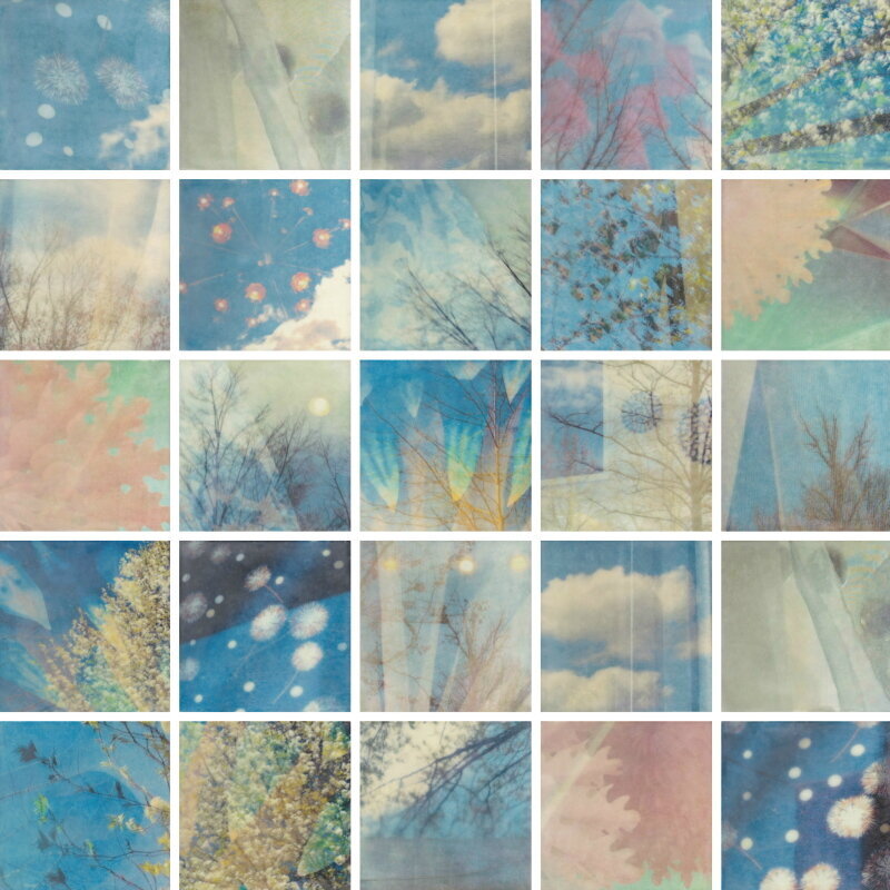
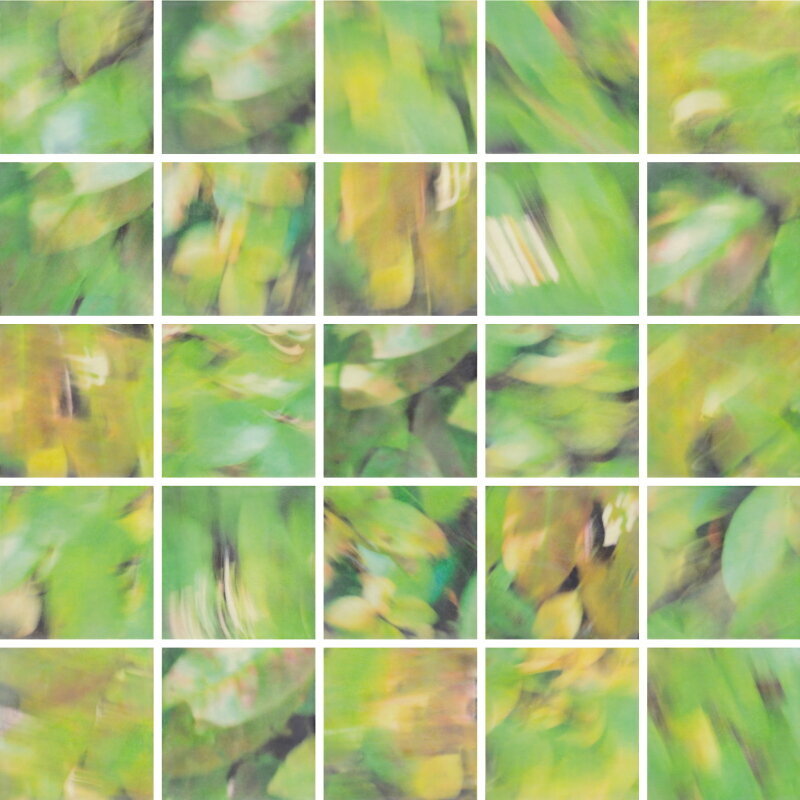
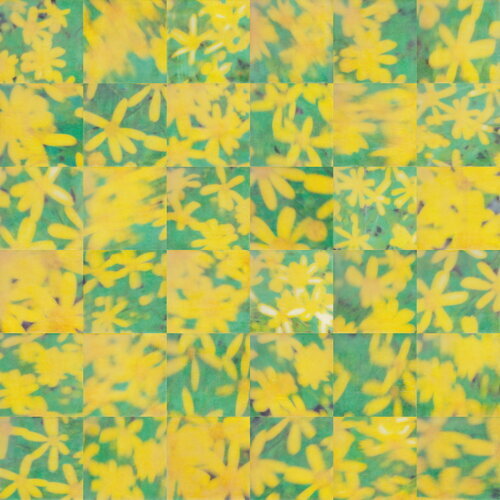
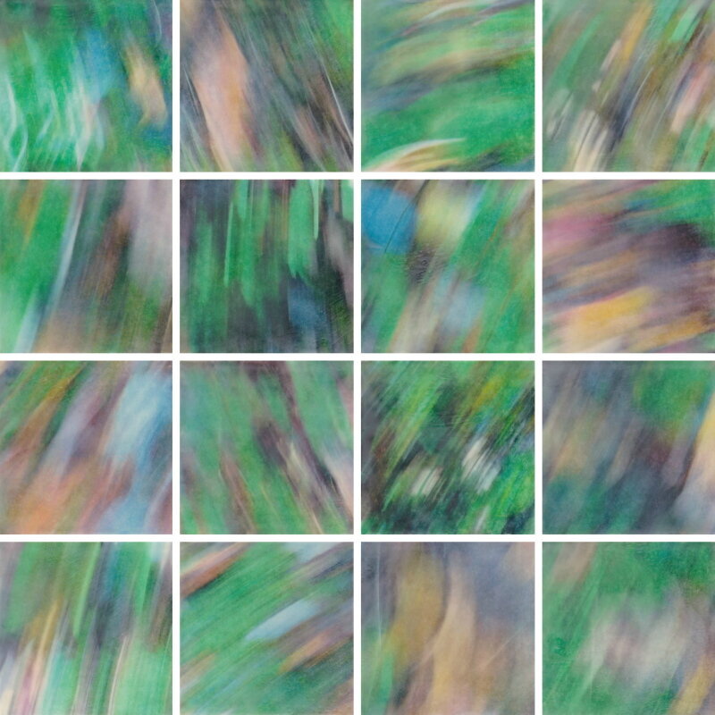
In her encaustic work, Erin uses photography as the basis of her pieces, but she doesn’t just snap images of objects or scenes. She captures reflections in windows or employs purposeful camera motion to blur and distort the image. Erin says about her process, “I am especially interested in elasticity of light as it dances around reflection, shadow, and motion.” Once she captures a number of images, she prints them and transfers the ink of the prints to wood panels. Then the magic happens! She covers the transferred photos with layers of encaustic beeswax giving the final image a softness and a unique glow of saturated color.

Check out some of Erin’s encaustic work below. The photos don’t do the work justice, and they really need to be seen in person.

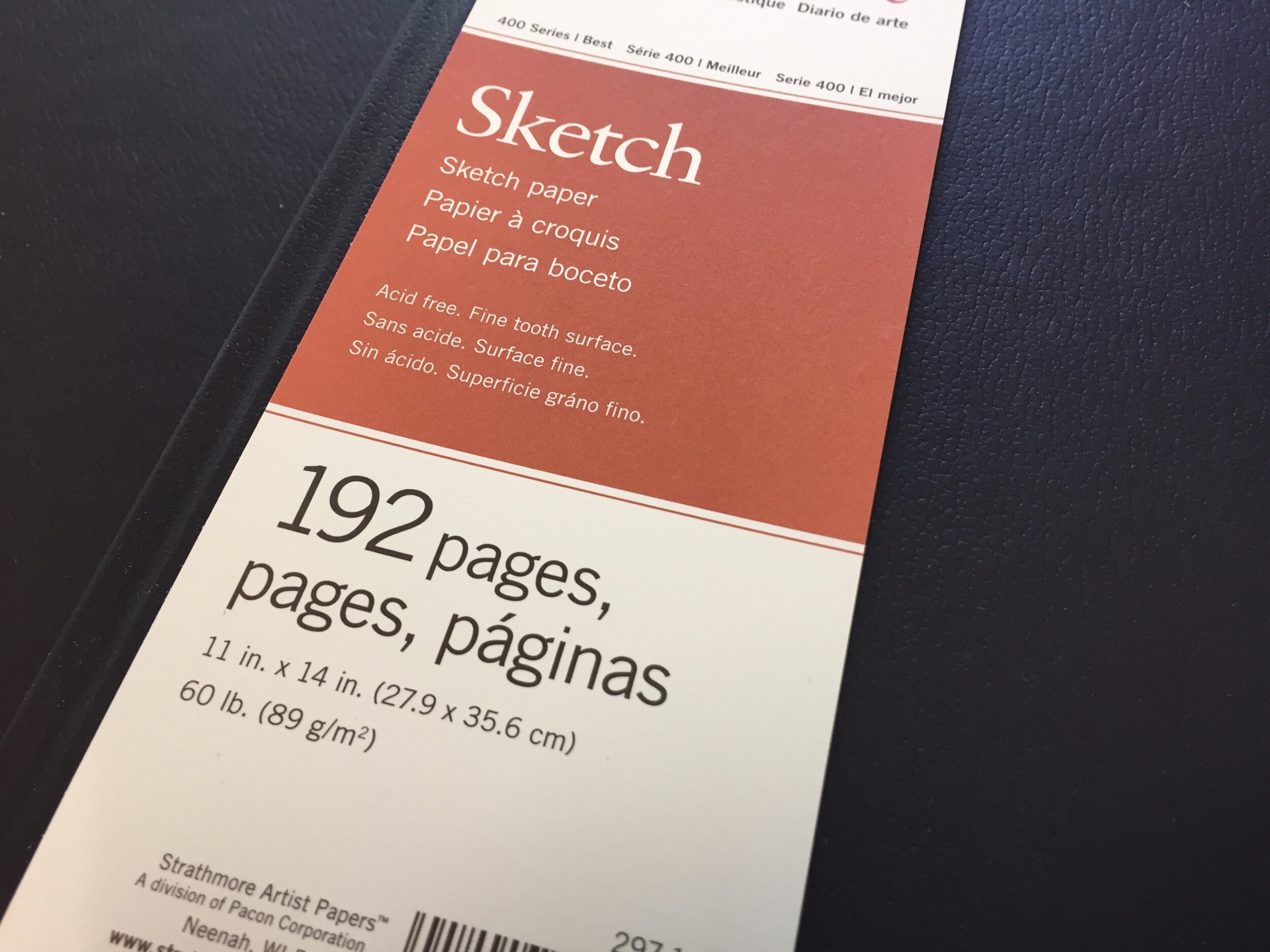
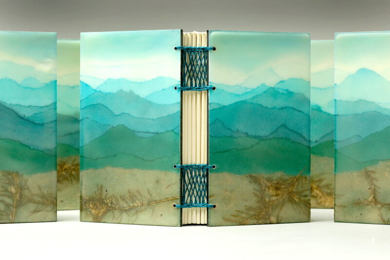
Erin’s bookbinding ranges from practical journals meant to be drawn, written, or worked in to journals meant to be stand alone works of art in and of themselves. She has also begun exploring bookmaking in sculptural terms creating complex structures that explore a variety of configurations and conceptual considerations.

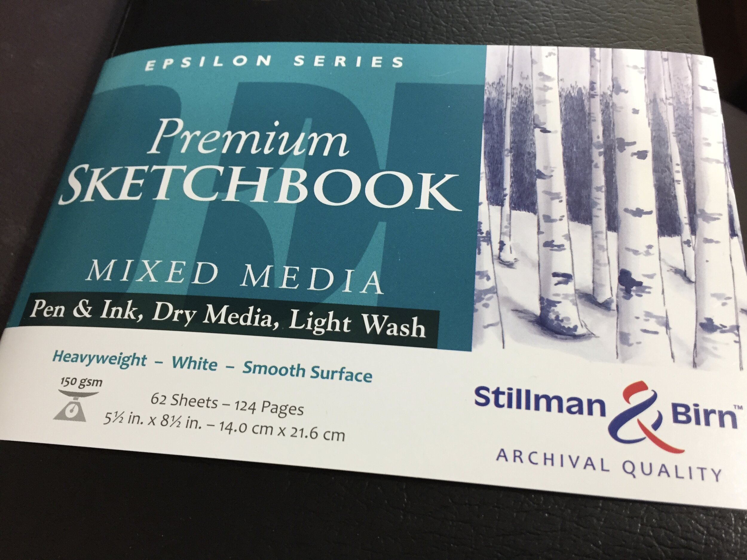
Here are a couple of Erin’s functional journals.

Along with creating work, Erin exhibits her art widely, and is represented by several galleries in western North Carolina including 310 ART, The Gallery at Flat Rock, Penland Gallery, The Bascom, and Southern Highland Craft Guild. She also shares her artistic process in a variety of classes and workshops throughout western North Carolina and beyond.

Erin has been a big inspiration to me over the years, and watching her transition from art teacher to self-sustaining artist really inspired me in my own journey as I made the decision to leave teaching in the public schools and pursue my own art. I love being a witness to journey of other artists, and I have been awed over the years as I’ve watched Erin’s. I hope that you enjoy her work as much as I do, and if you’re ever in or around Asheville, NC, make sure to check out her work in person.

Find out more about Erin and see more of her wonderful art on her website and social media channels.

Website: www.erinkeane.com
Facebook: www.facebook.com/ErinKeaneStudio
Instagram: www.instagram.com/erinbeankeane

Materials Monday: uni-ball Signo White Gel Pen

4B7987C5-BA81-4F6D-A554-6BEFB03BF3D9.jpeg

An opaque white pen seems to be on everyone’s list of must have mixed media supplies. So many times you just want to be able to write and draw on top of other materials with opaque white ink, but unfortunately, it can be hard to find one that fits the bill. There are a lot of choices out there, from gel pens to paint markers, but too often the ink is too transparent, or they don’t work well on certain materials or the tips clog too easily.

49DD217A-4B12-4D5B-8B7F-32EC0ADA98B1.jpeg

The uni-ball Signo white gel pen is a favorite of many mixed media artists and visual journalers. First, the ink is very opaque, so you don’t have to go over it several times to build up the opacity, and second it draws and writes on top of a variety of surfaces. Other pens are often very transparent or only work well on top of glossier surfaces such as acrylic paint or magazine pages, but the Signo works well on top of watercolor paint, colored paper, and much more. It has a broad 1mm tip, and the ink glides on smoothly.

 
Monster 35.jpeg
 

I particularly like using the white gel ink to bring highlights to my ink drawings on colored papers or painted backgrounds, especially on my monster drawings. The ink covers well, and creates a nice contrast to the background paper and black ink. But the white Signo is also something that I like to use in my journal, especially since I build up a lot of layers and cover the white of the page. The Signo lets me bring white back into the page with lines, shapes, and words, and like I said, it works well on top of collage, watercolor paint and pencil, and other inks. It’s ideally suited for the mixed media nature of my journal work.

 
94366D97-8DF4-4F3E-ABA9-887C9FF20AB0.jpeg
 

The white uni-ball Signo does have several drawbacks. First, it takes the ink a while to dry, and smudging can be a problem. I’ve also had issues when I’ve tried to fill in areas with solid white. Sometimes the tip seems to lift up the ink that was just laid down on the paper. I think it’s a matter of the ink not being dried when working on top of it, but it can be a bit frustrating to have to go over an area multiple times. Second the Signo can get clogged rather easily, and you have to be careful not to draw or write into wet glue or paint. Too often, I’ve had a fairly new pen simply stop working because the tip gets gummed up with glue or some other material. That’s a real hazard of a mixed media approach. Another drawback is that the pens seem to have a short shelf life once you start using them. I don’t know if the ink simple dries up inside or if it dries up just in the tip, but I’ve had issues with pens that I hadn’t used in a couple of months, even though I had only used them a few times. It’s just good practice to use the pen on a regular basis and not leave it sit for long periods of time. Maybe it’s the nature of gel pens. After all, a simple search online reveals a lot of hits about gel pens not working and how to revive them.

 
4468507F-D91A-45C9-92A4-B3D0CE5C6ECB.jpeg
 

All in all, the uni-ball Signo white gel pens have a nice opaque ink and go on very smoothly, especially when they’re new. They’re a nice addition to the mixed media supply bag, and great for embellishing and writing on top of a multitude of surfaces. You can buy them individually or you can sometimes find them in a set with a silver and gold gel pen.

If you’ve used the Signo white pens, let me know what you think of them in the comments!

As usual, I don’t get paid to promote any of these products. They’re just the things that I like and use personally!

Amplify: Steve Loya

As we’ve all been staying at home on lock down and quarantine, we need connection more than ever, and I believe that only by uplift each other will we make it through this COVID-19 crisis with our sanity. Ever since this began, one thought — one word has been popping into my mind with greater and greater frequency — amplify. It’s too easy to focus on all of the negativity, and it eats away at your heart. I’ve been thinking about how we need to come together and help amplify the positivity that others bring to the world, and I’ve been loving how artists, musicians, writers, and performers have been stepping up. And I want to do my small part.

I want to start highlighting, uplifting, and amplifying my fellow creative folks — some are good friends of mine, some are social media connections, some are just folks that I admire, and some are downright heroes of mine. I just want to share them with my little slice of the world.

I want to start off with artist and educator Steve Loya.

48746613626_9f26ebab64_k.jpg

I have known Steve for nearly 30 years, and we met our freshmen year at Edinboro University of Pennsylvania in 1991. We were both art education majors, but we didn’t meet in an art class or an education class. We met through Steve’s roommate when I needed to borrow a word processor for an English class, and we’ve been friends ever since.

It has been a pleasure watching Steve’s journey these past 29 years, and I am continually blown away by his prodigious output and his willingness to explore and experiment with new materials and new styles.

Steve has always been a lover of nature whether it was wondering the woods around his house where he grew up just north of Pittsburgh, PA or hiking the Appalachian Trail near his one now in Northern Virginia. Steve has explored that love of nature in his sketchbooks with countless drawings and sketches of trees, animals, and plants, and also in more resolved work like his Endangered Kingdom and Trees I’ve Known series. With his Endangered Kingdom series Steve researched a wide variety of endangered  animals and created an ink drawing of each animal on a watercolor background giving each animal a crown with unique details. As the title suggests, his Trees I’ve Known features a wide variety of trees that Steve has drawn in person.

Besides nature, Steve uses his imagination as a source of inspiration and is known for creations he calls Splotch Monsters. His process is simple. He typically creates a splotch from watercolor or ink, allows it to dry completely, and then draws in details with a variety of pens creating whimsical monsters. Sometimes he is more random with the splotches, and at other times, he is more controlled with the splotches. But there is always a good amount of chance and unpredictability with them.

Recently Steve has been exploring abstract painting using acrylic paint on canvas. In these paintings, he builds layers of paint allowing spontaneity and chance to have a vital role in the process. These paintings are very much inspired by Steve’s love of music, and have been influenced by the notion of chromesthesia, which is when a person sees sound as color. Though Steve doesn’t have chromasthesia himself, it provides a way of thinking about sound and music.

I admire Steve not just for all of the artwork that he puts out, but his ability to get his work seen. Over the years, he has had his work displayed all over in Virginia, Maryland, and DC whether it’s been part of group exhibits or solo shows, and it seems that he’s always got some show coming up.

It’s been so much fun being a witness to Steve’s journey. He’s such an inspiration! You can check out a recent podcast episode where I interview Steve here.

To see more of Steve and his creations make certain to check out his website, blogs, and social media!

Website: www.steveloya.com
Blog: www.goflyingtrtl.blogspot.com
Blog: www.asplotchmonsteraday.blogspot.com
Facebook: www.facebook.com/splotchmonsterisland
Instagram: www.instagram.com/sloya72
Instagram: www.instagram.com/splotchmonsterisland

Materials Monday: Paper

3C94E3CC-2806-4A5F-9F08-E06BEB52D5A3.jpeg

What sketchbook do you use? That’s probably the number one question that I get asked, so I thought that I’d tackle that question and expand it into a discussion about paper since the reason that so many people ask about the book is that they want to know about the paper that’s inside of it.

Here are a few of those things to consider the next time you go to choose paper or a book.

Paper Characteristics
Probably the first thing to think about with paper is the weight since it determines the thickness. Thin papers tend to buckle and bleed more than thicker papers, and anyone who wants their work to be flat, will probably want a thicker paper that can stand up to wet materials. You can get a general sense of a paper’s weight and thickness just by it’s type. Sketch paper tends to be rather thin, drawing paper is a little thicker, and mixed media and watercolor papers tend to be thicker and can handle wet materials with little buckling and bleeding. But even among the same type of paper, there are various weights that might get a bit confusing. Paper is usually marked in pounds (lbs.) here in the US, and that number comes from weighing 500 sheets of a certain paper at a certain size, but sometimes different sizes of paper are used. That means that two different papers can be marked as 90lbs. and one might be thicker then the other. Kind of odd, but look closely at paper, and you’ll see examples of this. It’s more accurate to look at the grams per square meter (gsm, or g/m2). So a 150gsm paper will be thinner than a 190gsm paper.

The next thing is to think about might be the surface texture of the paper, watercolor paper tends to have the most texture of the papers I’ve mentioned, and is often described as hot pressed and cold pressed with hot pressed being smoother than cold pressed. But hot pressed paper still has a slight texture which doesn’t make it ideal for mixed media — great for wet media like watercolor or painted ink, but not so great for drawing. Sketch paper and drawing paper are much smoother and are often described as smooth or vellum (slightly textured), but they don’t stand up as well to the wet materials. Then we have mixed media paper, and even mixed media paper can have smooth or vellum surface.

Then there’s the sizing. Sizing is usually a plant-based starch, an animal gelatin, or a synthetic substance that is applied to paper to regulate how the paper absorbs water. That’s why sketch and drawing papers don’t always handle wet materials — not so much because they are thin, but because they do not have the appropriate sizing. You may have had an issue in the past when you’ve painted on a piece of paper or in a sketchbook only to have the paint soak immediately into the paper. That’s the sizing, and it means that you can have a thick drawing paper that isn’t good for wet media, because it isn’t sized like a watercolor or a mixed media paper. The sizing on the watercolor and mixed media papers allows the wet media to sit on the surface longer before soaking in enabling the paint or ink to be pushed around a bit and dry at a slower rate.

Another thing to think about with paper, is what is it made of. You might have thought that all paper was made out of wood pulp, and most paper is. But for many companies the highest quality paper is made from 100% cotton and is often referred to as rag paper, but paper can be made of other materials as well. Yupo paper is 100% polypropylene, so basic plastic, and isn’t absorbent at all, and Yasutomo makes a mineral paper that is 80% calcium carbonate bonded with a small amount of plastic.

There are a lot of considerations when thinking about paper, and I haven’t even mentioned bristol board, pastel papers, newsprint, and so many others. Now that I’ve bored you with all of this paper knowledge, let me share with you what I like to use and why I like it.

 
7FE5CE2F-09A6-4FF6-872C-B2A6ED1378BF_1_201_a.jpeg
 

Journals
For my large 11x14 inch hardbound everyday journal, I like a Strathmore 400 Series Hardbound Sketch Journal. It has 192 pages of 89gsm sketch paper that holds up pretty well to the wet materials that I use, but there is a lot of buckling and sometimes materials bleed through. It just doesn’t bother me. The pages flatten out pretty well from the book just being closed, and the bleeding isn’t too bad. For my Journal Friday time-lapse videos, I use an 11x14 inch Strathmore 500 Series Hardbound Mixed Media Journal. It has 48 pages of 190gsm paper that is 100% cotton. The thick paper buckles slightly, but not much allowing it to lay fairly flat while filming. It’s a thick paper and doesn’t allow materials to bleed through.

B610B95C-F7C4-42A8-9E52-734BD8F3A260_1_201_a.jpeg

Though Strathmore has been my go to for quite a few years, I have gotten into Stillman and Birn, and I’ve been using some of their 5.5x8.5 inch hardbound sketchbooks lately. I really like their Epsilon Series which has 124 pages of 150gsm white paper with a smooth surface. It can buckle a bit, but it’s a nice paper that flattens pretty well from the book being closed, and it doesn’t bleed through.

D8416181-885A-428C-B0D5-D86D81B3C771_1_201_a.jpeg
C1DD9572-DEB5-4413-BE42-80C05C4A3E1E_1_201_a.jpeg

So with books, there’s a trade off — the thicker the paper, the fewer pages, but the less buckling and bleed through.

Papers
For drawing, I love the Strathmore 400 Series Recycled Drawing paper. It’s a bright white 130gsm paper that I use for drawing with graphite or ink, but it can stand up to light washes of paint, though it can buckle quite a bit when wet. I only use it with graphite or my drawing pens. 

2A13B3D1-D852-4EA3-B24A-C14C849AC19F_1_201_a.jpeg
Monster 5.jpeg

For mixed media work, I love the Strathmore 400 Series Mixed Media paper. This 300gsm paper is great for building layers of wet materials, but it’s smooth surface is also perfect for drawing with graphite or ink. It’s my go to paper for most of my stand alone mixed media work, though it warps a little bit when wet. I can build up layers of watercolor, watercolor pencil, ink, and collage, and it handles acrylic paint, as well. Recently, I’ve tried out Strathmore’s 500 Series Heavyweight Mixed Media paper. This is a 100% cotton paper that is a staggering 570gsm and can stand up to all types of media.

5590E45C-F07F-4C83-ACAD-E5006E35DD9B.jpeg
1D36A9D7-8810-4DE2-BB59-525338FA4D18_1_201_a.jpeg
 
Scan 83.jpeg
 

I hope that I haven’t shared too much about paper, but I feel like I’ve covered the basics so that you can go out an pick something that is appropriate for your work. But like anything, try it out, and find what you like best.

I get no compensation for these recommendations, and I simple share the materials and the brands that I like and personally use.

Live Stream Journaling

C9E4FF47-729C-474A-A5EB-8B213964A4EC.jpeg

I recently did a 10 part live stream series on Facebook where I shared lots of my basic techniques for working in the visual journal. You can find them on my art studio FB page and on YouTube, but I thought that I would gather them here in one place on the blog.

If you enjoy them and get something out of them, I’ve set up a support page in the online shop for anyone to offer a bit of financial support. I appreciate any support if you’re in a position to offer any. Thank you!

I hope that you do enjoy, and happy creating!


John C. Campbell


I was very fortunate to spend last week teaching at the renowned John C. Campbell Folk School in the mountains of western North Carolina. I’ve known about Campbell for quite some time, and I probably heard about it fifteen years or so ago when I was teaching at the North Carolina Center for the Advancement of Teaching (NCCAT) and learned of it and other schools like it, such as Penland and Arrowmont. Ever since teaching at NCCAT, I had dreamed of teaching at places like this, and this past week, it came to be.

John C. Campbell is a special place. Secluded in western North Carolina, it’s a haven for craft and art enthusiasts, and it has a studio for nearly every discipline. At any given time throughout the year, a hundred or more students and instructors are working in blacksmithing, wood turning, quilting, jewelry making, and much, much more. I was fortunate to spend my week in the Paper and Book Arts studio and work with nine wonderful students.

We dove into the visual journaling in a class called Beyond Blank Pages. I designed this class to be a bit different than other journal classes I have taught, and we approach the journal in a slightly different way, though we use many of the tried and true techniques that I have used and taught for years. The main idea of this class was to rethink what a book can be and to weave a visual and written narrative among, between, and through the pages. We thought about creating connection and interactivity as we painted, collaged, and wrote. We cut and folded pages, created windows, tunnels, and doors that went through pages. We tore the edges of pages, and connected spaces with color, lines, words, and more.


Through it all I wanted the students to go in with no preconceived ideas and, as Lynda Berry suggests in her book Making Comics, to let their hands wander a bit and discover something new. So they painted and collaged and wrote and cut, as they allowed ideas to flow. Eventually they each struck on a theme, an idea, or a notion that would drive the work. It was amazing to see how each took a different path in their books as a result of letting go of their resistances, judgments, and attachments. Each one had a unique take. They didn’t finish or fill the book, but instead walked away with the beginnings of a special book and ideas of how to continue the journey.

 
fullsizeoutput_145c.jpeg
 

It was an amazing week, full of power and discovery — filled with laughter and tears. I am filled with such gratitude, and I can’t thank, Jen, Thea, Dana, Eileen, Julie, Jo-Ellen, Vicki, Barbara, and Robin enough. I can’t wait to go back!