The piece is slowly developing as I layer more and more into it. Here are the next four layers using Prismacolor watercolor pencil, collage, uni-ball Vision Needle pen, and Prismacolor colored pencil.
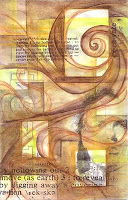 9. For this layer, I used Dark Umber watercolor pencil to enhance many elements with in the piece and bring more contrast to the forms. I darkened around the three rectangles as well as bringing more definition to the spiraling forms. As a result the rectangles begin to "pop" more and there is a greater sense of shallow space.
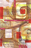 10. Next I collaged in three different types of paper. First I cut and glued down the red flowered paper which is the wrapper from a bar of rose-scented Flower & Bee soap. I then tore some translucent white paper and glued it in three of the corners, and I cut a rectangular piece of the same paper and glued it over the rectangle in the lower left. Finally I cut and glued down pieces of red vellum. The transparency of the vellum is a great layer allowing previous layers to show through.
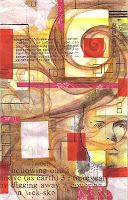 11. I then added more rectilinear elements with black waterproof ink. I used a template (stencil) to draw the repeating squares throughout. I added some larger rectangles as well with the pen. I tend not to use a ruler and prefer, instead, to free-hand it. I also used ink to define the facial features as well since the face did not transfer well in Layer 8. The repeating rectangles, squares, and colors bring a structure to the piece that keeps it balanced and unified.
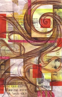 12. Using a variety of colored pencil, mostly shades of brown, I enhanced and accentuated many of the forms. With careful shading and blending, I was able to create some shallow depth especially around the spiral and the rectangle in the upper left.
 9. For this layer, I used Dark Umber watercolor pencil to enhance many elements with in the piece and bring more contrast to the forms. I darkened around the three rectangles as well as bringing more definition to the spiraling forms. As a result the rectangles begin to "pop" more and there is a greater sense of shallow space.
 10. Next I collaged in three different types of paper. First I cut and glued down the red flowered paper which is the wrapper from a bar of rose-scented Flower & Bee soap. I then tore some translucent white paper and glued it in three of the corners, and I cut a rectangular piece of the same paper and glued it over the rectangle in the lower left. Finally I cut and glued down pieces of red vellum. The transparency of the vellum is a great layer allowing previous layers to show through.
 11. I then added more rectilinear elements with black waterproof ink. I used a template (stencil) to draw the repeating squares throughout. I added some larger rectangles as well with the pen. I tend not to use a ruler and prefer, instead, to free-hand it. I also used ink to define the facial features as well since the face did not transfer well in Layer 8. The repeating rectangles, squares, and colors bring a structure to the piece that keeps it balanced and unified.
 12. Using a variety of colored pencil, mostly shades of brown, I enhanced and accentuated many of the forms. With careful shading and blending, I was able to create some shallow depth especially around the spiral and the rectangle in the upper left.
This piece is coming along nicely. I do feel that I've gotten a bit tight and fickle with it, but I usually do with smaller pieces. I still plan on layering acrylic and other image transfers into this piece, as well as re-emphasizing the word "sift" that has now become lost in the lower right corner.