The changes in these three layers are not as pronounced as when I first started, but nearing completion, this piece has become very rich, very layered, and very complex with a lot of push and pull.
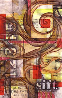 13. To bring back the word "sift" and the numbers that I stenciled in earlier in the process, I used water-soluble graphite pencil to shade in around the letters and the numbers. This darkened the negative spaces and allowed the letters and numbers to "pop". Instead of using water to blend the graphite, I used matte medium. The acrylic medium mixes with the water-soluble graphite and creates an interesting glazed effect. To strengthen and accentuate the letters and numbers even more, I use white colored pencil to fill them in. The white is somewhat opaque bringing a bit of solidity to the word and numbers. I then painted a layer of the matte medium over the entire surface. This does two things. It seems to make the colors a bit more saturated and it prepares the whole surface for acrylic paint by covering everything with a consistent layer.
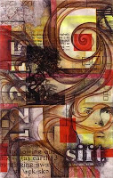 14. I wanted other images in the piece so I used four packaging tape transfers. This simple technique worked on bits of maps from an old road atlas lying around the studio as well as a laser print of a tree image (which is by photographer Eugene Atget). With these types of image transfers, the image is stuck to the clear tape and the paper is removed to create a transparent image. I used glue stick to glue the images to the surface. I probably should have used acrylic medium. But I sealed the entire surface with more matte medium which took the glossy finish off the tape transfers.
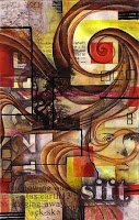 15. I spent quite a while applying acrylic paint to the piece as a way to accentuate some of the lines and forms. The layers of matte medium provided a good surface on which to paint, and I carefully mixed, blended, and layered paint in a way to bring a lot of contrast to the upper right and to several other areas throughout the composition. I used an acrylic retarder to allow for more mixing and blending directly on the surface. After the acrylic thoroughly dried, I used an opaque paint marker to apply black lines. For the most part these lines reinforced lines that were put in previously.
So this piece is close to being finished. I'll probably apply more paint as a way to solidify a few more areas and to push the paint marker into the piece instead of allowing it to float on the surface.
I am quite pleased with this piece, and although I was more particular and meticulous with this piece than I would have been with a journal page, hopefully you can see how I layer and layer to get those rich pages. I'll post the finished image once it is completed.
 13. To bring back the word "sift" and the numbers that I stenciled in earlier in the process, I used water-soluble graphite pencil to shade in around the letters and the numbers. This darkened the negative spaces and allowed the letters and numbers to "pop". Instead of using water to blend the graphite, I used matte medium. The acrylic medium mixes with the water-soluble graphite and creates an interesting glazed effect. To strengthen and accentuate the letters and numbers even more, I use white colored pencil to fill them in. The white is somewhat opaque bringing a bit of solidity to the word and numbers. I then painted a layer of the matte medium over the entire surface. This does two things. It seems to make the colors a bit more saturated and it prepares the whole surface for acrylic paint by covering everything with a consistent layer.
 14. I wanted other images in the piece so I used four packaging tape transfers. This simple technique worked on bits of maps from an old road atlas lying around the studio as well as a laser print of a tree image (which is by photographer Eugene Atget). With these types of image transfers, the image is stuck to the clear tape and the paper is removed to create a transparent image. I used glue stick to glue the images to the surface. I probably should have used acrylic medium. But I sealed the entire surface with more matte medium which took the glossy finish off the tape transfers.
 15. I spent quite a while applying acrylic paint to the piece as a way to accentuate some of the lines and forms. The layers of matte medium provided a good surface on which to paint, and I carefully mixed, blended, and layered paint in a way to bring a lot of contrast to the upper right and to several other areas throughout the composition. I used an acrylic retarder to allow for more mixing and blending directly on the surface. After the acrylic thoroughly dried, I used an opaque paint marker to apply black lines. For the most part these lines reinforced lines that were put in previously.
So this piece is close to being finished. I'll probably apply more paint as a way to solidify a few more areas and to push the paint marker into the piece instead of allowing it to float on the surface.
I am quite pleased with this piece, and although I was more particular and meticulous with this piece than I would have been with a journal page, hopefully you can see how I layer and layer to get those rich pages. I'll post the finished image once it is completed.