
Here’s this week’s Journal Friday. I’ve been contemplating a lot of changes that have been taking place lately, and this page is an extension of some of those thoughts.
Journal Friday #111: Inktense Layers

Here is last week’s Journal Friday time-lapse video! I decided to stick with just my Derwent Inktense pencils and build layers. Sometimes its good to get lost in the process.
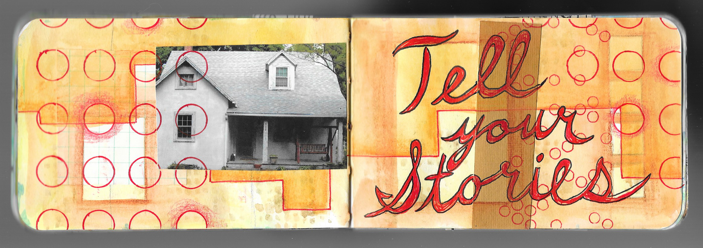
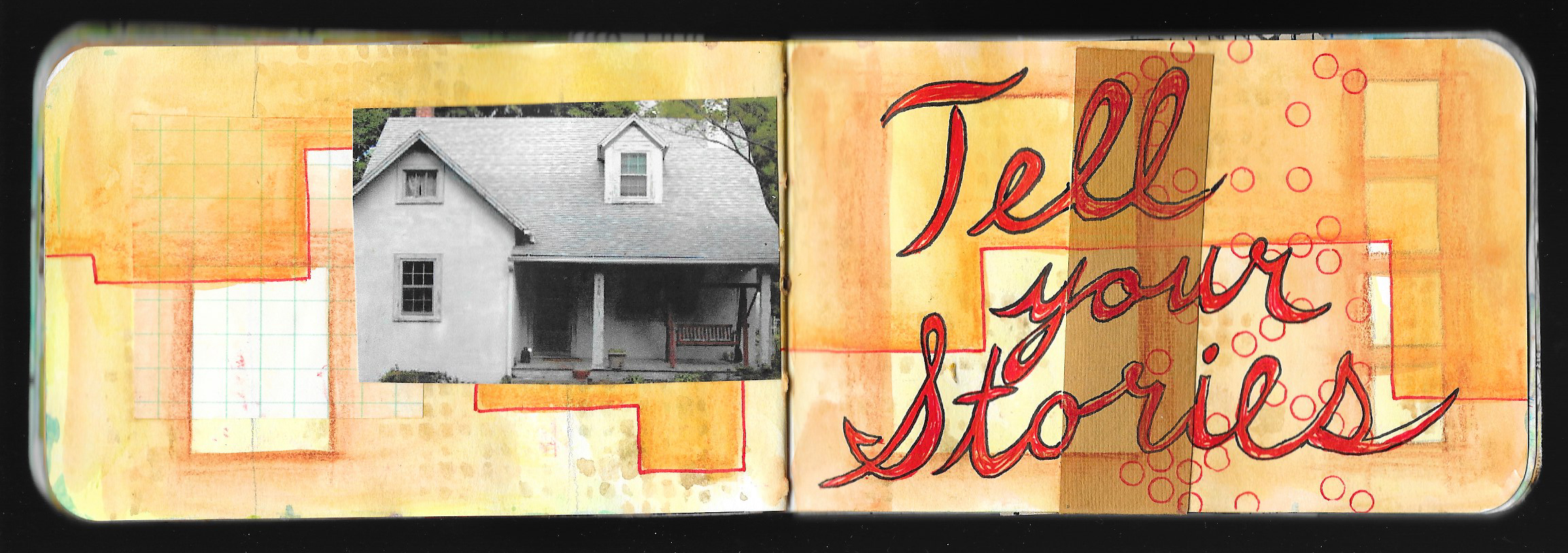
Journal Friday #109: Layers of Memories

Journal Friday has been on hiatus for the past couple of weeks — first, because of getting ready for the Western Loudoun Artists Studio Tour that I participated in the weekend of June 1st and 2nd, and then last week, I was on vacation and didn’t have time to post anything.
I’m back now with a new time-lapse video, and the spread is all about something that has been floating around in my mind for the past couple of weeks.
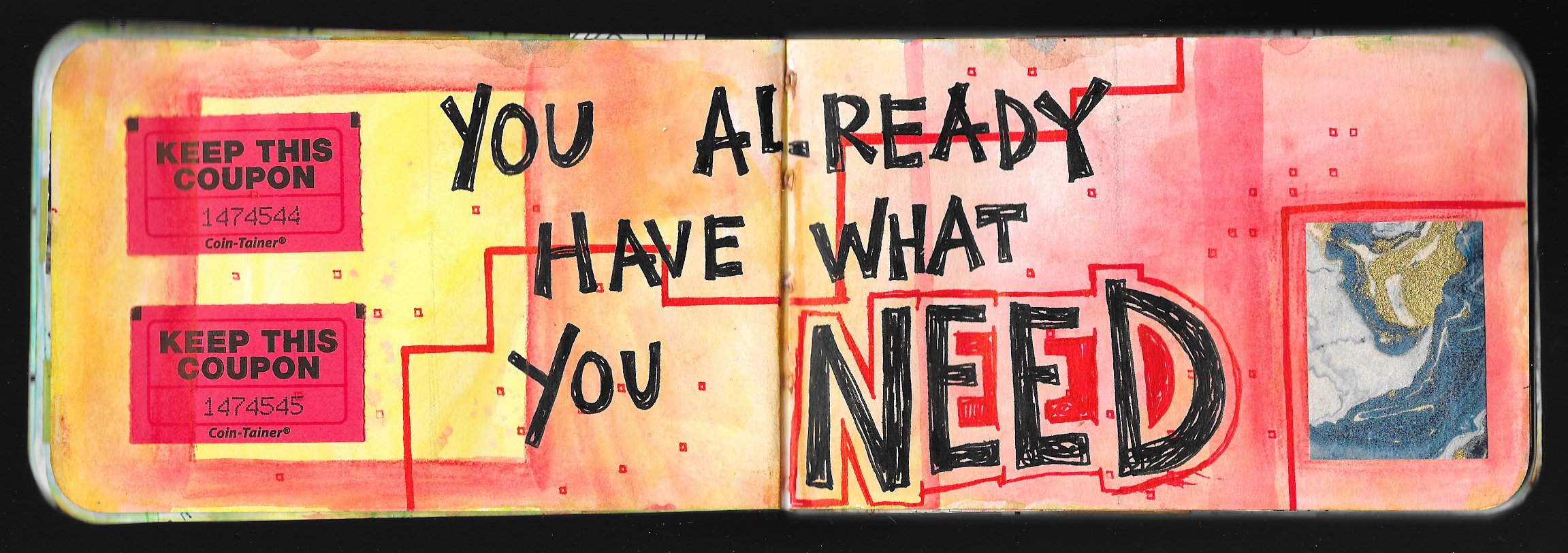
I’ve been feeling a bit lost with my art lately — feeling like I didn’t have a direction, like I was floating a bit aimlessly, but during my vacation, I had a bit of an epiphany. Travel for me is always cathartic, and my wife and I spent a whirlwind of a week in England seeing a lot of different things. But what struck me the most was the history. I remember the same feeling 25 years ago when I first visited England, and I felt it even stronger this time, especially with how it relates to my art. As we went place to place in England — from York to Alnwick, from London to the Cotswold, from Bath to Alton, there’s a real sense of history, and I came to really understand how places and people are both a culmination of experiences and memories, and as time goes by, different structures are imposed on top of one another. Much gets buried and covered up, but it’s still there influencing the character of the place to the person. People and places are an amalgamation of experiences, ideas, people, events, memories, thoughts, and so much more.
So I began to explore those ideas in this weeks Journal Friday spread. I haven’t come to any steadfast conclusions, but I am looking forward to exploring the ideas in my journal and in my art
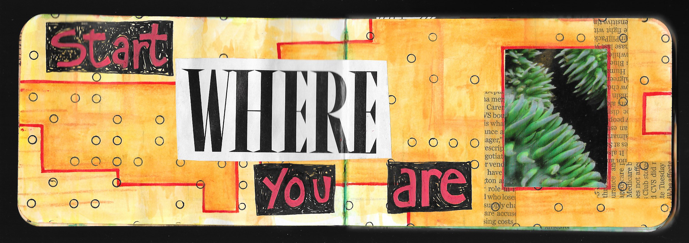
Journal Friday #106: Legacy

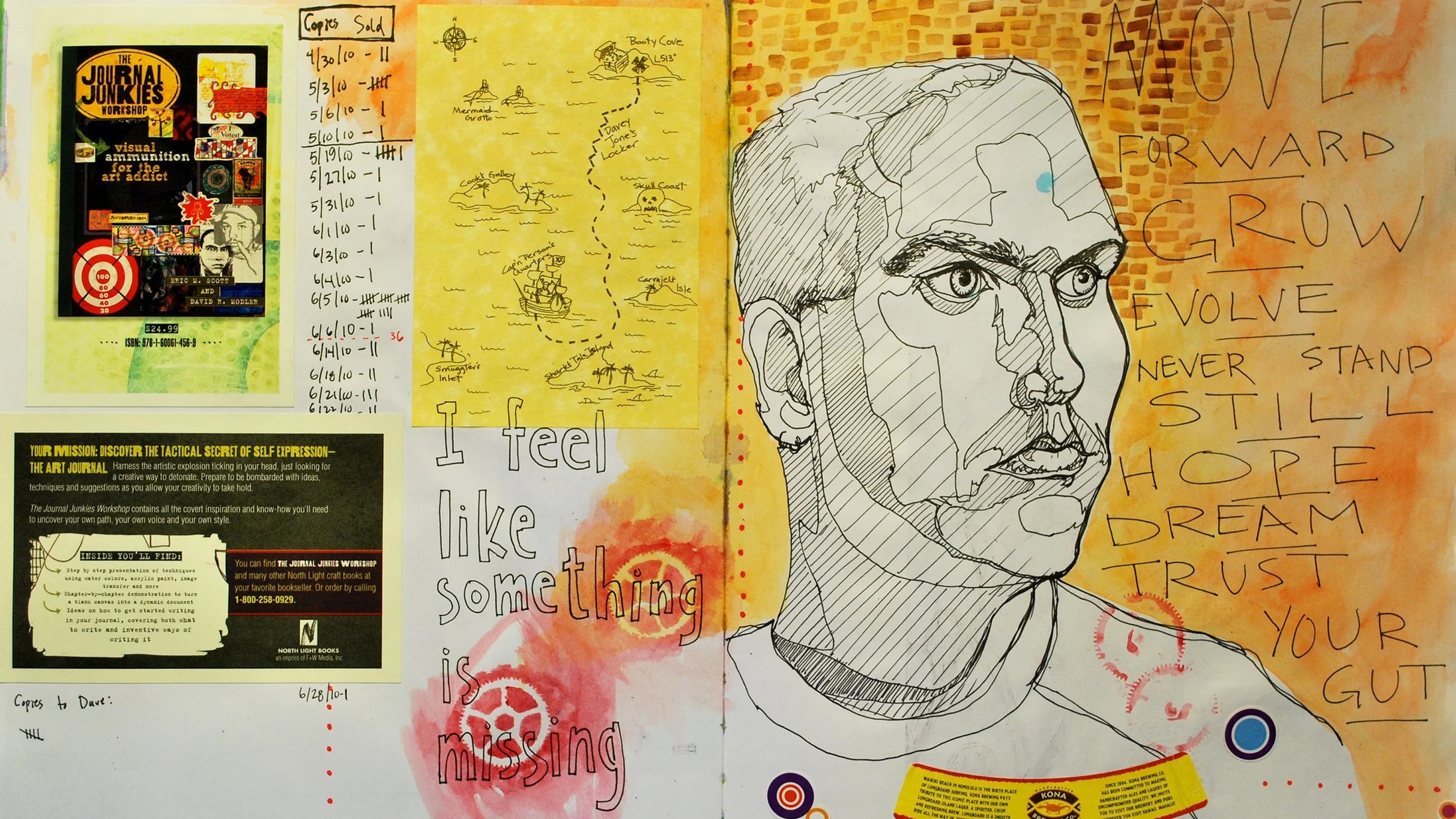
Today’s Journal Friday spread began with some collage, paint, and Inktense Pencils, but I quickly came to a point where I didn’t know what to do next. Then a line from a song that I was listening to hit me. “If I don’t know where I come from, how do I know where to go.” The song is Runaways by hip hop artist Sage Francis, and the line just resonated with me.
I’ve been feeling a bit stuck lately, dealing with some things from the past that seem to be holding me back, and I’m trying to find my feet and find a way forward. I love how journaling can help shine light into my thoughts and feelings.
Here’s to standing boldly and finding a way forward.
Journal Friday #104
I completely forgot to share last week’s Journal Friday here on the blog, but I did share it on social media. So today will be a double dose of Journal Friday. So, here’s a time-lapse video for Journal Friday #104.
Journal Friday #103
I keep forgetting to post Journal Friday on Fridays! I did share the video on social media this past Friday, but I completely forget to share it here on the blog. So here it is a few days late.
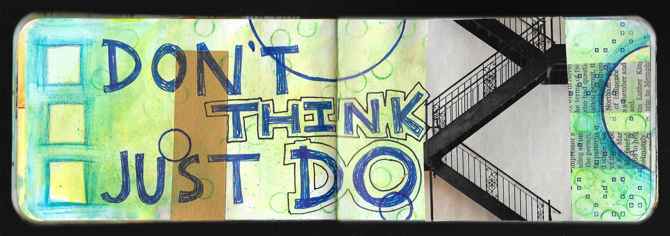
I’ve been trying to share different ideas with these videos, and not make them all the same, even though they use a lot of the same materials. I have been trying to push myself to approach each one in a slightly different way. With this spread, I began with a little reflective writing. Writing is a big component of my normal visual journaling, and I use it to clear my mind: reflect on life, events, and art: and to just figure things out. The initial writing in this spread dictated the direction for the pages, and I spent a lot of time working with letter stencils playing with the phrase, “The Universe Always Answers.”
I hope that you enjoy.
Journal Friday #102

I completely forgot to post the last Journal Friday here, so I’m catching up now. I’ve already posted the video to social media, but I wanted to post it here as well.
This spread really came out of nowhere, and I wasn’t of any of it when I started, except that I new that I wanted to start with collage. As I started the spread, I got a phone call from my brother saying that one of our uncles had passed away. It wasn’t unexpected. He had suffered a stroke a few months ago, and had been in the hospital ever since. He hadn’t really recovered, and I wasn’t surprised with the call. But still it was sad, and my heart hung heavy as I worked on the spread. The news did help dictate the direction of the page, and it became a way to process the feelings and emotions.
I did a variation on blackout poetry once I glued the book pages in, and I searched out rather heavy words as I began to string together phrases. But as I looked outside at the leaves beginning to bud on the bushes and trees, I knew I had to incorporate inspirations of spring despite the sad the news. As I worked through the page, I allowed my thoughts to churn and turn. Though the final spread seems to bear little to no semblance to the sad news, it was a great help in allowing me to process my feelings.
Creative Prayer Book: Embellishing

Welcome to the twelfth and final lesson of the Creative Prayer Book. In this lesson, I try to wrap up my pages with some simple embellishments. Though I talked of embellishing text last week, this lesson is about adding a bit more to the pages in general, as a way to tie things together on a page, to fill in some empty areas, and to bring some emphasis to certain areas.
You can use any materials to embellish, but I like to use drawing materials like pens, paint markers, and colored pencils. There are also a large number of ways to embellish, but I’m keeping it rather simple as I bring a bit of polish to my pages.
Lines, Shapes, and Patterns
One of the simplest ways to add embellishments is to add lines, shapes, and patterns. These little touches can help fill in empty areas and add a final layer to pages. By grouping them closely together around elements you can bring a bit of emphasis and make the elements “pop”. I like to use my uni-ball Vision pens for much of this, but paint markers work great, as well, especially when drawing over glossy surfaces like magazines.
I like to use stripes, spirals, rectangles, and circles as I embellish, and I can even use stencils and tracers to add the embellishments.
Shading
Colored pencil is perfect for adding a bit of depth to my pages as I use them to shade and color in areas. I use the colored pencils very much like I did the Inktense and watercolor pencils earlier on in the workshop and shade around elements. By applying a darker value around a shape or a letter, the shape or letter “pops” out from the page since the colored pencil acts like a shadow. I try to lighten up on my pressure so that the color fades into the background. I can be very neat and careful with this technique, or I can be a bit messy and give my page a bit of a rougher feel.
I also use the colored pencil to shade or color in areas and letters, and I like to use white colored pencil sometimes. The white doesn’t cover everything within the space, but it lightens it. This can bring a bit of contrast to the space making it stand out.
Shading is always a great way to add some final embellishment to a page.
As you work, try to think of various ways to decorate and embellish your pages. Try some of these ideas, and perhaps, try combining them. Or think of your own ways to wrap up your pages, and use any material that you like. Just remember that you’re just trying to add a bit of pizzazz to your pages on not completely reworking them.
I hope that you enjoyed these lessons, and I’ll be back next week to wrap up things. I’ll share a flip through my pages, and talk about the project, as well as share about what’s to come.
Thank you so much, and happy creating!
Creative Prayer Book: Embellishing Text

Welcome to the eleventh lesson of the Creative Prayer Book. In this lesson, I work again with text, but this time, it’s all about embellishing the words that are already in the book. Though I’ve discussed embellishing text a little bit in a few of the recent lessons, today is about using a few simple techniques to make the words stand out using marker and pen.
Outlining
Besides coloring in the text with solid color, outlining is probably one of the most basic embellishing techniques. It’s easy enough to use a contrasting color, whether it’s white or black, to go around the edge of words and letters and create a bit of a “pop”. The outline creates a nice separation with the background, and the contrast really heightens the effect.
Box It In
Sometimes creating a dark rectangle or box around a word can make it pop as well. I started off with Posca paint markers on the spread below to create the red letters, and then I used my black uni-ball Vision pen to create the rectangle. Unfortunately, this technique didn’t work out too great at first, and I had to add several layers of red to cover up the ink letters below. Sometimes things don’t go according to plan, but things can usually be salvaged.
Offset Outlining
This is like a combination of the above techniques — outlining and boxing it in. By leaving a bit of a space between the letter and the outline, I can tie whole words together in a single outline, as I create a slightly different effect. I do try to make the outline rather thick and heavy so that it stands out.
Try to experiment with embellishing text in a variety of ways in order to make it stand out. Use any materials that you want, and try some of these techniques or come up with your own. Just think of ways to jazz up your words and writing.
Thanks for joining me once again, and happy creating!
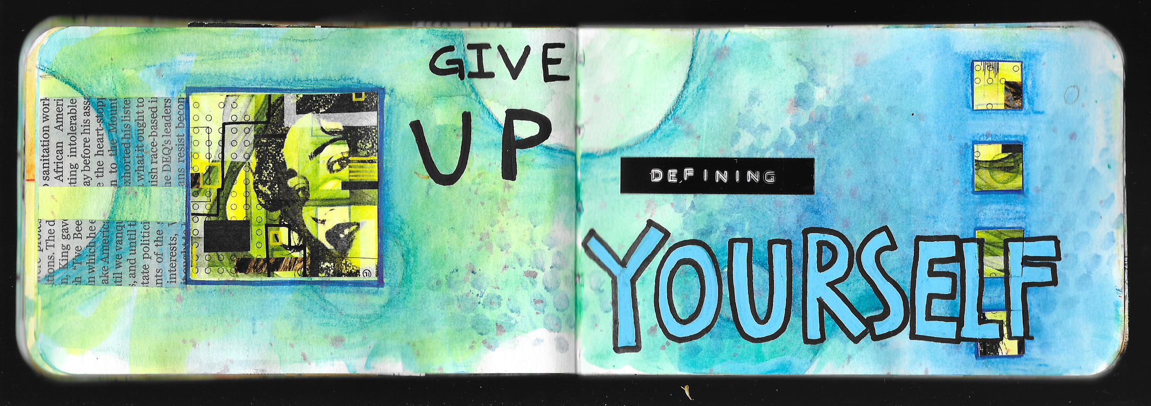
Journal Friday #100: Redefining Self
I feel like I’m going through a major shift — a monumental redefining of who I am. I’m just at the beginning of the process, and today’s Journal Friday is the start of the processing, defining, redefining, and reconfiguring. It’s definitely the start of new journey!