creative prayer book

Creative Prayer Book: Wrap Up

EScott Creative Prayer 1.jpeg

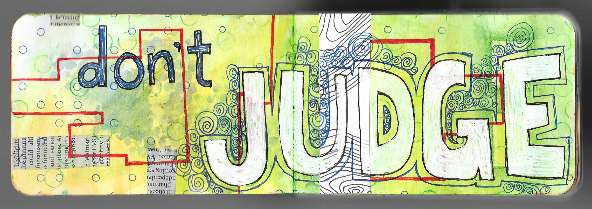
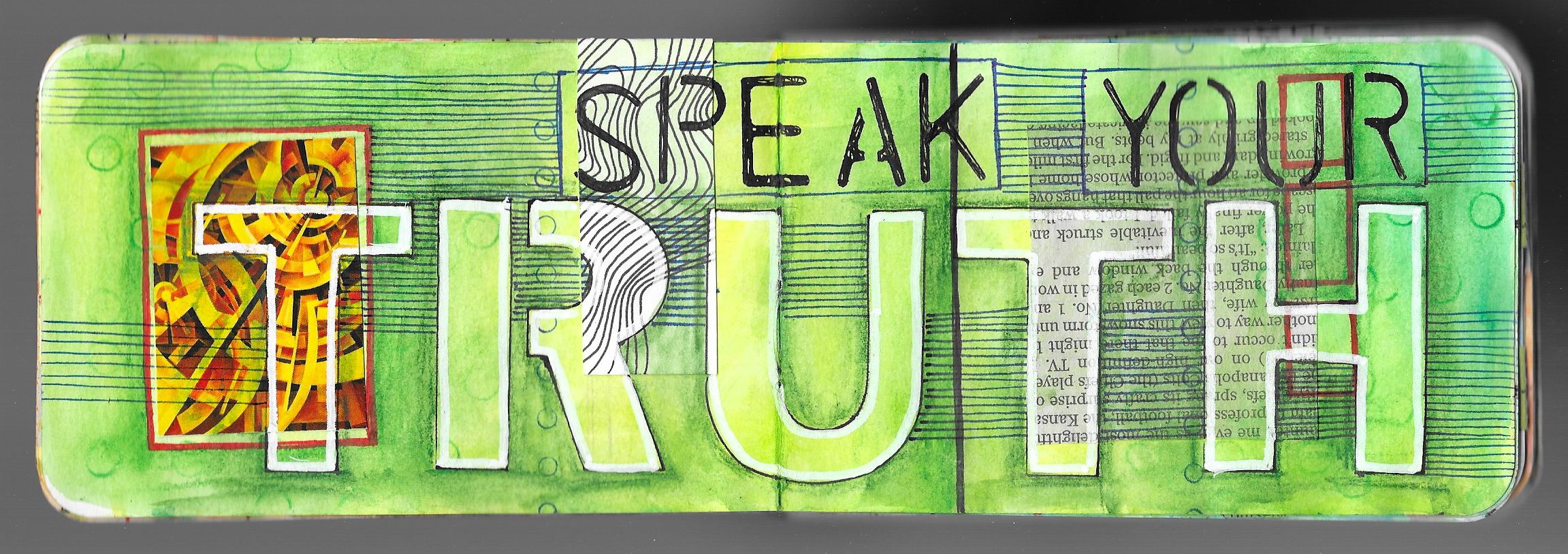
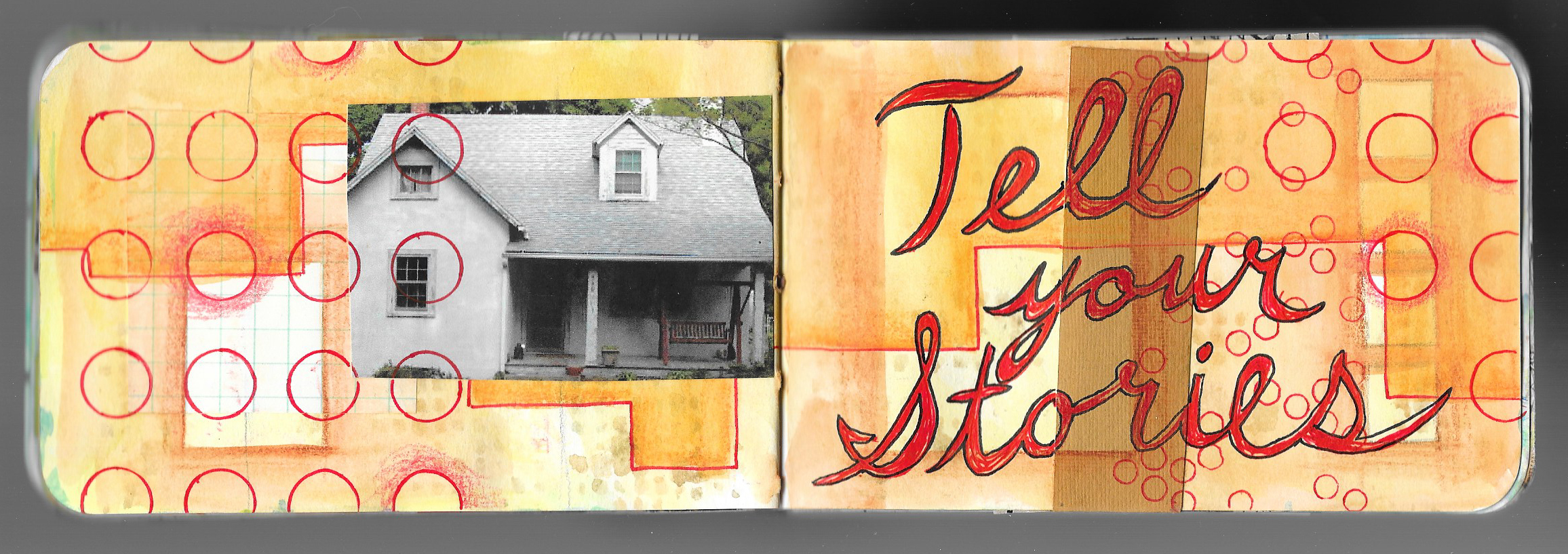
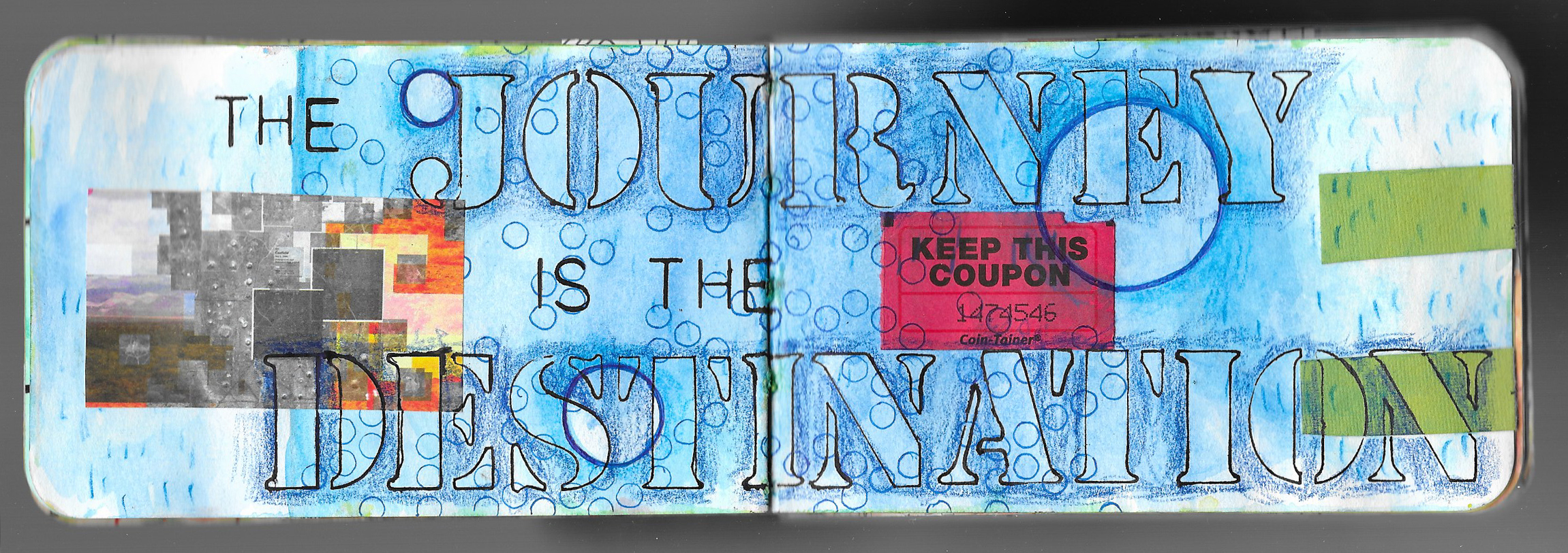
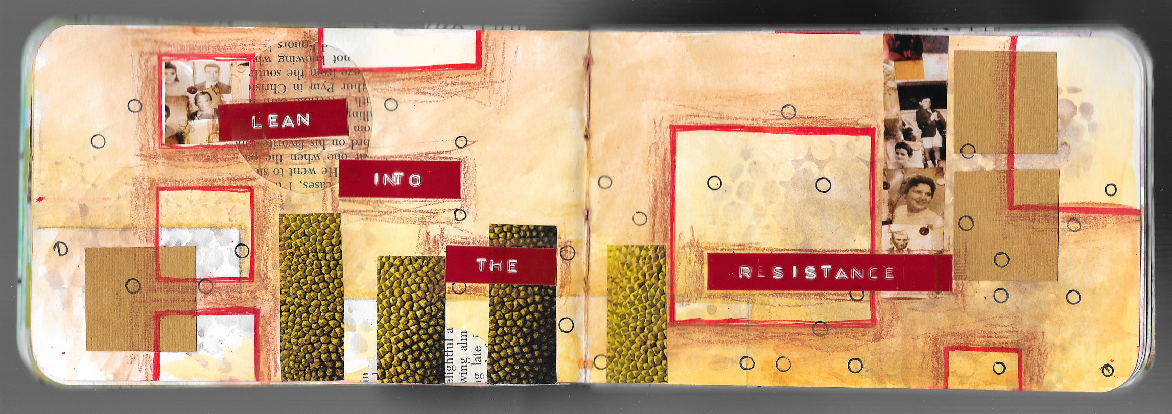
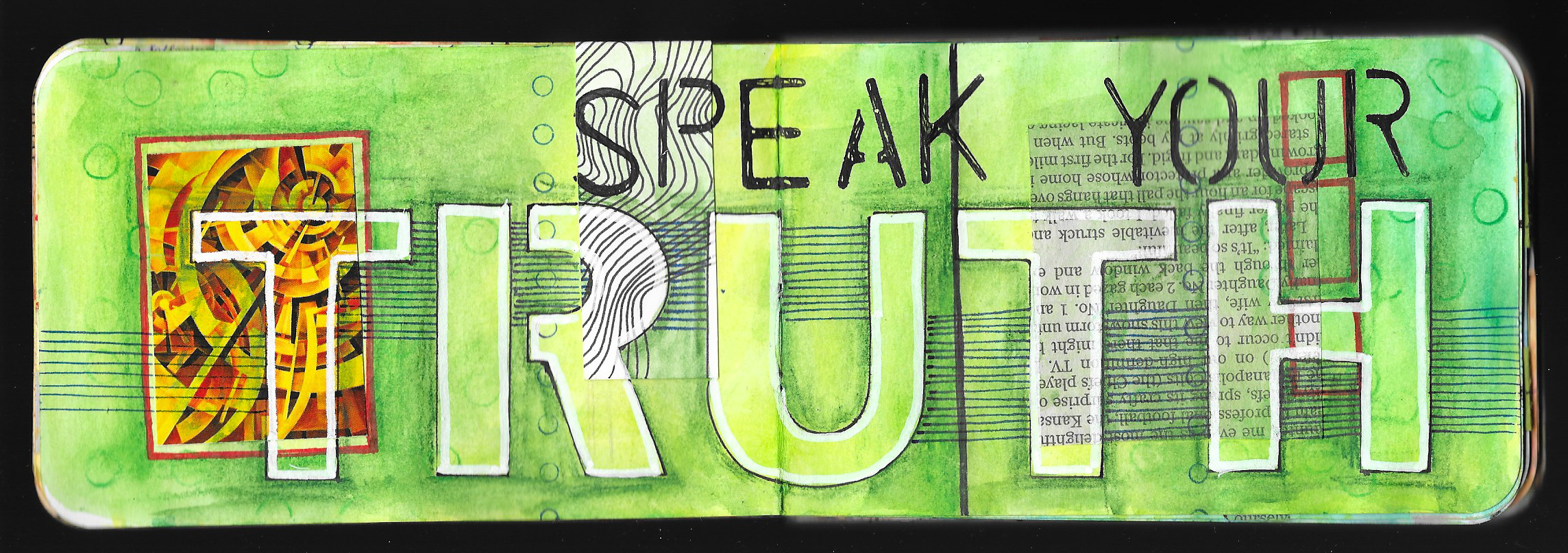
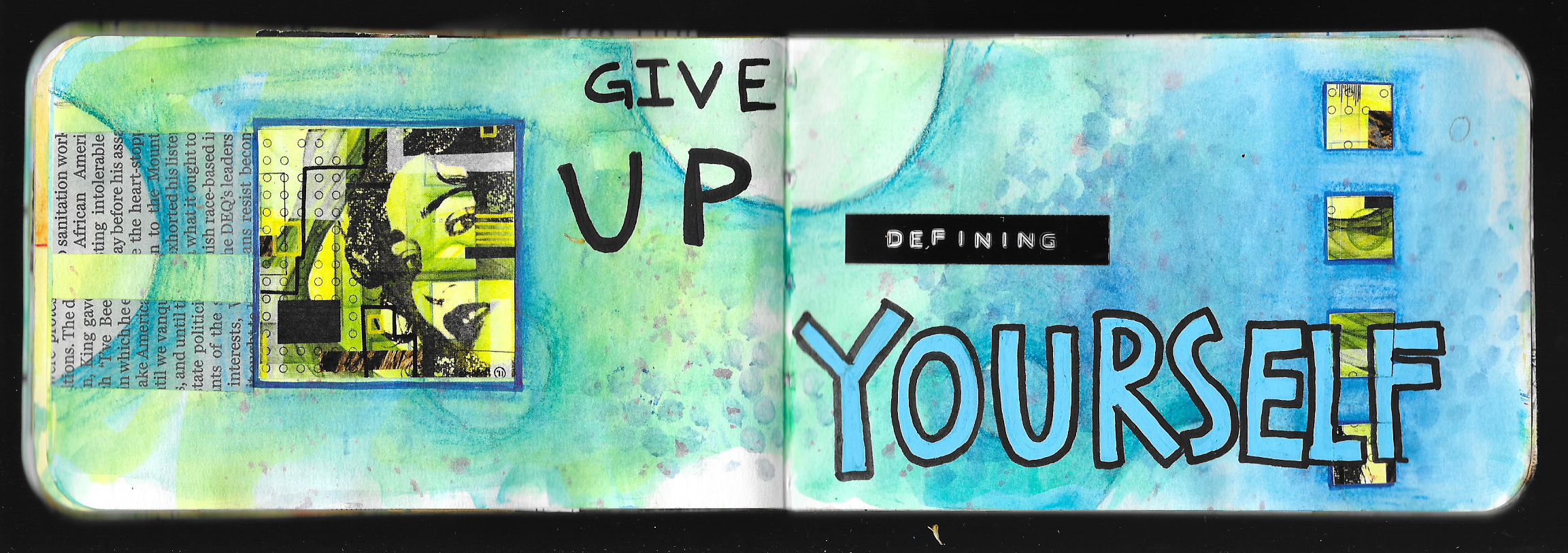
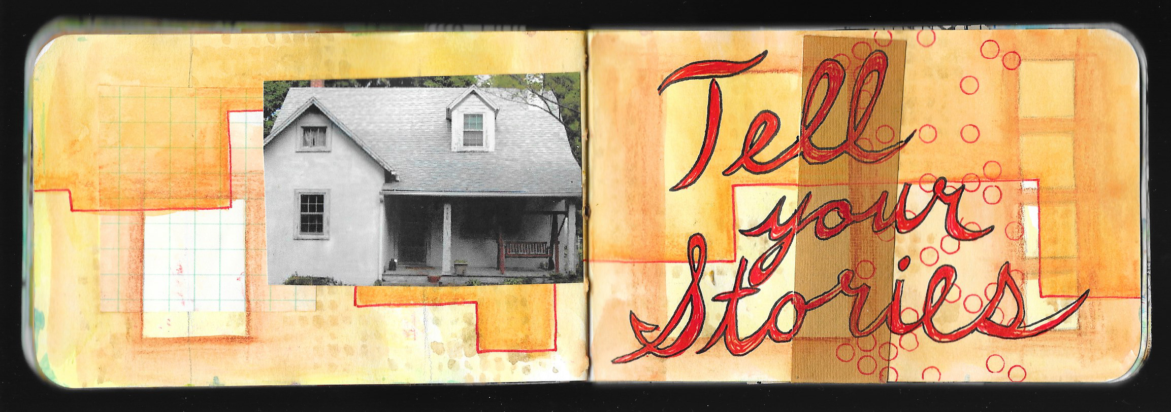
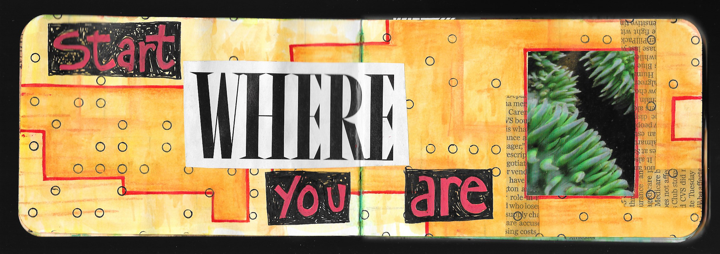
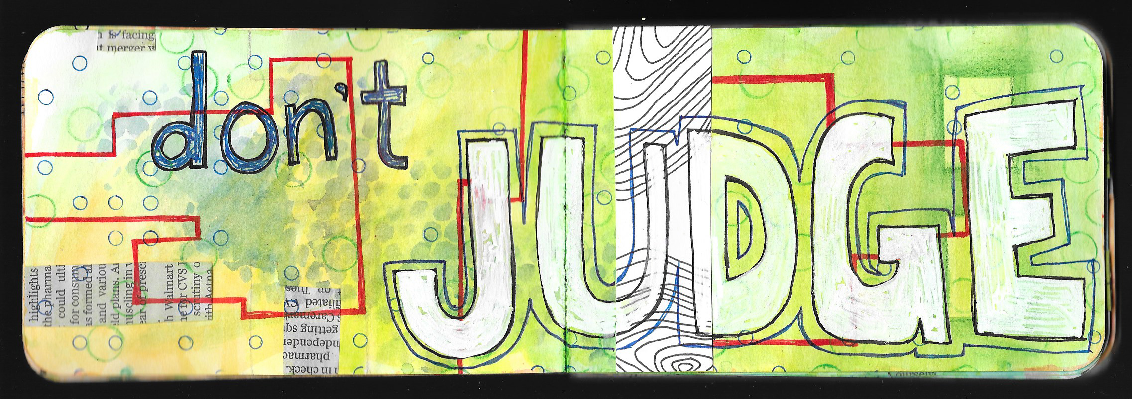
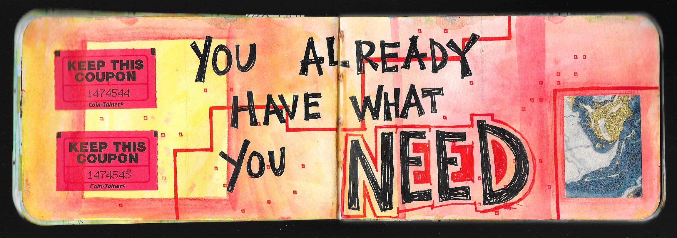
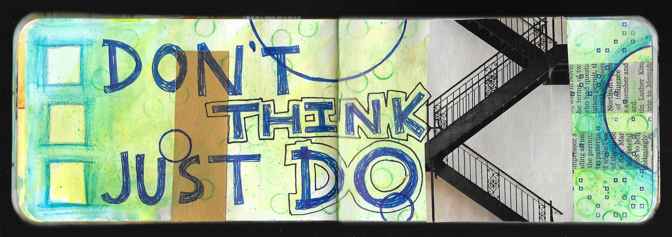
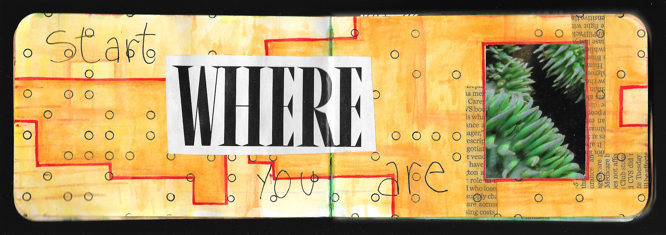
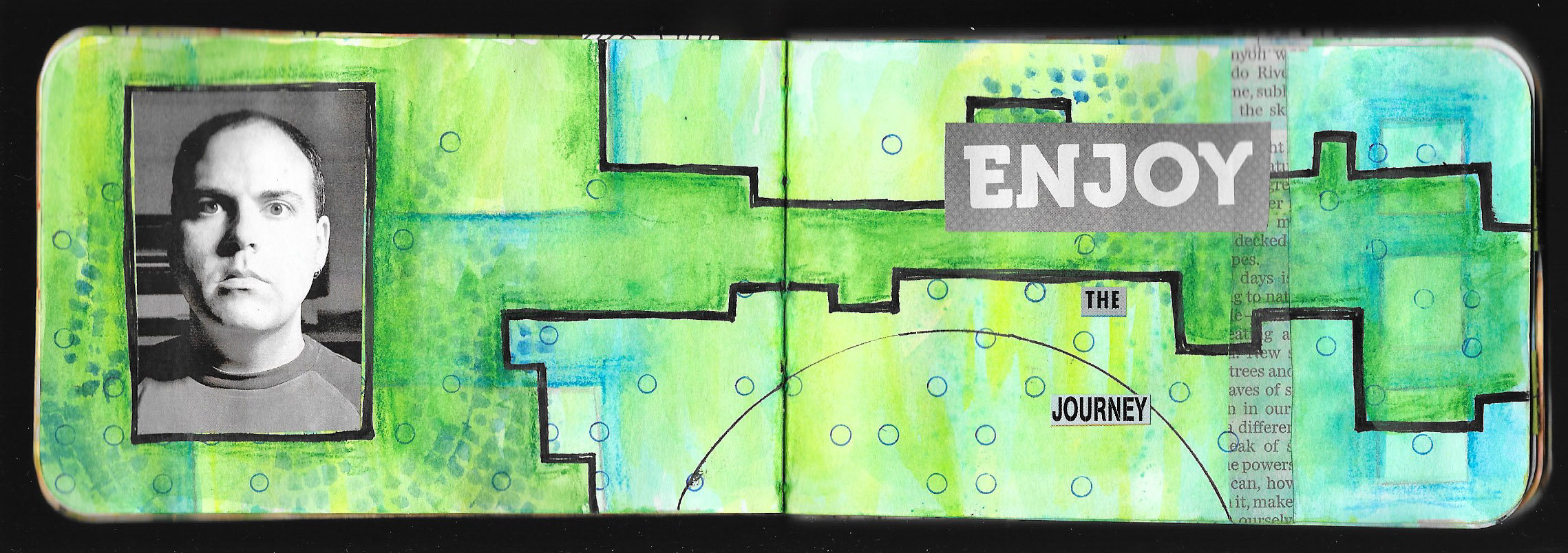
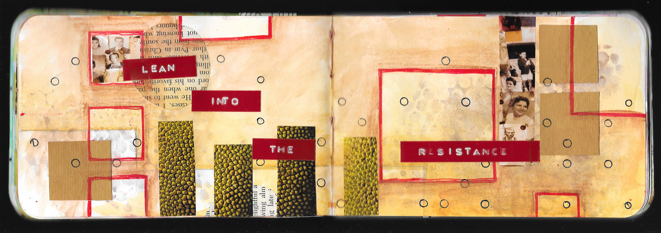
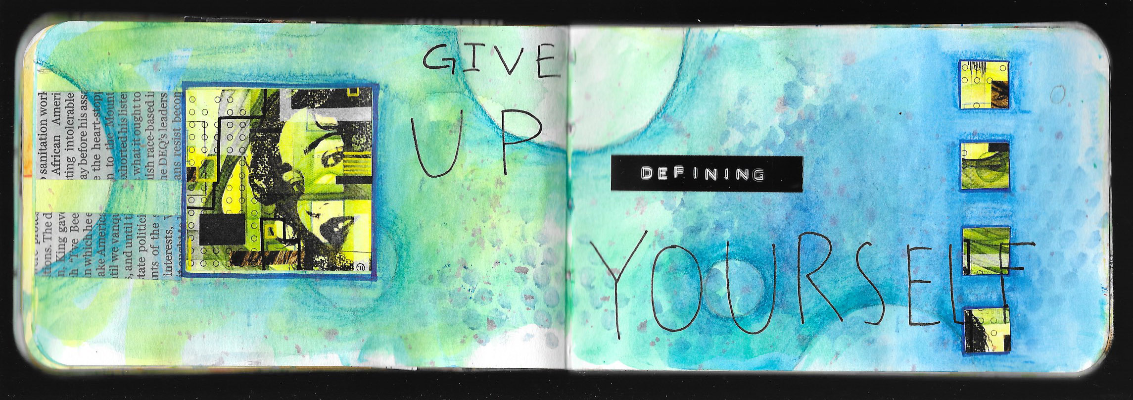
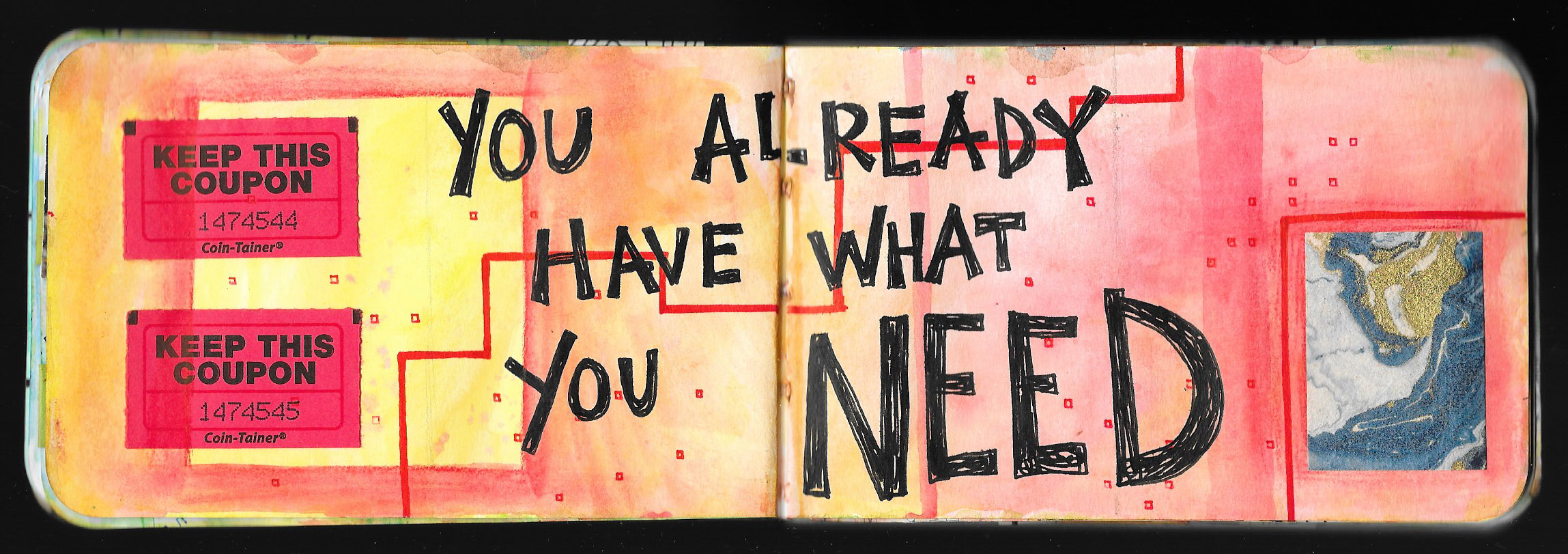
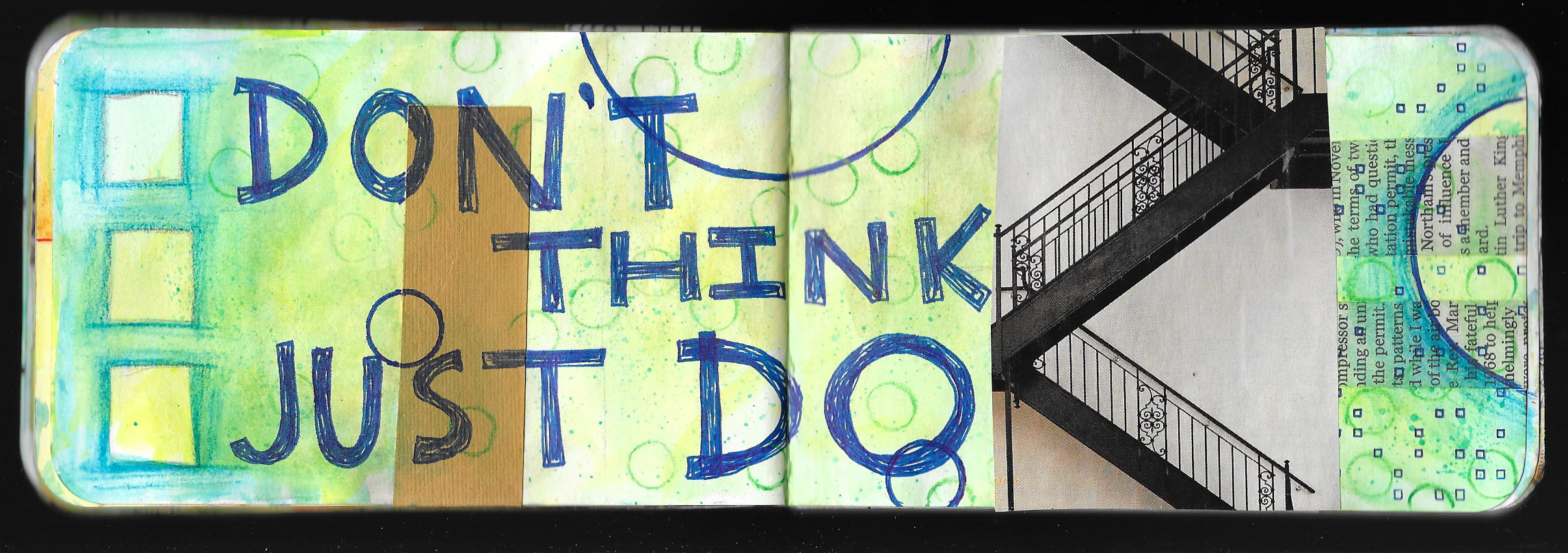
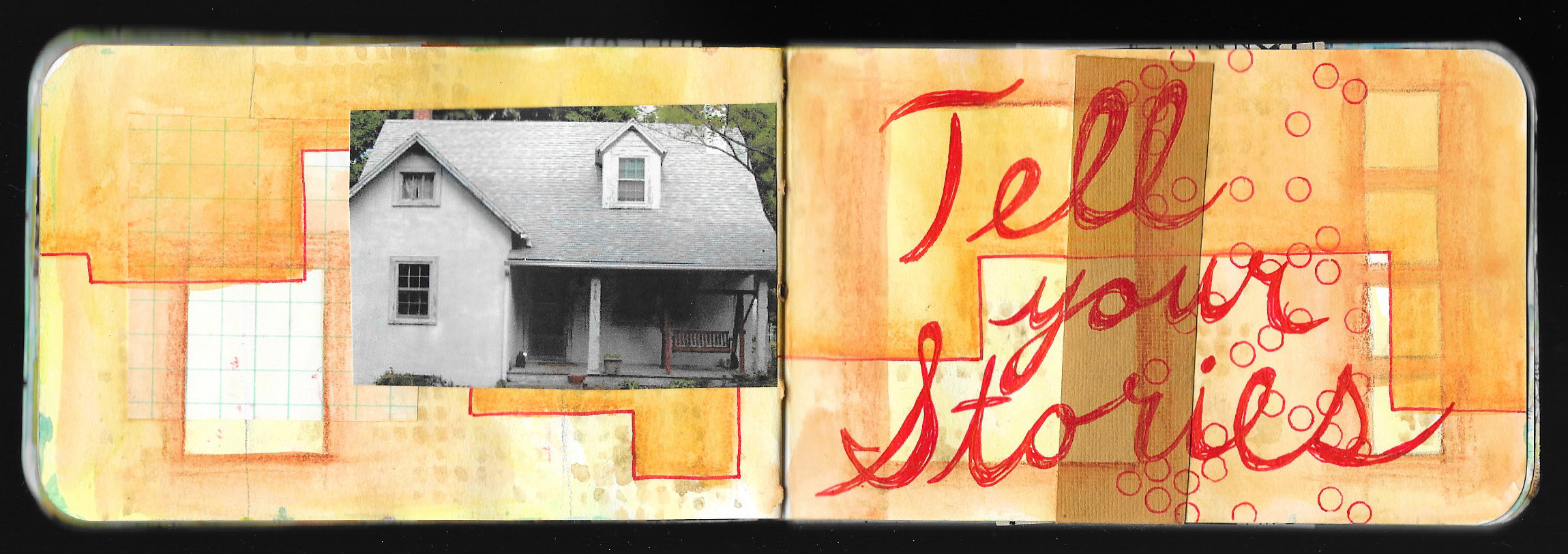
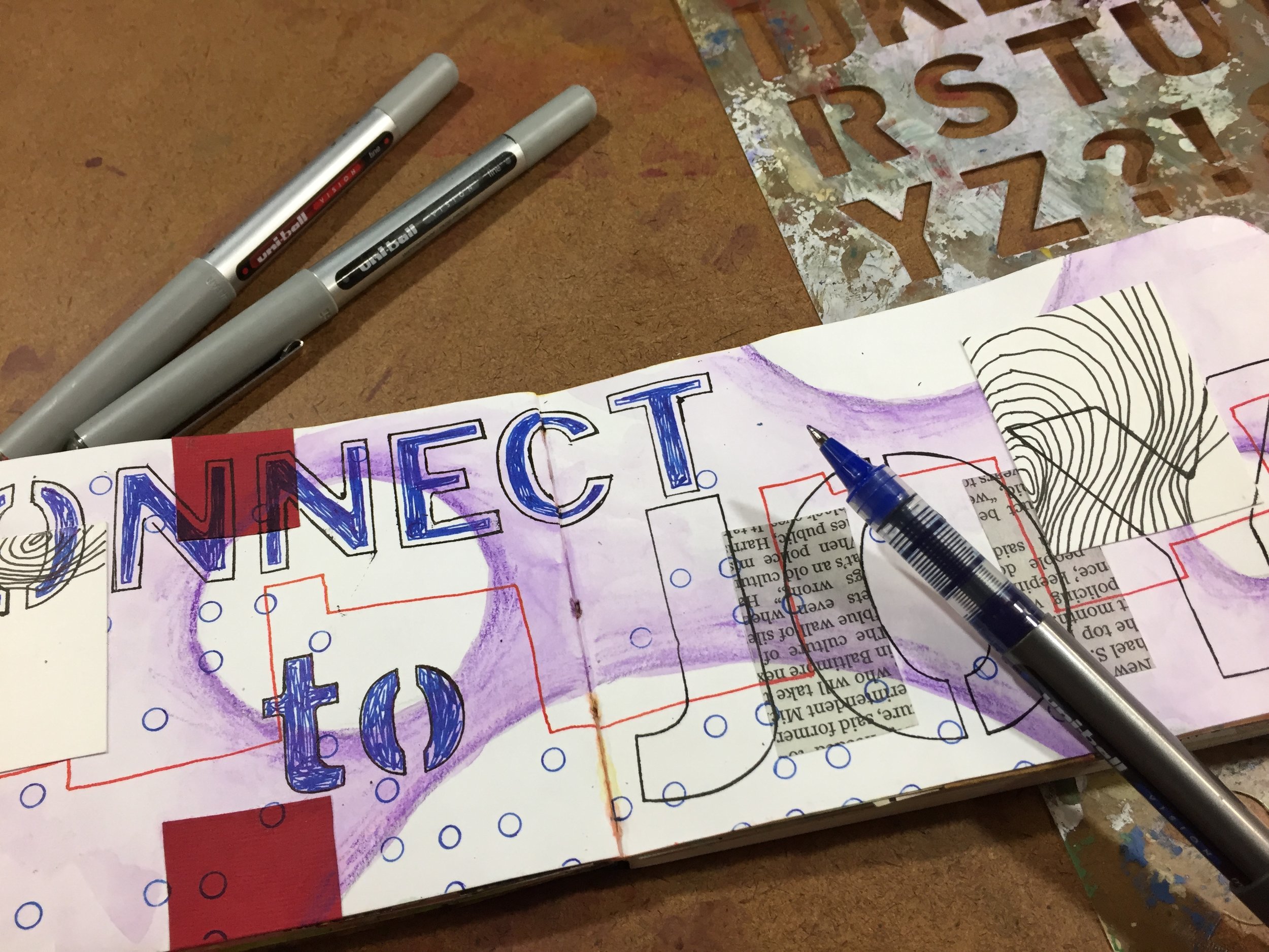
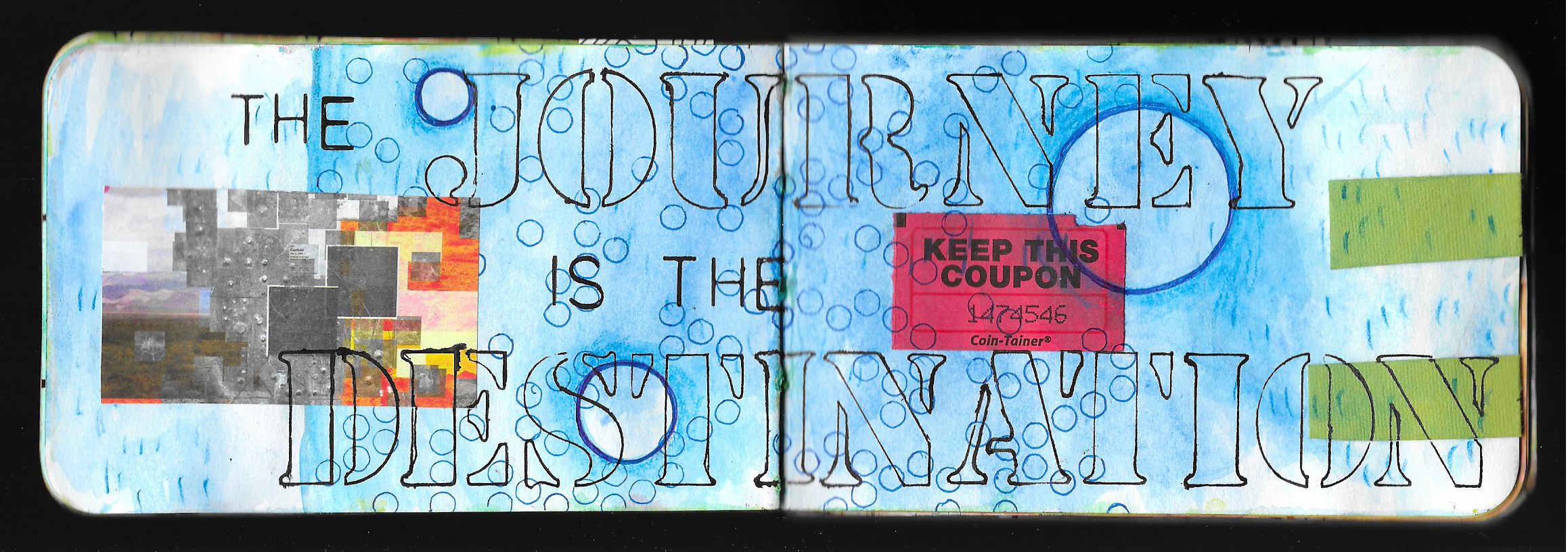
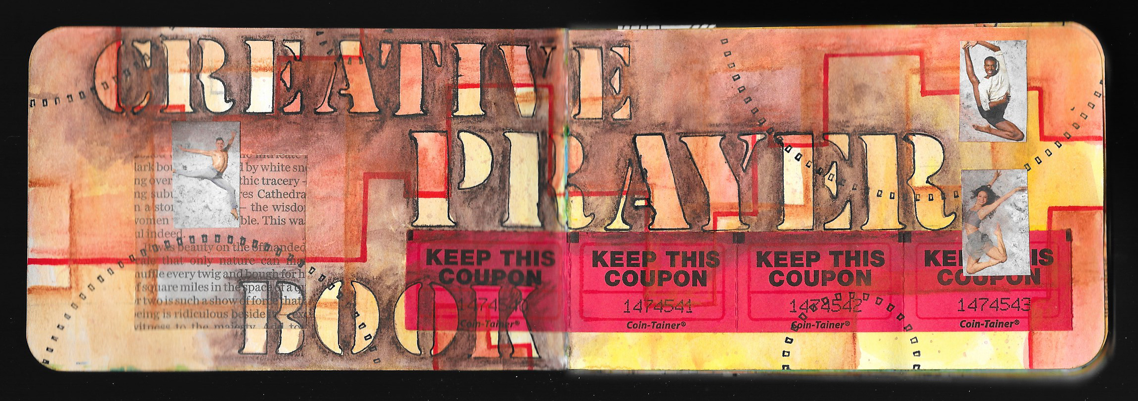
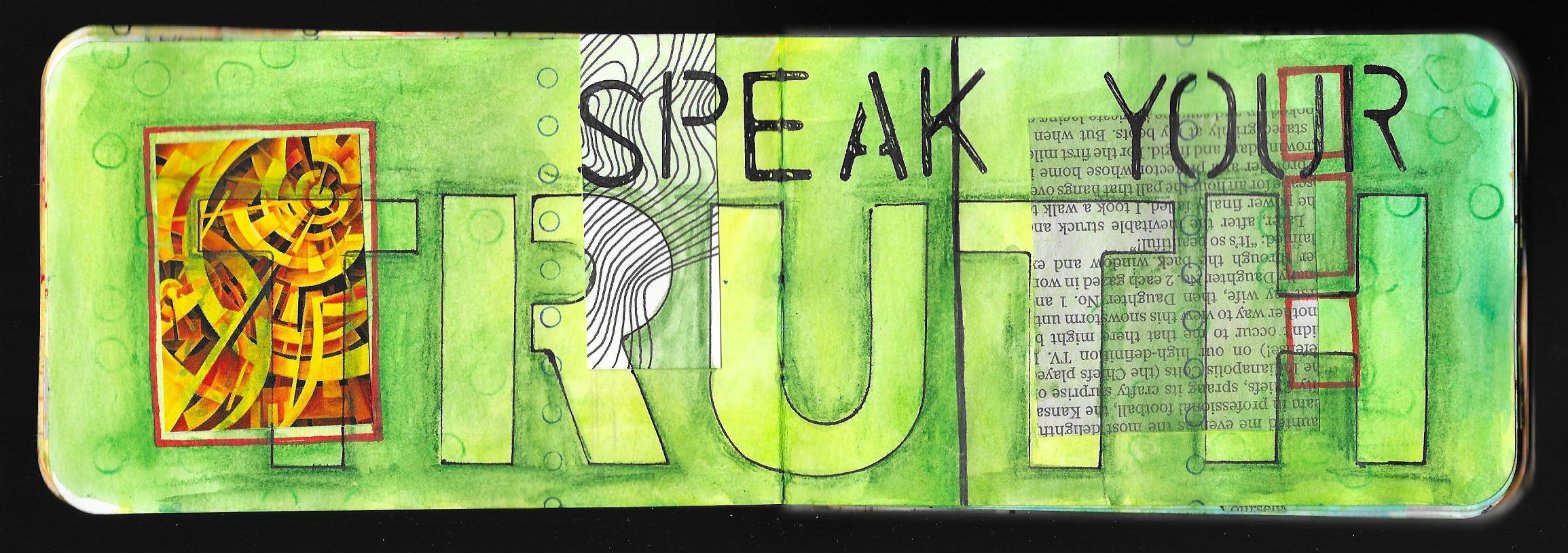
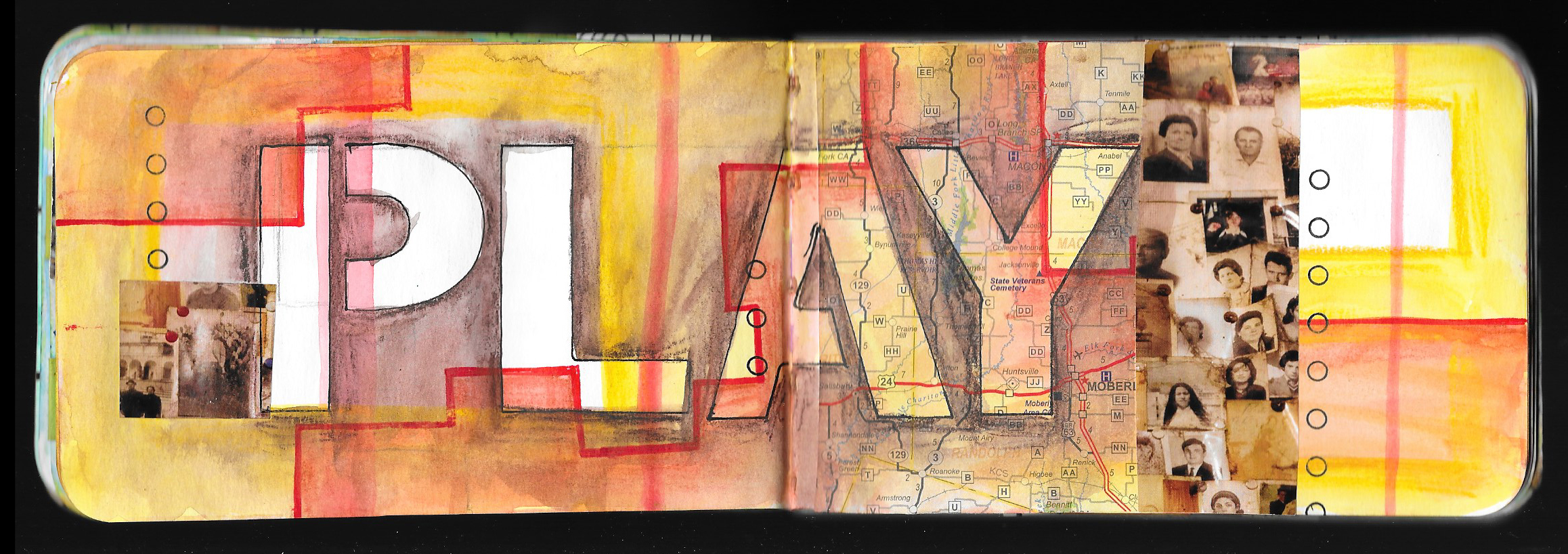
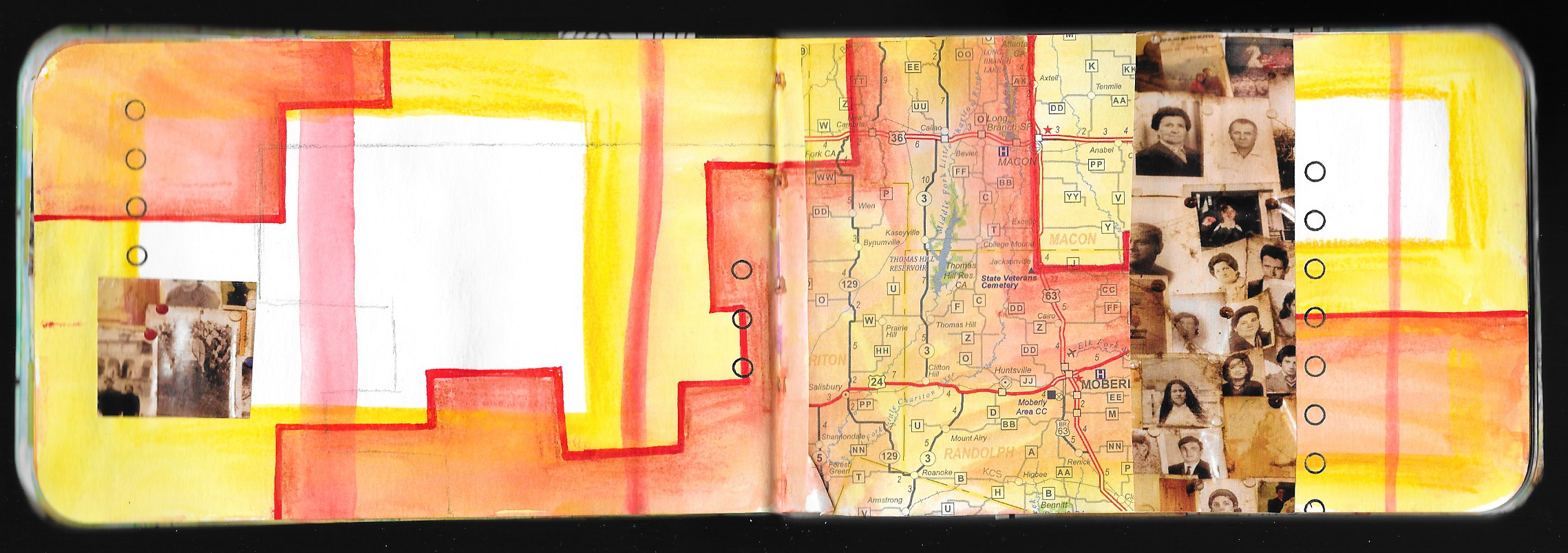
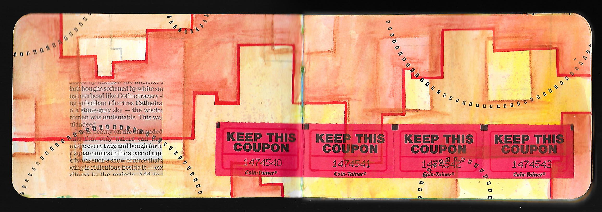
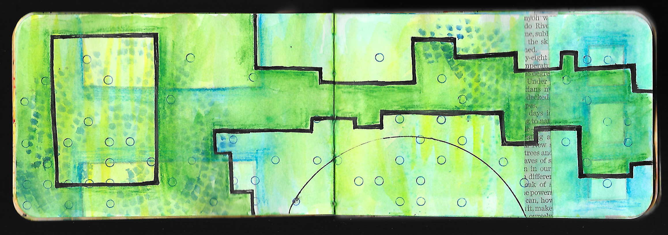
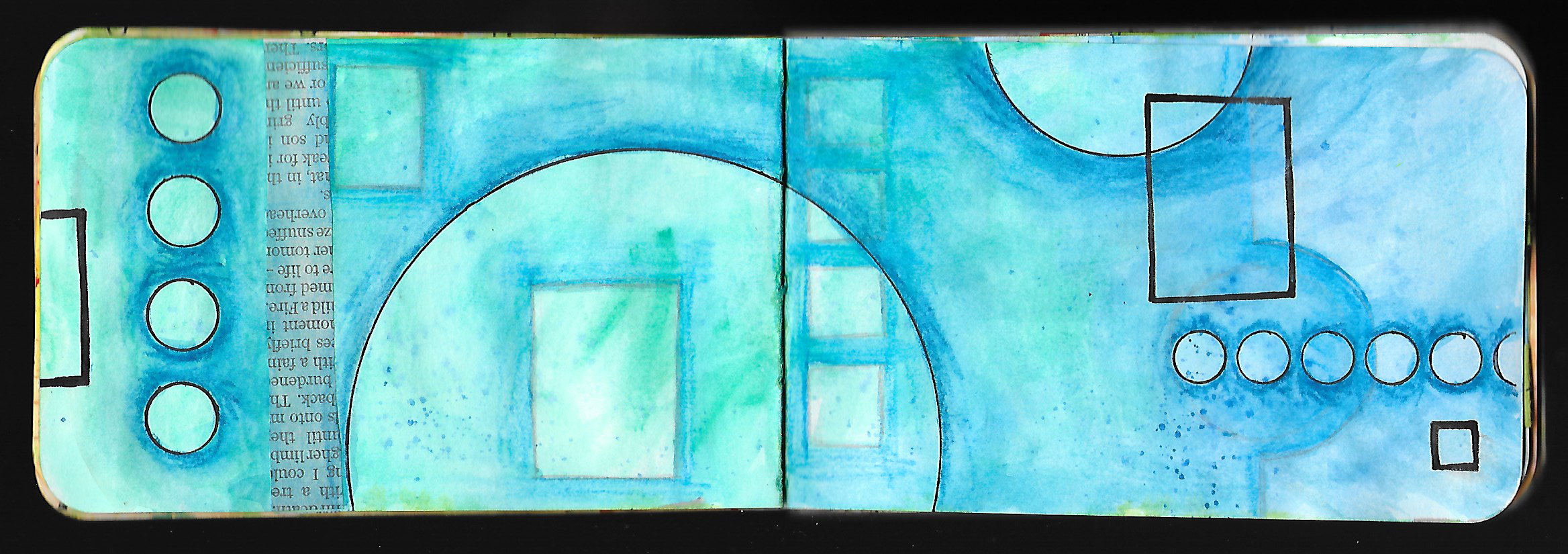
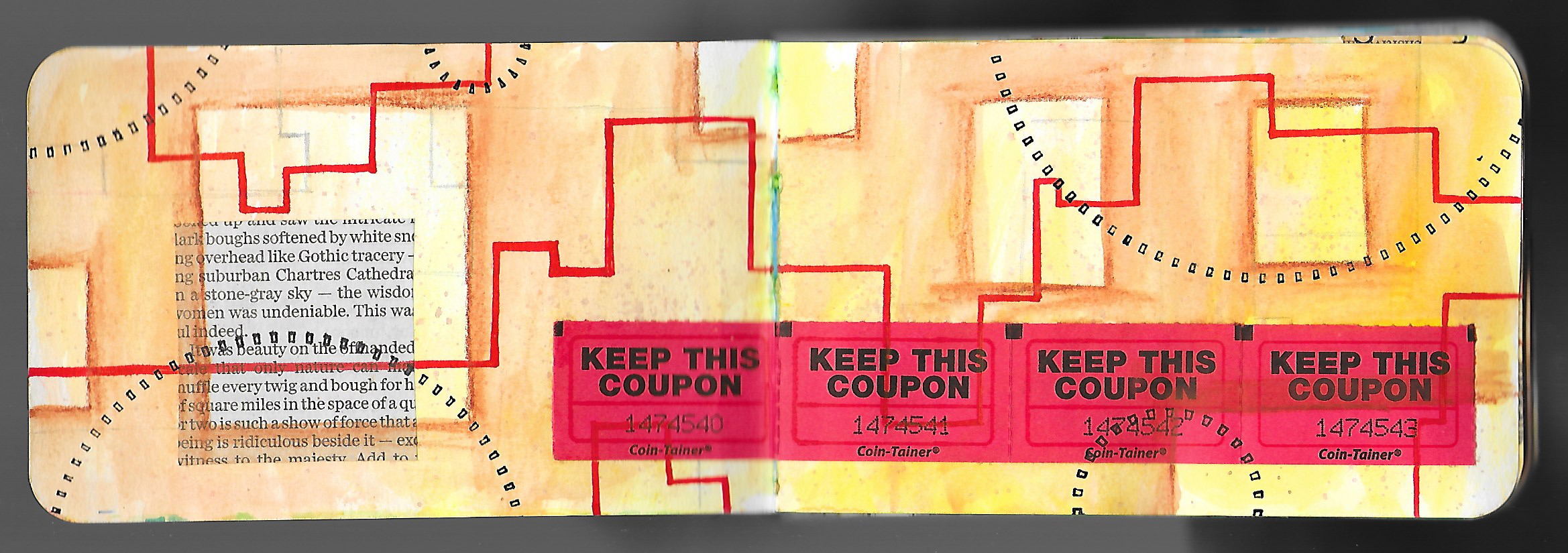
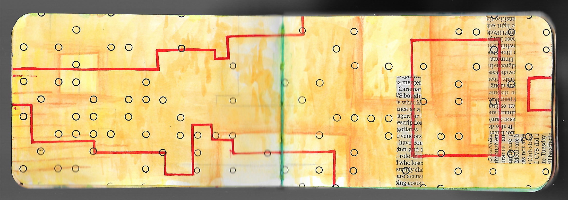
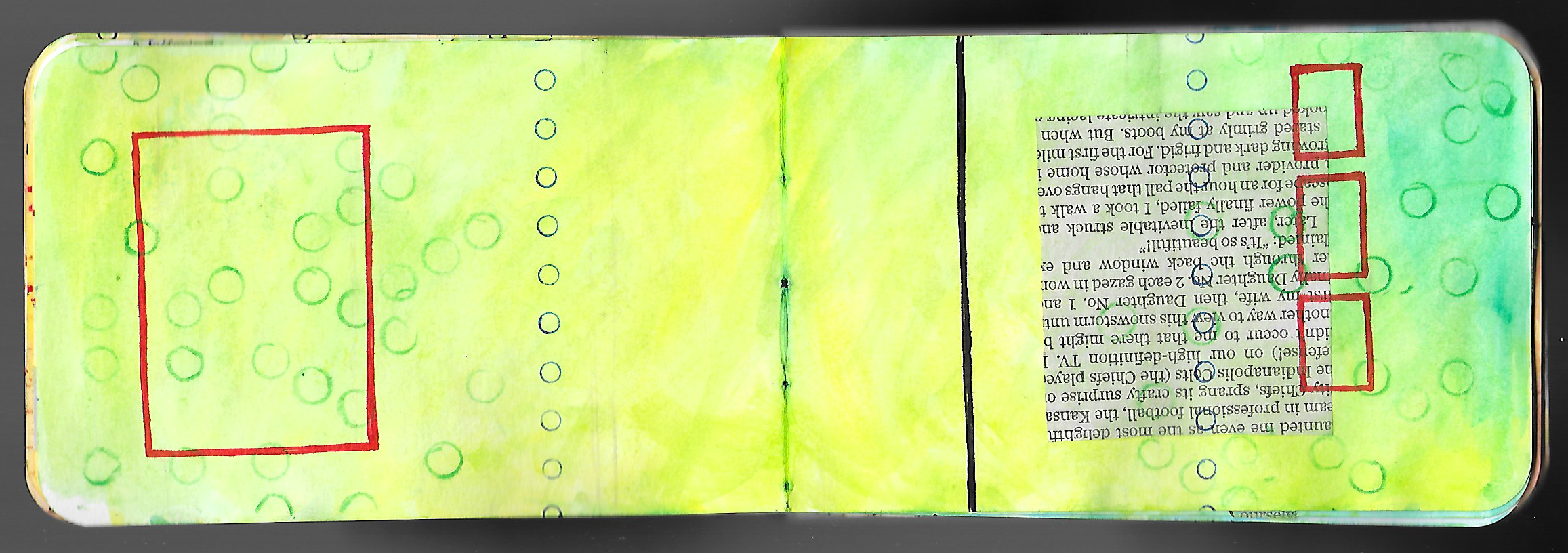
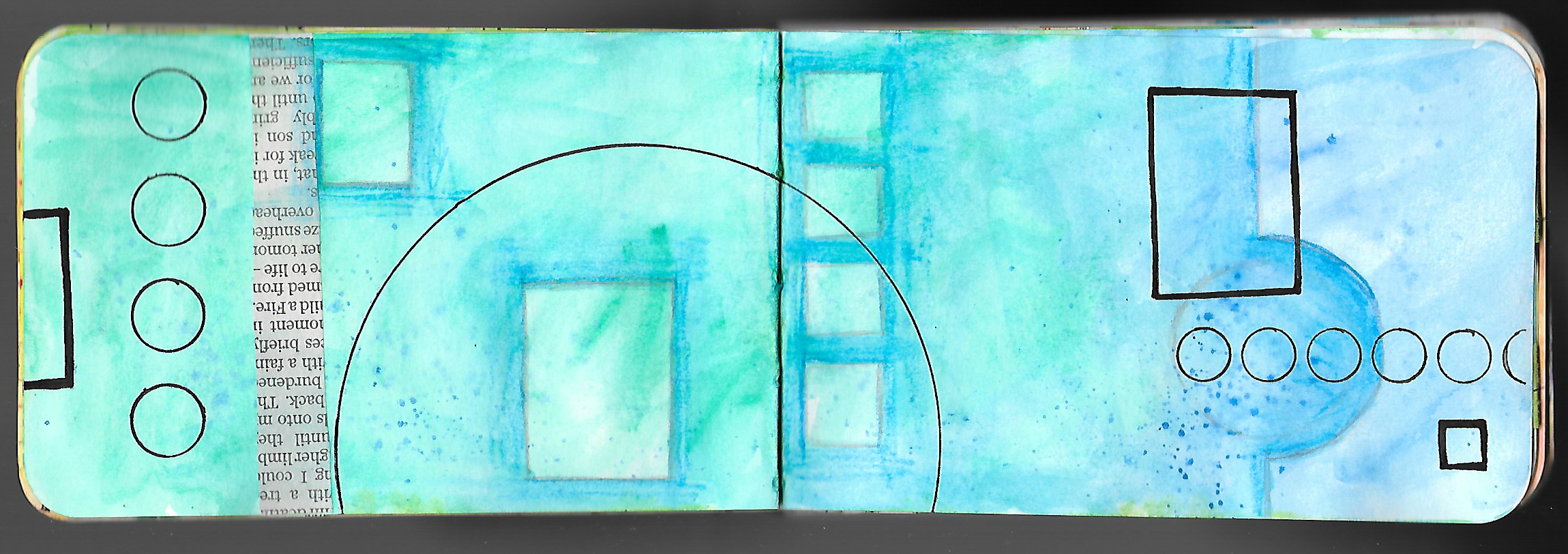
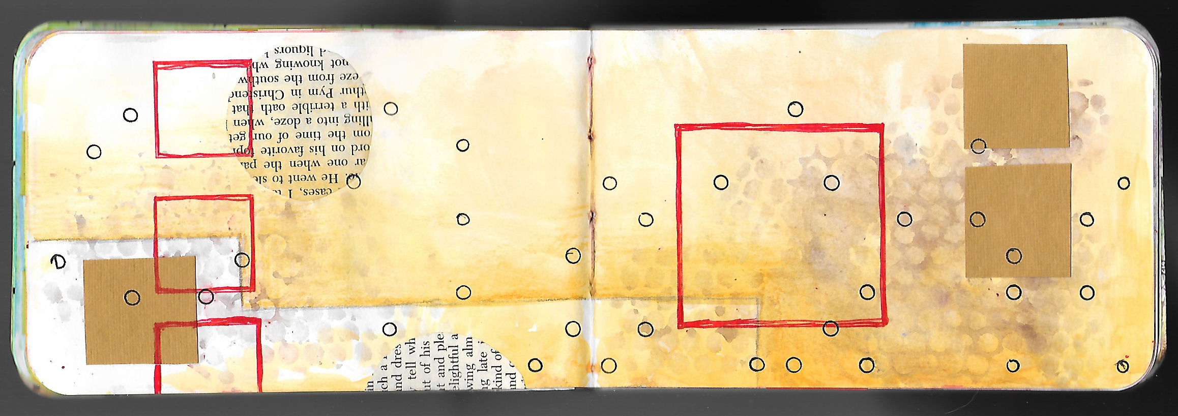
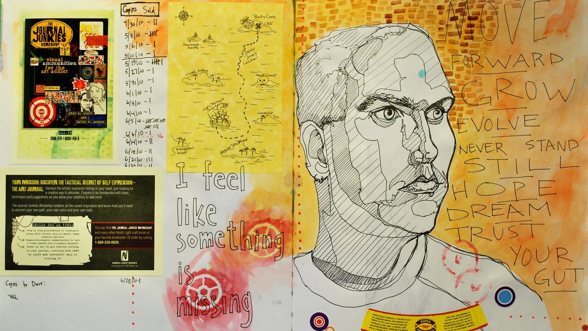
Though I finished up the final lesson of the Creative Prayer Book last week, I wanted to share a wrap up of the project, and create a video that shows a flip through the pages.

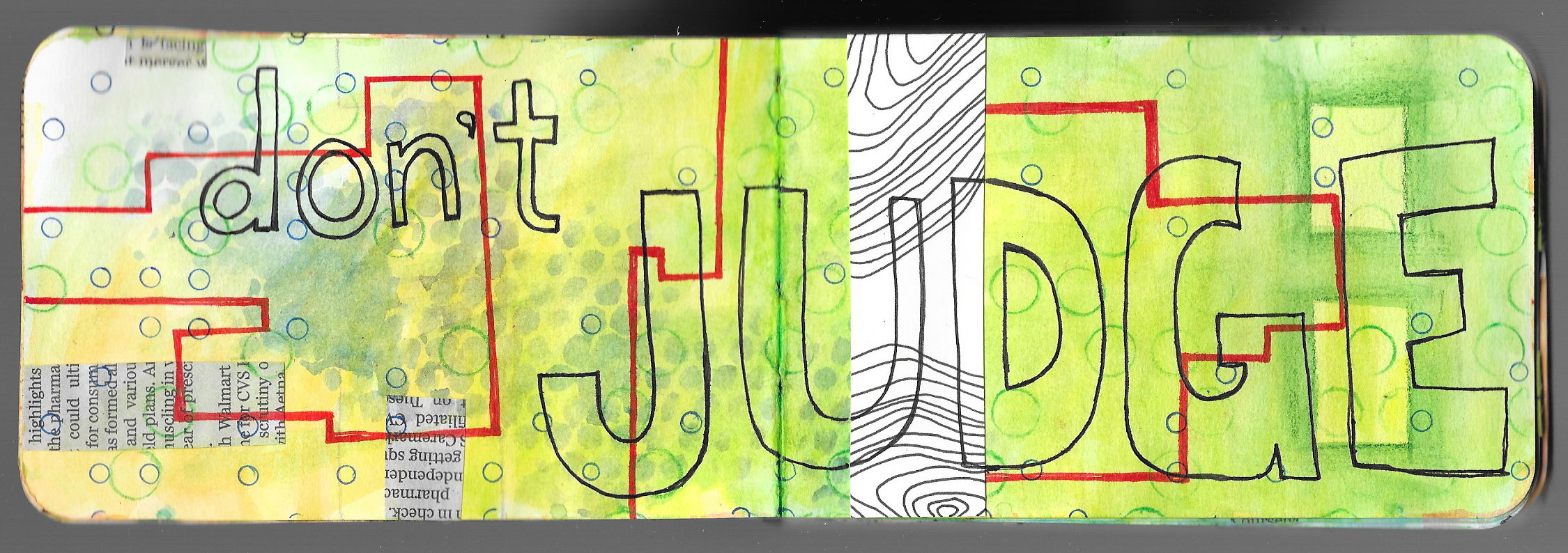
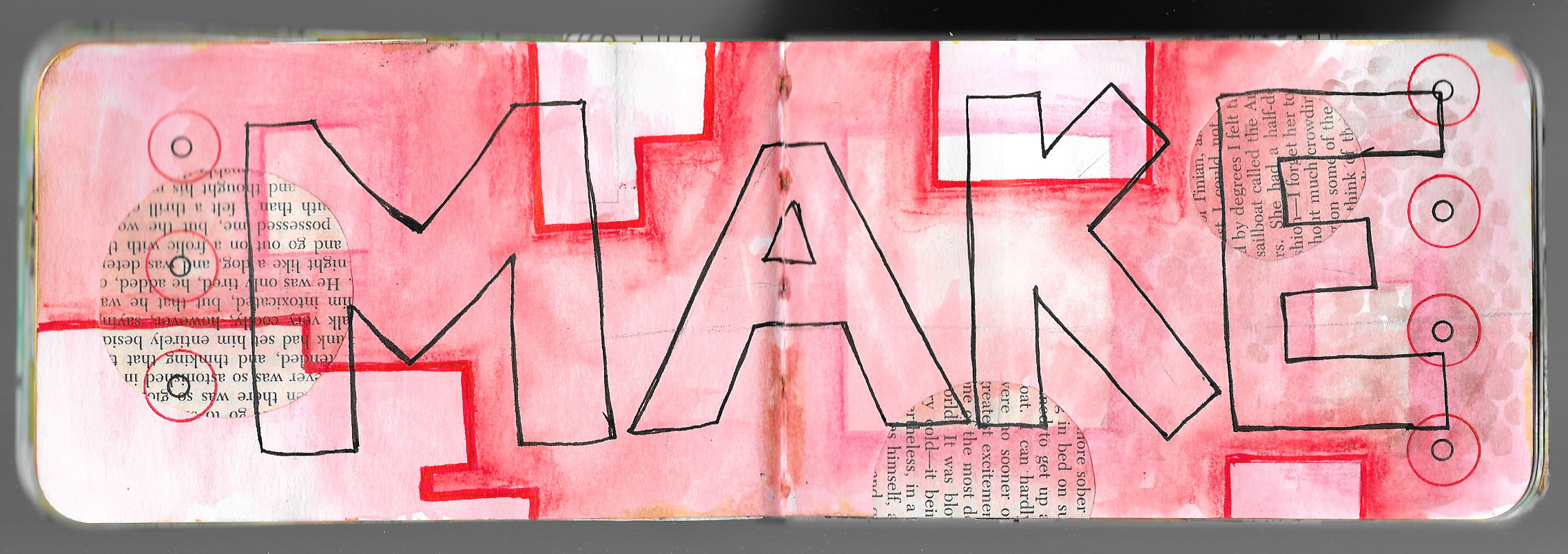
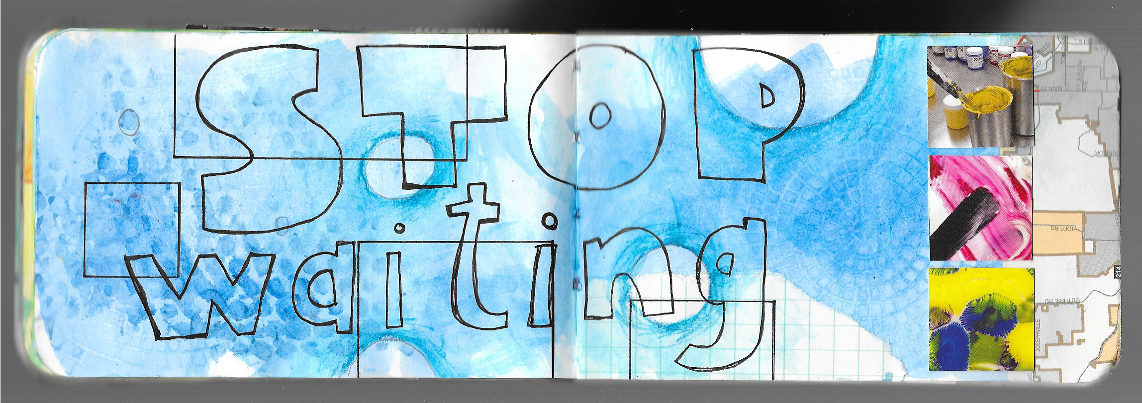
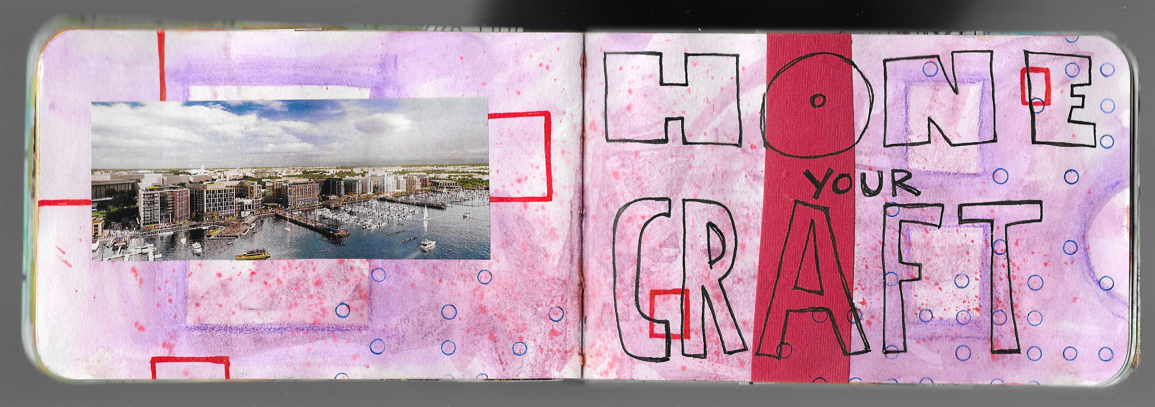
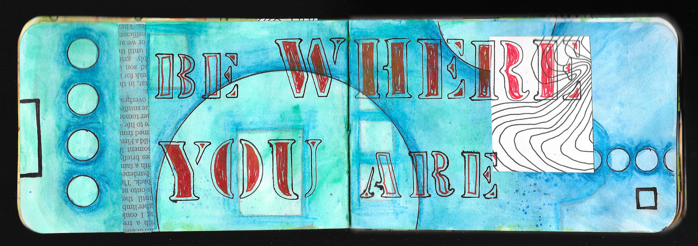
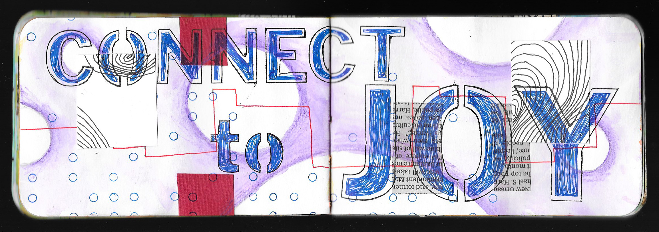
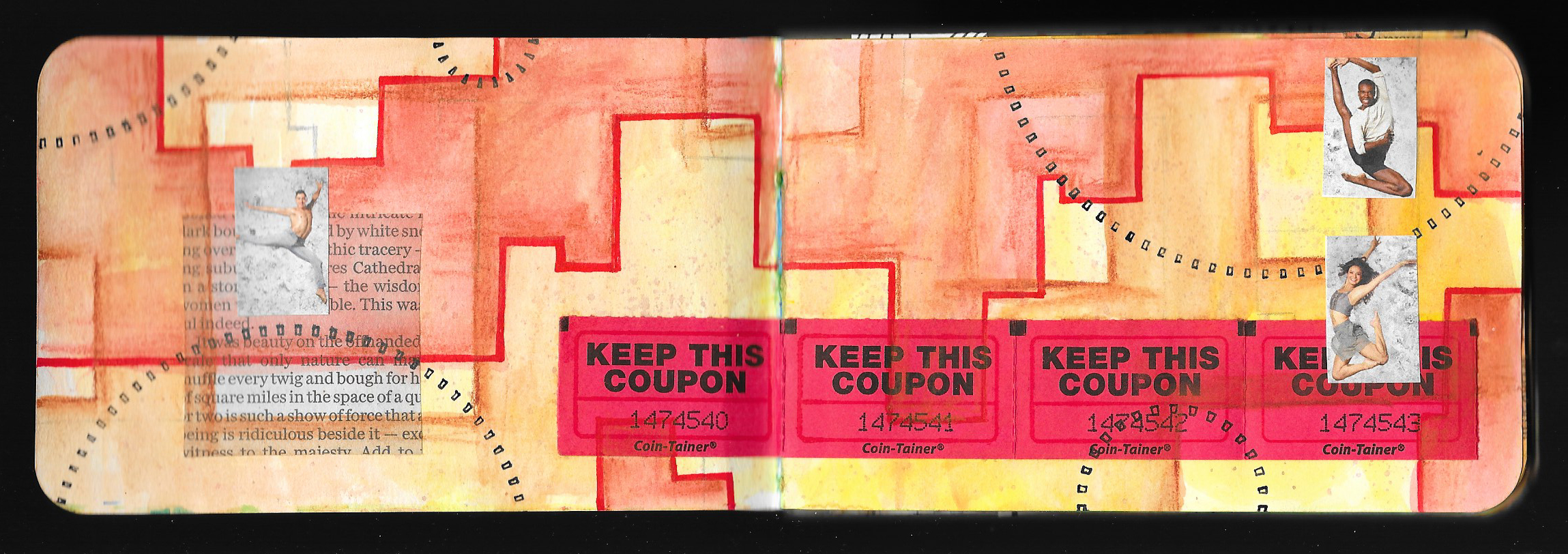
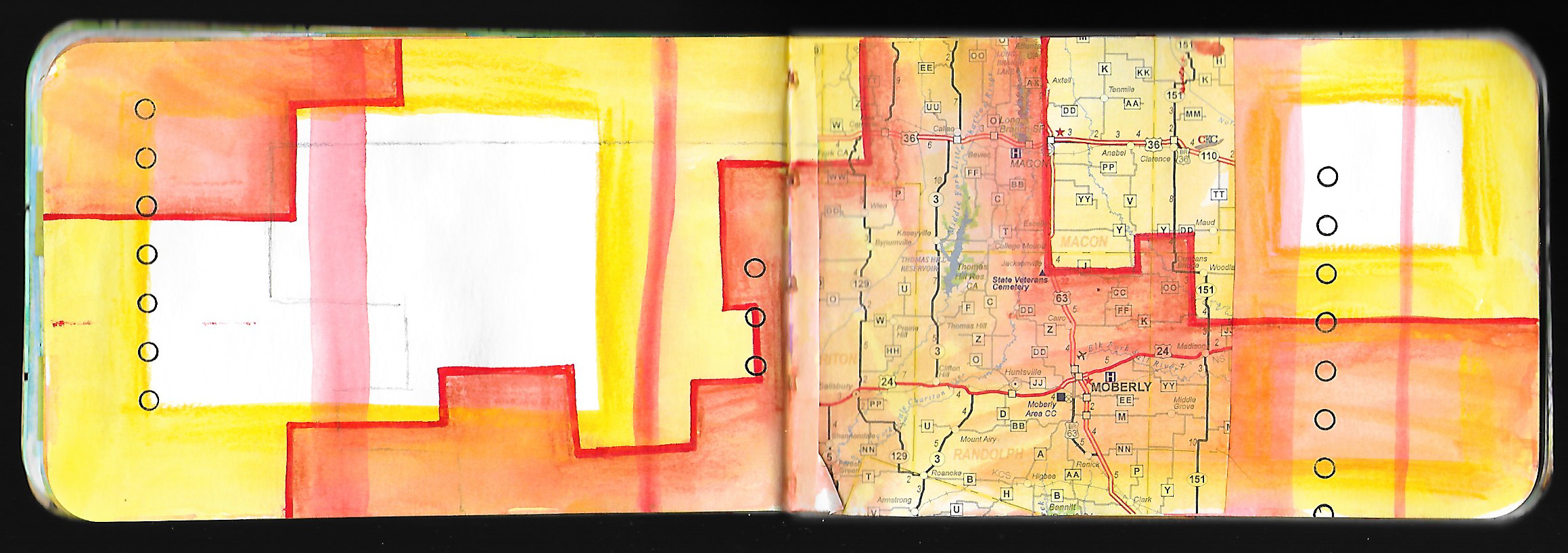
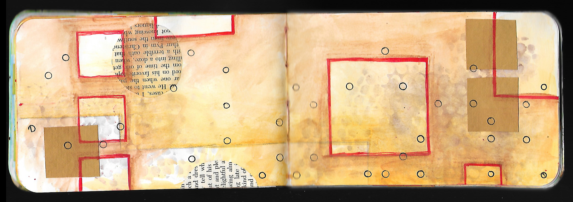
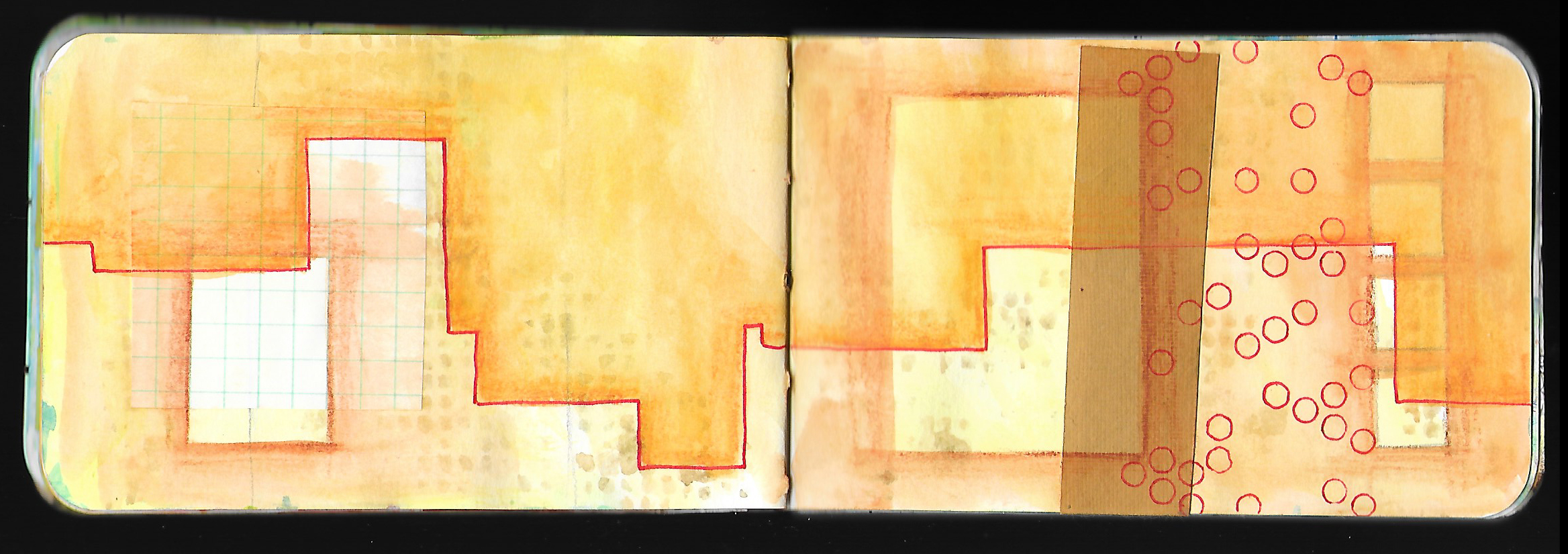
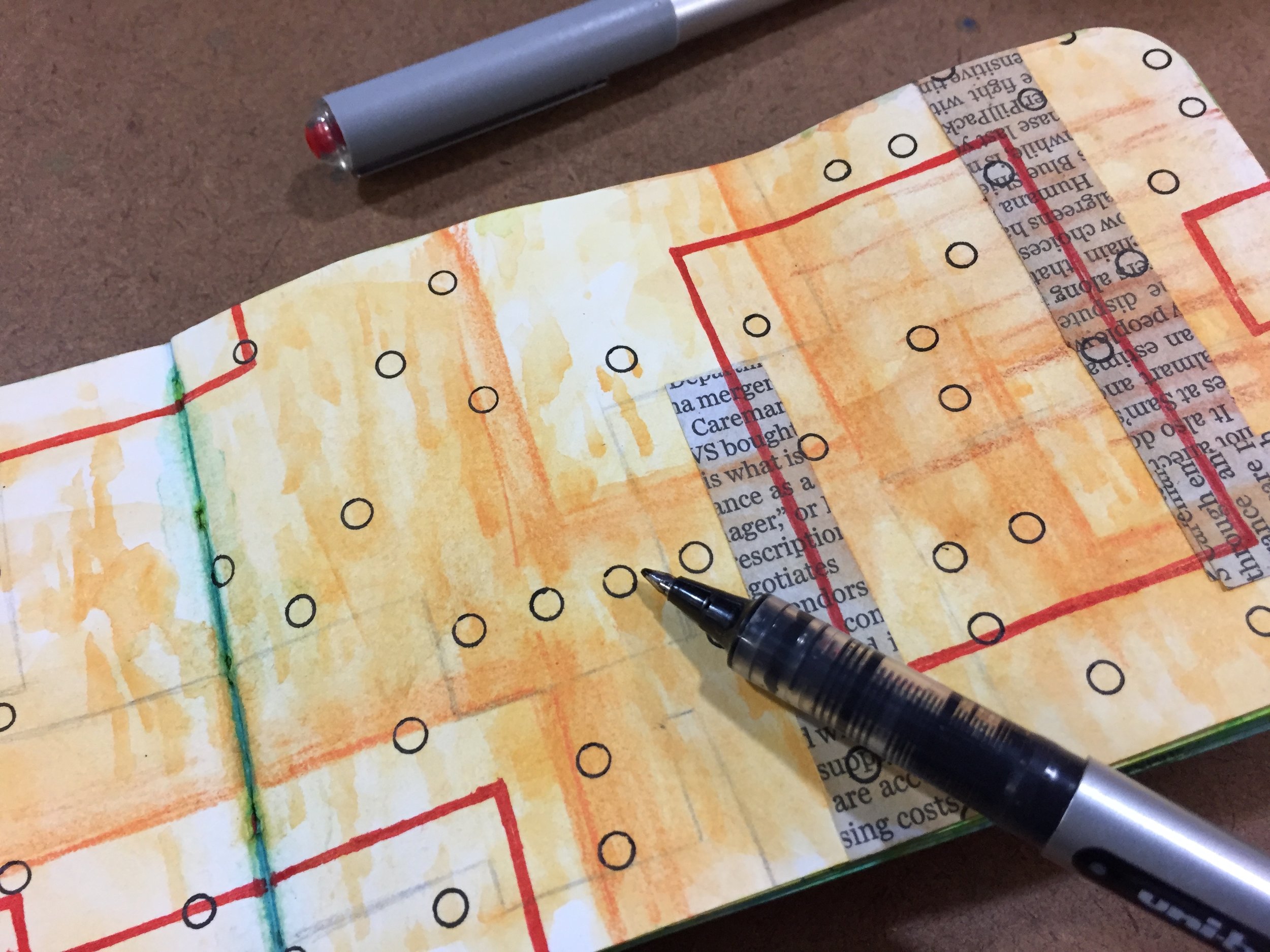
I began this project several months ago, and I’ve been sharing a new lesson each week as I built up layers in a small Stillman & Birn journal to create a small book of creative affirmations. I am a long way from calling this project finished, and I only got about halfway through the book. I still have many more pages to fill, but I wanted to wrap up the lessons and finish the book on my own time. I plan to continue working over the coming months, and hopefully I’ll be able to share the filled journal fairly soon.

I want to thank everyone who has followed along on this journey, and who drew inspiration from my ideas, techniques, and methods. I am grateful for the positive comments and feedback that I’ve received over the months. It has been a good challenge to bring a new lesson to you each week, and I’m hoping to create a new project in the future.

So thank you all so very much, and as always, Happy Creating!

Creative Prayer Book: Embellishing

 
IMG_4949.JPG
 

Welcome to the twelfth and final lesson of the Creative Prayer Book. In this lesson, I try to wrap up my pages with some simple embellishments. Though I talked of embellishing text last week, this lesson is about adding a bit more to the pages in general, as a way to tie things together on a page, to fill in some empty areas, and to bring some emphasis to certain areas.

You can use any materials to embellish, but I like to use drawing materials like pens, paint markers, and colored pencils. There are also a large number of ways to embellish, but I’m keeping it rather simple as I bring a bit of polish to my pages.


Lines, Shapes, and Patterns

One of the simplest ways to add embellishments is to add lines, shapes, and patterns. These little touches can help fill in empty areas and add a final layer to pages. By grouping them closely together around elements you can bring a bit of emphasis and make the elements “pop”. I like to use my uni-ball Vision pens for much of this, but paint markers work great, as well, especially when drawing over glossy surfaces like magazines.

I like to use stripes, spirals, rectangles, and circles as I embellish, and I can even use stencils and tracers to add the embellishments.

Shading

Colored pencil is perfect for adding a bit of depth to my pages as I use them to shade and color in areas. I use the colored pencils very much like I did the Inktense and watercolor pencils earlier on in the workshop and shade around elements. By applying a darker value around a shape or a letter, the shape or letter “pops” out from the page since the colored pencil acts like a shadow. I try to lighten up on my pressure so that the color fades into the background. I can be very neat and careful with this technique, or I can be a bit messy and give my page a bit of a rougher feel.

I also use the colored pencil to shade or color in areas and letters, and I like to use white colored pencil sometimes. The white doesn’t cover everything within the space, but it lightens it. This can bring a bit of contrast to the space making it stand out.

Shading is always a great way to add some final embellishment to a page.

As you work, try to think of various ways to decorate and embellish your pages. Try some of these ideas, and perhaps, try combining them. Or think of your own ways to wrap up your pages, and use any material that you like. Just remember that you’re just trying to add a bit of pizzazz to your pages on not completely reworking them.

I hope that you enjoyed these lessons, and I’ll be back next week to wrap up things. I’ll share a flip through my pages, and talk about the project, as well as share about what’s to come.

Thank you so much, and happy creating!

Creative Prayer Book: Embellishing Text

 
fullsizeoutput_125e.jpeg
 

Welcome to the eleventh lesson of the Creative Prayer Book. In this lesson, I work again with text, but this time, it’s all about embellishing the words that are already in the book. Though I’ve discussed embellishing text a little bit in a few of the recent lessons, today is about using a few simple techniques to make the words stand out using marker and pen.

Outlining

Besides coloring in the text with solid color, outlining is probably one of the most basic embellishing techniques. It’s easy enough to use a contrasting color, whether it’s white or black, to go around the edge of words and letters and create a bit of a “pop”. The outline creates a nice separation with the background, and the contrast really heightens the effect.

Box It In

Sometimes creating a dark rectangle or box around a word can make it pop as well. I started off with Posca paint markers on the spread below to create the red letters, and then I used my black uni-ball Vision pen to create the rectangle. Unfortunately, this technique didn’t work out too great at first, and I had to add several layers of red to cover up the ink letters below. Sometimes things don’t go according to plan, but things can usually be salvaged.

CPB Embellish Text.jpeg

Offset Outlining

This is like a combination of the above techniques — outlining and boxing it in. By leaving a bit of a space between the letter and the outline, I can tie whole words together in a single outline, as I create a slightly different effect. I do try to make the outline rather thick and heavy so that it stands out.

Try to experiment with embellishing text in a variety of ways in order to make it stand out. Use any materials that you want, and try some of these techniques or come up with your own. Just think of ways to jazz up your words and writing.

Thanks for joining me once again, and happy creating!

Creative Prayer Book: Drawn Text

 
IMG_4939.JPG
 

Welcome to the tenth lesson of the Creative Prayer Book. We’ve focused on stenciling letters and words, using our own handwriting, and using found text, so this quick lesson is about drawing text. You might think about those block and bubble letters that you used when you were in school, and they’re perfect for this. But don’t limit yourself to just these two ideas. You can also use drawn script, fancy fonts, and graffiti letters and words. So, experiment with a variety.


If you’re not comfortable with drawing letters and words, use a pencil first, and perhaps practice on a piece of scrap paper first. If you’re a complete novice, one technique uses your own printed letters as a skeleton for the larger, drawn letter. Using a pencil, lightly write your word or words. Then, draw in the letters around the thin lines. You can make thin and thick letters this way. Erase your original, guide letter.

Of course, you can simply draw in the letters as you go, but be careful and pay attention to spelling. That’s why I like having the words and phrases drawn on a separate paper so that I can make sure that I am spelling things correctly. As you draw your letters, think about the outer shape of the letter, and if needed, use a pencil to lightly sketch in the lines.

I like to draw my letters with a pen, and I don’t worry about using a pencils. But I’m pretty confident with drawing words, but I still make spelling and placement mistakes.

Give drawing letters words and phrases a go!

I plan on just two more lessons in this series, and we’re done with the text and words, so if you still have space, feel free to stencil, write, draw, or find your text to fill in the spaces.

Thank you for joining me again, and as always, Happy Creating!

Creative Prayer Book: Found Text

 
IMG_4929.JPG
 

Welcome to the ninth lesson of the Creative Prayer Book. In this lesson, I continue to add text to my book. As I’ve said before, I’m creating a book of creative affirmations, but feel free to add hopes, wishes, dreams, prayers, or quotes to your book.

Over the past couple of weeks, I’ve been adding text using stencils and my own handwriting, but for today’s lesson, I want to add some found text — text from alternative sources. I’ll use some of my own handwriting in conjunction with this found text, but I want to find some of the words in other sources or create some of it in a different way. I turn to some readily available sources of text for my words today — magazines, stickers, and a label maker.


Magazine Text

Magazines are a great source for text, but I want to use big words, so I look for headlines and advertisements. I probably won’t be able to find very word in the phrase that I want to use, but I can probably find a a couple key words. I spend time flipping through magazines to find words that will work.

Newspapers are also a good source of headline text.

Stickers

Arts and craft stores often have sticker sets of words meant to be used in scrapbooking and mixed media art. I happen to have a set that I bought a long time ago in a stash of fodder in the studio. The words all deal with travel, and contain quite a few key words from a number of my affirmations.

Don’t feel like you need to make a special trip to the store of sticker words, but if you have some lying around, feel free to use them.

Label Maker

Label makers are great as an alternative source of text, and some electronic ones allow you to change the size and the font. I have an old embossing label maker from many years ago, and I think that it would be perfect for using for this lesson. This is the type that uses plastic tape and pushes the letters up into the plastic causing the letters to be raised and to turn white. I used to use it a lot when I first got into journaling, but I haven’t used it in quite a while. I use it to create whole phrases and to add key words.

Think about printing out words from the computer if you don’t have a label maker, but use one if you got it. I was surprised to see that Dymo still makes the embossing type of label maker similar to the one I have.

I do use my regular handwriting for some of the words that go with the magazine text and label maker, and if I wanted, I could thicken the letters like I did last week. But, I’ll wait because I have some ideas for embellishing the text in different ways, and I’ll save it for a future lesson.

Think about ways that you can use found text or words from alternative sources as you continue to add your affirmations, prayers, or quotes to your book, and until next time, Happy Creating!

Creative Prayer Book: Handwriting

CPB Handwriting 1.jpeg

It’s the eighth lesson of the Creative Prayer Book, and I’m diving into more into my creative affirmations. Remember that you can add any text that you want — affirmations, quotes, song lyrics, poems, prayers. It’s really up to you.


Last week I used some stencils to add the words, so this time, I turn to those index cards with my affirmations, and I use my ordinary handwriting and my uni-ball Vision pens to add the text. I definitely don’t have a neat and fancy handwriting style, so I’m relying on my printed and cursive handwriting, but to make it stand out more, I thicken the letters by going back over the letters with my pen and carefully drawing in a thicker shape around the lines of the letters and filling in the resulting shapes with solid ink. This not only makes them bolder and easier to see, but it allows me to make the letters neater and to be a bit more artistic with them.

CPB Handwriting 2.jpeg

As I decide what text goes on which page, I think about the placement of my words and how big to write them. Since the ink doesn’t draw too well on top of glossy surfaces, I try to avoid writing on top of magazine images.

CPB Handwriting 3.jpeg
CPB Handwriting 4.jpeg

I do a couple pages of printed text and a couple pages of cursive text, and along with the stenciled text from last week, I have a good start with adding my affirmations to my pages. So think about how you can add more text to your pages using your ordinary handwriting.

Creative Prayer Book: Letter Stencils


Welcome to the 7th lesson of the Creative Prayer Book. This lesson is all about using letter stencils to begin adding text to some of the pages. I’ve decided to use my book as a book of affirmations, and I’m using a series of phrases, quotes, words, and ideas to create reminders about my creative journey. Several years ago, I wrote a bunch of these affirmations on index cards with the notion of using them in my journal or my art, but they have been sitting around my studio all this time. The Creative Prayer Book is a perfect use for them.


CPB Stencil 3.jpeg

As I begin adding words to my book, I want to use letter stencils for some of the affirmations, especially since I don’t have the best handwriting. I could just use the stencils plain, and trace the letters with a pen, pencil, or marker, but it can be hard to read the words sometimes. So, I want to use a couple of techniques to make the words “pop.”

Inktense

I can use one of my favorite materials, Derwent Inktense pencils, to create some contrast around the letters so that the words stand out from the page. I trace the letters first with my black uni-ball Vision pen, and then shade a dark Inktense pencil around the letters and spread it with plain water. This makes the words stand out a bit from background. If the color isn’t dark enough, I can add a darker color later.

Fill

Another technique for making the words stand out is to fill them with color, and I could simply fill them in with solid color. But I like to fill them in a slightly more creative way. I like using my uni-ball Vision pens and leave a white line around the edge of the letters giving the letters a bit of a sophisticated look. By drawing a shape inside of the letters that runs parallel to the edge of the letters, I can then fill the shape to create a two-tone letter. I really like the look of this technique.

Think about using stencils in your book since their are a quick and easy way to add text and word. If you want to add a bit of flair and make the words stand out, try using a little ink or Inktense pencil to add some visual interest to the letters and make them “pop.” Try experimenting with letter stencils, but don’t fill all of your pages because we’ll tackle some other lettering techniques in lessons to come.

Happy Creating!

Creative Prayer Book: Purposeful Collage

CPB Collage 1.jpeg

Welcome to Lesson 6 of the Creative Prayer Book. Over the past 5 weeks, I’ve built up layers of watercolor, graphite pencil, collage, watercolor pencil, ink, and Inktense pencils. For this week’s lesson, I turn again to collage, but this time I want to be a bit more purposeful with the fodder that I choose.


Magazines

Magazines are always a good source of collage materials, and I look for small images to use or for parts of larger photos that can fit into the format of may pages.

Personal Fodder

I also look through my stash of personal ephemera and find photos of myself, scraps of paper, postcards, and other things that have a personal connection.

Artwork

Finally, I find some small works of art that I can cut up. These are experimental or unfinished pieces that have been sitting around the studio, and I gather a variety to use.

I use the collage in a variety of ways, and I cut some of it into horizontal or vertical strips. I also cut out small squares and rectangles. Some of the pieces are recognizable images, and some are simply textures and patterns. With some of the collage, I cut it so that it can fit into certain spaces and certain shapes, and with it all I use my favorite glue stick, UHU, to glue it all onto my pages. Some collage elements might be a bit thick and glossy, so I might consider using a different adhesive if I use them. I try to use the collage sparingly leaving room for the words and the affirmations that are to come.

CPB Collage 4.jpeg

Try adding some more collage to your pages!

Happy Creating!

Creative Prayer Book: Inktense Pencils

 
IMG_4843.JPG
 

Welcome to the fifth lesson of the Creative Prayer Book. I’ve built up several layers using watercolor, graphite pencil, collage, watercolor pencil, and ink in previous lessons, and I was originally thinking of using collage for this lesson. But as I worked with the ink this past week, I felt like I wanted at least one more layer before diving back into using collage.

To create this layer, I pulled out my Derwent Inktense Pencils, which I discussed at length in this week’s Materials Monday. The Inktense are used just like watercolor pencils, but they are all very transparent since they are water-soluble ink instead of watercolor. This makes them perfect for layering over other materials.


My main goal in this lesson is to use the Inktense pencils to reinforce the structure of the pages. Last week, I used lines and shapes drawn with ink to experiment with layout and composition on my pages, and this week I use the Inktense to create contrast that will heighten the structure and make the pages more dynamic.

Since the Inktense work just like watercolor pencil, I use my technique of shading around shapes and fading the color into the background with plain water. This gives me a chance to shift the colors on my pages by give adding a tint of one color or another, and allows me to make shapes and areas pop out. The darker color in certain areas fades into the background making the lighter areas stand out more.


Try experimenting with water-soluble pencils to see if you can reinforce the composition of your pages, and if you don’t have water-soluble pencils, watercolor crayons will work just as well. You could also just use watercolor paint to create a similar effect. No matter what, have fun building layers!


Happy creating!

Creative Prayer Book: Ink - Lines, Shapes, and Textures

 
fullsizeoutput_1218.jpeg
 

The fourth lesson of the Creative Prayer Book is a quick lesson about using ink to add another layer or two to my pages. I turn to my favorite ink pens — my uni-ball Vision pens, and I make certain that they are waterproof. Since I may want to paint or use a wet material in a future lesson, I want to minimize bleeding. The ink may bleed and blend a little if I paint over it, but not a lot. I use the pens in three main ways — to connect pages, to create structure, and to add texture.


Connection

One of my goals with the Creative Prayer Book is to try to make it so that the pages feel connected, so I’ve been trying to make sure that colors, lines, and textures flow and repeat from page to page. I do the same with ink. I draw lines that act like threads that bridge and tie pages together. Two-page spreads are easy to connect, but in order to tie back-to-back pages together, I wrap the lines around the edge of the page so that they continue from one page to another. By extending these lines, I can tie together quite a few pages. Another way to connect pages is through repetition. By repeating lines, shapes, and textures, I can tie my pages together.

Structure

Another way that I use the ink pen is to draw lines and shapes to divide and break up the space of some of my pages. I use a lot of rectangles, squares, and straight lines to create structure and to create interesting spaces within my pages. I use big and little shapes to have some variety, and I thicken some of the lines so that they stand out. Some of the shapes might be filled in later with images and drawings, and others will be left as generic structural elements.

Texture

In the previous lesson, I used watercolor pencil to add texture to some of my pages, and I want to reinforce that with ink, so I use some of the punchinella, plastic mesh, and circle templates to trace patterns on some of my pages. This repeats some of the elements that I’ve already used, and creates some additional visual interest. The marks and shapes that I make are other small, and I try to spread them throughout my pages so that they don’t create too much emphasis.

CPB Ink 5.jpeg

With everything that I’ve done so far in my little book, I’ve been laying the foundation and slowly building layers. I’ve thought about what affirmations that I want to use, but I haven’t made any hard decisions about exactly which ones will go where. But I’m starting to think about it, and I’m looking forward to seeing how things will develop.

I hope that you’ll try experimenting a little with ink as you build in more layers into your book, and as always, Happy Creating!