Journal Friday #92

 
IMG_4769.JPG
 

As I’ve mentioned before on this blog, my normal mode of working in the journal is one of small artistic acts, and for the first part of today that’s exactly what I did. I worked on one simple act — collage, and I spent some time gluing in a bit of fodder. I accumulate a lot of random things in my day-to-day life, and I sat down today and glued some of it into my book. Collage is great way to document life by including bits and pieces of everyday life, and it’s a perfect way to start new pages or to add to other pages.


I also spent part of the day making another time-lapse video. These videos are a lot of fun to do, and I’m looking forward to making more!

Thinking Thursday: Diminishing Ourselves

 
IMG_4764.JPG
 

For years and years, I have taught a variety of hands-on workshops at a wide range of venues, and during that time, I’ve heard iterations of the same type of comment over and over. Now I belong to a few mixed media and journal groups on social media, and I’m consistently seeing variations of this same kind of comment. I feel like I want to take a little bit of time to ponder it and address it.

Over and over again, I’ve heard one person or another or I’ve read one comment or another that all start out in a similar vein. “Well, I’m not really in artist.” “I’m just a beginner.” “I don’t really know what I’m doing.” “I’m not talented like others.” These statements and others are usually said right before sharing their work or introducing themselves or offering a comment, and I just can’t help wondering why we feel the need to qualify our art, our words, and ourselves with these statements. What has made us so ready to diminish ourselves and the things that we do? We seem so willing to disqualify ourselves as if we don’t really belong in the conversation. Is it simply fear and doubt? Are we just conditioned to dim our own light? Why are we afraid to shine?

This isn’t something new, and I’ve pondered these ideas in the past in my journal and on the blog, but it’s something that is consistent — something that so many people struggle with and seem to utter at one point or another. Even folks that you think really wouldn’t feel that way, can feel exactly that way, and I just can’t help wondering why we make ourselves small — why we dim our own light. And I wonder what if we turned the narrative around, and spoke our truth with light and confidence. What if we stood tall, and allowed our personal truth to shine out of every inch of our bodies?

Life isn’t a competition, and art isn’t a race. It isn’t about who has more or who is better or worse, but we make it that way. We want to compare ourselves with others, and we seem to want to bury our faces and hide. What if we simply shared ourselves openly without qualifiers — without tearing ourselves down — without dimming our truth? In a way we set ourselves up for failure from the start. By qualifying the work that we do or the comments that we make with these statements, we set the bar low and brace ourselves against what is to come. Are we afraid that people will confront us? Are we afraid to be called out and ridiculed? Or is it just a matter of the Imposter Syndrome where we simply feel that we’re playing at making art and not really creating?

I know a lot of it has to do with confidence and self perception, and it might be boiled down to how we were raised and how we were praised. But why do we beat ourselves up over our creative endeavors? Why do we not claim this part of ourselves wholeheartedly and stand proud? Why does it seem shameful to share such an important part of ourselves?

So, I’d love to see more people claim their truth and question these ideas and beliefs. If you say that you’re not an artists, then what is an artist? If you’re a beginner, why do you feel like you need to qualify yourself with that. Why does making you a beginner make what you have to share, say, or ask any less valid than others? If you feel like you have no talent, do you really believe that talent has anything to do with speaking your truth? If you feel like someone else is better, how does that diminish what you have to say

It’s a lot of questions, because I don’t have an answer, I’m just asking folks to stop diminishing themselves and making themselves small.

Stand tall, and let your personal truth shine!

Creative Prayer Book: Getting Started with Watercolor

 
IMG_4748.JPG
 

Welcome to the first lesson in the Creative Prayer Book. In this lesson, I’m using watercolor paint, but feel free to use whatever material you wish. My main objective is to simply engage the blank pages of my book and get backgrounds started on some of my pages using the watercolor paint. I want to get a good number of pages started, so I’m jumping around in my book and not worrying about trying to make finished or completed pages yet. I’m not even worrying about the prayers or quotes that I will eventually use. I just want to get started working in the book.

Depending on the number of pages your book has, you might engage all of your pages or you might focus on a certain number of pages. It also depends on how much time you have, but even if you only have 15 or 20 minutes you can get started on quite a few pages.


In the video, I only show a few techniques, but I am concentrating on trying to allow colors and techniques to flow from one page to another so that one page ties into the next. I can do this by using similar colors, lines, and shapes or by simply continuing what I did on one page onto the next. Use any techniques that you like, but below are a few to try that I show in the video.

Wash - A wash of watercolor paint is a light thin layer of paint. By keeping the color light at this point, it makes it easier to build layers later. It might be difficult to deal with dark colors later on as I draw, paint, and write to develop the pages further.

Blends and Bleeds - Two wet colors of watercolor will bleed together when they touch, allowing you to blend colors together to create gradients. This allows you to add some variety of color to your pages.

Splattering - By flicking the bristles with your finger, you can create tiny splatters of paint. This is perfect for adding a bit of texture to blank pages or to pages you’ve already started.

Found Stencils - Items like plastic mesh make great stencils for adding textures and shapes to your pages. By painting through the openings you can add subtle patterns, but with thicker items, you might have to use a stiff brush and tap the paint through the openings.

Layering - Don’t be afraid to go back and add color, brush marks, lines, and textures on top of pages that are already dry. You can create visually interesting backgrounds that way.

If you you’re interested in other techniques, try using plastic wrap, salt, rubbing alcohol, sponges, or string with the paint. Just experiment and have some fun with the paint as you create backgrounds, and don’t worry about being neat or tidy. Don’t worry about filling the page completely, and work on as many or as few pages as you wish. Just keep the colors on the light side so that you can layer and add in future lessons.

Next week, I’ll focus on adding collage and a little drawing to these pages and to blank pages as well.

Happy creating!

Materials Monday: Strathmore Hardbound Sketch Journal

 
IMG_4761.jpg
 

Probably, the question that I get asked the most is “What kind of book do you use?”

If you keep a sketchbook, art journal, or visual journal, you might be very picky about the book that you use, and choosing a book can be a very personal choice. I know that I am rather particular about the books that I use. Some artists prefer to make their own, controlling every aspect from how big it is to the type of paper used, and others use any book that they have on hand. But for me, I like to use a manufactured book that I can buy at the store or online. I like the consistency, and I like being able to simply grab a new book when I’m ready to start a new one. I admire those who hand-make their books, but it’s just not for me.

For years I used hardbound Cachet Classic Sketchbooks, but at some point I noticed a change in the quality. Where materials barely bled through in my older journals, I noticed that ink and watercolor would bleed through some of the newer ones, so I switched to the Strathmore Hardbound Drawing Journal. It had a thicker drawing paper, and I used these books for a few years. But over time it has gotten more difficult to get them, and my favorite retailers don’t seem to carry them.

So for my current journal, I’m using a Strathmore Hardbound Sketch Journal, and it is been serving me well over the past year. This book contains 192 pages of 60 lbs. (89 gms) heavyweight sketch paper, and though it’s intended for dry media, it holds up well to my mixed media approach with minimal bleed through. I’ve almost filled it, and I have another one waiting in the wings. Unfortunately, it’s getting more difficult to find these at retailers as well, but luckily, I have a stash of them to use over the next couple of years.

I chose the Strathmore Hardbound Sketch Journal for several reasons. First, it’s one of the few hardbound books that comes in an 11 inch by 14 inch size. I’m not a fan of spiral bound books, since I like to create a lot of two-page spreads and a spiral just gets in the way. I also, really enjoy the larger format, and many manufactures make books no bigger than 8.5 x 11 inches. The bigger book challenges this standard size that we’re so use to, and it allows for more expansive opportunities when adding to the pages. There’s just more room to explore. Second it has 192 pages. I really liked the Strathmore Drawing Journal, but it only had 96 pages because of the heavier paper. It’s nice to have a book with lots of pages. Finally, the sketch journal has good quality paper. It’s part of Strathmore’s 400 series which they call their best. Yes, it’s on the thin side and meant for dry materials, but there’s not a whole lot of bleed through, even with watercolor and ink. There can be some, but I accept it as part of the process and a trade off for having the number of pages that I want.

The thin paper is the only drawback that I see. Some artists can’t stand even the slightest bleed through, and colors coming through from the other side of the page can drive them crazy. Also, there is a lot of buckling with the paper when using watercolor or water-soluble materials. Again, that can drive some folks nuts because they want the paper to stay flat and unaffected by water. Like I said before, I accept these things as part of the process, and it doesn’t bother me. Besides, the pages flatten out pretty well when the book is closed.

All in all, I am very pleased with the Strathmore Hardbound Sketch Journal, and it’s comparable in price to other hardbound sketchbooks. If you can find it, it’s a great book to work in as you journal.

Journal Friday #91: Journal Stripped Bare Time-Lapse

 
Journal Time Lapse.jpg
 

For today’s Journal Friday, I worked on a two-page spread and shot a time-lapse video. I limited the materials to collage — craft paper and photocopies, water-soluble graphite, ink, metallic marker, and tape transfer. I’m exploring ideas for a new upcoming, online workshop, The Journal Stripped Bare. I think that it’s too easy to get bogged down with a bunch of materials and complicated techniques, so I’m looking to create a workshop that focuses on some basic supplies, but delves into making layered and meaningful pages. In the meantime, I hope that you enjoy the video.


Thinking Thursday: Dealing with Disappointment

IMG_4676.JPG

Although I have several major projects going on, the New Year has started out with a major disappointment — one that hit me pretty hard. I haven’t said anything until now, but a class that I was scheduled to teach at the renown John C. Campbell Folk School next week has been cancelled due to low registration. The class just didn’t get enough sign ups to run.

I was super excited a year ago when I got the class accepted, and has been a dream of mine to teach there. Over the past few months, I started to really look forward to the trek down to western North Carolina and spending five days diving deep into some sacred work. It was a bit of a let down to receive the news, especially since I had two other workshops cancelled last spring for the same reason at other venues. It was definitely a bit of a blow, and it left me kind of questioning and second guessing myself as I wondered if I was on the right path.

But I’m trying to see the silver lining — trying to turn the negative into a positive. When the classes were cancelled back in the spring, it allowed me to focus more on getting my studio and artwork ready for a big studio tour that I was a part of. It gave me added time to make the stour tour a big success, and I’m trying to see this latest disappointment in a similar light — as an opportunity to focus my energy elsewhere. I think the universe is trying to tell me that it’s not the right time, and that there’s something else, perhaps something bigger, that I need to do right now.

In many ways, I think that I just haven’t connected with people. I’ve always been a very socially awkward in person, and I think I’m doubly so online. But for the past month or so, I’ve been making a concerted effort to reach out and to connect in a variety of ways, and I think that’s where my energies need to go. I’m looking at this disappointment as an opportunity to reassess what I want and what I need, and to offer up more of myself and to connect in much deeper ways.

So, a big thank you to anyone who has been a longtime supporter — who has been around since the beginning of this journey, and a big thank you to anyone who I have connected with recently. I feel a sense of growing support — of a growing community. I feel the tide shifting. To use a term from my dear friend Erin Keane, I see a sea change coming!

Here’s to finding the positive, shifting energies, listening to the universe, and creating a sea change!

Creative Prayer Book: An Introduction

 
IMG_4739.JPG
 

Last week I received two small, softcover sketchbooks from Stillman & Birn for being one of the winners of their Holiday Giveaway. I’m already a fan of their sketchbooks, and I’ve used several of their 5.5”x8.5” inch hardbound sketchbooks over the past couple of years. Winners got to pick books from one of their six series, and I chose the Alpha Series which has 46 sheets of white, medium grain paper with a weight of 150gsm.

The size and format of the smaller book really intrigues me. At 5.5”x3.5”, it’s quite small, but the landscape format is one that I’ve never worked with before. I want to push myself to do something different with it, and I want it to be a project — something very specific and purposeful. I’ve decided to use the idea of a prayer book to focus this project.

IMG_4742.JPG

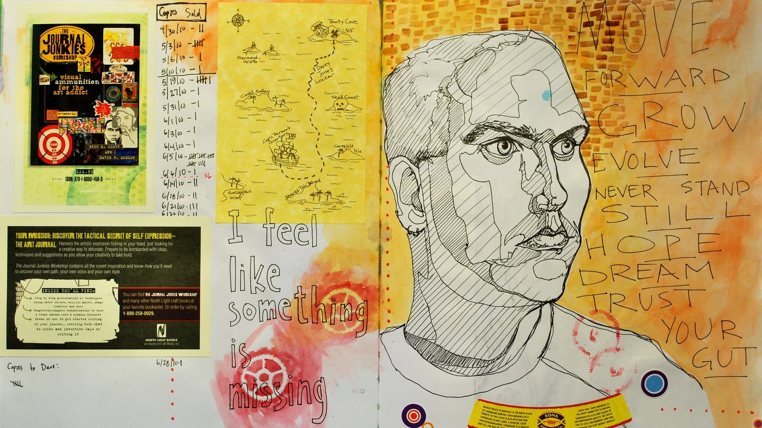
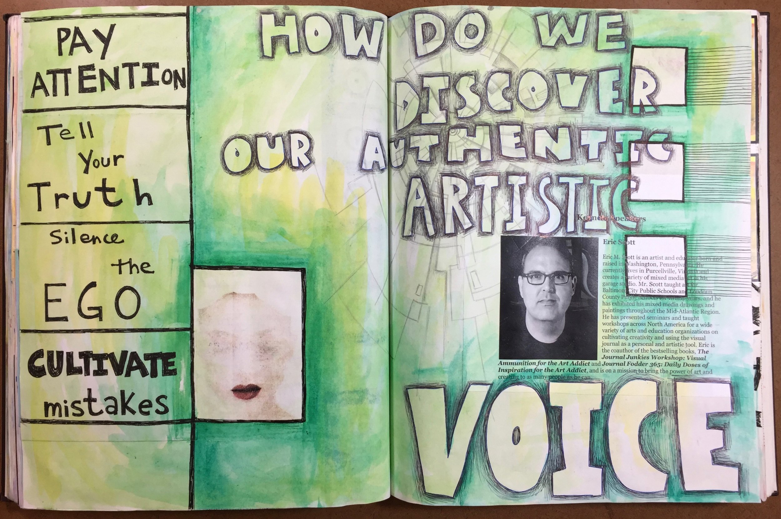
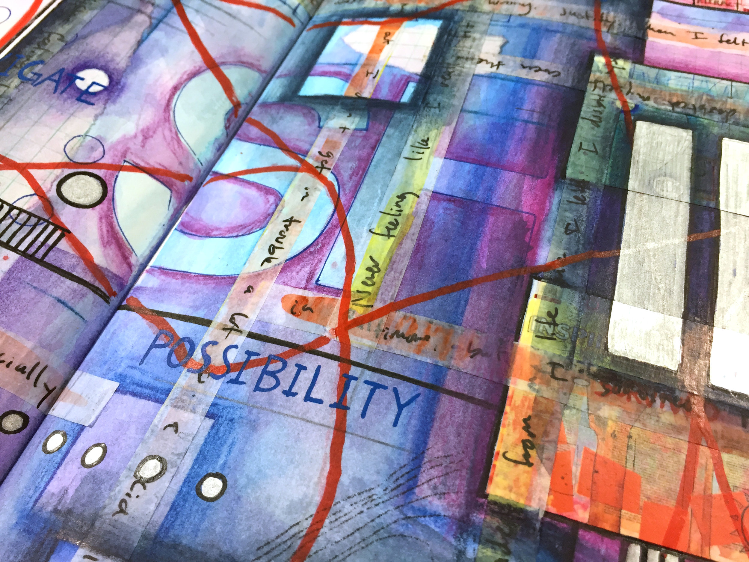
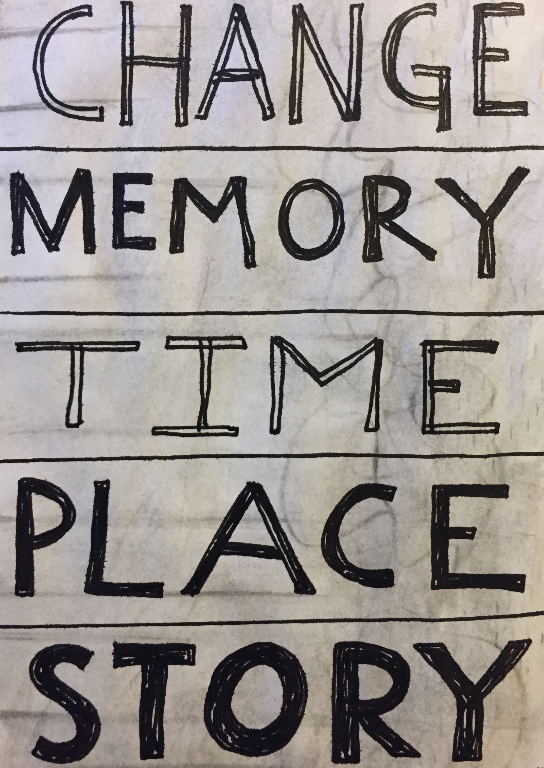
Now I’m not a religious person, but I am spiritual. I believe that the act of creating is a spiritual act, so I want to fill the book with ideas, words, quotes, and phrases about creativity and making art. This way I can have a little book to flip through anytime that I need a reminder or a little creative nudge.

The more that I think about it, the more I think that there might be others out there that might want to follow along. So, Im documenting the journey, and creating a weekly series from my explorations as a sort of ongoing tutorial and workshop that is open to anyone who wants to work along with me. I’m not certain how long it will take me to work through the book, but the plan is to post about the project every Wednesday so that folks can join in on the creative fun. Here’s a little intro:

Welcome to the Creative Prayer Book!

In our busy lives, it’s easy to get bogged down with all that we have to do, and so much is vying for our attention. It’s too easy lose track of the things that are important to us, and as we struggle with daily chaos and general busyness, we can forget to feed our souls and take the time to create. Join me in a journey to create a sacred book that will be a reminder to take a deep breath and remember what is truly important. Fill your book with favorite techniques, images, and color, and allow your book to echo your hopes, dreams, and wishes

What you need:

  • A journal or sketchbook

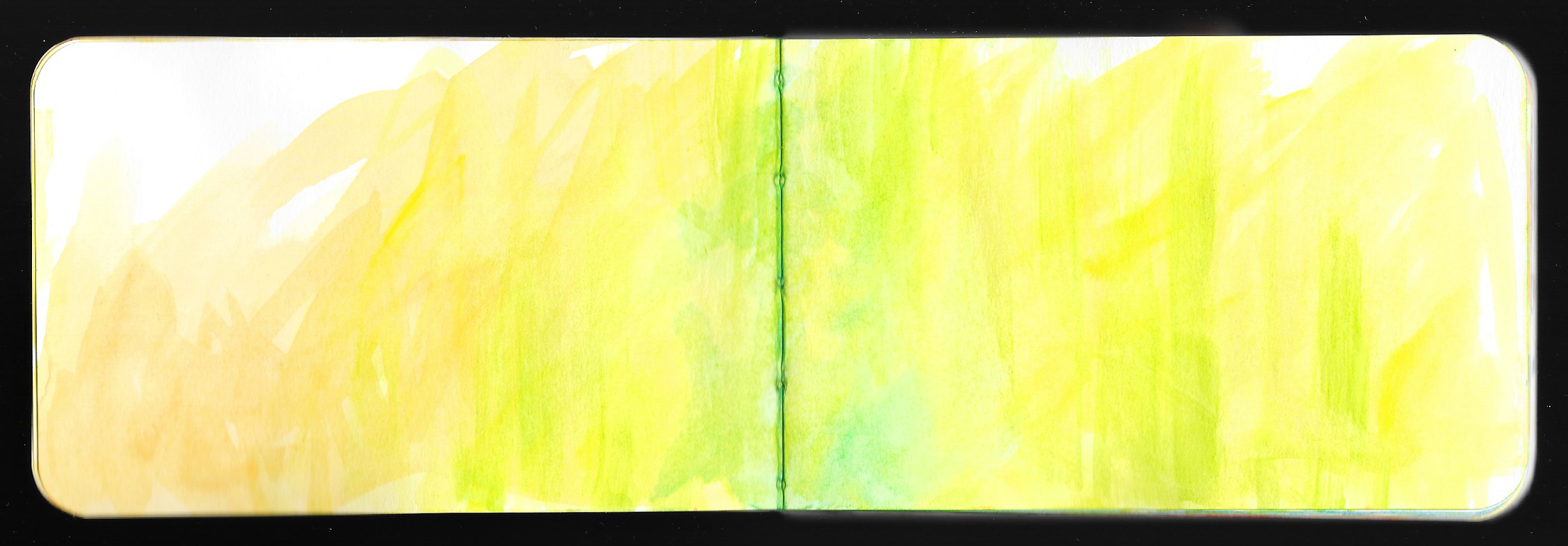
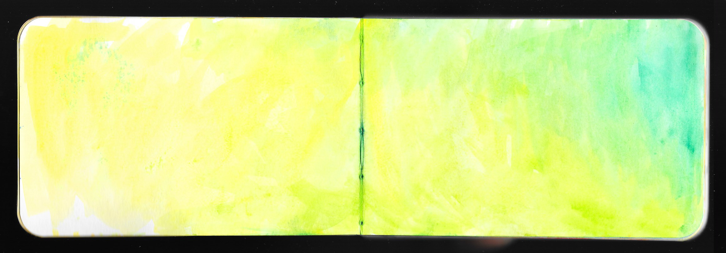
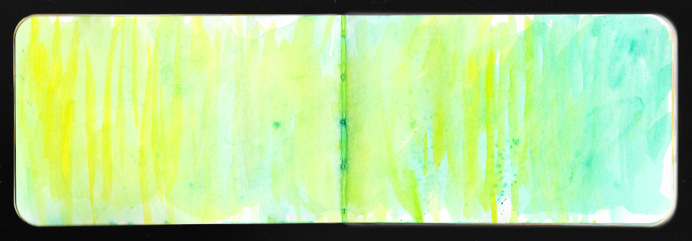
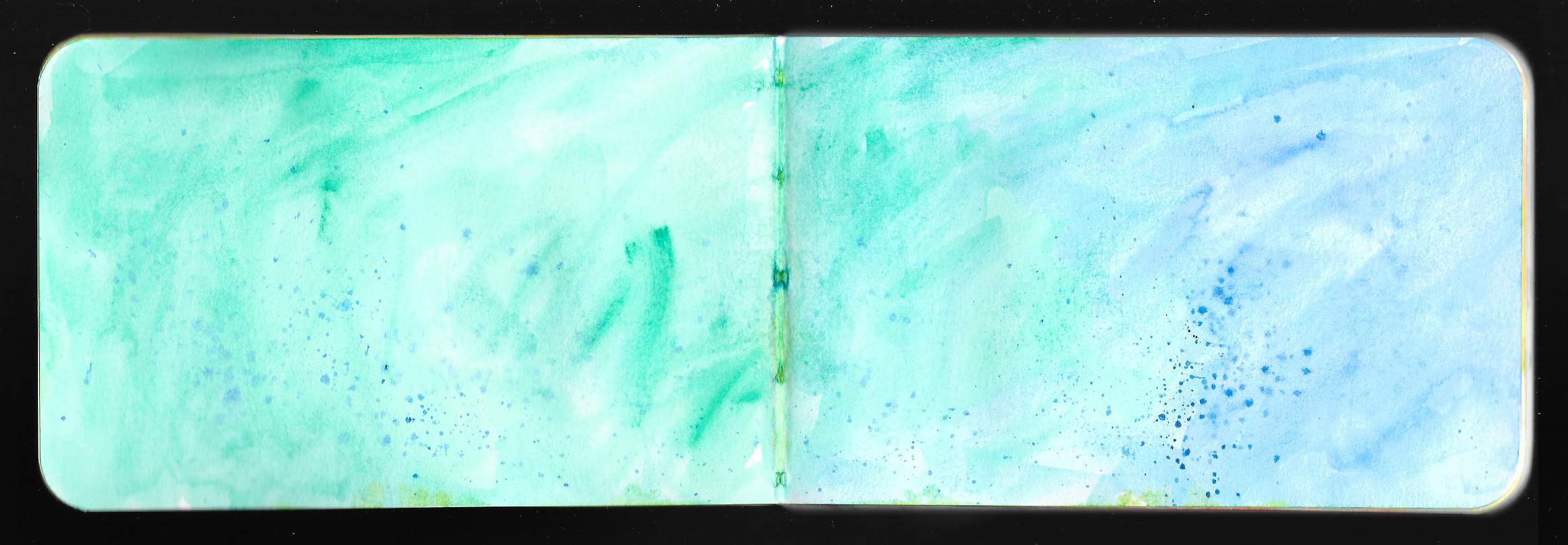
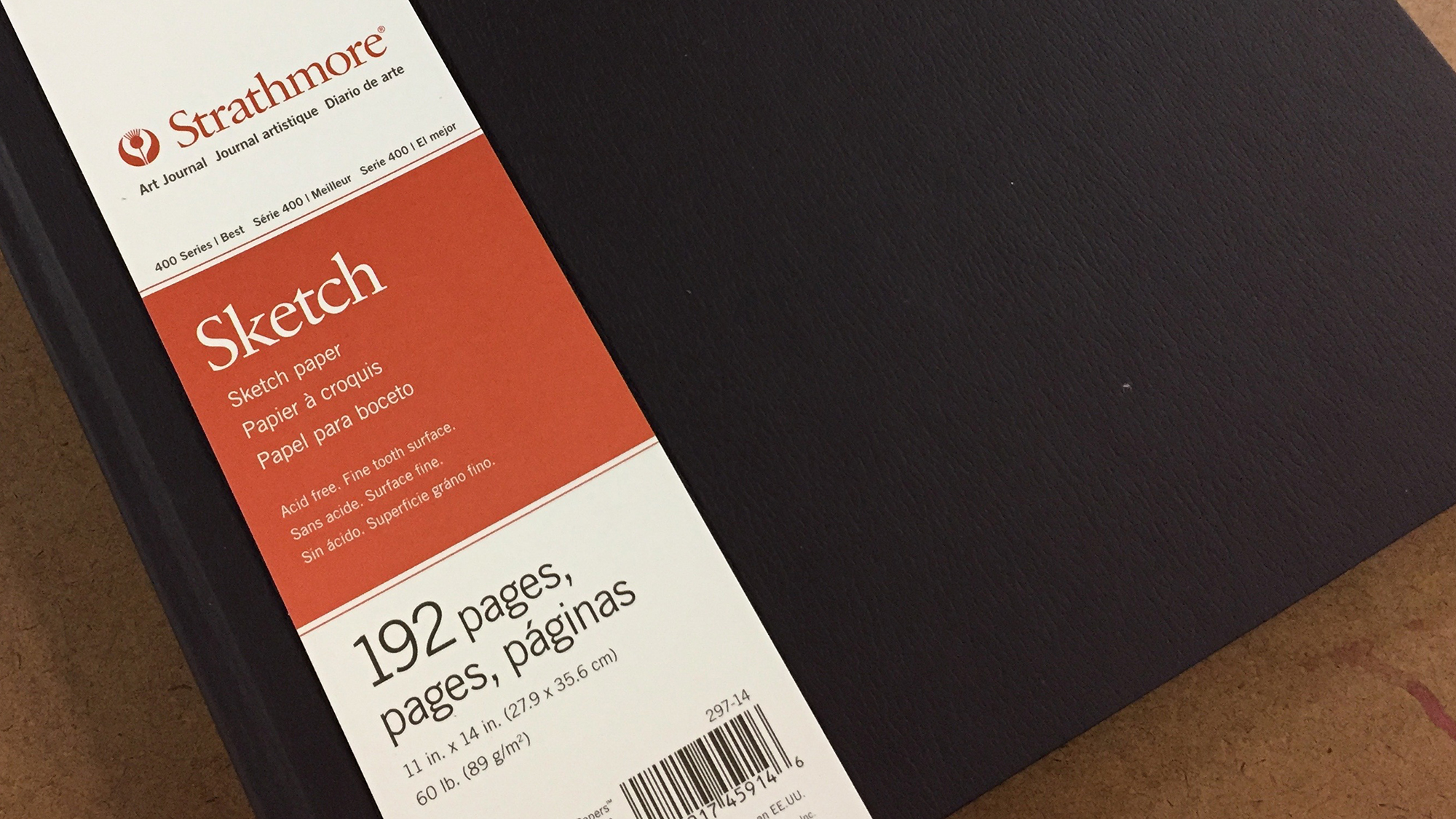
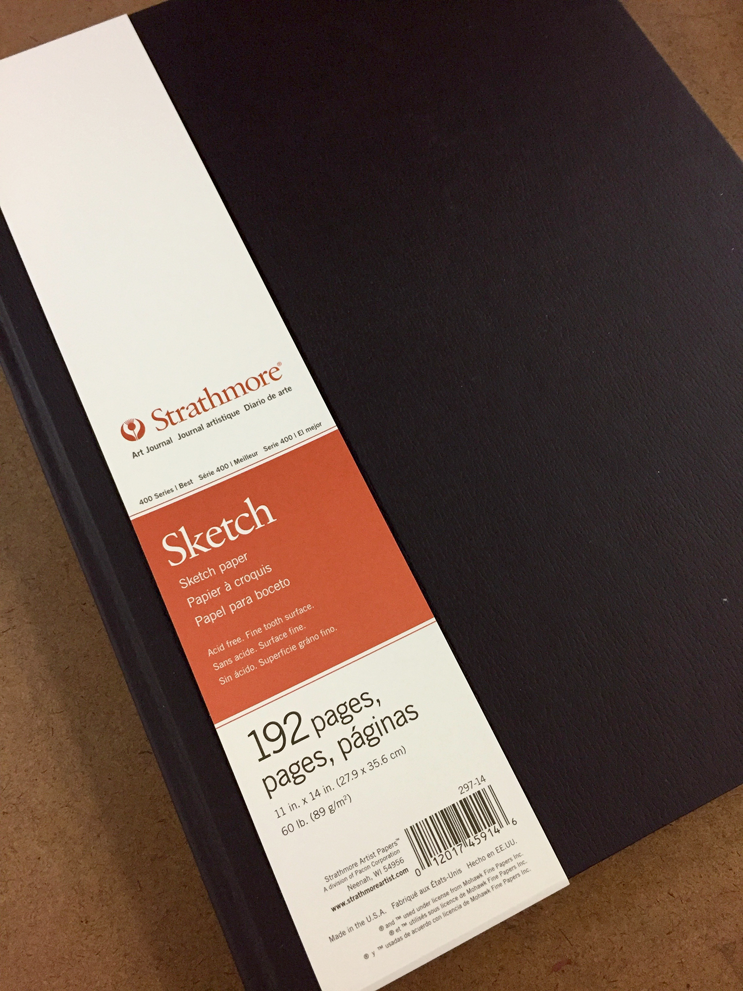
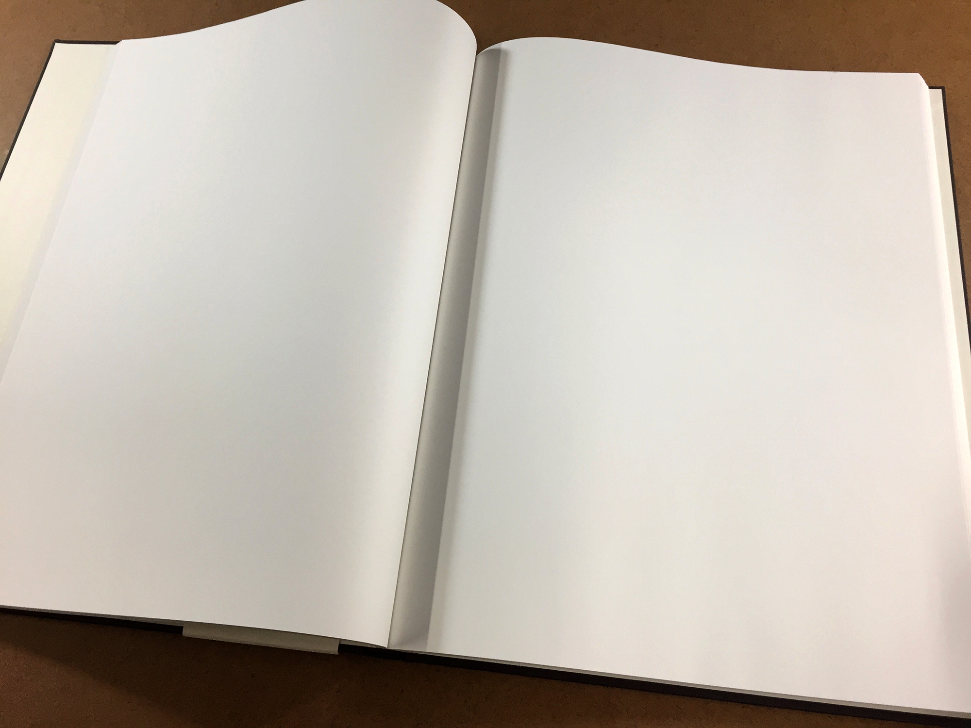
You’ll need some kind of book — something small with a limited number of pages is good. That way you won’t get bogged down with trying to fill a huge number of expansive pages and be overwhelmed with the process. Something around 4”x6” is good, and you can purchase something or make your own. Perhaps get something with sturdy watercolor or mixed media paper. The Stillman & Birn book that I am using has good paper for mixed media, but it can buckle and bend from the wet media, so if that drives you crazy, get a heavier weight paper.

  • Some of your favorite art supplies

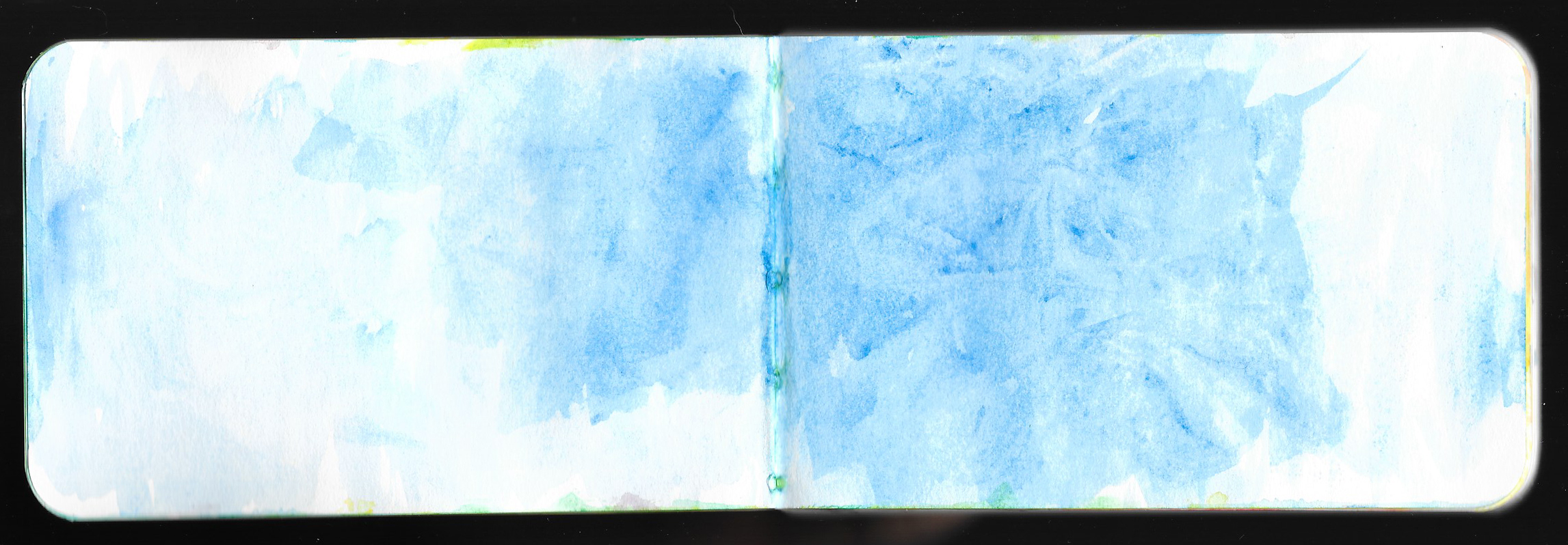
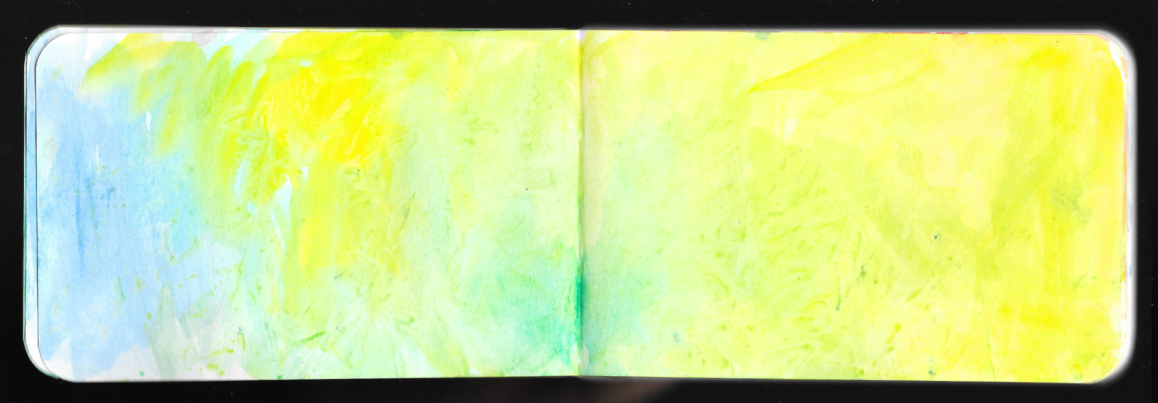
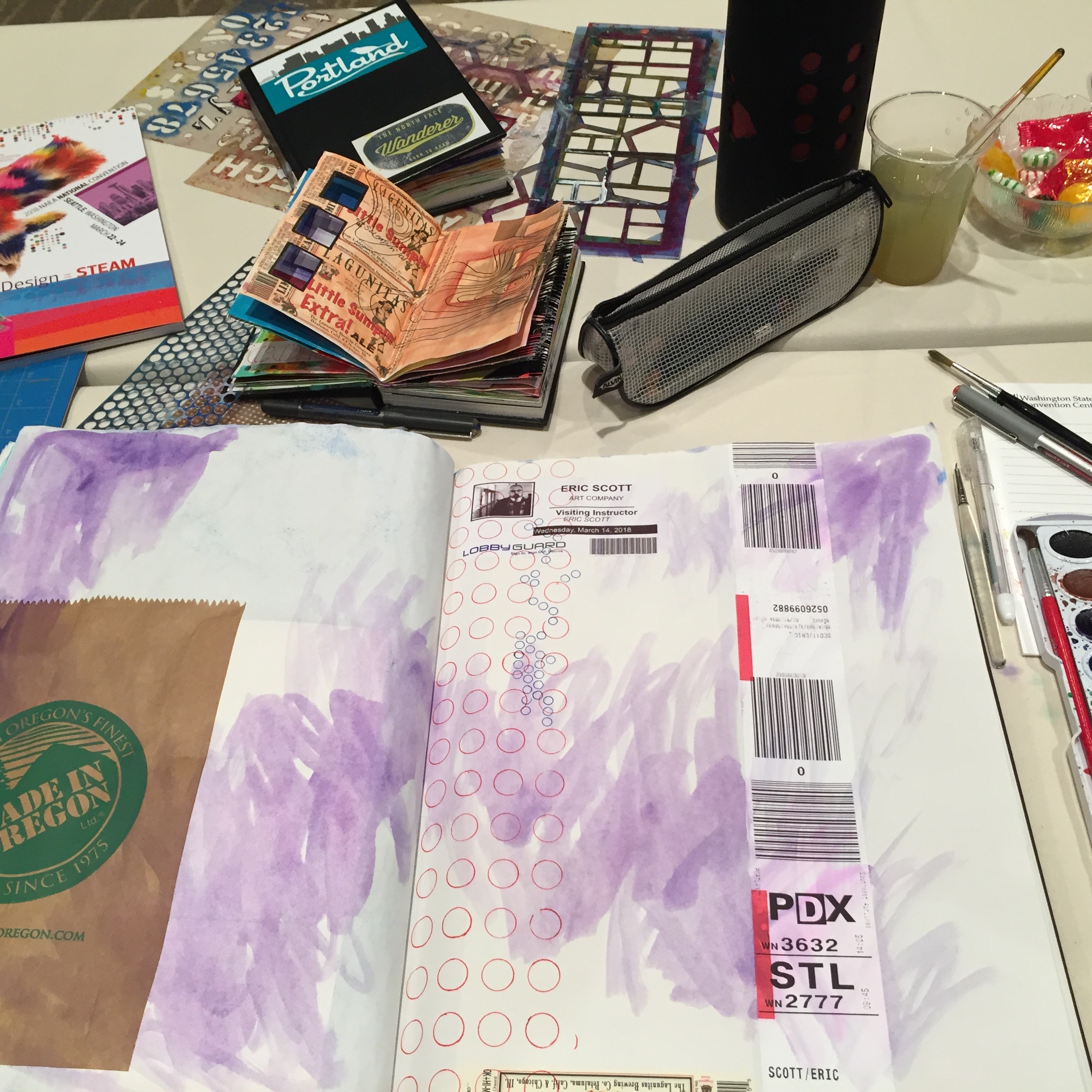
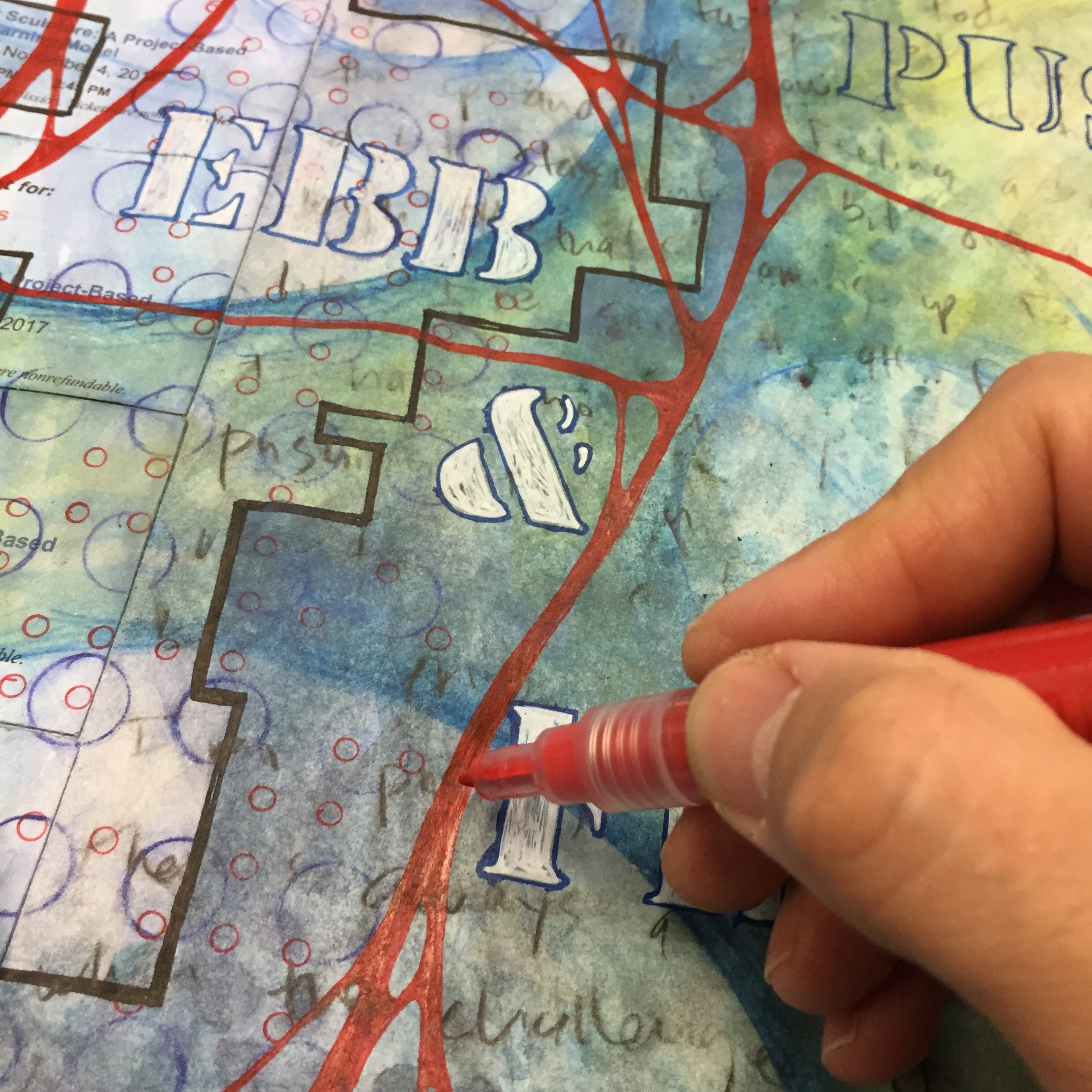
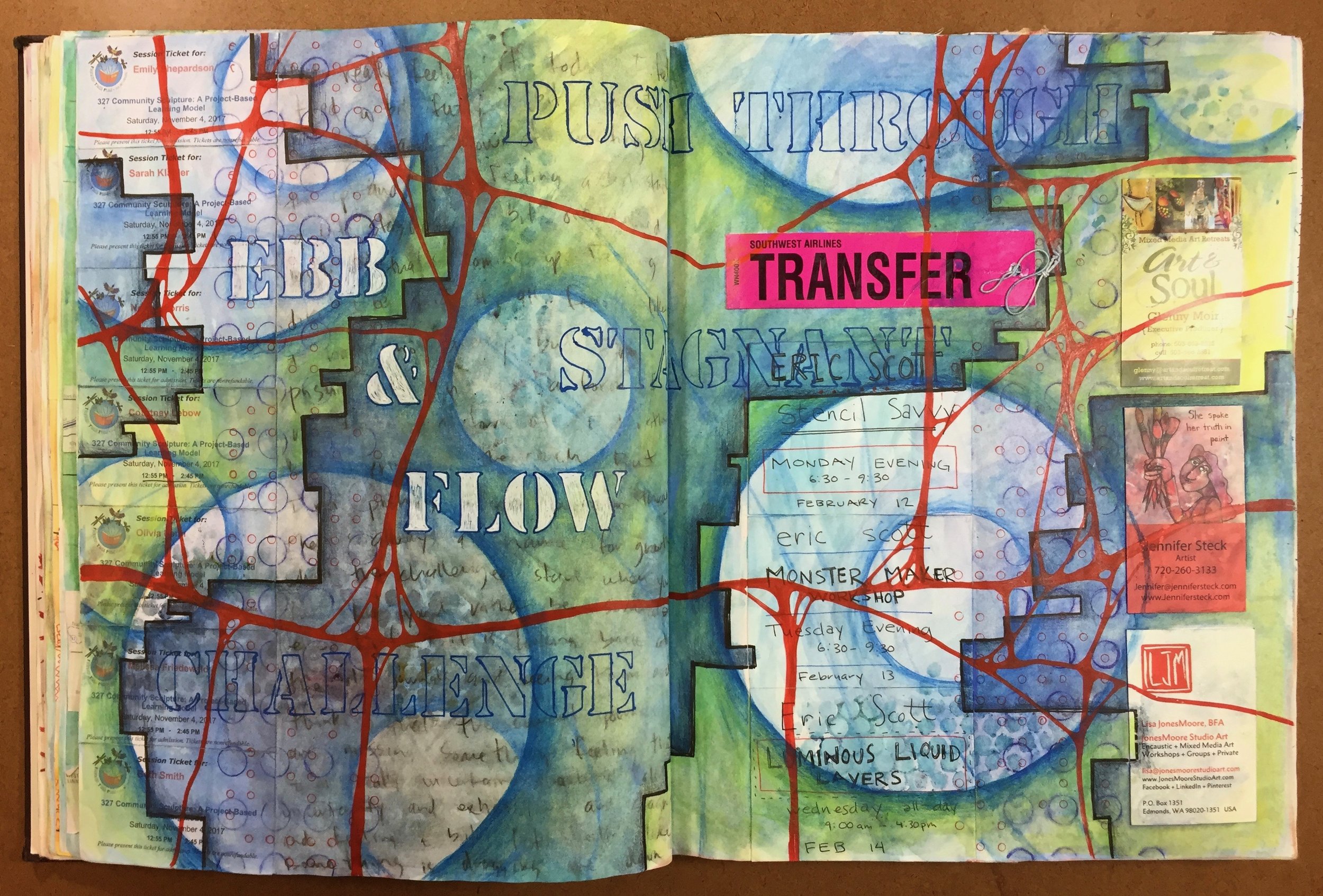
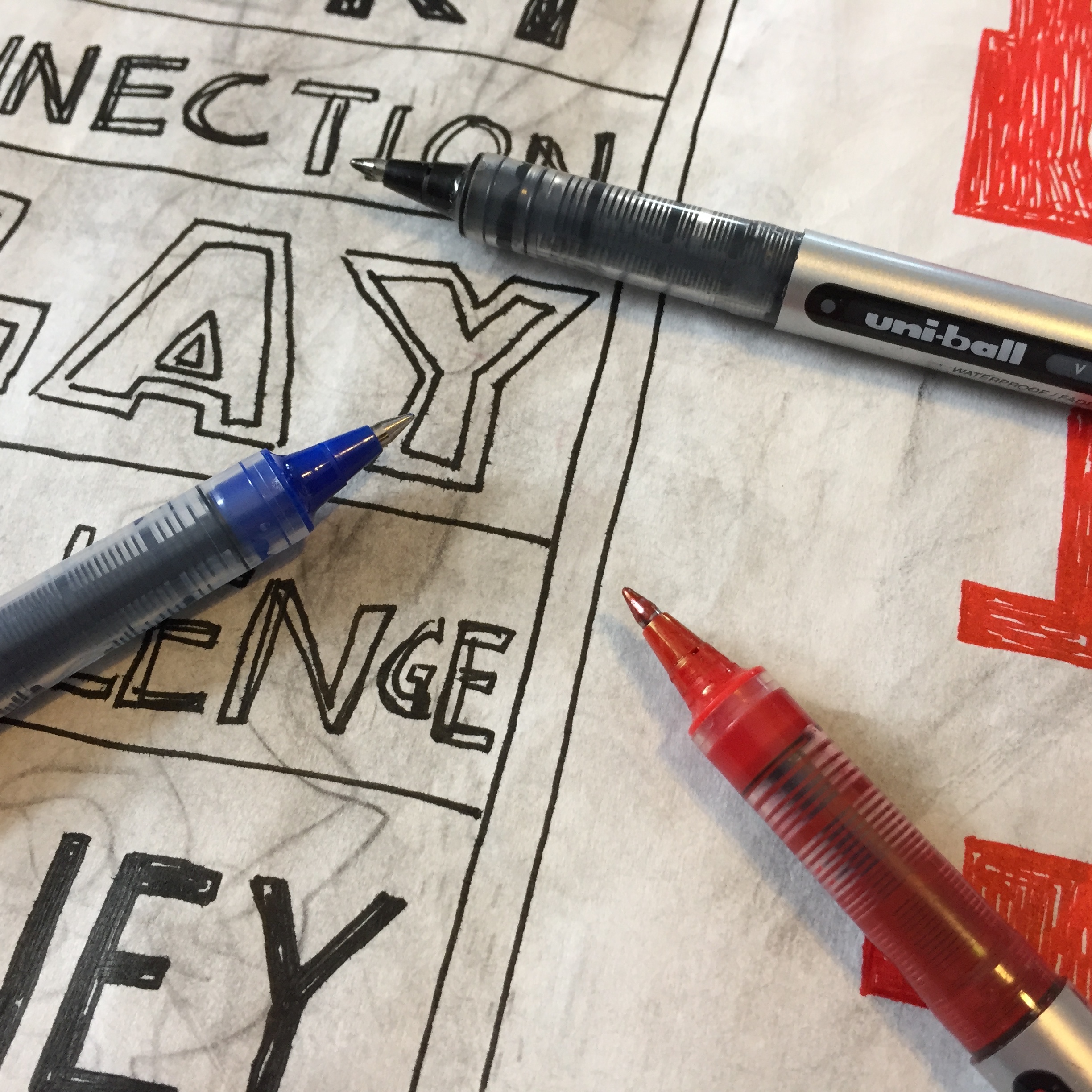
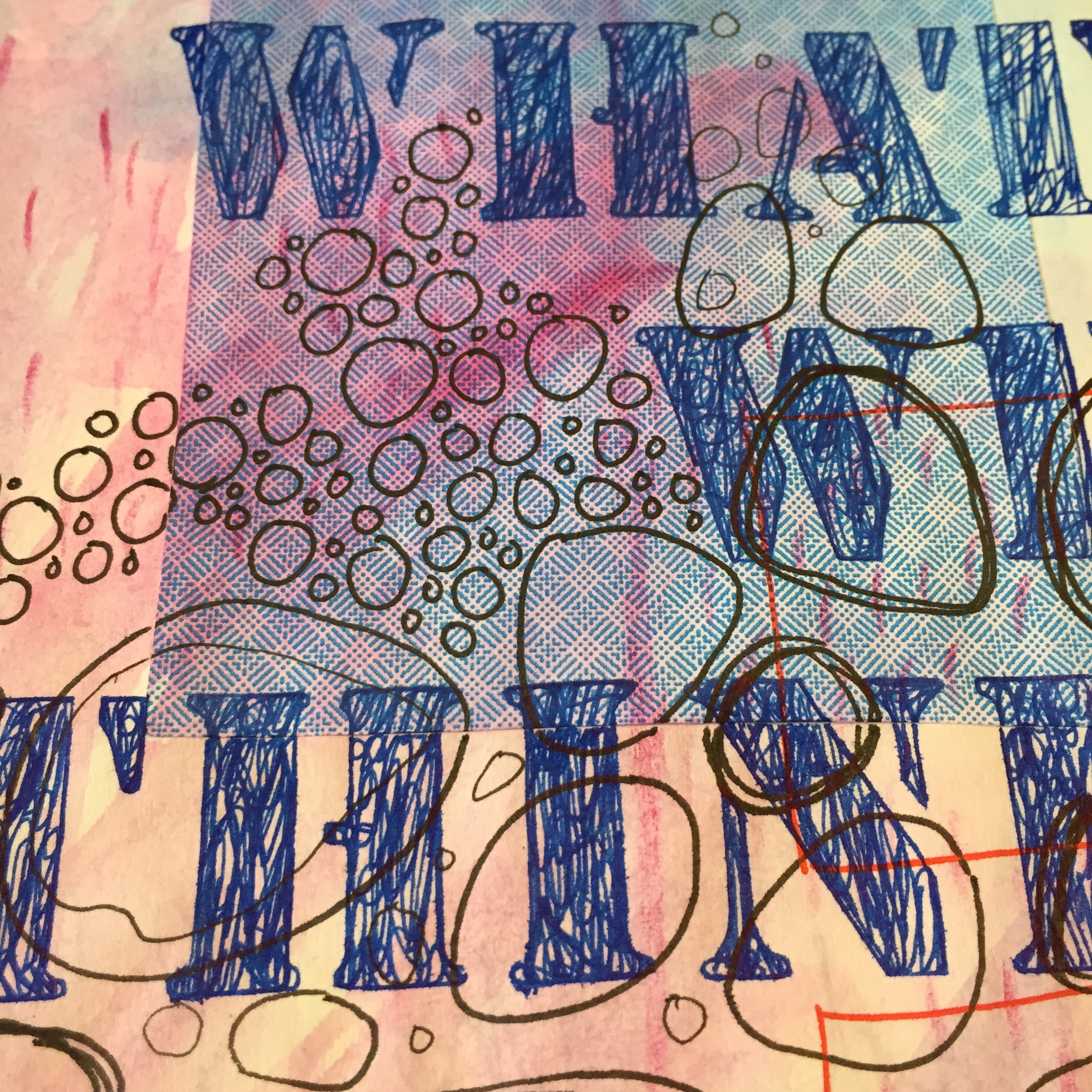
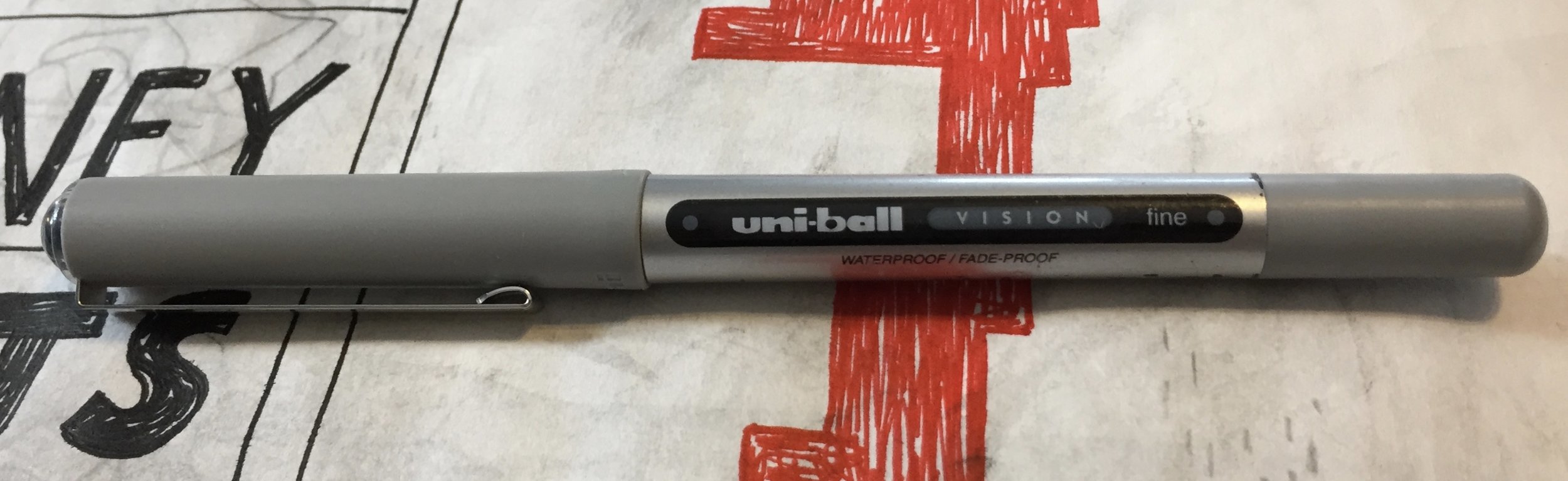
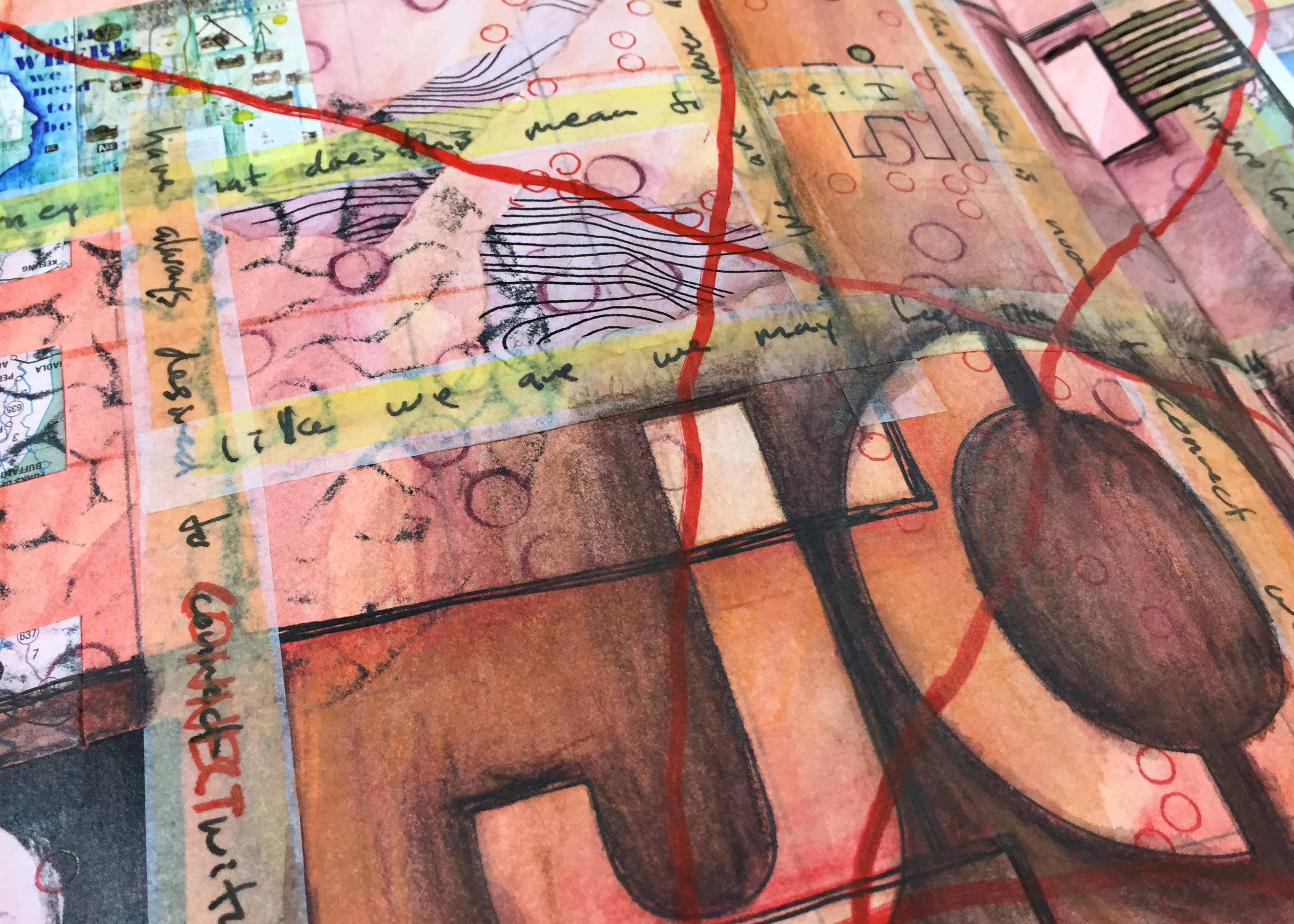
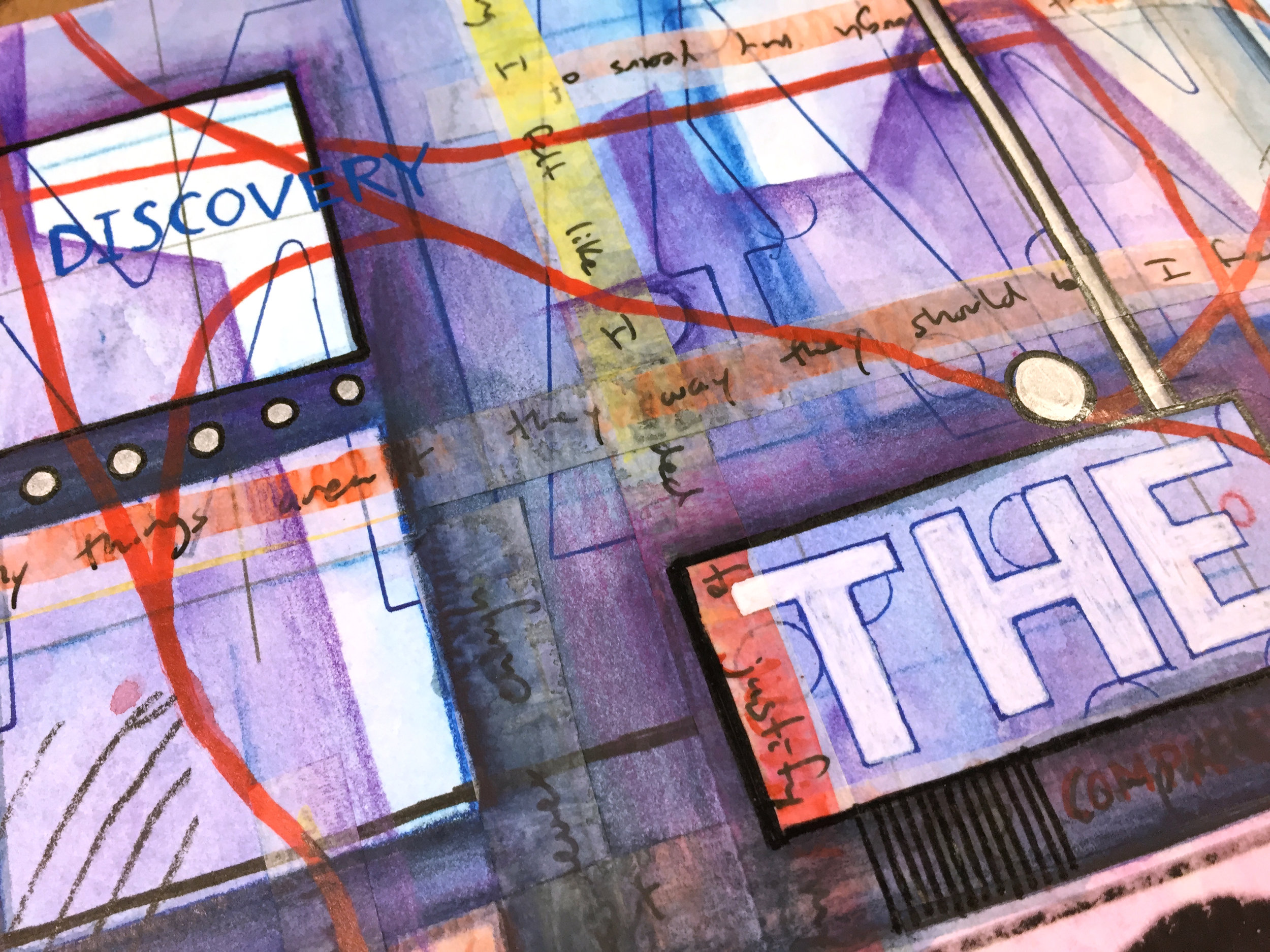
I want this to be something that doesn’t need a special place or special materials, so I’m using materials that I can use anywhere at anytime. I don’t want to load myself down with materials that I can only use in my studio or anything that’s too complicated. I love working with transparent layers, so watercolor and watercolor pencils are a must for me. I’m definitely going to use collage, so I’ll need my jumbo UHU Glue Stic. Of course, Ill be writing and drawing so some waterproof pens and markers are good, as well as a pencil or two and a couple of metallic markers.

Each week, I’ll share the materials and tools that I’m using, so you can add other items as needed.

Next week, I’ll share some watercolor ideas as I start to engage some of the pages and ease my way into the book.

Grab a journal and some art materials, and come create with me!

Materials Monday: uni-ball Vision Pens

 
fullsizeoutput_11ed.jpeg
 

A good pen is essential for working in the visual journal — from writing and doodling to drawing and embellishing, a quality pen will serve you well, and it seems like most everyone has their favorite brand. For me, it’s my uni-ball Vision pens.

I’ve been using these pens for years, and I don’t really remember when I first discovered them. I always seem to have several stuffed in my pocket no matter where I go, but I am careful with the ones that I get. I make certain that the pens are marked as waterproof/fade-proof, and these are really good at any stage of a page. They easily draw and write on a blank page as well as on top of watercolor and collage. Since they are waterproof/fade-proof, I can paint over the ink once it’s dry with little to no bleeding. However the ink will bleed more often when I paint over solid areas of ink or when I paint over fresh lines of ink, but I accept this as part of the process. If needed, I can always go back over top of these areas and lines.

The regular uni-ball Vision pens and the Vision Needle pens both come in two sizes — micro (0.5mm) and fine (0.7mm), and the Vision Elite pens come in the micro size and a bold (0.8mm) size. The Vision pens are acid-free and available in a variety of colors, but not all colors are waterproof/fade-proof and can easily bleed and blend when painted over with water or watercolor. I normal carry a black, red, and blue, but I do like occasionally having other colors to use so I have a variety of colors stashed in my bag of portable supplies. Over the years, I have tried the Vision Elites and the Vision Needles, but I find the I like the ordinary Vision pens the best.

Although these are my favorite pens, I do have one big gripe. The regular Vision pens are not too airplane safe, and they can end up spewing ink due to the change in pressure on a flight. This is quite annoying when you end up with a big blob of ink on a page or end up with ink all over your fingers. If you fly a lot, these pens can give you problems, and making certain that they are carried with the tips pointing up can help a little to even the pressure inside the pen. The Vision Elite pens are airplane safe, but I find that the ink is not too waterproof, so there is a trade off.

The are only a couple of minor issues with the Vision pens that can be a bit of a nuisance. The first is that the tips can get clogged from time to time if you write over top of wet glue or acrylic paint, so it’s good to be careful not to be in a big hurry and allow paint and glue to dry thoroughly. The other issue is that the ink can take a while to dry on top of shiny surfaces, and if you draw over top of magazine images or slick postcards, you want to give the ink plenty of time to dry.

fullsizeoutput_11f0.jpeg

If you’re looking to add a good quality pen to your journal kit, I highly recommend the uni-ball Vision pens, and as a reminder, I am not getting paid or reimbursed in anyway for recommending any of the materials that I share. These are just the things that I personally use.

Happy journaling!

New JFJ Giveaway!

 
1500 Giveaway.jpg
 

The Journal Fodder Junkies Facebook Page hit a milestone this past week. The page hit and surpassed 1500 likes! Thank you to everyone one who has decided to follow our journey — those who have followed us for years and those who have only recently discovered us. I want to celebrate this milestone with a giveaway!

I launched a new online workshop, Mapping the Journey, in December, and I want to give away one free registration as a way to say thank you to everyone who has supported the JFJ in some way. Anyone is eligible to enter, even those who have already purchased the workshop. If you’ve purchased the workshop and win, you’ll have the option to pass the free registration onto someone you know or have your money refunded from your purchase. The winner will receive a copy of the workshop’s PDF and will have access to all the video tutorials.

There is only one way to enter, by opening and filling out the form below, and entries will be taken until 11:59pm EST, Wednesday, January 16th. A winner will be selected randomly from all entries, and announced on Thursday, January 17th.

Good Luck!

This contest is closed.

Journal Friday #90: Journal Stripped Bare

fullsizeoutput_11e7.jpeg

This week I’ve shifted focus a little in my journal as I’ve pared down the materials that I’ve been working with as I explore ideas for a new online workshop. I think that we often get caught up in the materials that we have and use, and the journaling practice can get overwhelmed with choices of materials and techniques drawing attention and focus away from meaning, ideas, and creativity. But what do we really need in order to have a rich visual journaling practice?

With this new online workshop, I want to explore that idea and delve into the possibilities of limiting the materials that we really need in order to create deeply authentic pages while at the same time pushing our creativity. I am reminded of a quote by psychologist Rollo May, “Creativity... requires limits, for the creative act rises out of the struggle of human beings with and against that which limits them.” We don’t need a stocked studio to be creative or to carry on a deep journal practice. We just need a few materials, some tried and true techniques, and the courage to go deep within.

 
fullsizeoutput_11e8.jpeg
 

I’m thinking of calling the workshop The Journal Stripped Bare, and it’s loosely based on an in-person workshop David and I taught a few years ago. But this new workshop will be much more encompassing, and will include techniques and ideas for using a limited amount of supplies while diving deep with ideas, themes, and personal concepts. So, I focused on using only a few materials this week — mostly water-soluble graphite and ink, as I began some initial explorations.


I’m excited to delve into these ideas deeper to see what I can discover, and to see if I can turn them into a viable workshop. Here’s to limitations and pushing our creativity.