Materials Monday: Metallic Sharpies

 
fullsizeoutput_1207.jpeg
 

Metallic markers and pens are a wonderful addition to any mixed media tool bag, and I feel that they’re pretty essential to the visual journal. Who doesn’t love adding some sparkling flair to their work?

I’ve used metallic ink for a long time to bring emphasis and focus to my journal pages, and it’s ideal for highlighting words, lines, and shapes. Over the years, I’ve used a lot of different metallic markers and pens, and some I’ve loved and some I’ve loathed. Even the best, though, can have problems of drying out, clogging up, and blobbing ink.

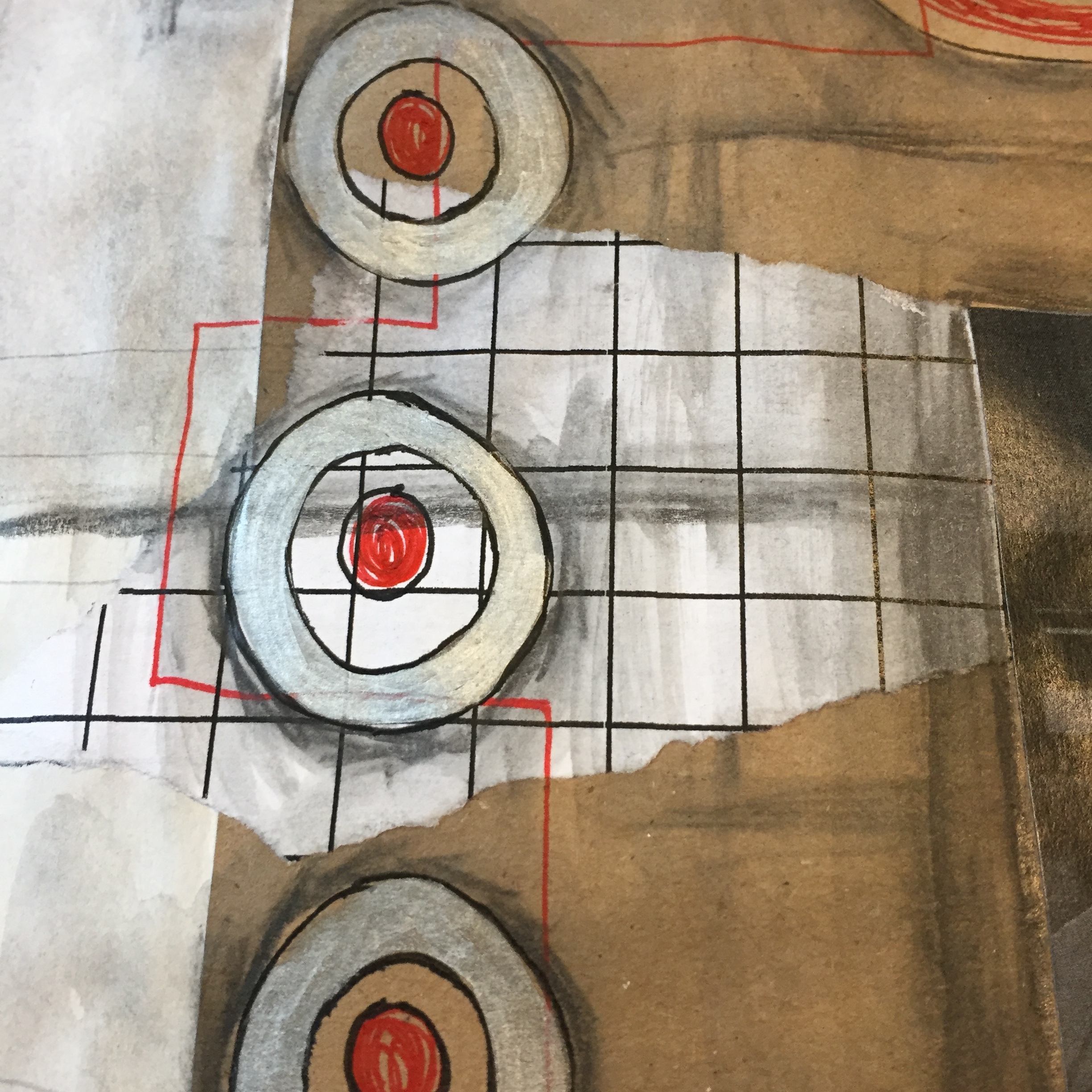
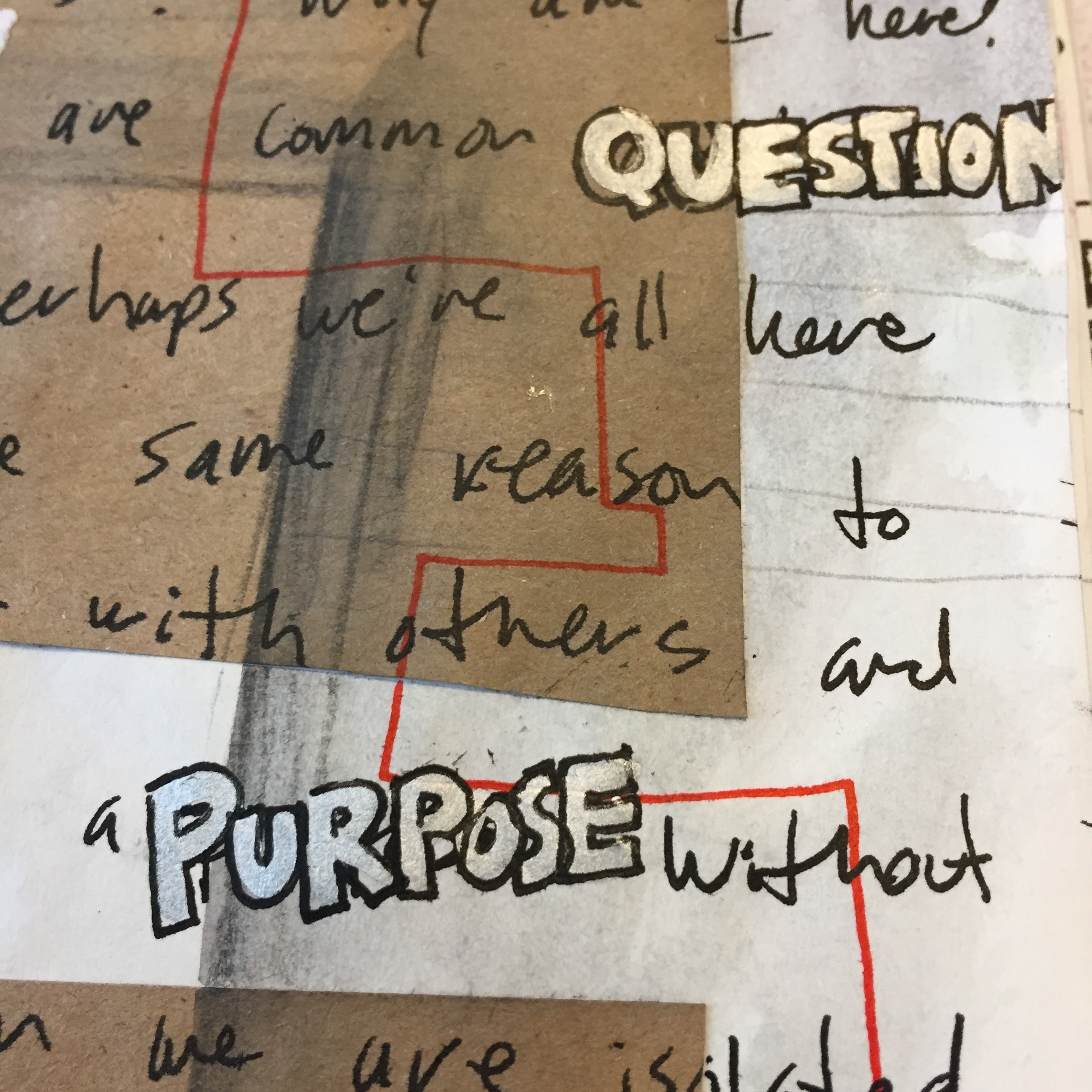
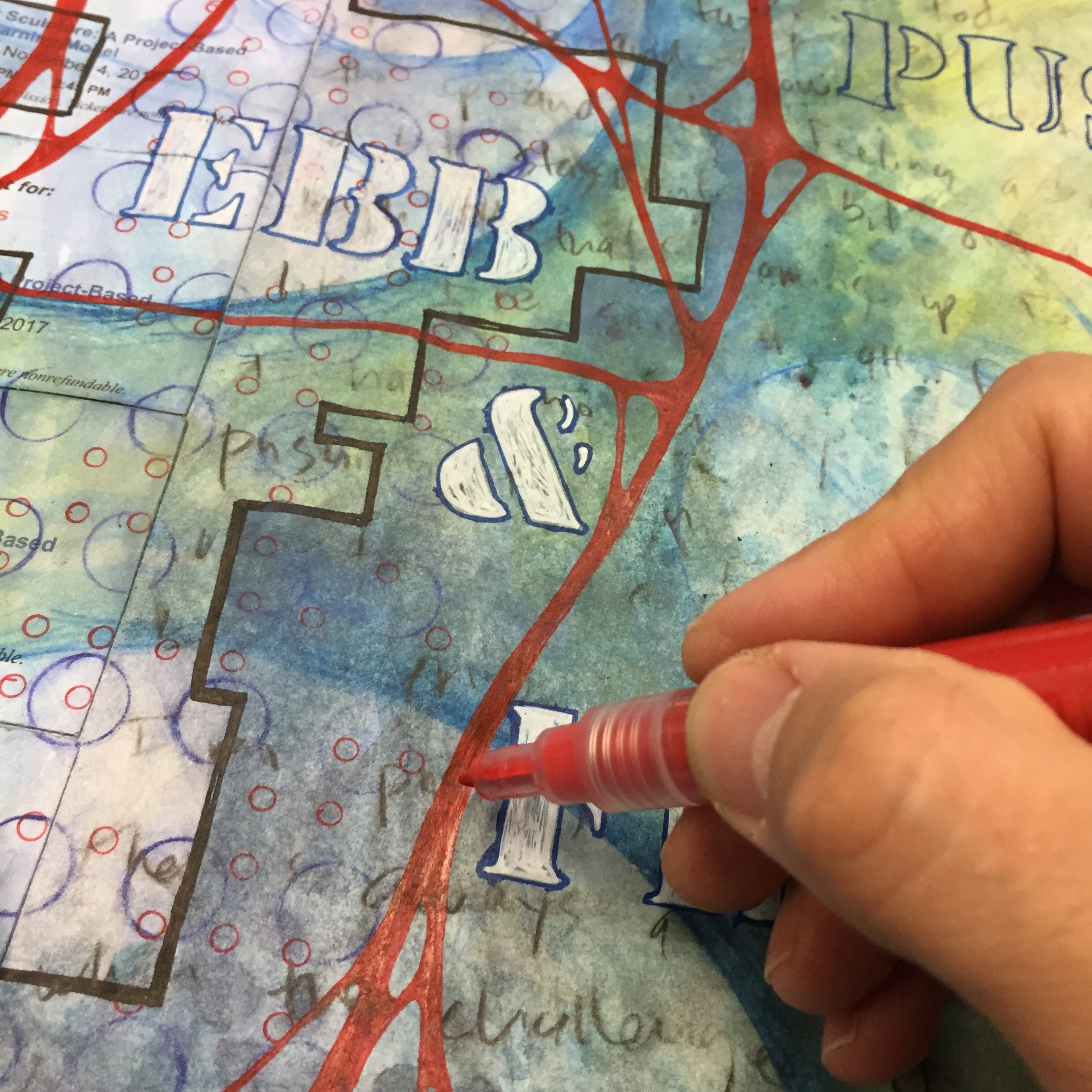
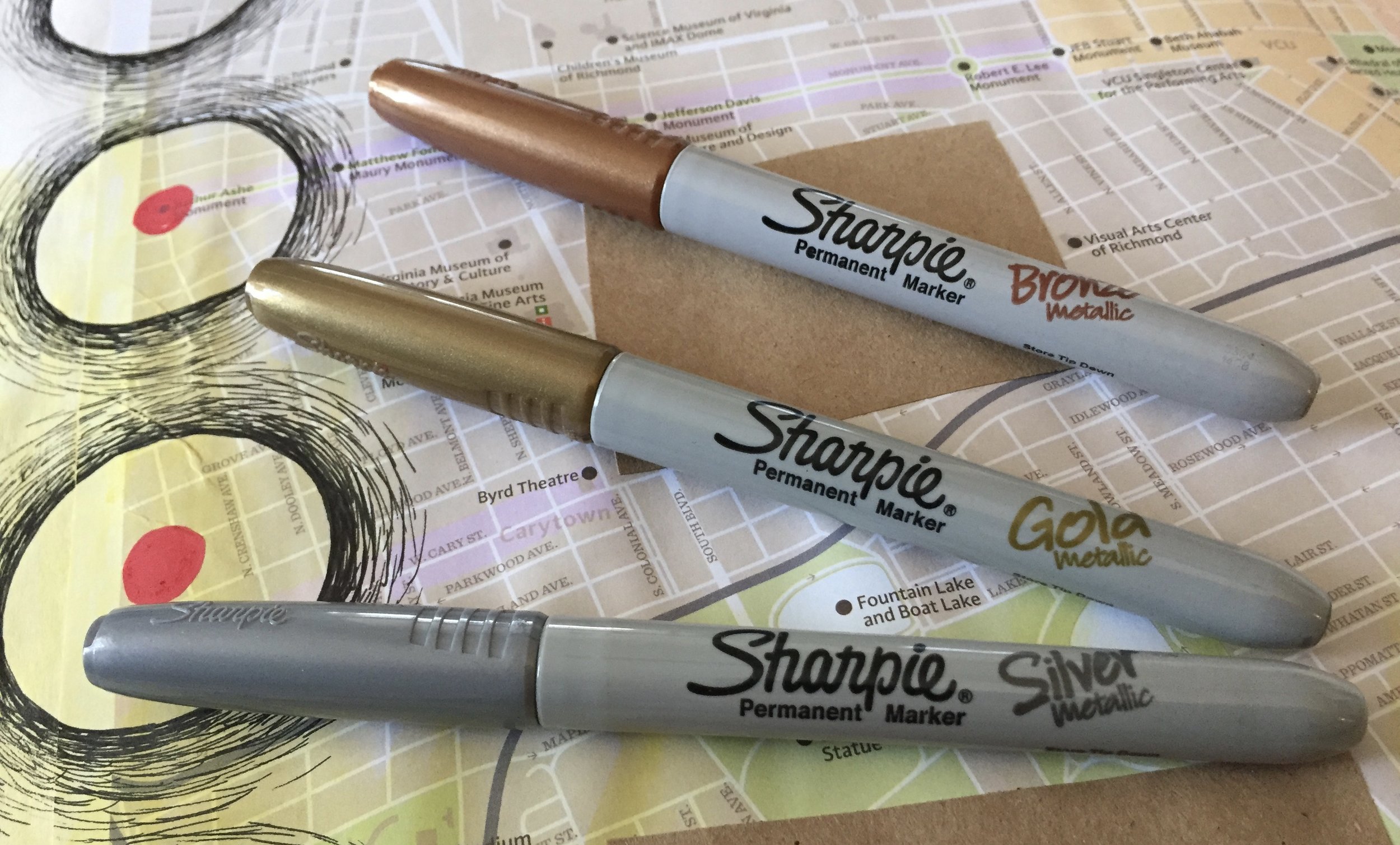
Over the past few years I’ve turned Metallic Sharpies. They’re relatively inexpensive, easy to find, and pretty reliable. Sharpie also makes metallic paint pens, but I’m talking about their metallic permanent markers. The ink isn’t as opaque and shiny as some others out there, and the markers won’t draw and write on top of every material, but they work on top of most materials that I use in the journal. They’re great for adding embellishments and a little bit of extra pop to elements on a journal page, and I always have a few in the studio and few in my travel art kit. I do find that they stand out more, if you draw or write on a dark surface, or if you outline the marker with a black pen.

One really nice thing about the Metallic Sharpies is that they are less messy then many other metallic pens and markers, especially paint markers. There’s nothing like trying to get a paint marker’s paint to flow and ending up with a huge, unwanted blob of paint on your page. There’s no worry about that with the Sharpie since it’s a plain, permanent marker with metallic ink — no shaking, no pressing down the tip to get the ink to flow. Another plus is that the metallic Sharpies come in three distinct colors — gold, silver, and bronze, and you can often find them in a convenient 3-pack. I did notice that Sharpie has three new metallic colors, as well — sapphire, ruby, and emerald, but I haven’t tried them.

There is one major drawback with the Metallic Sharpies. They must be stored with the tip down, and I’m thinking that this has something to do with the metallic ink inside. I’ve had some metallic Sharpies that were just kicking around inside my bag all willy-nilly, and after a while, they just don’t write or draw well. They’re just not very metallic, and the ink appears clear. I think that this is an issue of the ink separating inside the marker, and storing them tip down, makes this less likely. Also, there is a little bit of bleed through with these markers, but not like with regular sharpies. Any bleed through is nominal, and it’s something that I can live with. I don’t know how well they would hold up on stand alone work, but overall, I like using these Sharpies in my journal.

If your looking for an inexpensive, yet effective metallic marker to add to your stash, I recommend the Metallic Sharpies — just make certain to store them with the tip down!
Journal Friday #93

IMG_4785.JPG

I sat down this week, and took a look at a bunch of posts on Instagram with the hashtags #visualjournal and #visualjournaling. At first, I was struck by the sheer number of posts and the diversity, but then I was struck by how different my journaling approach is. That’s definitely not a bad thing, but unlike many people who use observational drawing or acrylic paint, I tend to use a lot of geometric shapes and transparent materials. Also, I tend to use mundane, personal fodder instead of magazine images or vintage ephemera. In the spread that I made today for the video, I used Derwent Inktense to build up layers of shapes and color, and I used lots personal fodder. I also used POSCA markers, which is a new material for me, and I’ve only been using them for a few weeks.

One interesting thing with the video, is that for some reason, the color was very off, and the purple Inktense pencils I used, look very blue. Oh well!
It’s always fun to make these videos.

Creative Prayer Book: Initial Layers

IMG_4780.JPG

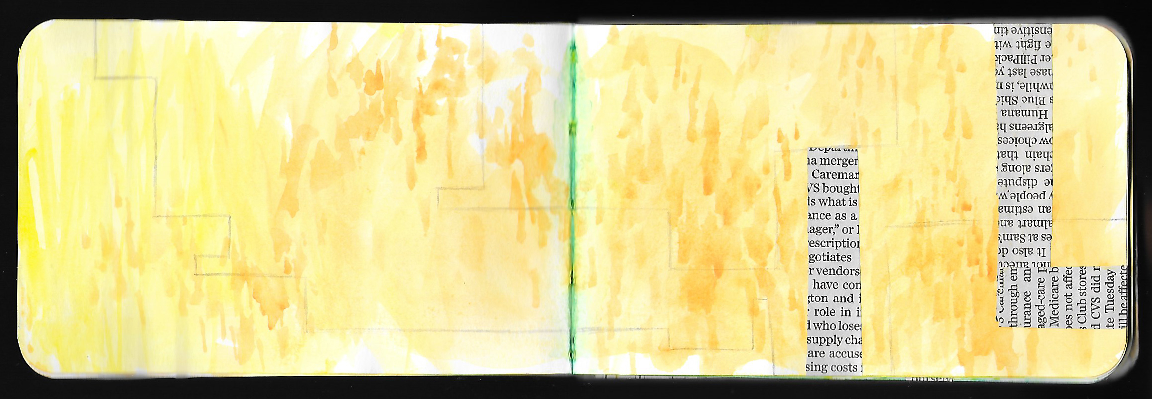
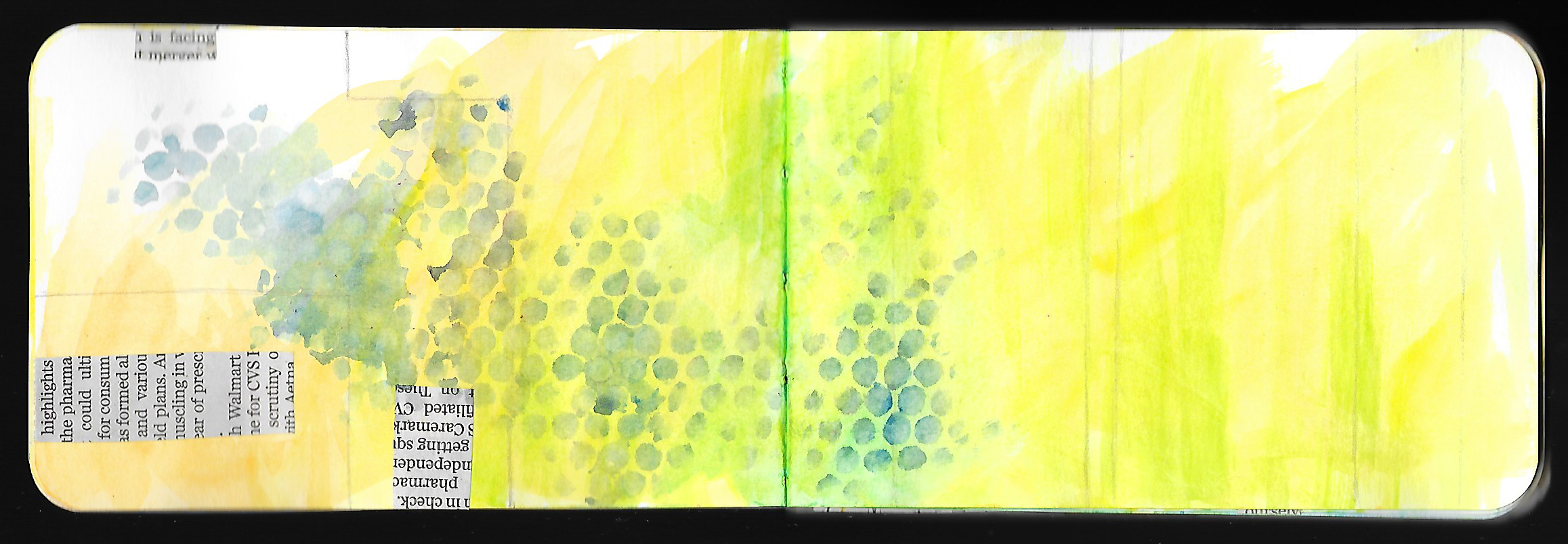
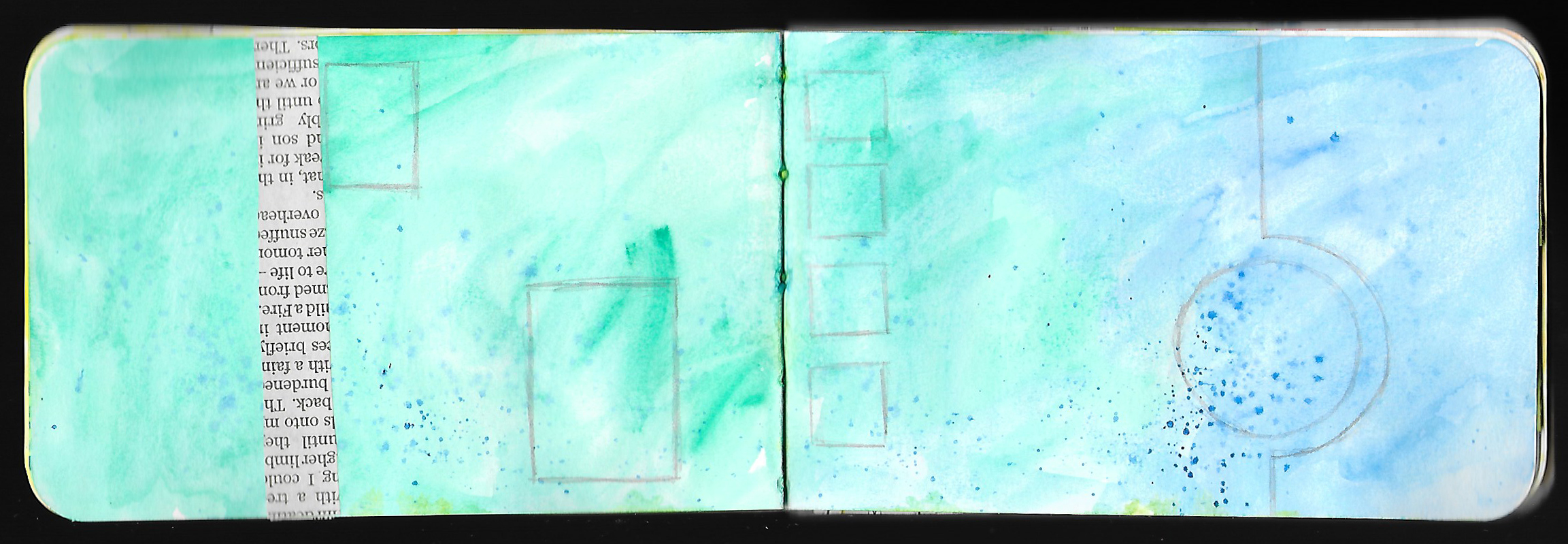
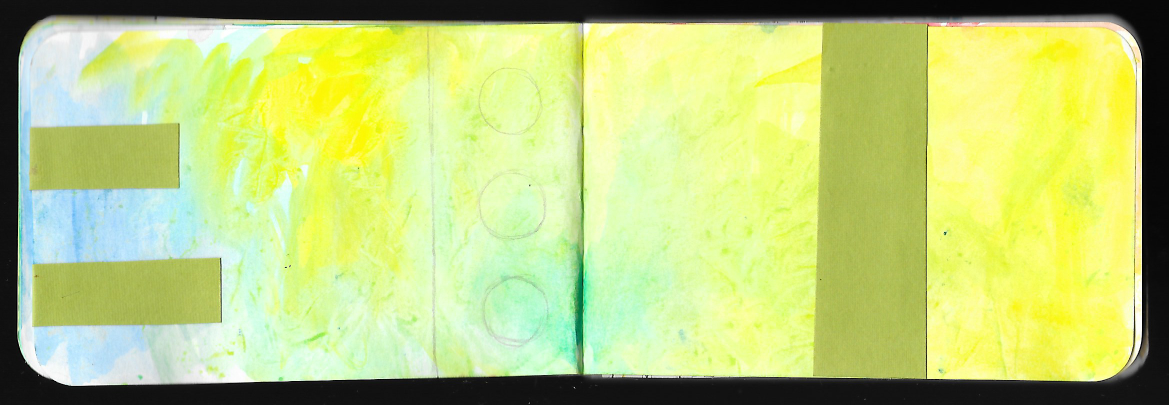
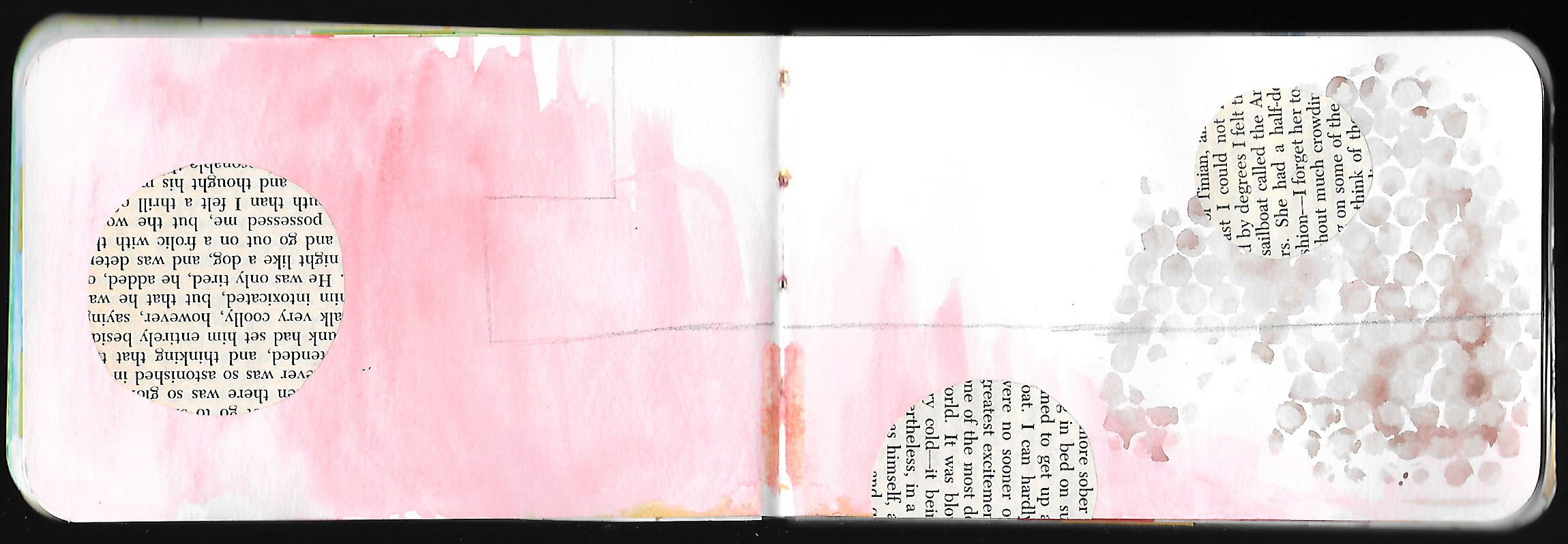
Last week I eased into my Creative Prayer Book with a variety of techniques using watercolor paint, so this week in Lesson 2, I want to build some initial layers on top of the watercolor. I’m not too focused on the content of the pages yet, so I’m only using materials and techniques that will add some structure, color, pattern, or texture to the pages. I’m avoiding anything with a strong image or content, and this will allow me to build up the background before delving into the meaning making. I want to add some drawing with pencil and some simple collage as a way to begin building layers..

Just like with the watercolor paint, I’m focusing on allowing the pages to flow from one to another, so I want to use lines and shapes to transition from page to page, so I wrap some of the collage around the edges of pages and repeat some of the same shapes from page to page. This helps connect the pages together, and helps tie the pages into a cohesive whole.


Pencil Drawing
Adding simple lines and shapes with pencil is an easy way to add more to the background. The value of the pencil is subtle and doesn’t stand out too much, allowing my marks to fade into the page. I like to use geometric shapes and lines, and rectangles, and straight lines add a lot of structure and help divide up the space of the pages. Circles and curved lines, on the other hand, help to add some variety and visual interest to pages. Feel free to use any types of lines, shapes, or marks that you want. Perhaps avoid drawing representational images, and keep your mars on the decorative side.


Collage
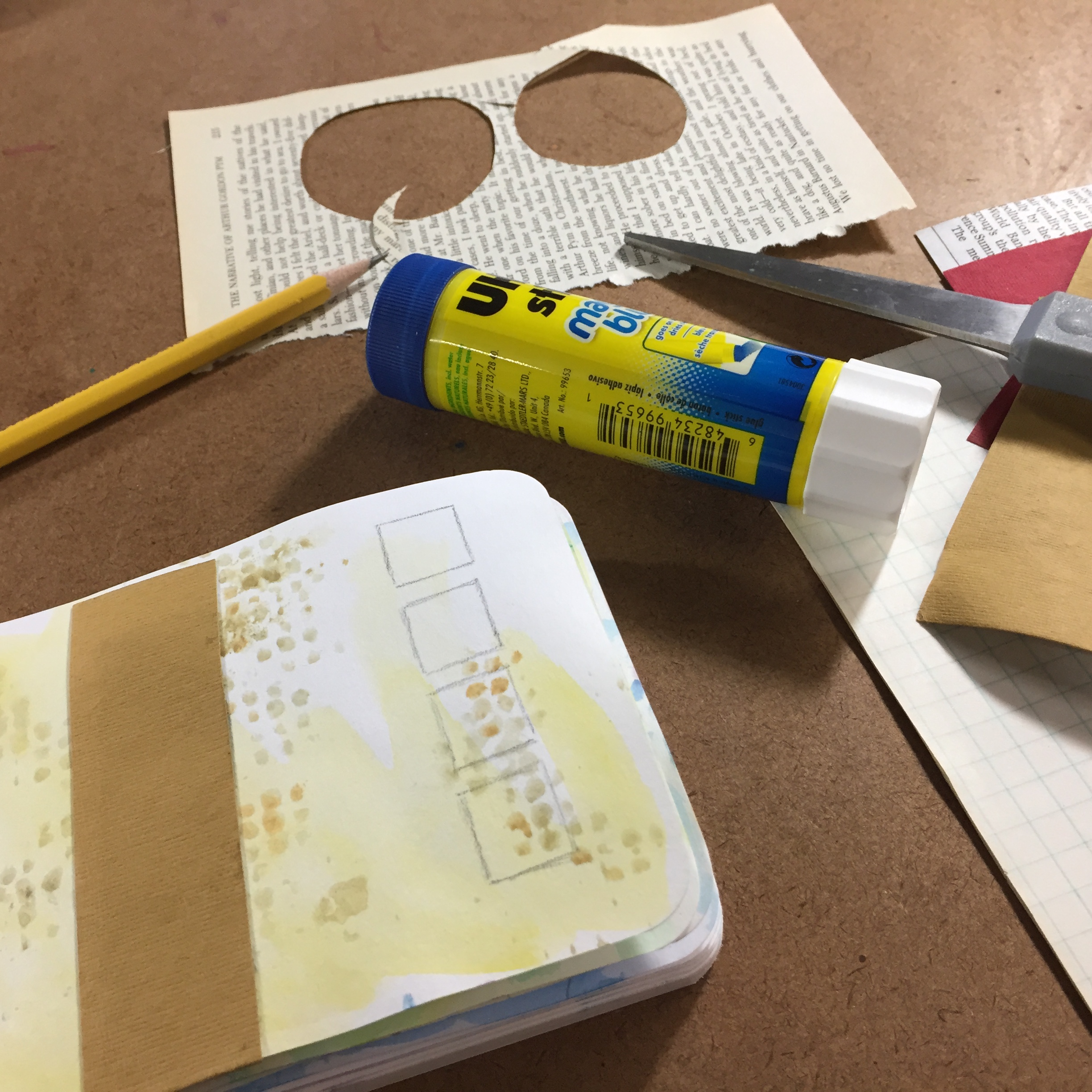
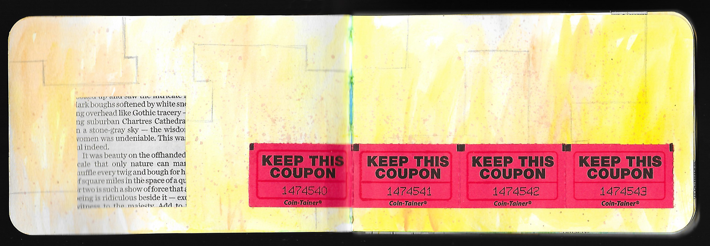
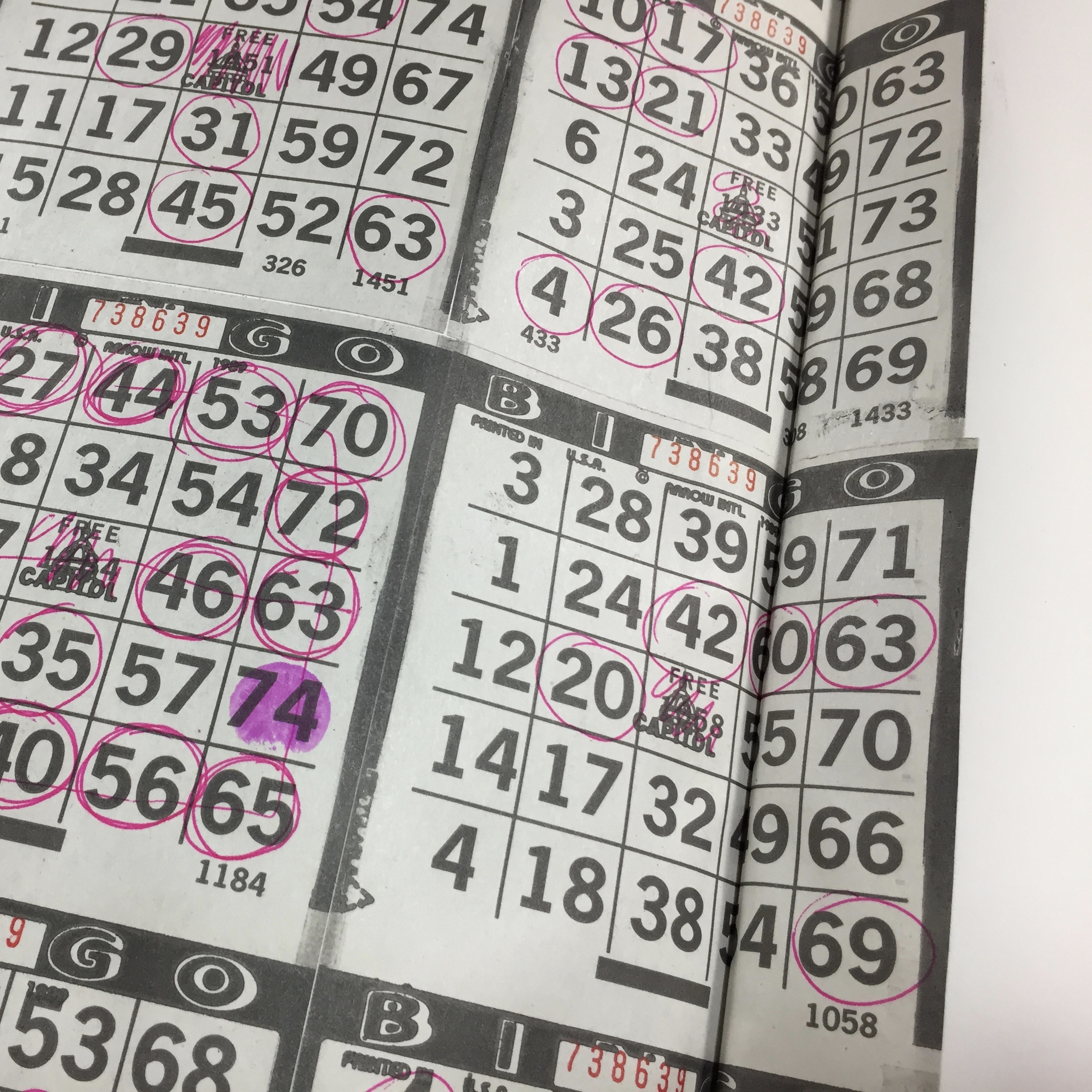
Collage is a big part of my journal practice, and I always have a pretty big stash of ephemera to use. Just like the pencil drawing, I want the collage to be somewhat subtle, so I don’t have anything with imagery. Newspaper, book pages, raffle tickets, maps, and colored paper all add some color, pattern, or texture to the pages without hinting at content or meaning. UHU glue stick is my go-to adhesive. I know some people have issues with glue stick, but when used effectively it works great. Besides, glue stick is the most appropriate for the materials that I use. A lot of people use an acrylic medium as a glue, but watercolor and watercolor pencil just won’t stick to the acrylic. Dig through your stash of papers and materials and find things that you want to glue in.


Try experimenting with some drawing and collage to build some layers on your pages, and don’t worry yet about what the content will be. We’ll get to that in future lessons, so have some fun building some initial layers and using up some of your fodder stash. Just like with the watercolor, work on as many pages as you wish, and remember that you don’t have to include the drawing and collage on every page.

Happy creating!

Materials Monday: Faber-Castell Graphite Aquarelle Pencils

 
fullsizeoutput_11ff.jpeg
 

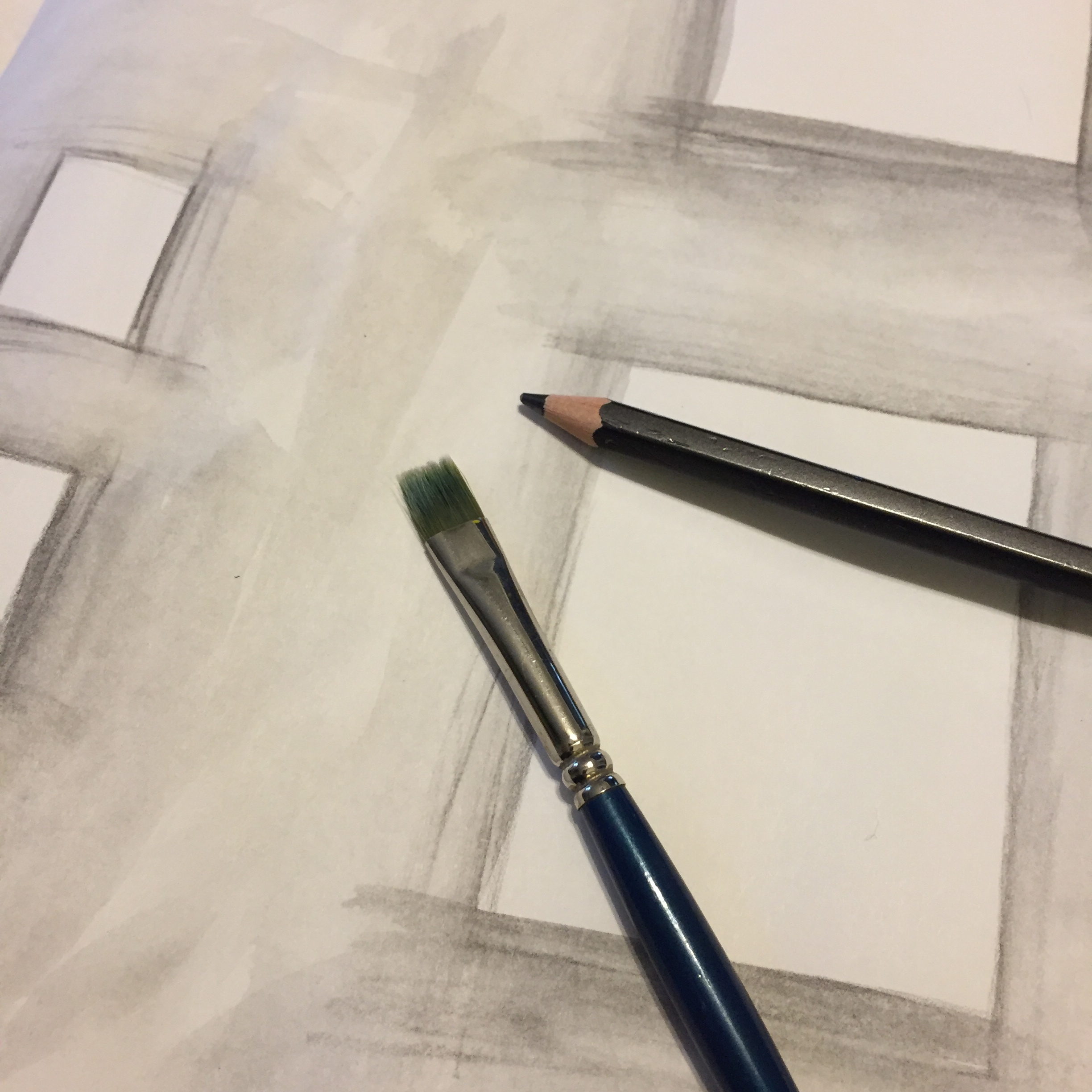
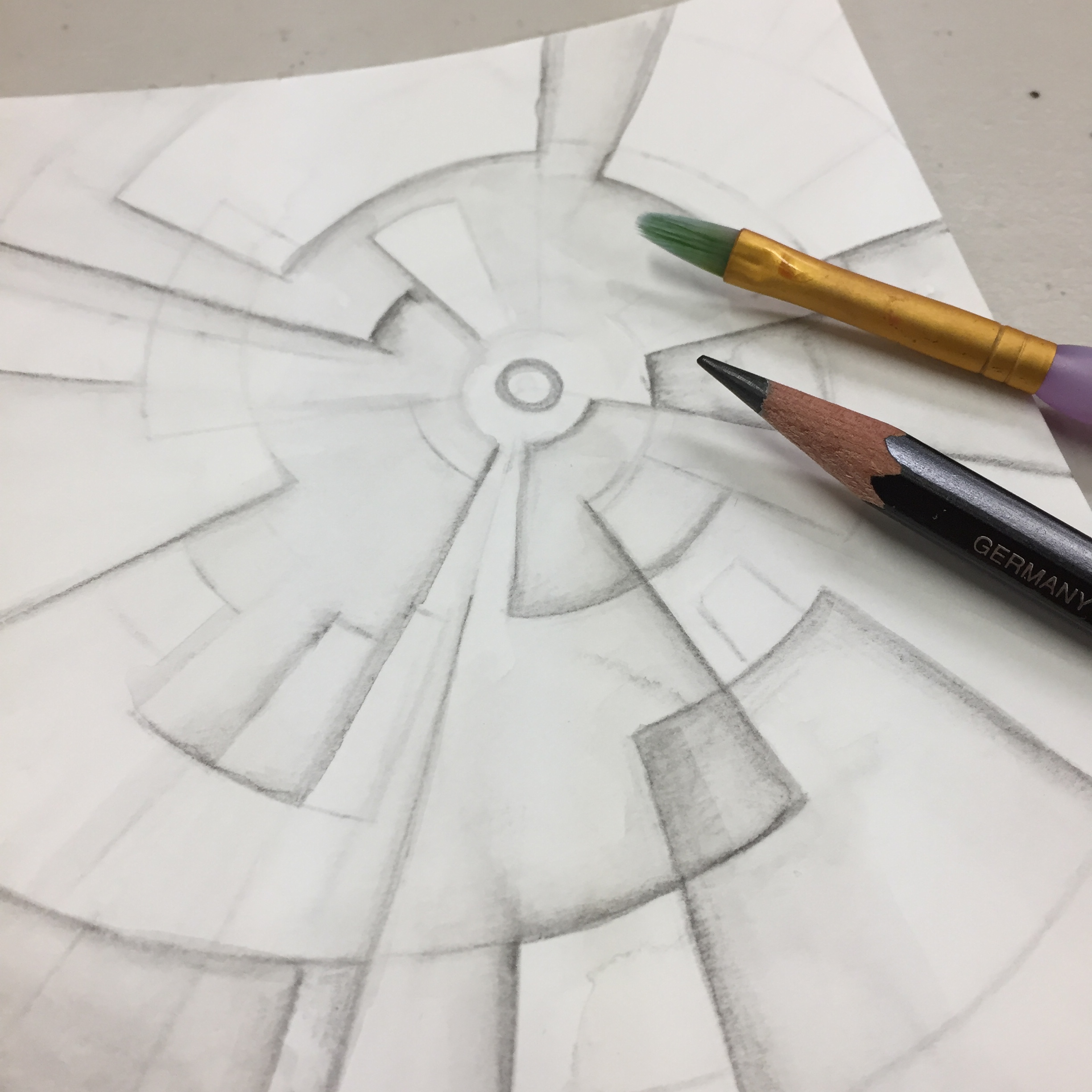
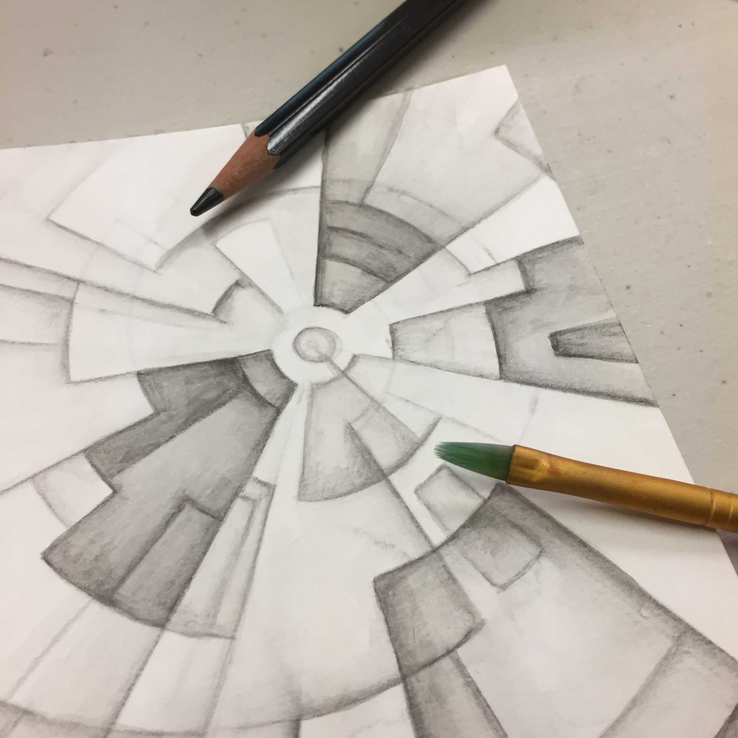
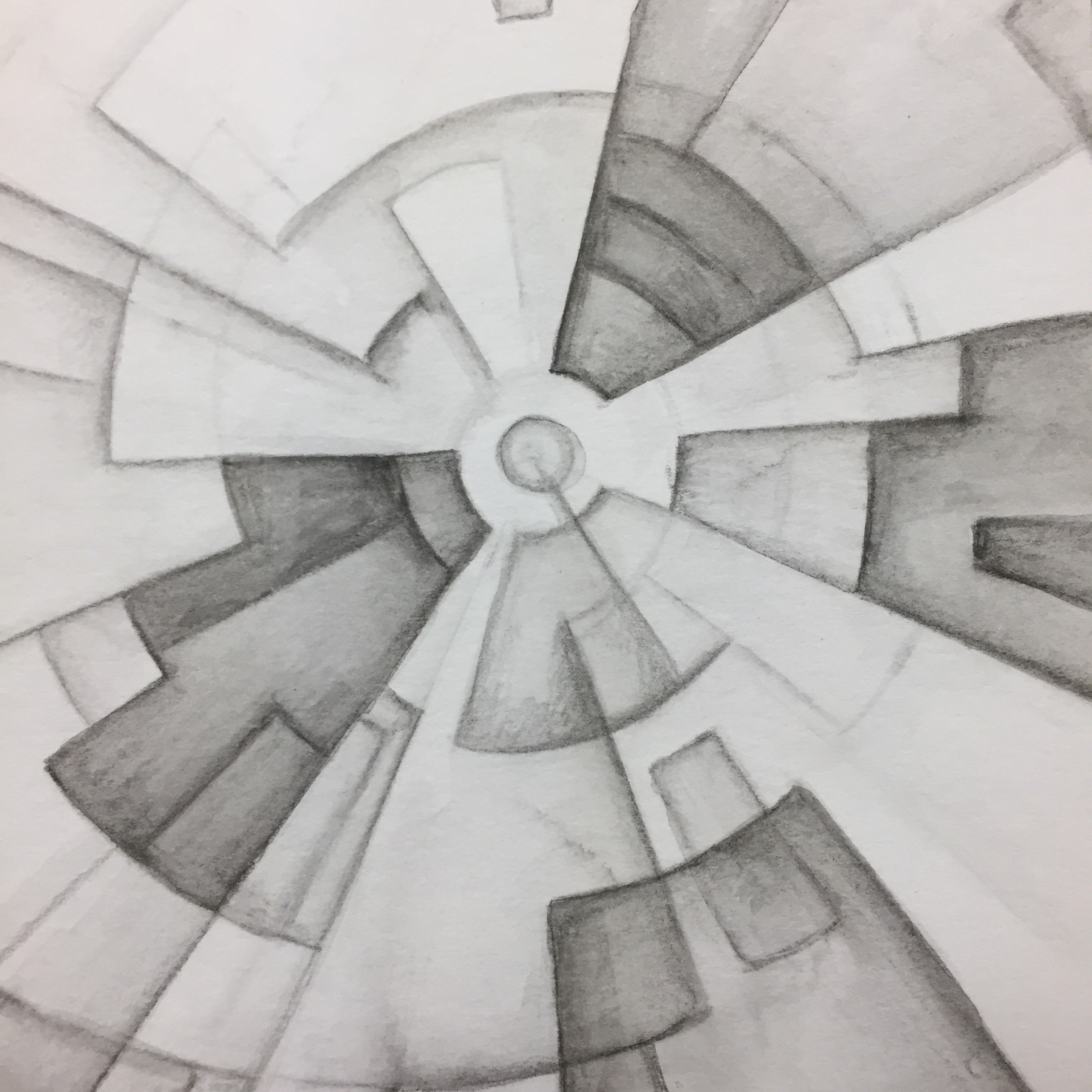
I must say that I am a big fan of water-soluble pencils, and I’ve already confessed my love of watercolor pencil here on the blog. So, it’s no wonder that I include water-soluble graphite as part of my artist’s tool bag. These pencils work very much like watercolor pencil, but the just do it with graphite instead of colored pigment. You can use them in a number of ways like watercolor pencils, but I mostly draw and shade with them first, and then brush water over the marks. The pencils give me a lot of control, but with a little water, I get a nice painterly effect.

IMG_4715.JPG

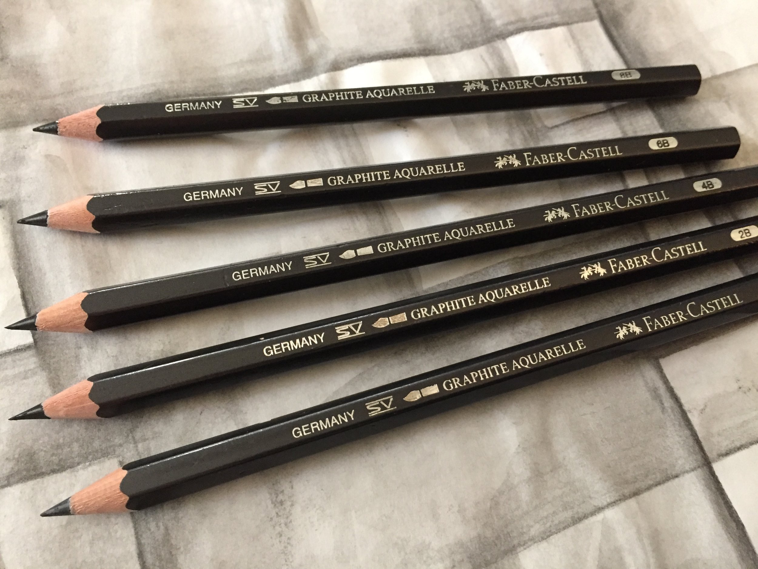
I’ve used many different brands of water-soluble pencils throughout the years, but I am currently using Faber-Castell’s Graphite Aquarelle Pencils. Faber-Castell is a maker of high quality pencils, colored pencils, pens, and markers, and the Graphite Aquarelles are no exception to this quality. They are a chunky pencil with a barrel that’s slightly larger than your average pencil allowing for a thicker graphite core. They blend beautifully with water, and come in five hardness grades — HB, 2B, 4B, 6B and 8B, allowing for a full range of value. Conveniently, you can get all five in a set, but if you were to get just one pencil, I’d recommend one of the darker pencils, either the 6B or 8B, since you can control the value by how hard you press.

Over the years, I’ve used water-soluble graphite in my journal and in stand alone mixed media work and  graphite drawings, and I’ve loved the effect in all instances. It’s easy to build up layers of graphite using all of the hardness grades, and this is one of my favorite ways to use them. I start with the lightest pencil — the HB, and establish a composition on mixed media paper painting over it with clean water. After it dries, I build up another layer with a darker pencil, and I continue with all the pencils to achieve dark, rich values. But the effect can be a little bit messy since painting over the graphite is never extremely precise, so I like to use regular graphite on top to make edges crisp and to even out values. The combination of water-soluble and regular graphite results in a rich piece. Of course, the Graphite Aquarelles work excellently in mixed media pieces as layers in with materials like pen, marker, and collage, and having the ability to spread and blend the graphite can lead to interesting effects. You can also combine the pencils with other materials, and the darker pencils are great to use with acrylic paint or medium as they will mix and blend with the wet acrylic.

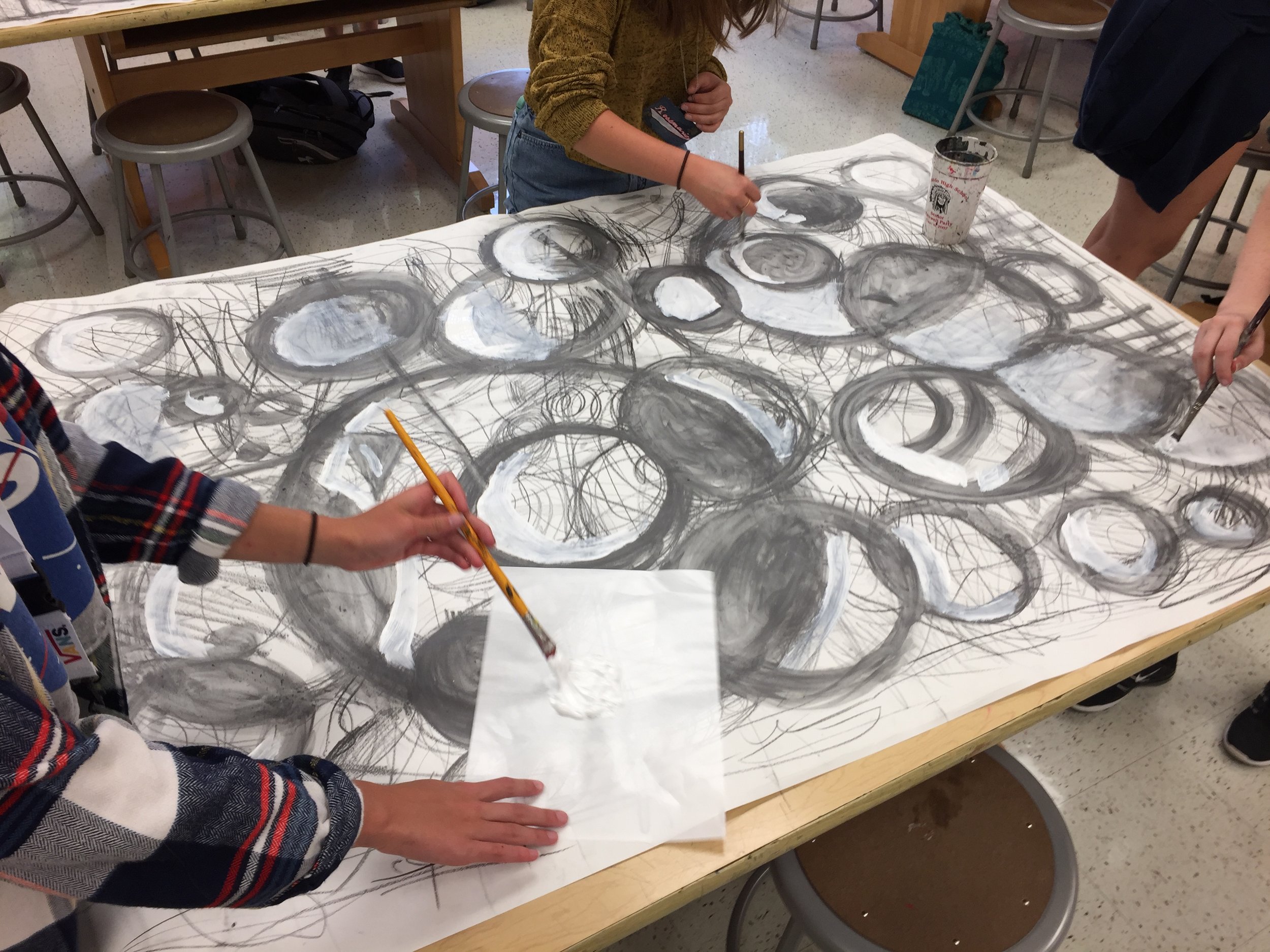
Students experimenting with water-soluble graphite and white acrylic paint.

Overall, the Faber-Castell Aquarelle pencils are a versatile medium to use on it’s own or with other materials, and the selection of five hardness grades gives an advantage to Faber-Castell over some other brands that offer just one grade. The only downside that I can see is that by themselves, the pencils can be rather messy when brushing over them with water, but using them with regular graphite or other materials easily makes up for it. I never go anywhere without at least one tucked in my bag.

Please remember that I do not receive payment or any other benefits from the makers and manufactures of the materials that I share on Materials Mondays. These are materials that I personally use and enjoy!

Journal Friday #92

 
IMG_4769.JPG
 

As I’ve mentioned before on this blog, my normal mode of working in the journal is one of small artistic acts, and for the first part of today that’s exactly what I did. I worked on one simple act — collage, and I spent some time gluing in a bit of fodder. I accumulate a lot of random things in my day-to-day life, and I sat down today and glued some of it into my book. Collage is great way to document life by including bits and pieces of everyday life, and it’s a perfect way to start new pages or to add to other pages.


I also spent part of the day making another time-lapse video. These videos are a lot of fun to do, and I’m looking forward to making more!

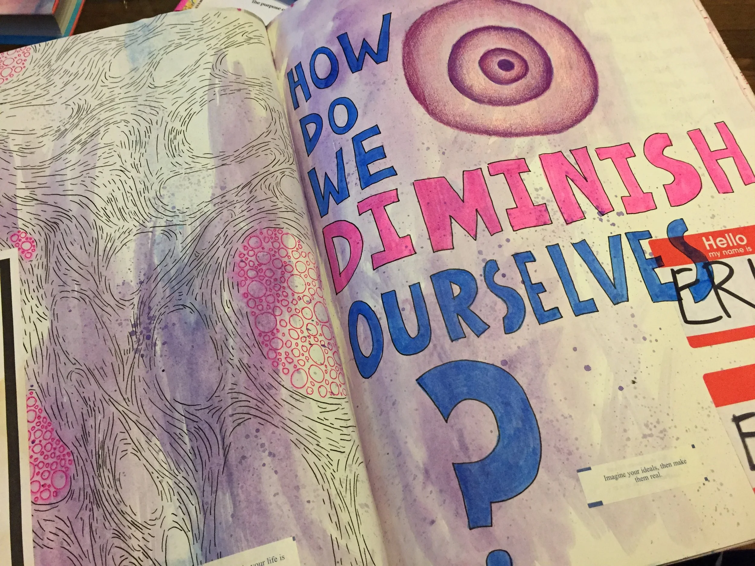
Thinking Thursday: Diminishing Ourselves

 
IMG_4764.JPG
 

For years and years, I have taught a variety of hands-on workshops at a wide range of venues, and during that time, I’ve heard iterations of the same type of comment over and over. Now I belong to a few mixed media and journal groups on social media, and I’m consistently seeing variations of this same kind of comment. I feel like I want to take a little bit of time to ponder it and address it.

Over and over again, I’ve heard one person or another or I’ve read one comment or another that all start out in a similar vein. “Well, I’m not really in artist.” “I’m just a beginner.” “I don’t really know what I’m doing.” “I’m not talented like others.” These statements and others are usually said right before sharing their work or introducing themselves or offering a comment, and I just can’t help wondering why we feel the need to qualify our art, our words, and ourselves with these statements. What has made us so ready to diminish ourselves and the things that we do? We seem so willing to disqualify ourselves as if we don’t really belong in the conversation. Is it simply fear and doubt? Are we just conditioned to dim our own light? Why are we afraid to shine?

This isn’t something new, and I’ve pondered these ideas in the past in my journal and on the blog, but it’s something that is consistent — something that so many people struggle with and seem to utter at one point or another. Even folks that you think really wouldn’t feel that way, can feel exactly that way, and I just can’t help wondering why we make ourselves small — why we dim our own light. And I wonder what if we turned the narrative around, and spoke our truth with light and confidence. What if we stood tall, and allowed our personal truth to shine out of every inch of our bodies?

Life isn’t a competition, and art isn’t a race. It isn’t about who has more or who is better or worse, but we make it that way. We want to compare ourselves with others, and we seem to want to bury our faces and hide. What if we simply shared ourselves openly without qualifiers — without tearing ourselves down — without dimming our truth? In a way we set ourselves up for failure from the start. By qualifying the work that we do or the comments that we make with these statements, we set the bar low and brace ourselves against what is to come. Are we afraid that people will confront us? Are we afraid to be called out and ridiculed? Or is it just a matter of the Imposter Syndrome where we simply feel that we’re playing at making art and not really creating?

I know a lot of it has to do with confidence and self perception, and it might be boiled down to how we were raised and how we were praised. But why do we beat ourselves up over our creative endeavors? Why do we not claim this part of ourselves wholeheartedly and stand proud? Why does it seem shameful to share such an important part of ourselves?

So, I’d love to see more people claim their truth and question these ideas and beliefs. If you say that you’re not an artists, then what is an artist? If you’re a beginner, why do you feel like you need to qualify yourself with that. Why does making you a beginner make what you have to share, say, or ask any less valid than others? If you feel like you have no talent, do you really believe that talent has anything to do with speaking your truth? If you feel like someone else is better, how does that diminish what you have to say

It’s a lot of questions, because I don’t have an answer, I’m just asking folks to stop diminishing themselves and making themselves small.

Stand tall, and let your personal truth shine!

Creative Prayer Book: Getting Started with Watercolor

 
IMG_4748.JPG
 

Welcome to the first lesson in the Creative Prayer Book. In this lesson, I’m using watercolor paint, but feel free to use whatever material you wish. My main objective is to simply engage the blank pages of my book and get backgrounds started on some of my pages using the watercolor paint. I want to get a good number of pages started, so I’m jumping around in my book and not worrying about trying to make finished or completed pages yet. I’m not even worrying about the prayers or quotes that I will eventually use. I just want to get started working in the book.

Depending on the number of pages your book has, you might engage all of your pages or you might focus on a certain number of pages. It also depends on how much time you have, but even if you only have 15 or 20 minutes you can get started on quite a few pages.


In the video, I only show a few techniques, but I am concentrating on trying to allow colors and techniques to flow from one page to another so that one page ties into the next. I can do this by using similar colors, lines, and shapes or by simply continuing what I did on one page onto the next. Use any techniques that you like, but below are a few to try that I show in the video.

Wash - A wash of watercolor paint is a light thin layer of paint. By keeping the color light at this point, it makes it easier to build layers later. It might be difficult to deal with dark colors later on as I draw, paint, and write to develop the pages further.

Blends and Bleeds - Two wet colors of watercolor will bleed together when they touch, allowing you to blend colors together to create gradients. This allows you to add some variety of color to your pages.

Splattering - By flicking the bristles with your finger, you can create tiny splatters of paint. This is perfect for adding a bit of texture to blank pages or to pages you’ve already started.

Found Stencils - Items like plastic mesh make great stencils for adding textures and shapes to your pages. By painting through the openings you can add subtle patterns, but with thicker items, you might have to use a stiff brush and tap the paint through the openings.

Layering - Don’t be afraid to go back and add color, brush marks, lines, and textures on top of pages that are already dry. You can create visually interesting backgrounds that way.

If you you’re interested in other techniques, try using plastic wrap, salt, rubbing alcohol, sponges, or string with the paint. Just experiment and have some fun with the paint as you create backgrounds, and don’t worry about being neat or tidy. Don’t worry about filling the page completely, and work on as many or as few pages as you wish. Just keep the colors on the light side so that you can layer and add in future lessons.

Next week, I’ll focus on adding collage and a little drawing to these pages and to blank pages as well.

Happy creating!

Materials Monday: Strathmore Hardbound Sketch Journal

 
IMG_4761.jpg
 

Probably, the question that I get asked the most is “What kind of book do you use?”

If you keep a sketchbook, art journal, or visual journal, you might be very picky about the book that you use, and choosing a book can be a very personal choice. I know that I am rather particular about the books that I use. Some artists prefer to make their own, controlling every aspect from how big it is to the type of paper used, and others use any book that they have on hand. But for me, I like to use a manufactured book that I can buy at the store or online. I like the consistency, and I like being able to simply grab a new book when I’m ready to start a new one. I admire those who hand-make their books, but it’s just not for me.

For years I used hardbound Cachet Classic Sketchbooks, but at some point I noticed a change in the quality. Where materials barely bled through in my older journals, I noticed that ink and watercolor would bleed through some of the newer ones, so I switched to the Strathmore Hardbound Drawing Journal. It had a thicker drawing paper, and I used these books for a few years. But over time it has gotten more difficult to get them, and my favorite retailers don’t seem to carry them.

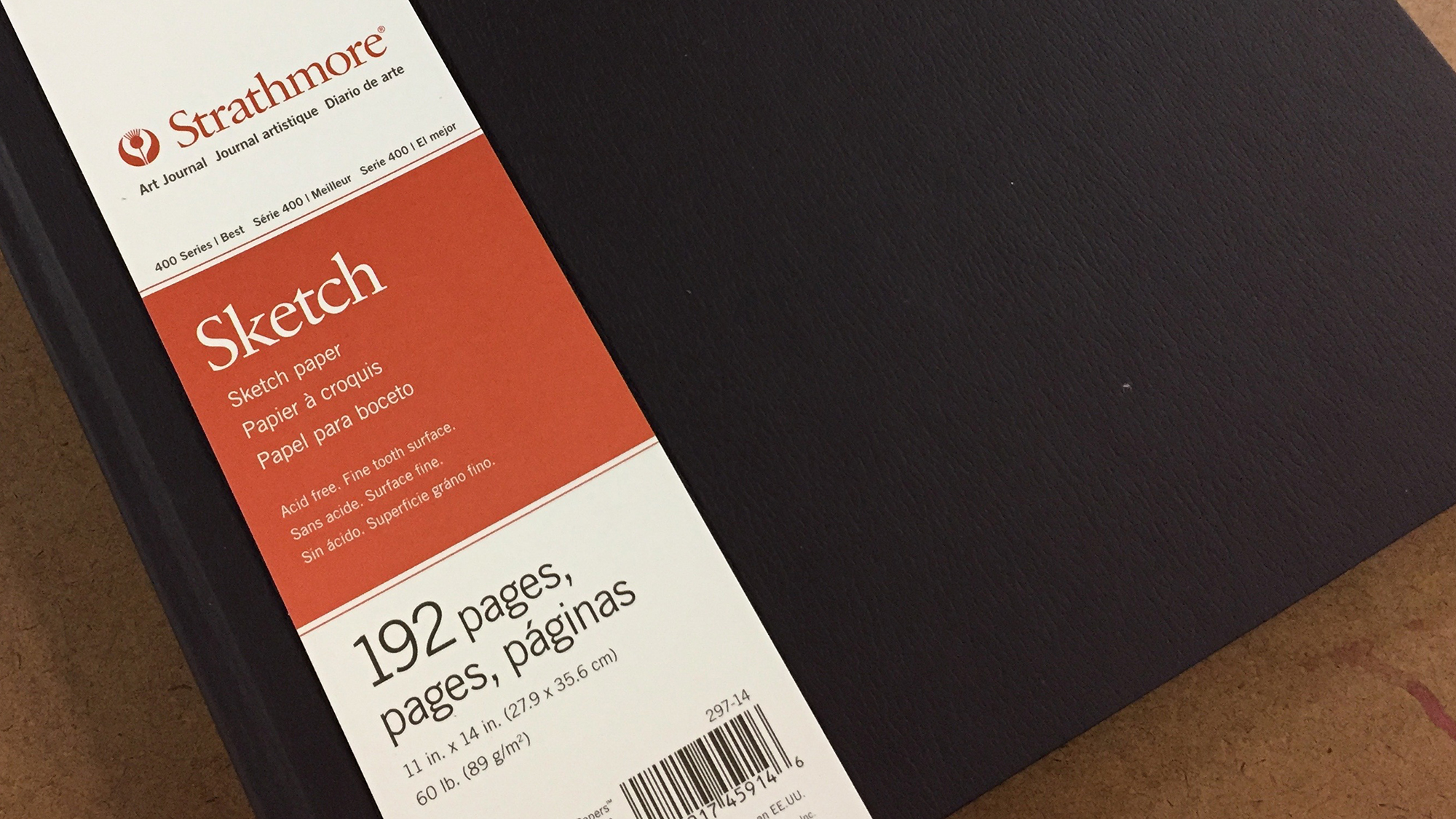
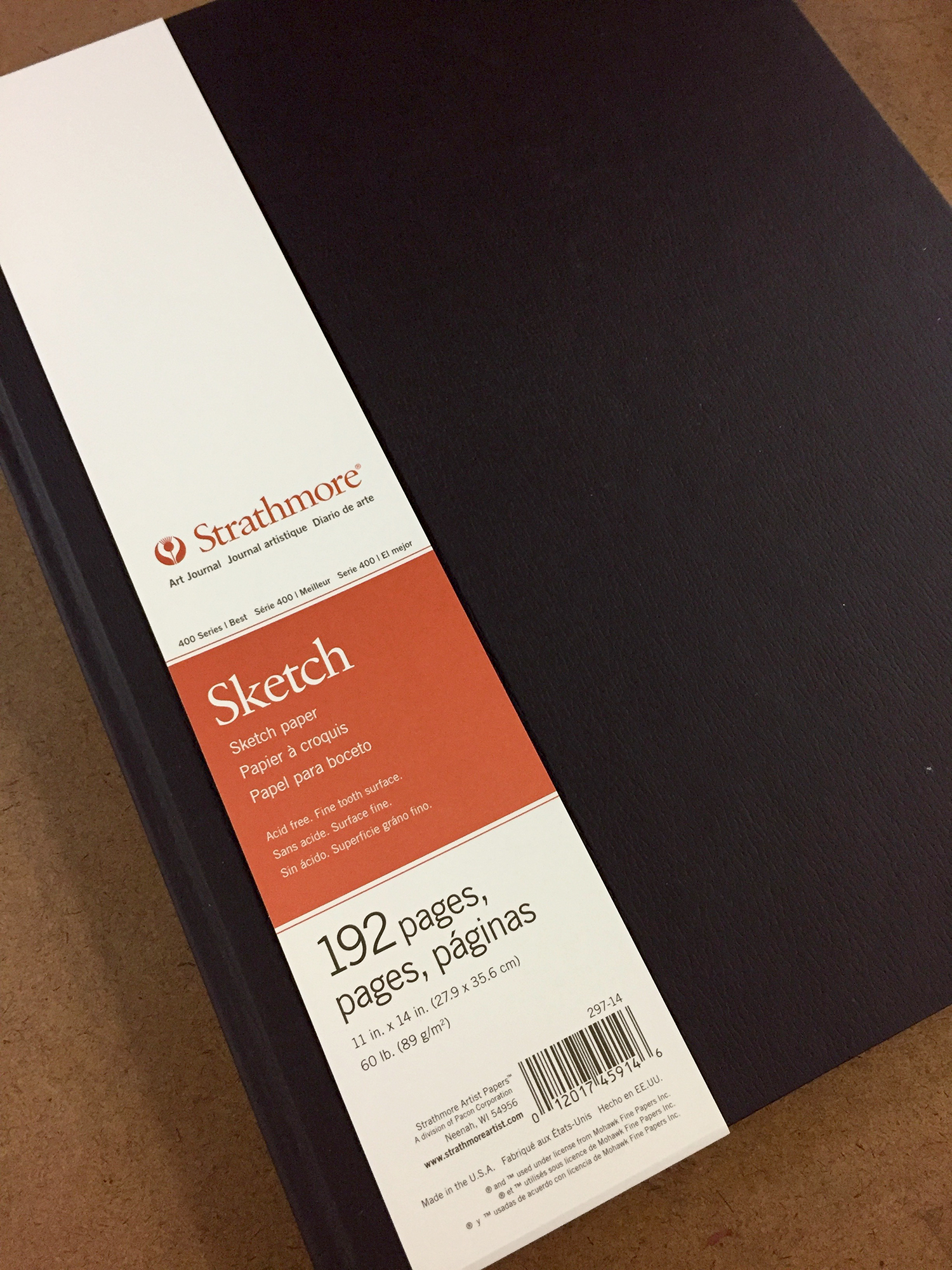
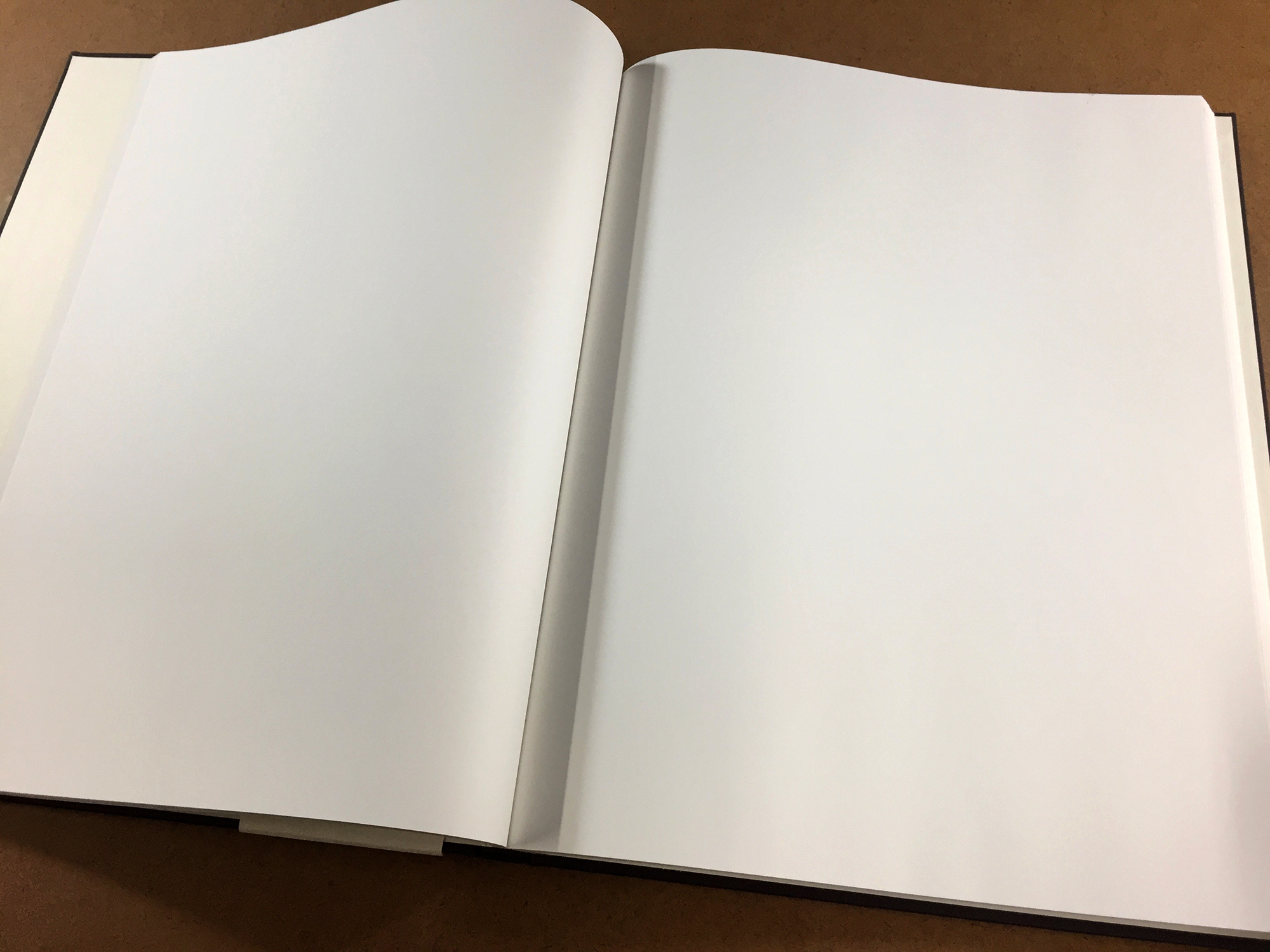
So for my current journal, I’m using a Strathmore Hardbound Sketch Journal, and it is been serving me well over the past year. This book contains 192 pages of 60 lbs. (89 gms) heavyweight sketch paper, and though it’s intended for dry media, it holds up well to my mixed media approach with minimal bleed through. I’ve almost filled it, and I have another one waiting in the wings. Unfortunately, it’s getting more difficult to find these at retailers as well, but luckily, I have a stash of them to use over the next couple of years.

I chose the Strathmore Hardbound Sketch Journal for several reasons. First, it’s one of the few hardbound books that comes in an 11 inch by 14 inch size. I’m not a fan of spiral bound books, since I like to create a lot of two-page spreads and a spiral just gets in the way. I also, really enjoy the larger format, and many manufactures make books no bigger than 8.5 x 11 inches. The bigger book challenges this standard size that we’re so use to, and it allows for more expansive opportunities when adding to the pages. There’s just more room to explore. Second it has 192 pages. I really liked the Strathmore Drawing Journal, but it only had 96 pages because of the heavier paper. It’s nice to have a book with lots of pages. Finally, the sketch journal has good quality paper. It’s part of Strathmore’s 400 series which they call their best. Yes, it’s on the thin side and meant for dry materials, but there’s not a whole lot of bleed through, even with watercolor and ink. There can be some, but I accept it as part of the process and a trade off for having the number of pages that I want.

The thin paper is the only drawback that I see. Some artists can’t stand even the slightest bleed through, and colors coming through from the other side of the page can drive them crazy. Also, there is a lot of buckling with the paper when using watercolor or water-soluble materials. Again, that can drive some folks nuts because they want the paper to stay flat and unaffected by water. Like I said before, I accept these things as part of the process, and it doesn’t bother me. Besides, the pages flatten out pretty well when the book is closed.

All in all, I am very pleased with the Strathmore Hardbound Sketch Journal, and it’s comparable in price to other hardbound sketchbooks. If you can find it, it’s a great book to work in as you journal.

Journal Friday #91: Journal Stripped Bare Time-Lapse

 
Journal Time Lapse.jpg
 

For today’s Journal Friday, I worked on a two-page spread and shot a time-lapse video. I limited the materials to collage — craft paper and photocopies, water-soluble graphite, ink, metallic marker, and tape transfer. I’m exploring ideas for a new upcoming, online workshop, The Journal Stripped Bare. I think that it’s too easy to get bogged down with a bunch of materials and complicated techniques, so I’m looking to create a workshop that focuses on some basic supplies, but delves into making layered and meaningful pages. In the meantime, I hope that you enjoy the video.


Thinking Thursday: Dealing with Disappointment

IMG_4676.JPG

Although I have several major projects going on, the New Year has started out with a major disappointment — one that hit me pretty hard. I haven’t said anything until now, but a class that I was scheduled to teach at the renown John C. Campbell Folk School next week has been cancelled due to low registration. The class just didn’t get enough sign ups to run.

I was super excited a year ago when I got the class accepted, and has been a dream of mine to teach there. Over the past few months, I started to really look forward to the trek down to western North Carolina and spending five days diving deep into some sacred work. It was a bit of a let down to receive the news, especially since I had two other workshops cancelled last spring for the same reason at other venues. It was definitely a bit of a blow, and it left me kind of questioning and second guessing myself as I wondered if I was on the right path.

But I’m trying to see the silver lining — trying to turn the negative into a positive. When the classes were cancelled back in the spring, it allowed me to focus more on getting my studio and artwork ready for a big studio tour that I was a part of. It gave me added time to make the stour tour a big success, and I’m trying to see this latest disappointment in a similar light — as an opportunity to focus my energy elsewhere. I think the universe is trying to tell me that it’s not the right time, and that there’s something else, perhaps something bigger, that I need to do right now.

In many ways, I think that I just haven’t connected with people. I’ve always been a very socially awkward in person, and I think I’m doubly so online. But for the past month or so, I’ve been making a concerted effort to reach out and to connect in a variety of ways, and I think that’s where my energies need to go. I’m looking at this disappointment as an opportunity to reassess what I want and what I need, and to offer up more of myself and to connect in much deeper ways.

So, a big thank you to anyone who has been a longtime supporter — who has been around since the beginning of this journey, and a big thank you to anyone who I have connected with recently. I feel a sense of growing support — of a growing community. I feel the tide shifting. To use a term from my dear friend Erin Keane, I see a sea change coming!

Here’s to finding the positive, shifting energies, listening to the universe, and creating a sea change!