Creative Prayer Book: Drawn Text

 
IMG_4939.JPG
 

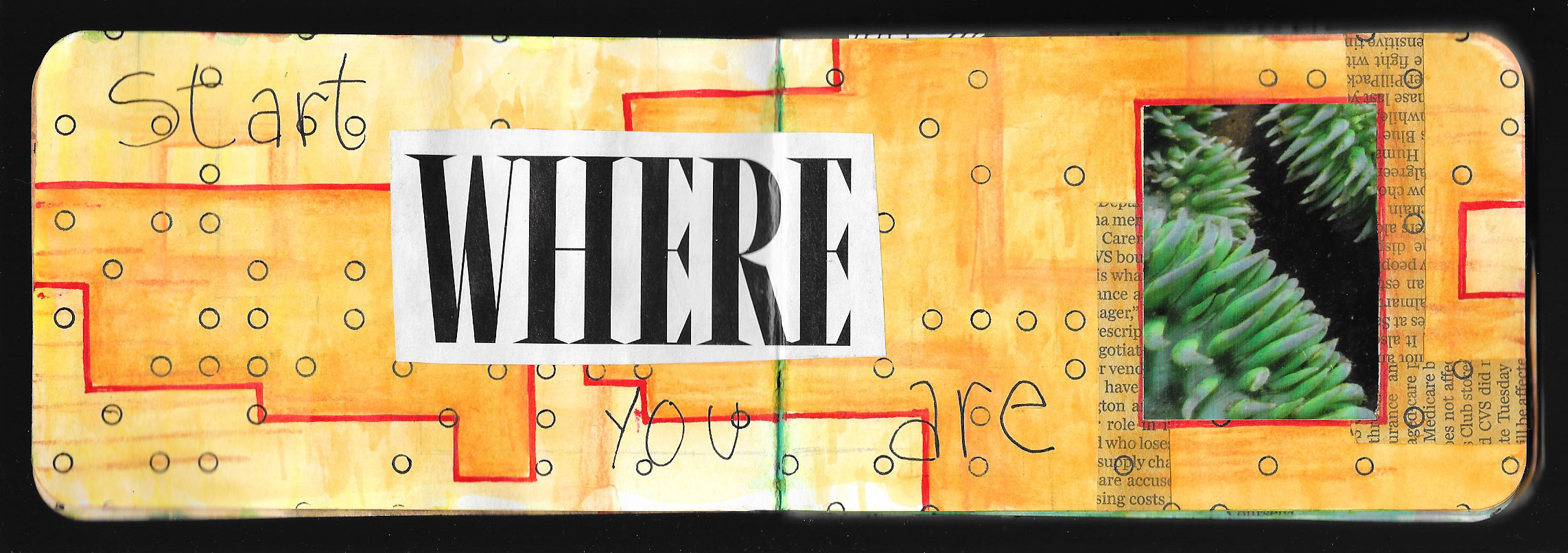
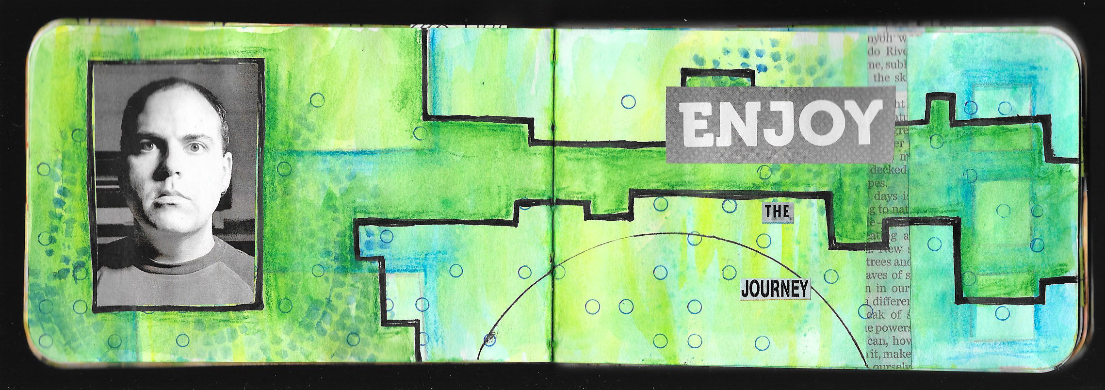
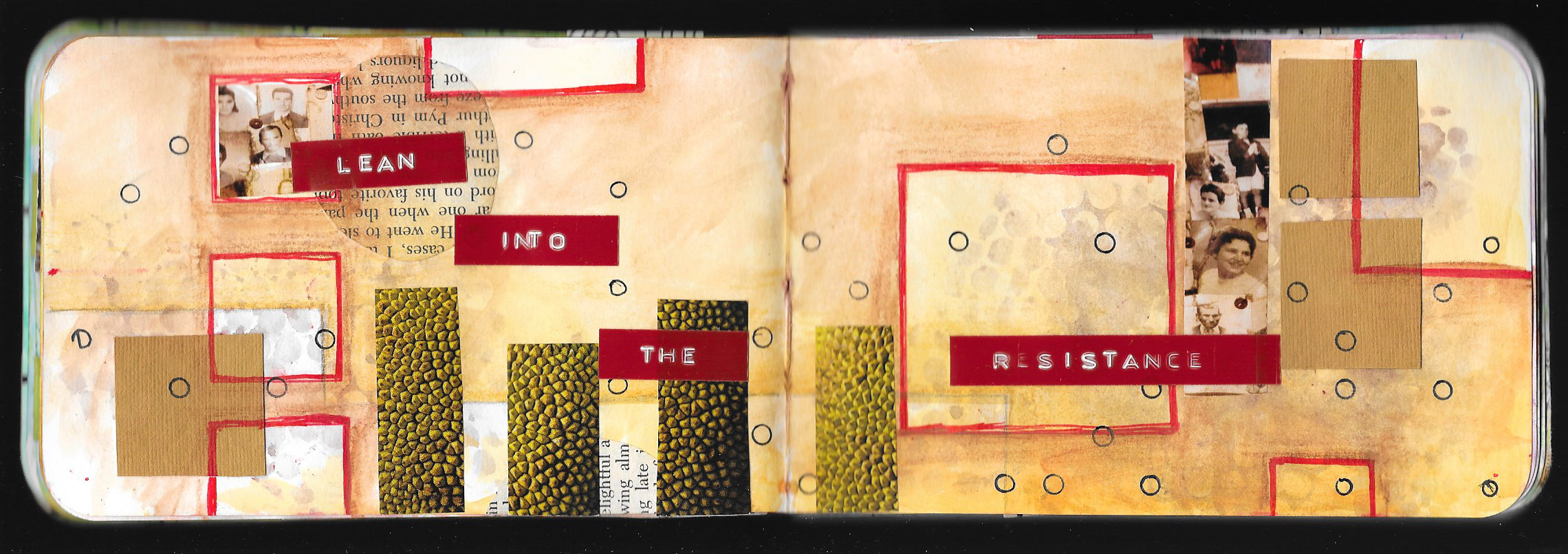
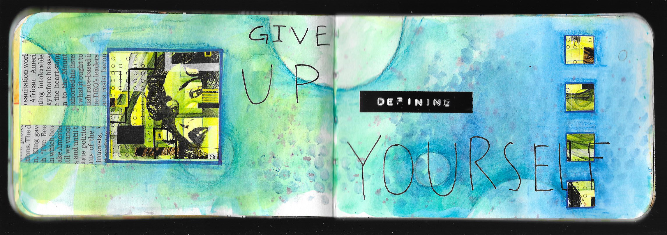
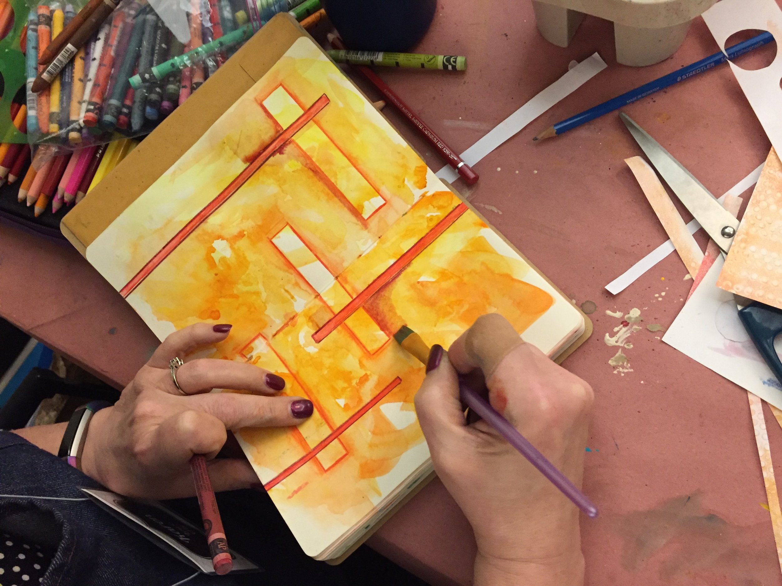
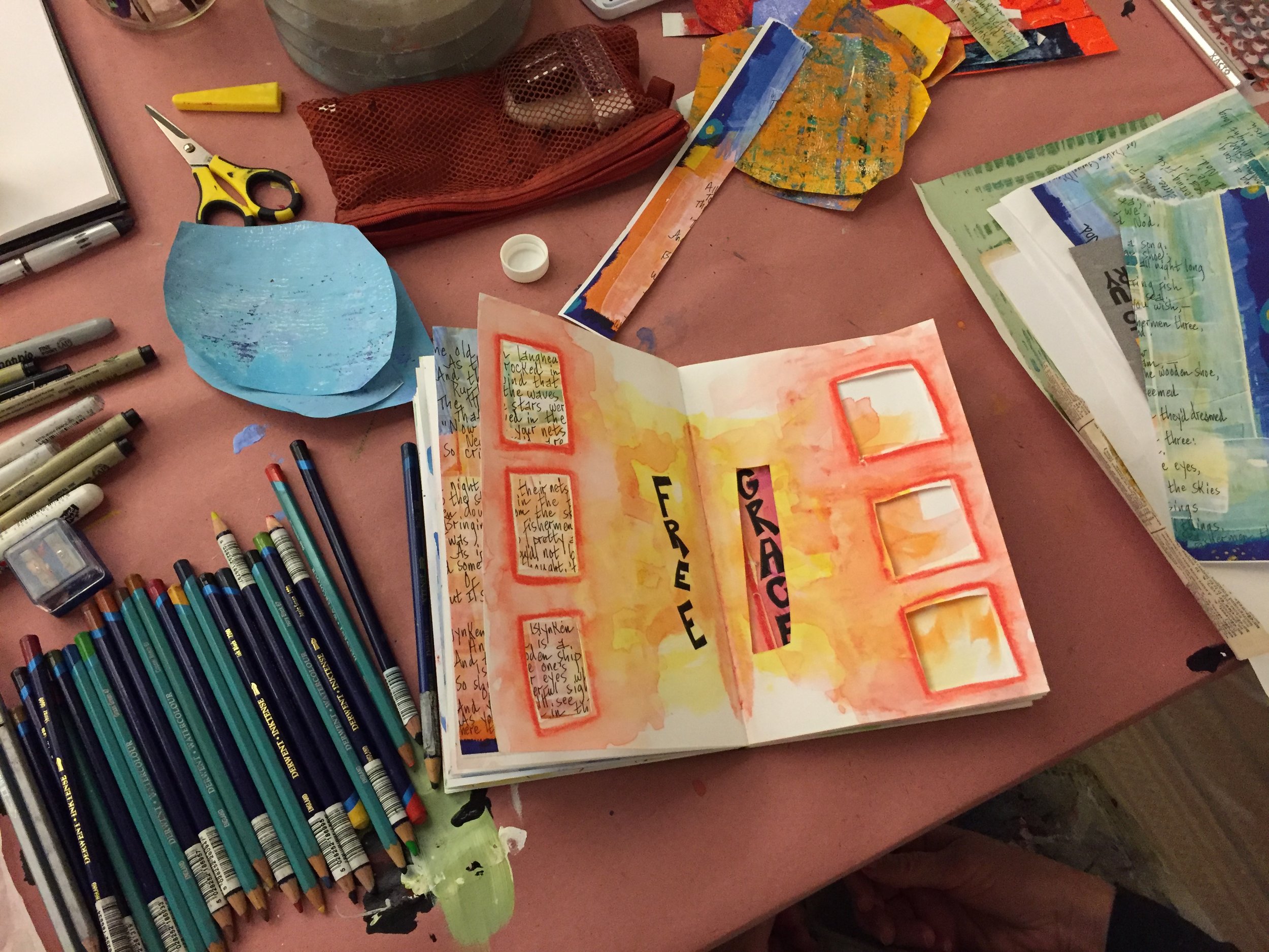
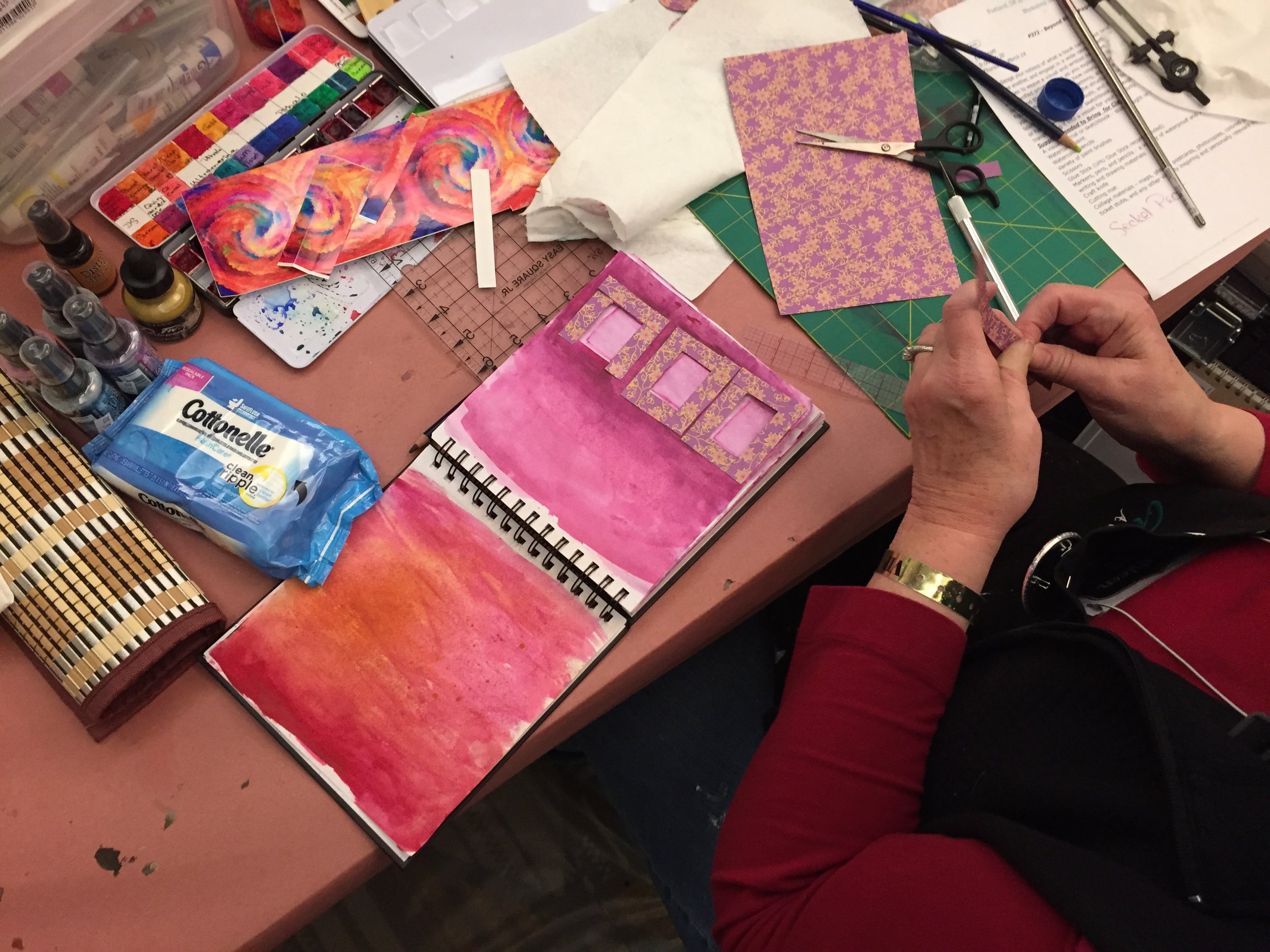
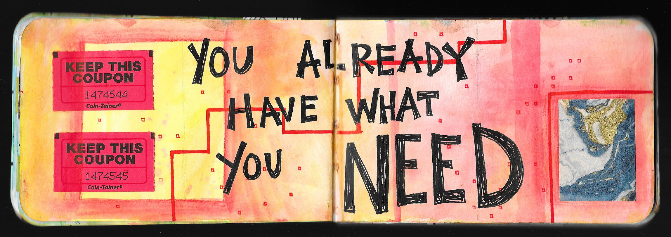
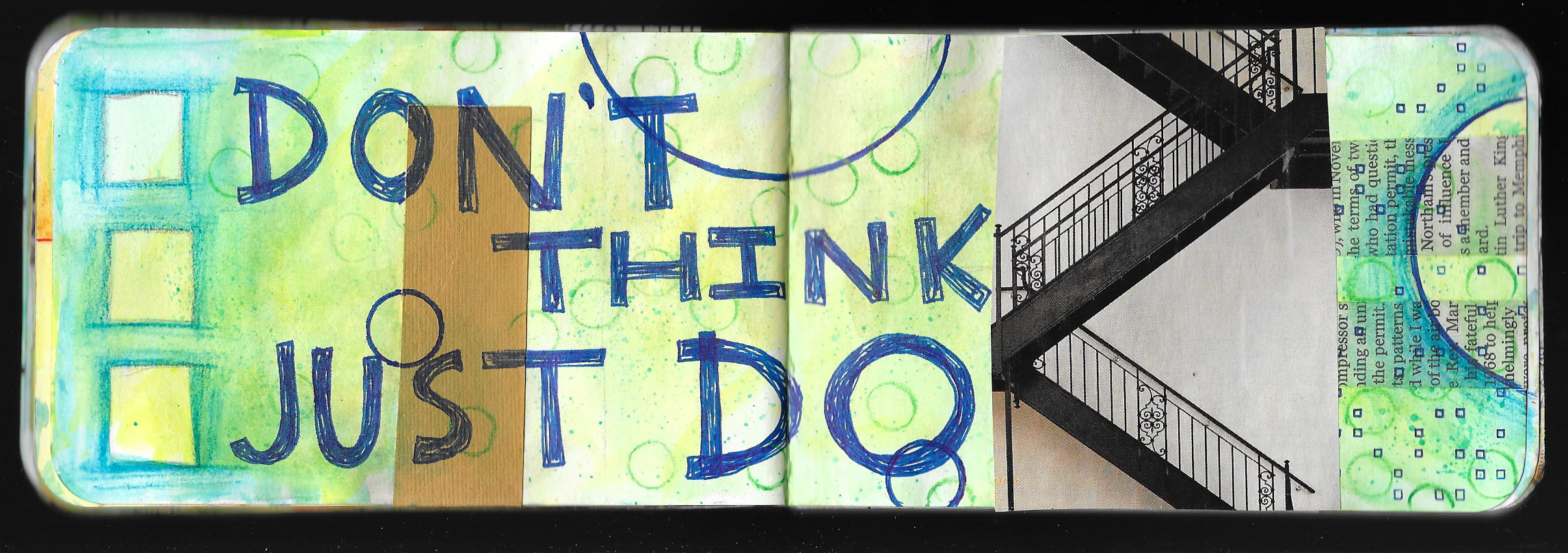
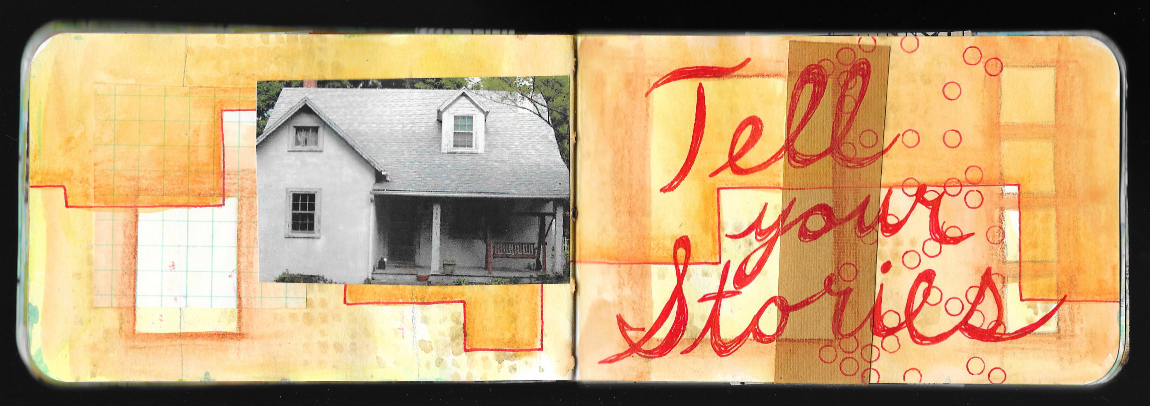
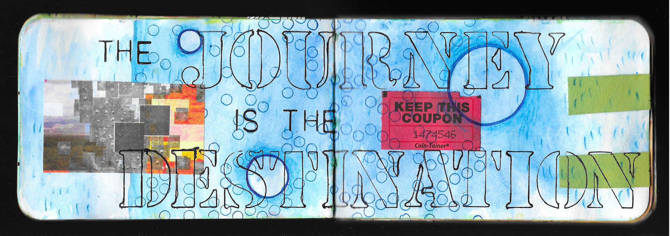
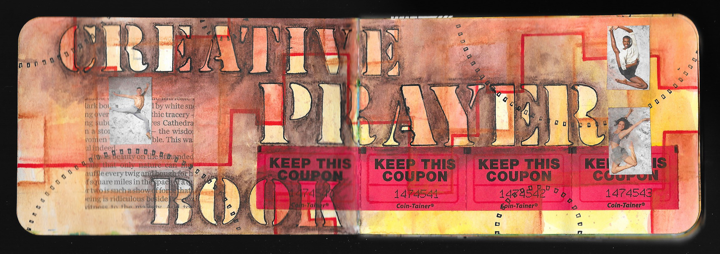
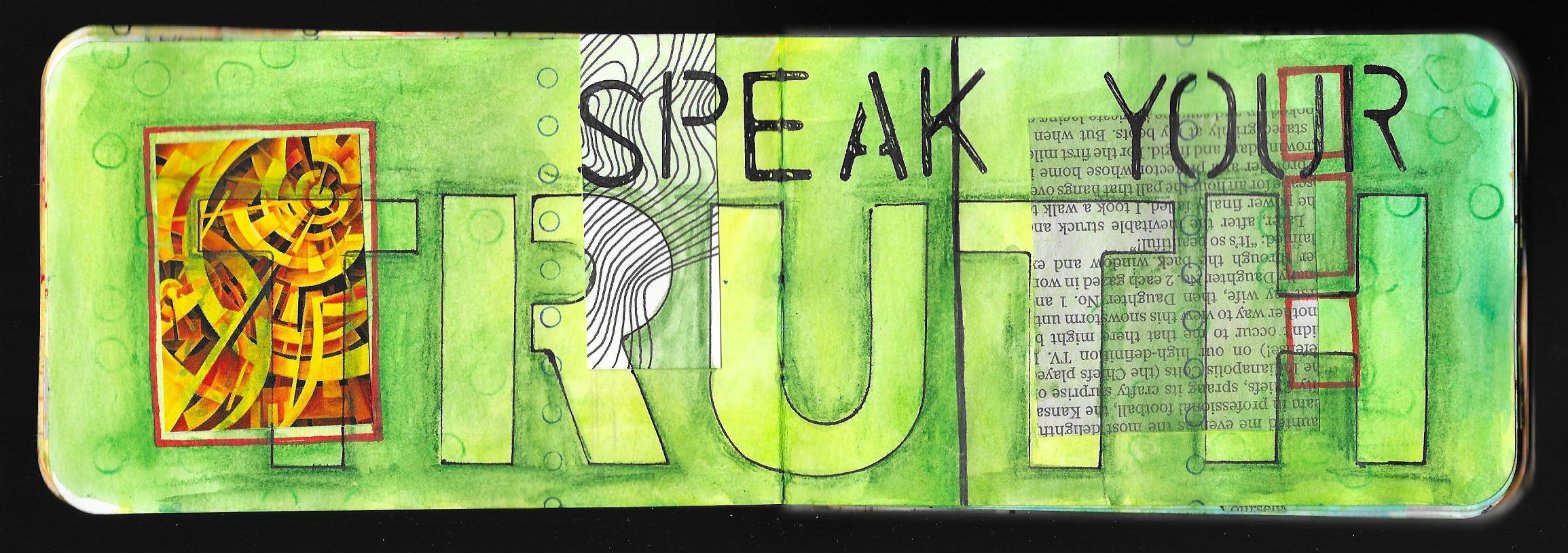
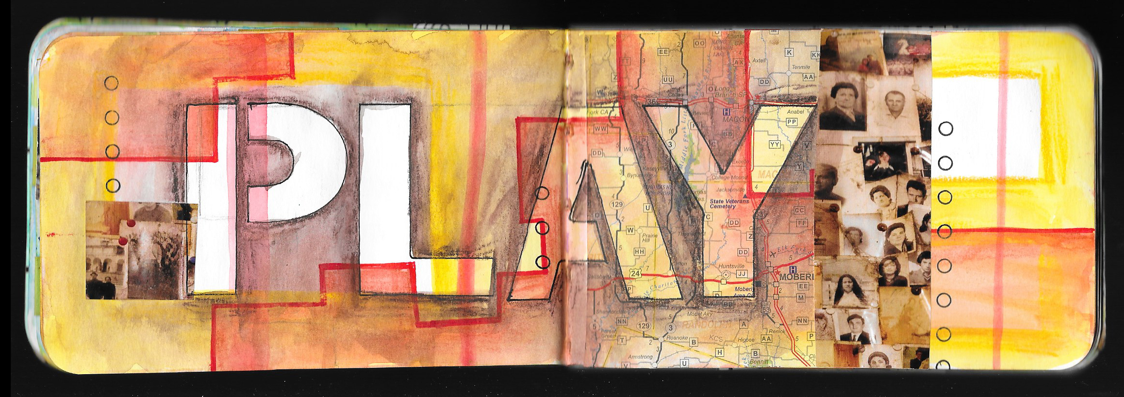
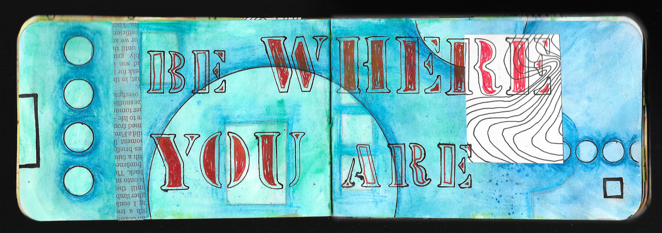
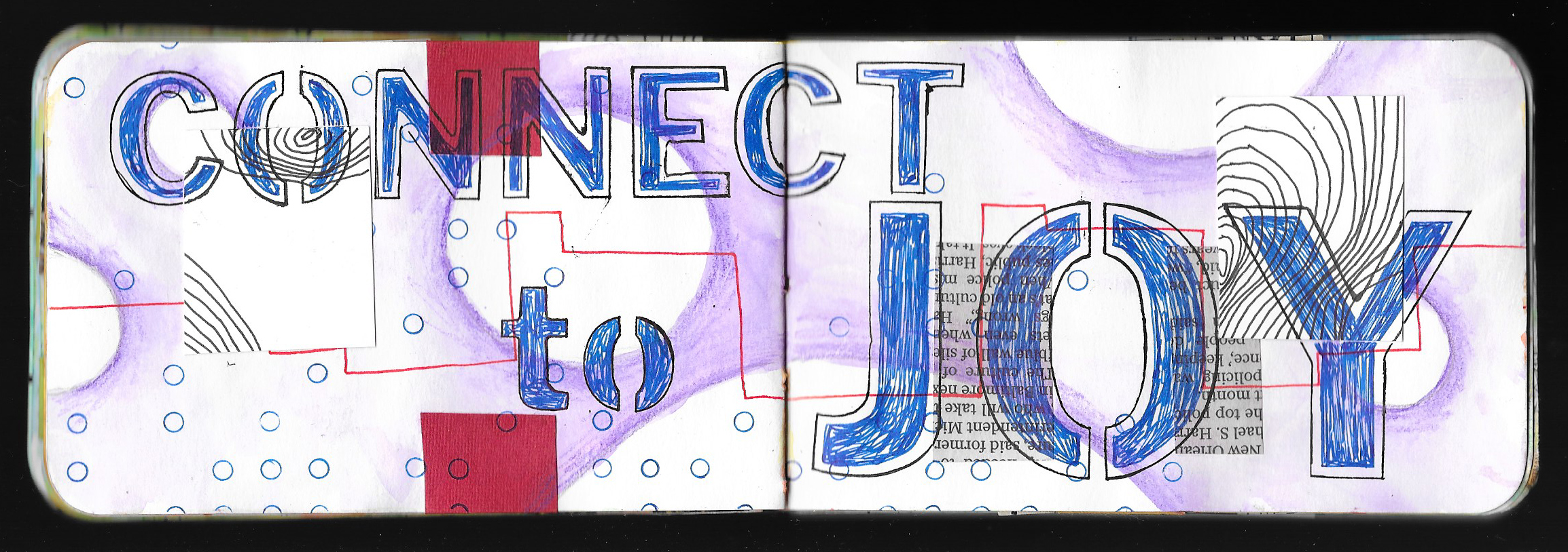
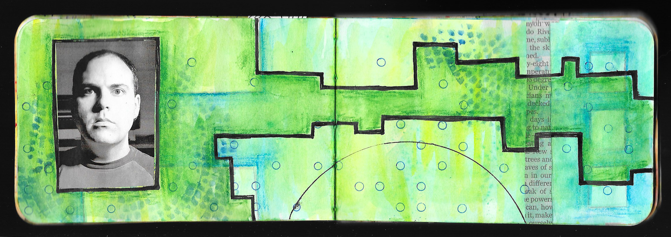
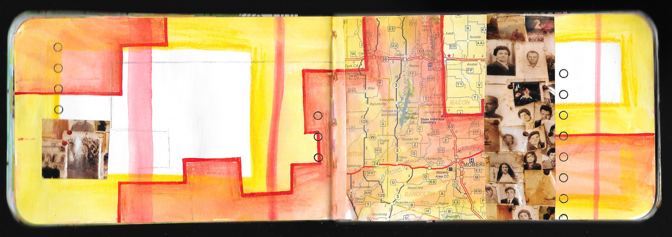
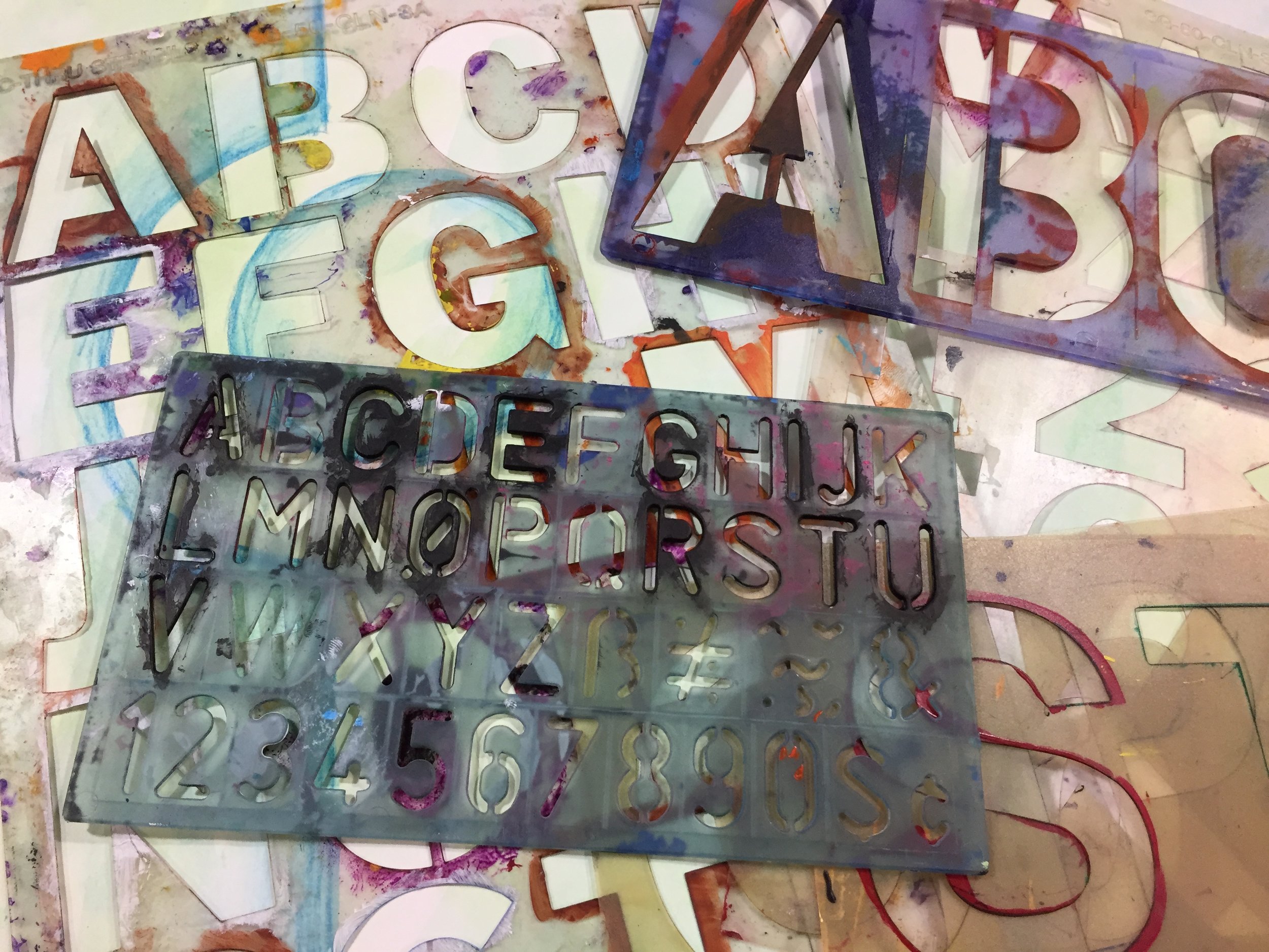
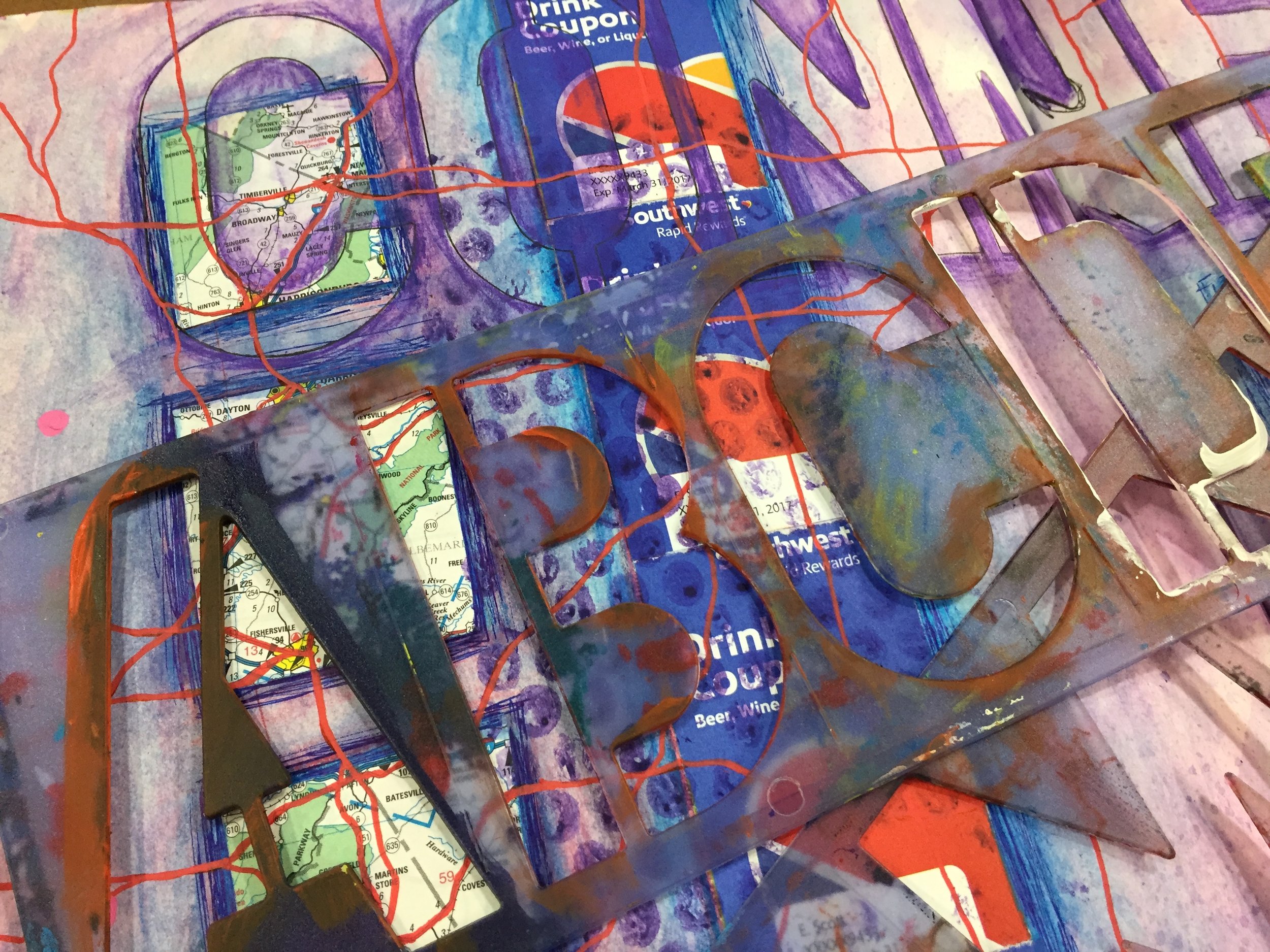
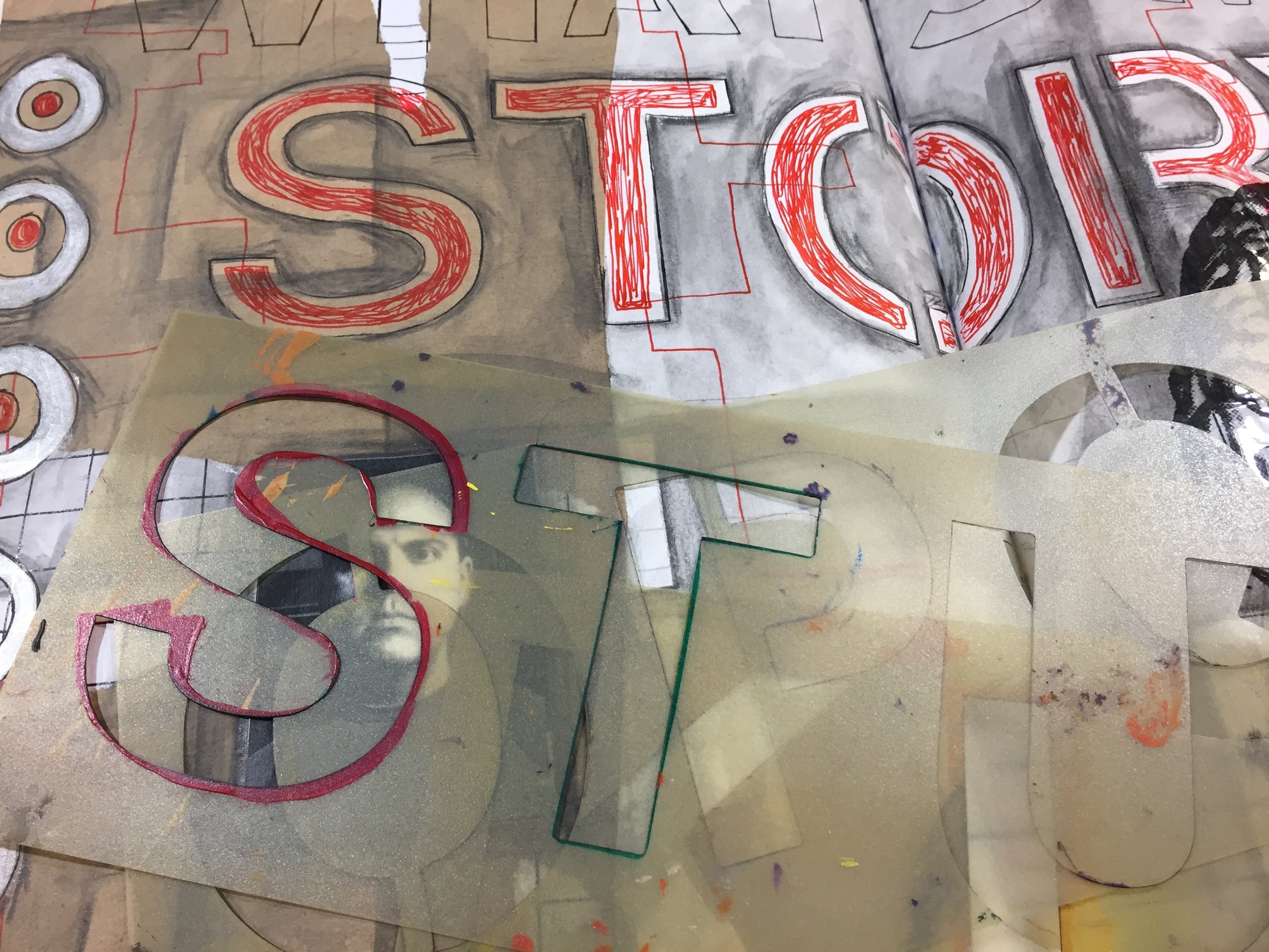
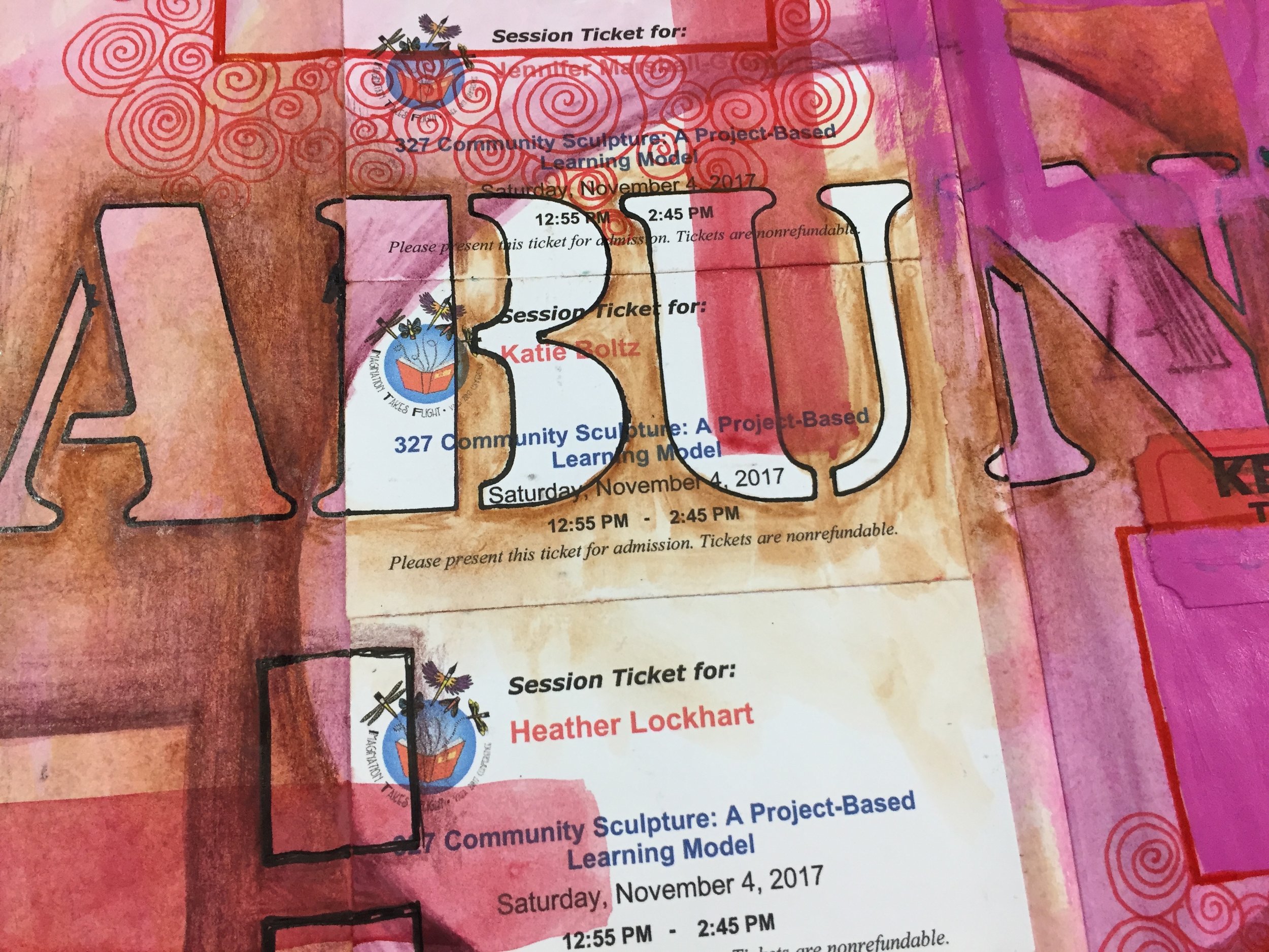
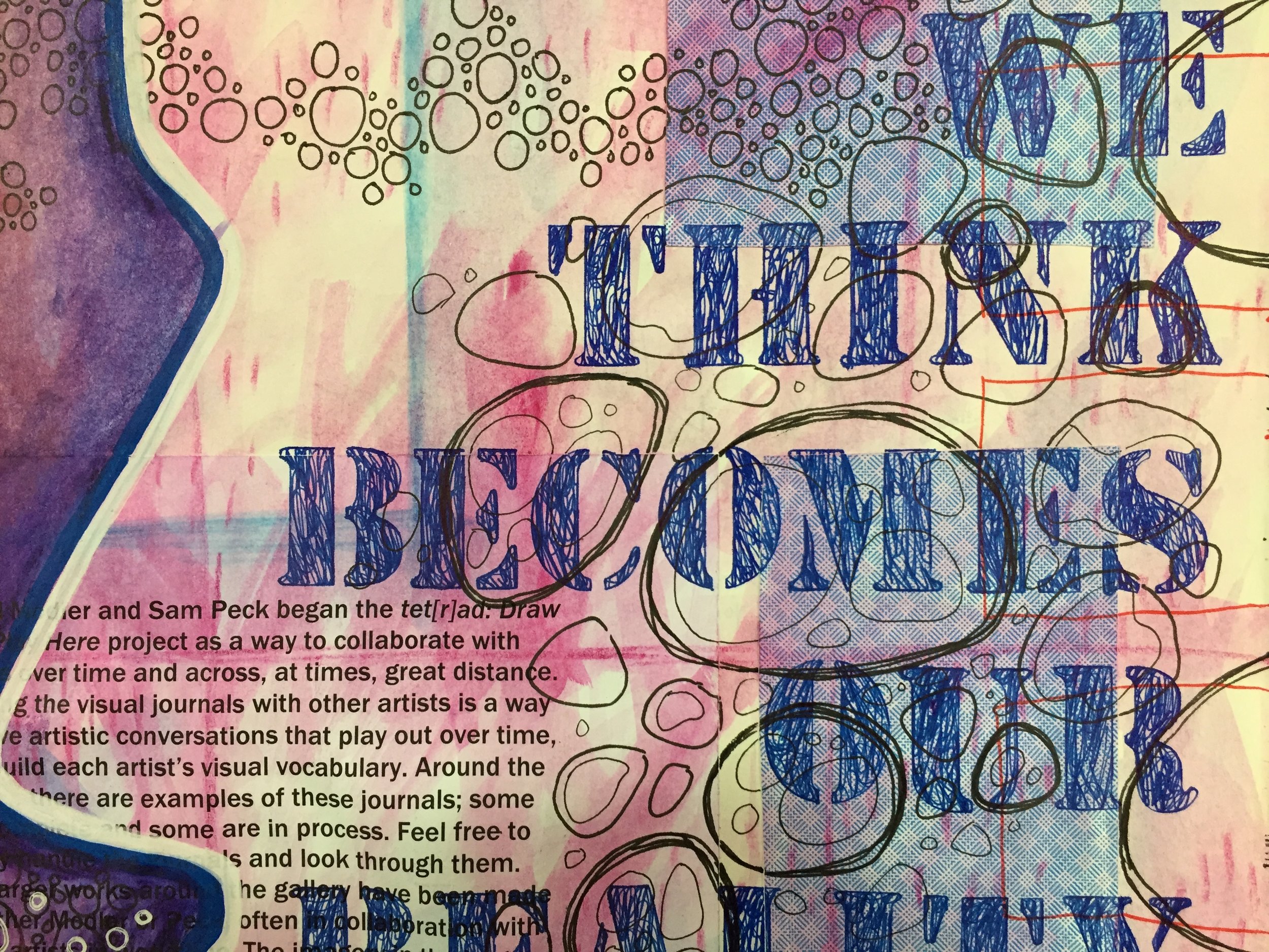
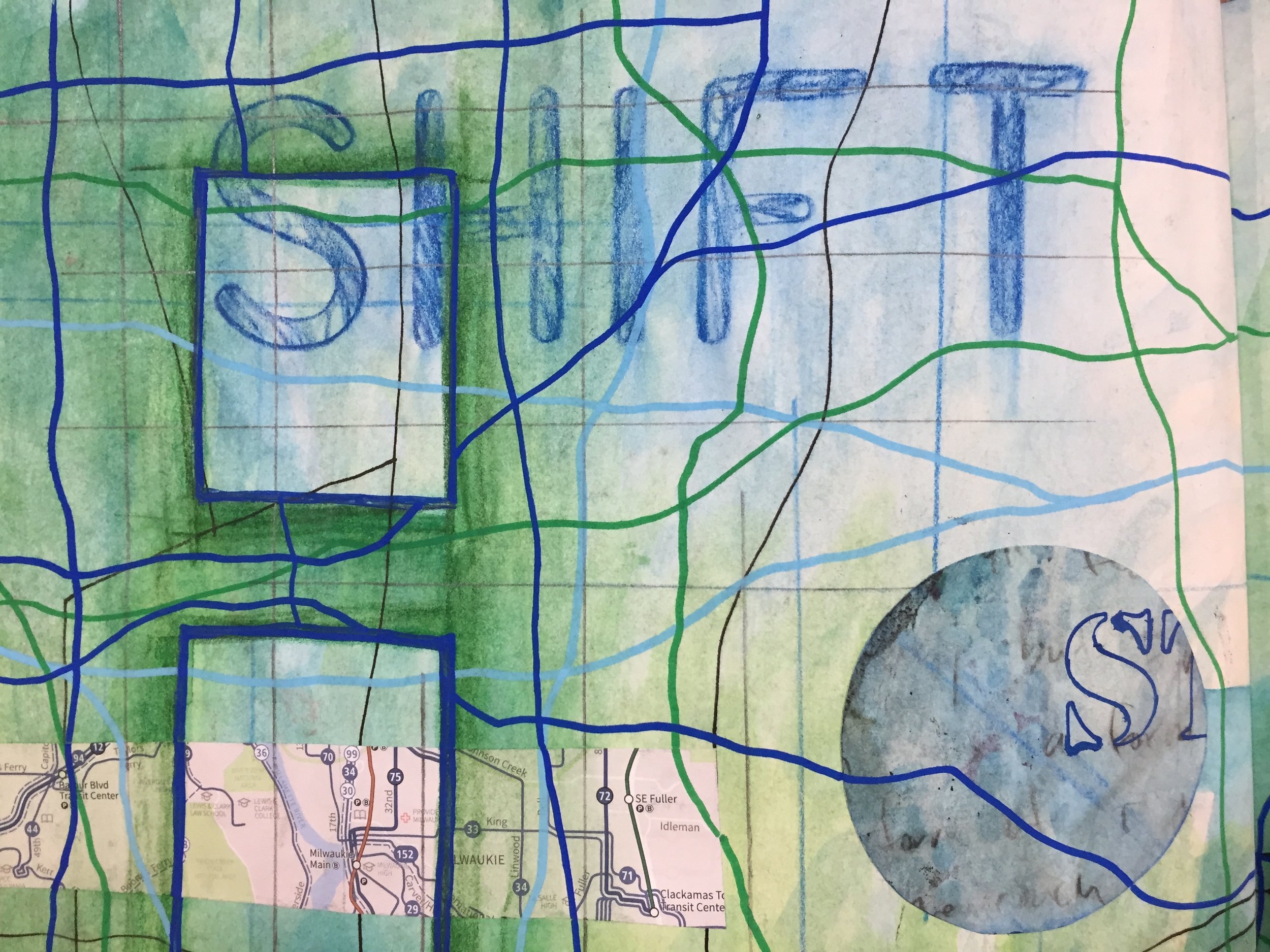
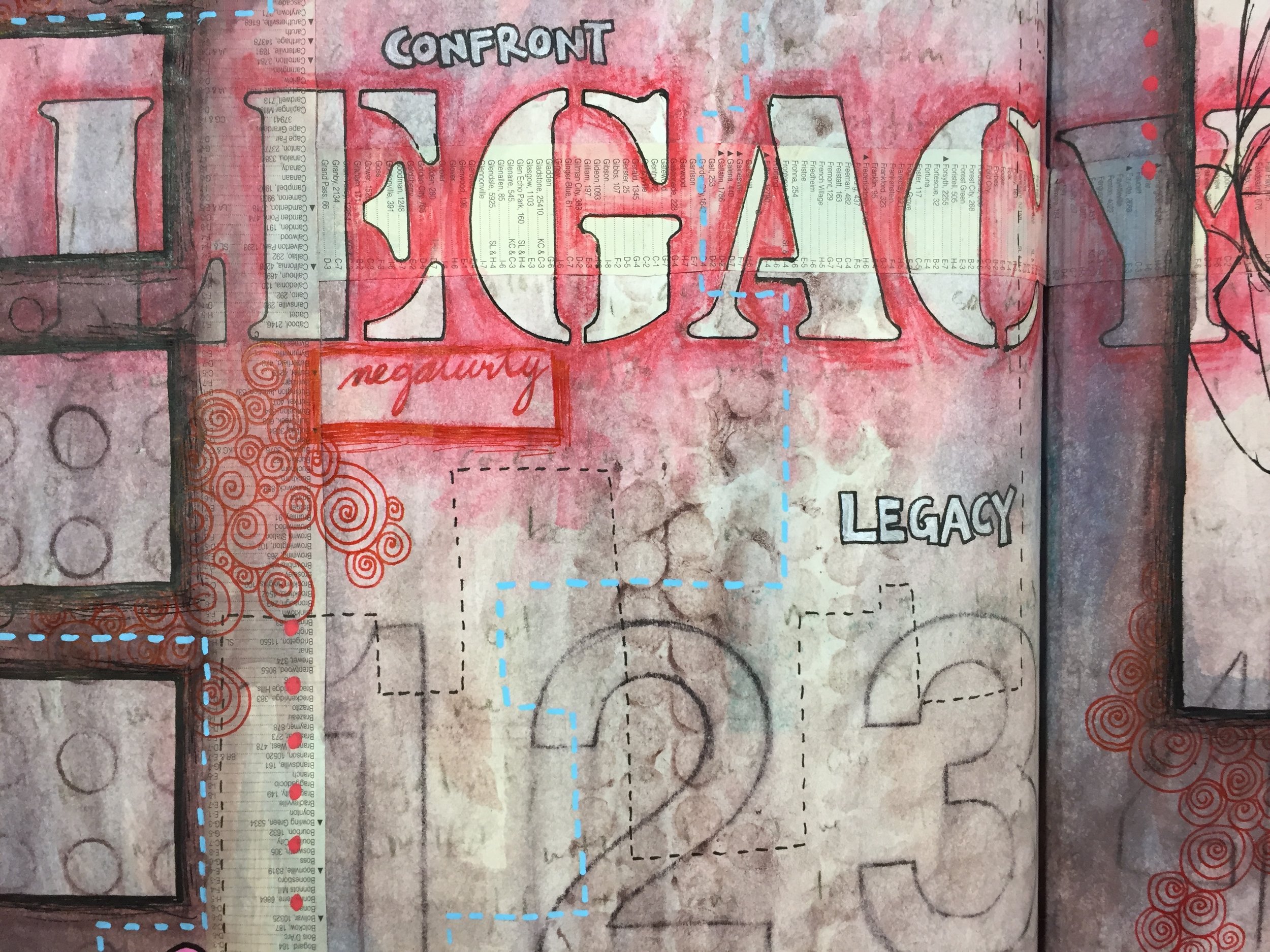
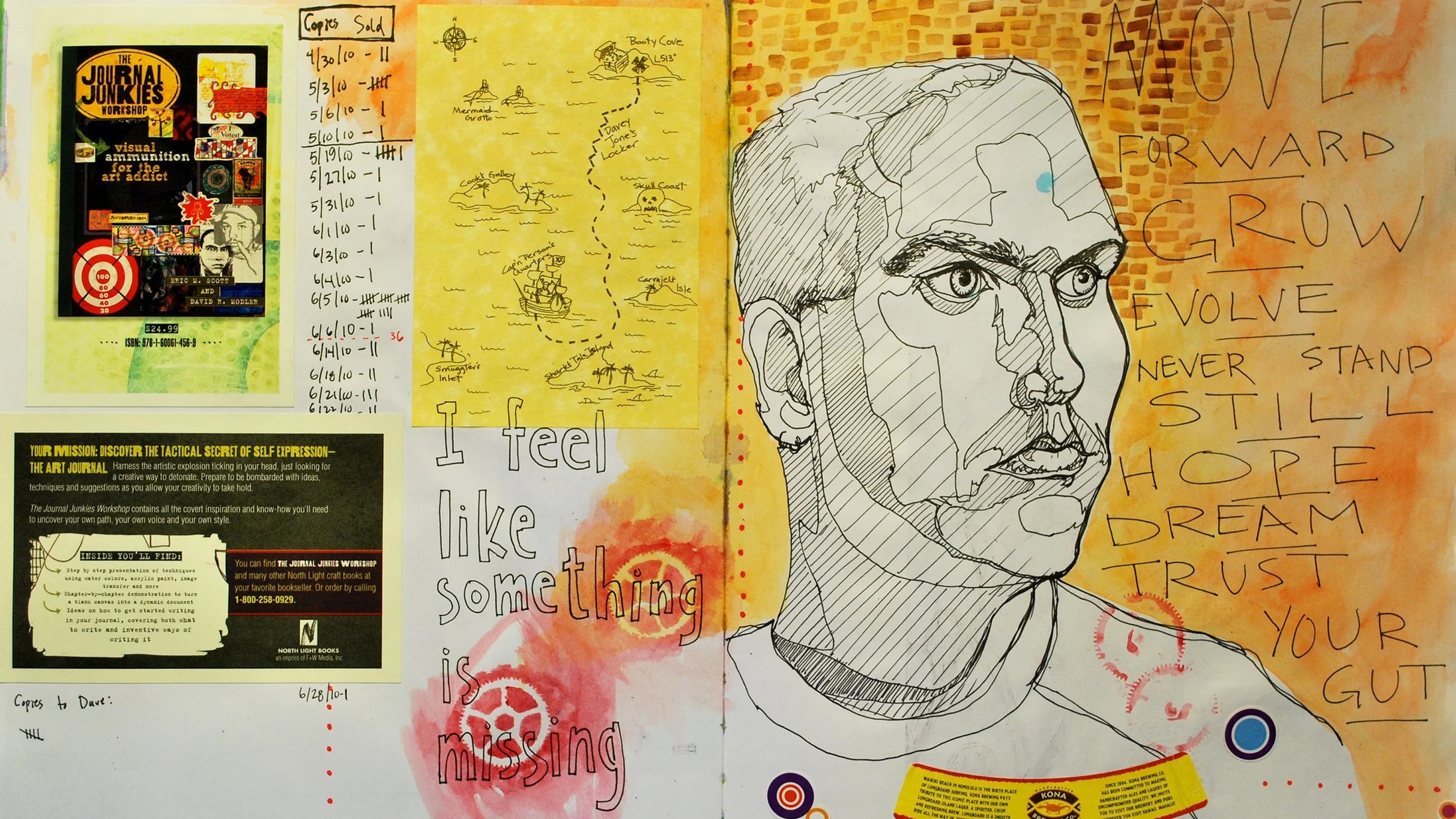
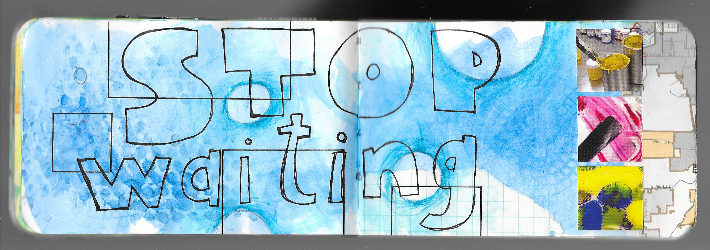
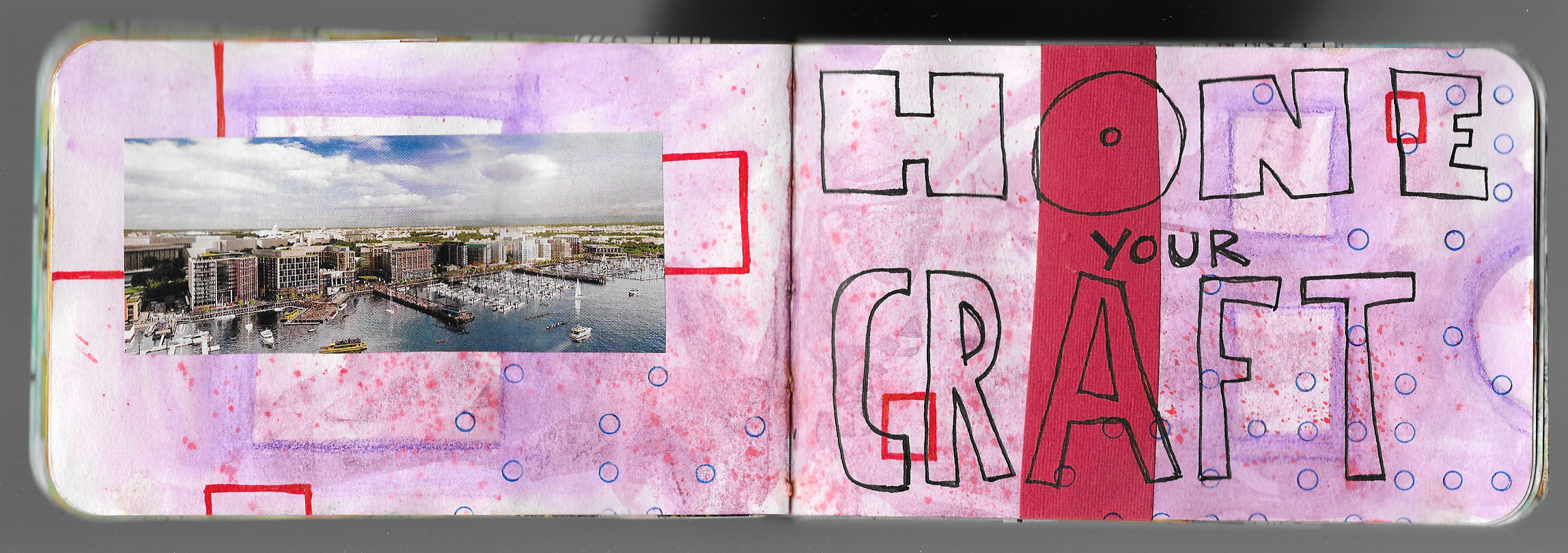
Welcome to the tenth lesson of the Creative Prayer Book. We’ve focused on stenciling letters and words, using our own handwriting, and using found text, so this quick lesson is about drawing text. You might think about those block and bubble letters that you used when you were in school, and they’re perfect for this. But don’t limit yourself to just these two ideas. You can also use drawn script, fancy fonts, and graffiti letters and words. So, experiment with a variety.


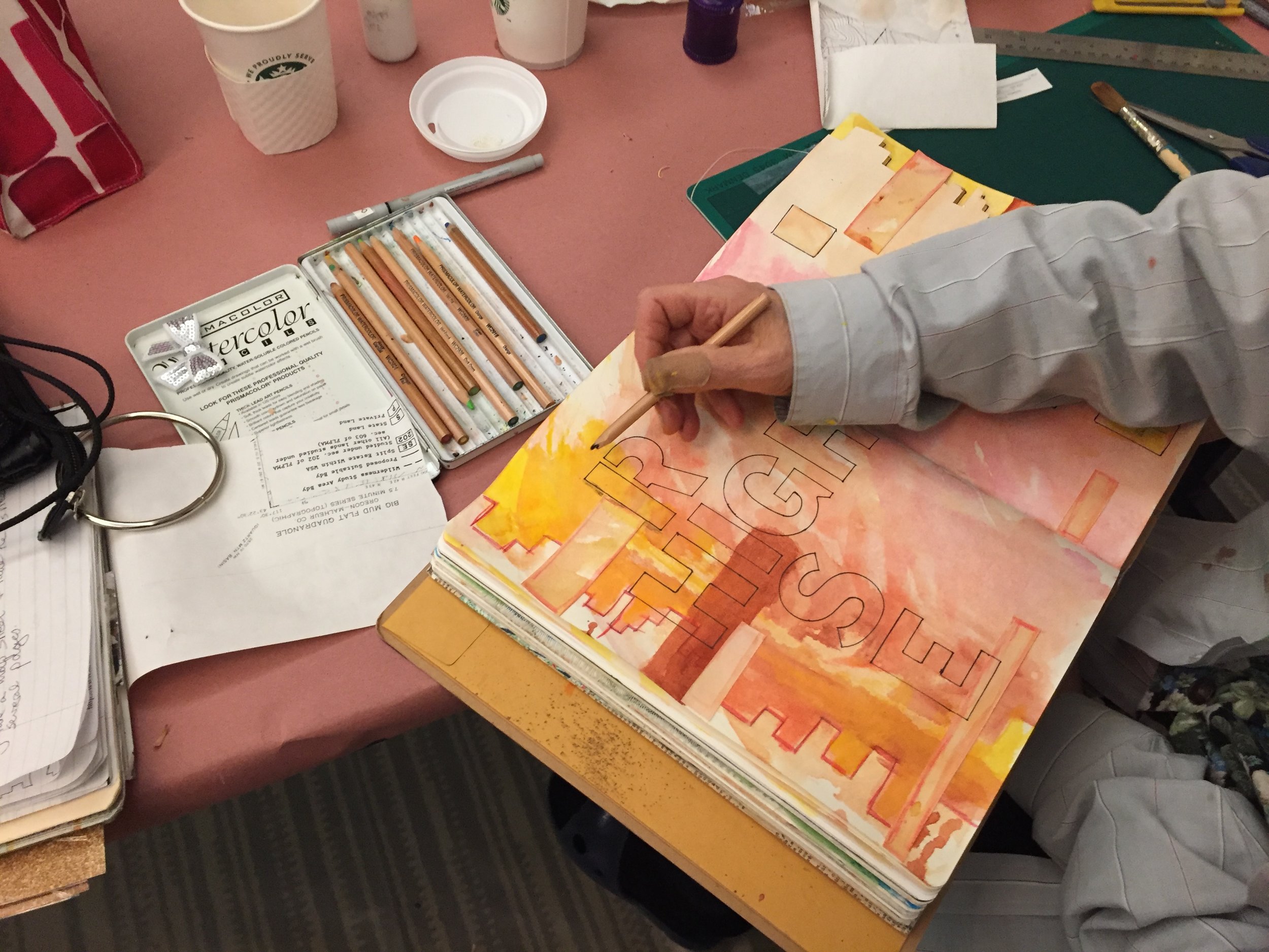
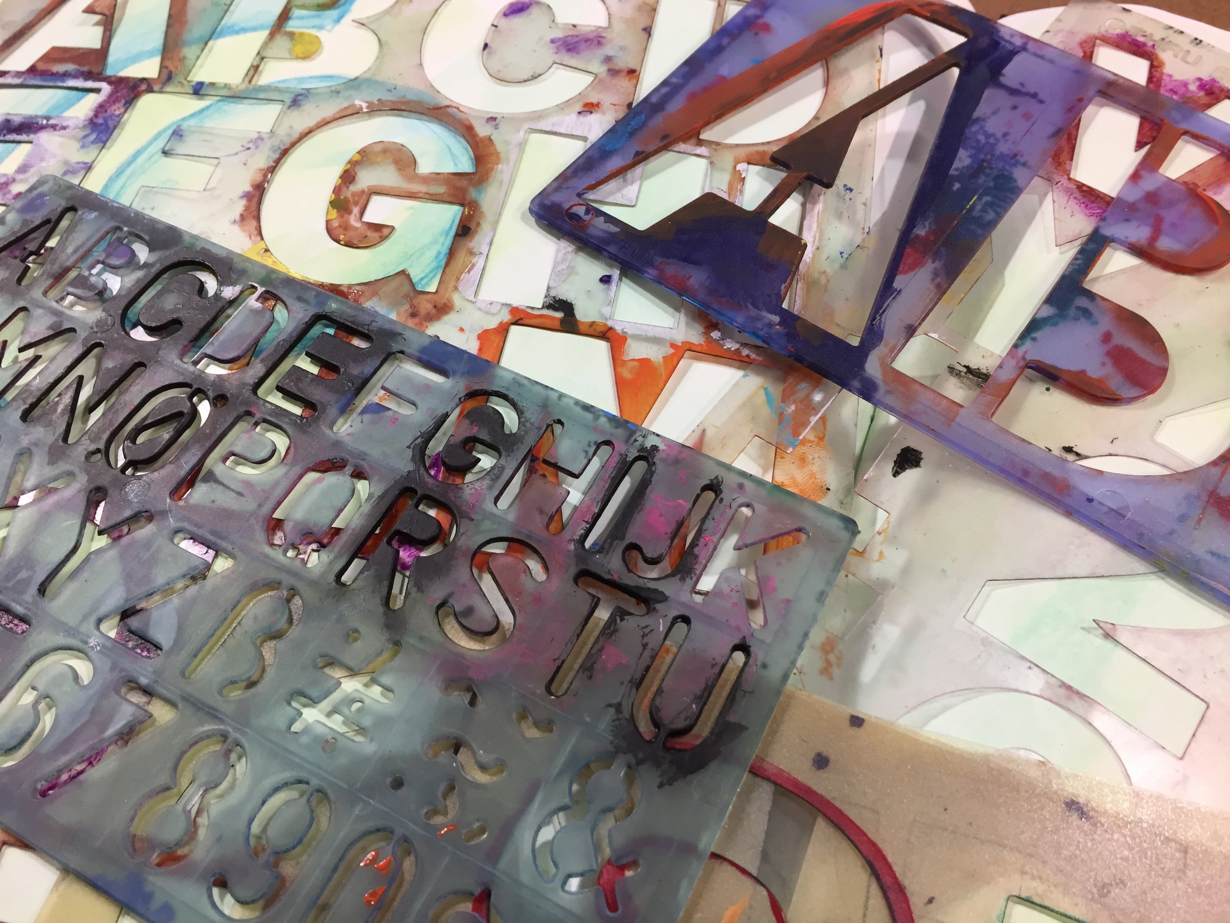
If you’re not comfortable with drawing letters and words, use a pencil first, and perhaps practice on a piece of scrap paper first. If you’re a complete novice, one technique uses your own printed letters as a skeleton for the larger, drawn letter. Using a pencil, lightly write your word or words. Then, draw in the letters around the thin lines. You can make thin and thick letters this way. Erase your original, guide letter.

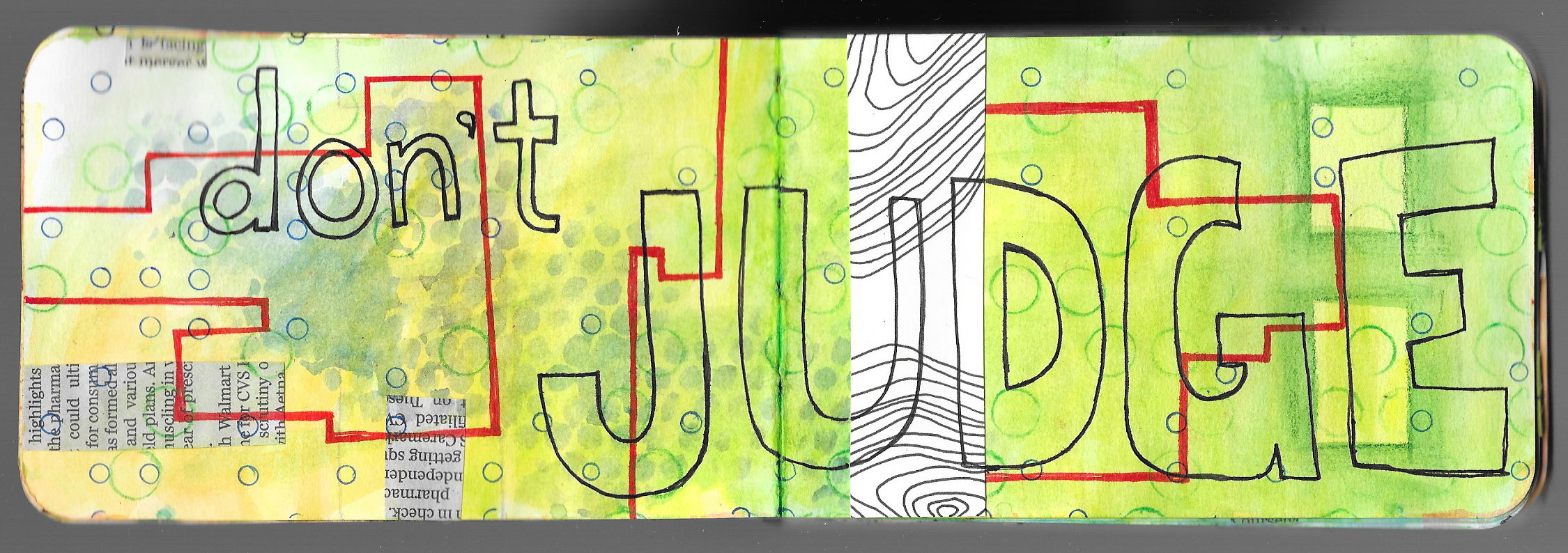
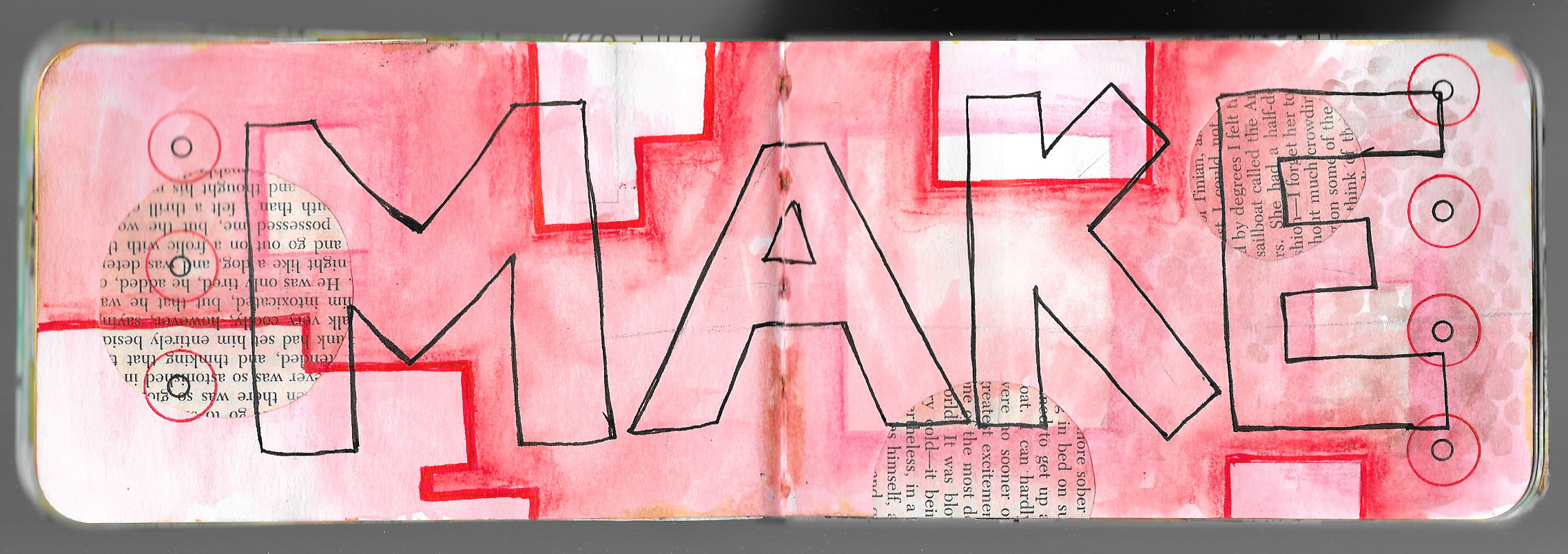
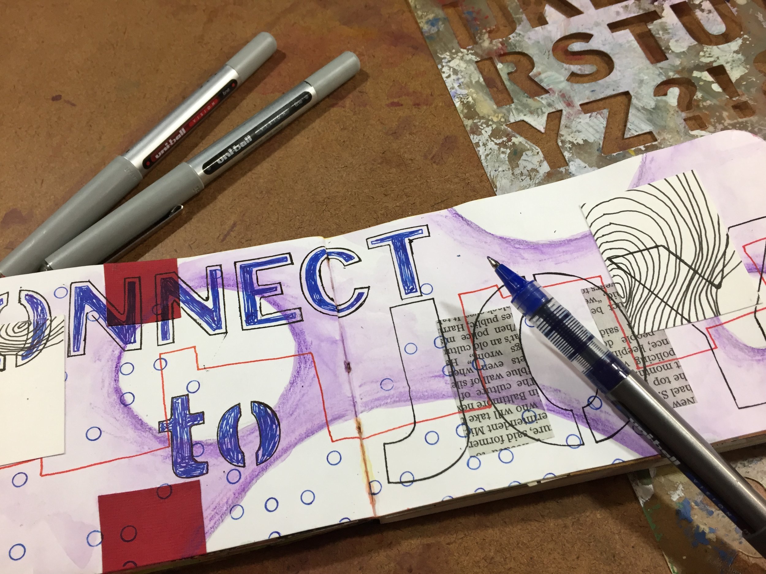
Of course, you can simply draw in the letters as you go, but be careful and pay attention to spelling. That’s why I like having the words and phrases drawn on a separate paper so that I can make sure that I am spelling things correctly. As you draw your letters, think about the outer shape of the letter, and if needed, use a pencil to lightly sketch in the lines.

I like to draw my letters with a pen, and I don’t worry about using a pencils. But I’m pretty confident with drawing words, but I still make spelling and placement mistakes.

Give drawing letters words and phrases a go!

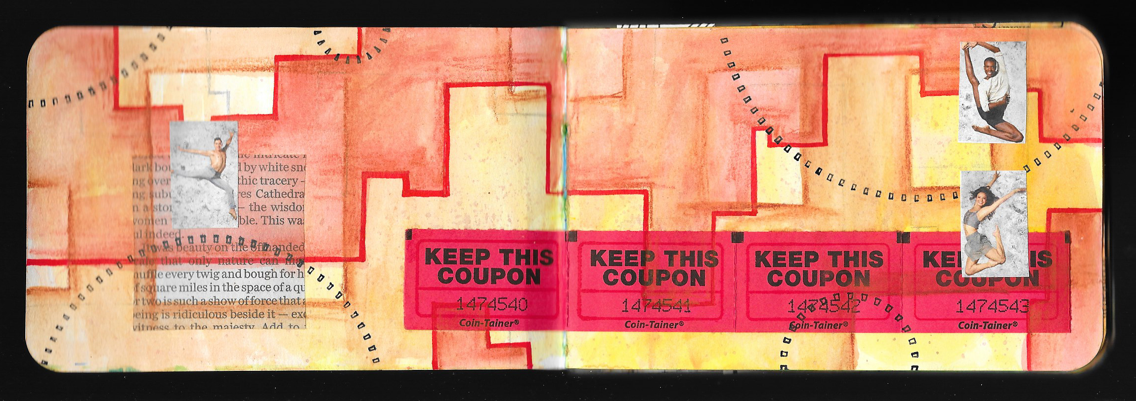
I plan on just two more lessons in this series, and we’re done with the text and words, so if you still have space, feel free to stencil, write, draw, or find your text to fill in the spaces.

Thank you for joining me again, and as always, Happy Creating!

Materials Monday: Derwent Inktense Paint Pan Travel Set

 
IMG_4938.JPG
 

Some how, It’s been nearly a month since I last posted a Materials Monday. It’s amazing how life gets busy, but it’s back today.

Like most artists I don’t just use one type or brand of a particular material, and I have different brands, often for different purposes. And so it goes with watercolor paint. I love using watercolor paint in my journal and in my mixed media art, and I’ve already shared my enthusiasm for the inexpensive Prang semi-moist watercolors. Unfortunately, Prang watercolors are not lightfast, meaning that they will fade over time when exposed to light, and they are not the best paint to use for pieces that will hang on the wall. Though they are portable in their tough plastic case, the larger 16-color set is a bit on the bulky side, and are not always convenient to take everywhere.

Over the past couple of years, I’ve been searching for a travel set of paints that were better quality, more lightfast, and something that wasn’t going to break the bank. Quality watercolor paints can be on the expensive side, so I became quite intrigued when Derwent announced that they were releasing their Inktense in the form of a travel paint pan set. I love the Inktense pencils, and I’ve used them for years, so I had to snatch up a set of the paints. Overall, I’m quite pleased, and they have announced that they are releasing a second set with different selection of colors.

First, I must say that technically, these paints are not watercolor paints, just as the Inktense pencils are not watercolor pencils. The pencils, blocks, and paints are all water-soluble ink. But the paint set acts just like watercolor paint with one exception. Like the Inktense pencils and blocks, the paint is more permanent and less likely to lift when painted over, and supposedly can be used on fabric, though I’ve never done that.

One of the main highlights of the Inktense paint pans is price. They are a good quality paint, at a very decent price, and they can often be found for under $25 in the US. They aren’t available everywhere, but they can be ordered online.

I am quite pleased with the Inktense paint. The set comes with 12 bright colors, and they are rich and intense like the pencils and cover well. The set is small and very compact making it a perfect travel size, but the pans are a bit smaller than normal half-pans, and unfortunately, I haven’t seen replacement pans available in the US, but it looks like they are available in the UK. The set comes with a small water brush and a sponge, neither of which I use. I got the set for the paint!

 
IMG_4748.JPG
 

The only real issue that I have with the paint is the selection of the colors, and it’s really more a matter of personal taste. Though the set has your basic colors, I wish that it had a crimson or a magenta. I’ve been getting into color schemes lately that include more pinks and purples, and the poppy red that is included is a very warm red making it difficult to get the pinks and purples that I want. The set also comes with a dark plum instead of a standard violet. Though the plum is great for blending into the blues and using as a complement to the yellow and the ochre, I again have gotten into these pink and purple color schemes, and I’d love a brighter violet.

 
fullsizeoutput_11f1.jpeg
 

I love the brightness of the colors, the quality of the paint, the compactness of the set, and the price. I’d just love a slightly different color selection. However, Derwent has recently announced that it is releasing a second set of the Inktense Paint Pans with 12 different colors including a scarlet and a fuchsia, though no bright violet, but for now it only appears to be available in the UK. I’m not sure when or if it’ll be available in the US, but in the meantime, I’ll make do with what I have.

So if you are looking for a compact and inexpensive set of lightfast paints, the Derwent Inktense Paint Pan Travel Set might be just the thing. Please remember that I am not receiving any kind of compensation for any of these reviews or recommendations. They are just the materials that I personally like to use.

Journal Friday #99: Text

 
Logo.jpg
 

Words, text, and reflections are a big part of my journaling process, but there are times when I might not want the text to be so obvious, especially since I openly share my journal with others. So obscuring the words is a great way to include writing while making it hard to read.

Today I worked primarily with text using a General’s Sketch & Wash pencil (water-soluble graphite), Derwent Inktense pencils, and uni-ball Vision pens. I focused on using the text in a more graphic manner, and the reflective writing provided a textured background while the stenciled words created some big words that stand out. The smaller emphasized words provided a little visual pop. I see this as a good start, and I’ll most likely add more to this spread in the future.

I hope that you enjoy the video!

Creative Prayer Book: Found Text

 
IMG_4929.JPG
 

Welcome to the ninth lesson of the Creative Prayer Book. In this lesson, I continue to add text to my book. As I’ve said before, I’m creating a book of creative affirmations, but feel free to add hopes, wishes, dreams, prayers, or quotes to your book.

Over the past couple of weeks, I’ve been adding text using stencils and my own handwriting, but for today’s lesson, I want to add some found text — text from alternative sources. I’ll use some of my own handwriting in conjunction with this found text, but I want to find some of the words in other sources or create some of it in a different way. I turn to some readily available sources of text for my words today — magazines, stickers, and a label maker.


Magazine Text

Magazines are a great source for text, but I want to use big words, so I look for headlines and advertisements. I probably won’t be able to find very word in the phrase that I want to use, but I can probably find a a couple key words. I spend time flipping through magazines to find words that will work.

Newspapers are also a good source of headline text.

Stickers

Arts and craft stores often have sticker sets of words meant to be used in scrapbooking and mixed media art. I happen to have a set that I bought a long time ago in a stash of fodder in the studio. The words all deal with travel, and contain quite a few key words from a number of my affirmations.

Don’t feel like you need to make a special trip to the store of sticker words, but if you have some lying around, feel free to use them.

Label Maker

Label makers are great as an alternative source of text, and some electronic ones allow you to change the size and the font. I have an old embossing label maker from many years ago, and I think that it would be perfect for using for this lesson. This is the type that uses plastic tape and pushes the letters up into the plastic causing the letters to be raised and to turn white. I used to use it a lot when I first got into journaling, but I haven’t used it in quite a while. I use it to create whole phrases and to add key words.

Think about printing out words from the computer if you don’t have a label maker, but use one if you got it. I was surprised to see that Dymo still makes the embossing type of label maker similar to the one I have.

I do use my regular handwriting for some of the words that go with the magazine text and label maker, and if I wanted, I could thicken the letters like I did last week. But, I’ll wait because I have some ideas for embellishing the text in different ways, and I’ll save it for a future lesson.

Think about ways that you can use found text or words from alternative sources as you continue to add your affirmations, prayers, or quotes to your book, and until next time, Happy Creating!

Art and Soul: Portland 2019

IMG_4901.JPG

I got back a few days ago from the annual Art and Soul retreat in Portland, OR, but it’s taken a few days to recover. Travel is always good, but it tends to wear me out. I’ve taken it easy the last couple of days, but now’s time to get back into the swing of things. So, I thought that I’d reflect a little about Art and Soul to kick off the week, and perhaps I can squeeze a new Materials Monday in before the end of the day to get back on track with those as well.

But onto Art and Soul!

I must say that I had a blast in Portland, and the week just whooshed by so quickly. I flew in on Monday, and didn’t have a class until Tuesday evening. So I grabbed lunch with a friend who lives in Portland, and spent a couple of hours wandering downtown Portland. I was almost late for my own class when I narrowly missed the train back. Luckily a train runs every 15 minutes, but that 15 minutes difference meant that I was nearly running to get back on time. Luckily I got to class with 5 minutes to spare, and we had a great class. I taught my Artful Layers class which I’ve done before as an all-day and a 2-day workshop, but this time it was a three-hour evening class. I was so into the class that I completely forgot to take photos, but we had fun layering watercolor, watercolor pencil, collage, and more.

On Wednesday I taught my Monster Maker Workshop as an all-day class, and we had so much fun creating little creatures in watercolor, polymer clay, and collage. It was a small intimate class, and I remembered to take photos. I’ve had so much fun making my monsters over the past several years, that it was good to see others who enjoyed it just as much.

Beyond Blank Pages was my all-day class on Thursday, and it was great to teach a brand new class. I developed the class as a week-long workshop for the John C. Campbell Folk School, but it was cancelled due to low enrollment. I turned it into a one-day class for Art and Soul, and we spent the day creating pages that linked together through color, repetition, cut-outs and more. Though it’s based on journal workshops that I’ve taught before, it’s a new spin on the journal as you try to consciously create a visual narrative that runs through the pages as ideas, themes, colors, lines, and more all connect from page to page.

I had a fantastic time working with the students, and it was so nice to see so many new faces. Though a couple had taken classes with my before, most were brand new, and many knew very little about me or what I do. I’m so glad that my classes appealed to them. Teaching at Art and Soul last week reminded me why I teach — to connect with others and to share my love of art. I am grateful for everyone who came out and made art with me, and I am looking forward to next year!

In the meantime, I have a couple of other teaching gigs lined up for 2019, and I’m hoping to add more. In May, I’m teaching the Creative Prayer Book as an all-day workshop at the Round Hill Arts Center in Round Hill, VA. In October, I’ll be repeating Artful Layers, Monster Maker Workshop, and Beyond Blank Pages at Art and Soul in Ocean City, MD.

Creative Prayer Book: Handwriting

CPB Handwriting 1.jpeg

It’s the eighth lesson of the Creative Prayer Book, and I’m diving into more into my creative affirmations. Remember that you can add any text that you want — affirmations, quotes, song lyrics, poems, prayers. It’s really up to you.


Last week I used some stencils to add the words, so this time, I turn to those index cards with my affirmations, and I use my ordinary handwriting and my uni-ball Vision pens to add the text. I definitely don’t have a neat and fancy handwriting style, so I’m relying on my printed and cursive handwriting, but to make it stand out more, I thicken the letters by going back over the letters with my pen and carefully drawing in a thicker shape around the lines of the letters and filling in the resulting shapes with solid ink. This not only makes them bolder and easier to see, but it allows me to make the letters neater and to be a bit more artistic with them.

CPB Handwriting 2.jpeg

As I decide what text goes on which page, I think about the placement of my words and how big to write them. Since the ink doesn’t draw too well on top of glossy surfaces, I try to avoid writing on top of magazine images.

CPB Handwriting 3.jpeg
CPB Handwriting 4.jpeg

I do a couple pages of printed text and a couple pages of cursive text, and along with the stenciled text from last week, I have a good start with adding my affirmations to my pages. So think about how you can add more text to your pages using your ordinary handwriting.

Creative Prayer Book: Letter Stencils


Welcome to the 7th lesson of the Creative Prayer Book. This lesson is all about using letter stencils to begin adding text to some of the pages. I’ve decided to use my book as a book of affirmations, and I’m using a series of phrases, quotes, words, and ideas to create reminders about my creative journey. Several years ago, I wrote a bunch of these affirmations on index cards with the notion of using them in my journal or my art, but they have been sitting around my studio all this time. The Creative Prayer Book is a perfect use for them.


CPB Stencil 3.jpeg

As I begin adding words to my book, I want to use letter stencils for some of the affirmations, especially since I don’t have the best handwriting. I could just use the stencils plain, and trace the letters with a pen, pencil, or marker, but it can be hard to read the words sometimes. So, I want to use a couple of techniques to make the words “pop.”

Inktense

I can use one of my favorite materials, Derwent Inktense pencils, to create some contrast around the letters so that the words stand out from the page. I trace the letters first with my black uni-ball Vision pen, and then shade a dark Inktense pencil around the letters and spread it with plain water. This makes the words stand out a bit from background. If the color isn’t dark enough, I can add a darker color later.

Fill

Another technique for making the words stand out is to fill them with color, and I could simply fill them in with solid color. But I like to fill them in a slightly more creative way. I like using my uni-ball Vision pens and leave a white line around the edge of the letters giving the letters a bit of a sophisticated look. By drawing a shape inside of the letters that runs parallel to the edge of the letters, I can then fill the shape to create a two-tone letter. I really like the look of this technique.

Think about using stencils in your book since their are a quick and easy way to add text and word. If you want to add a bit of flair and make the words stand out, try using a little ink or Inktense pencil to add some visual interest to the letters and make them “pop.” Try experimenting with letter stencils, but don’t fill all of your pages because we’ll tackle some other lettering techniques in lessons to come.

Happy Creating!

Journal Friday #97: Be Where You Are and Initiating a New Journal

 
IMG_4872.JPG
 

I wanted to do something a little different for the time-lapse video that I made today, so I limited myself to using just a few materials — Derwent Inktense pencils, UHU glue stick, and uni-ball Vision pens. I also, started the spread off a bit differently. I used a series of ovals to create an overall texture as an initial layer, and then I built up other layers on top of it. I also drew a face, which I haven’t done for the time-lapse videos before. I had thought about adding more to the spread, but I’ve been trying to keep these videos to about a minute in length. Drawing the face and using the Inktense around the stenciled words took a little while, so I didn’t include everything that I was thinking about. But that’s the way it goes sometimes.

After creating the video, I broke out my new journal. I had started prepping it a while back, and the beginning of a new month seemed like a perfect time to initiate working in it. I didn’t do much and simply used a square stencil and an Inktense pencil to get something started. However small of a start it might be, it’s the first step of a grand, new adventure! I love beginning in a new journal. It’s always filled with such promise and potential.

Creative Prayer Book: Purposeful Collage

CPB Collage 1.jpeg

Welcome to Lesson 6 of the Creative Prayer Book. Over the past 5 weeks, I’ve built up layers of watercolor, graphite pencil, collage, watercolor pencil, ink, and Inktense pencils. For this week’s lesson, I turn again to collage, but this time I want to be a bit more purposeful with the fodder that I choose.


Magazines

Magazines are always a good source of collage materials, and I look for small images to use or for parts of larger photos that can fit into the format of may pages.

Personal Fodder

I also look through my stash of personal ephemera and find photos of myself, scraps of paper, postcards, and other things that have a personal connection.

Artwork

Finally, I find some small works of art that I can cut up. These are experimental or unfinished pieces that have been sitting around the studio, and I gather a variety to use.

I use the collage in a variety of ways, and I cut some of it into horizontal or vertical strips. I also cut out small squares and rectangles. Some of the pieces are recognizable images, and some are simply textures and patterns. With some of the collage, I cut it so that it can fit into certain spaces and certain shapes, and with it all I use my favorite glue stick, UHU, to glue it all onto my pages. Some collage elements might be a bit thick and glossy, so I might consider using a different adhesive if I use them. I try to use the collage sparingly leaving room for the words and the affirmations that are to come.

CPB Collage 4.jpeg

Try adding some more collage to your pages!

Happy Creating!

Materials Monday: Letter Stencils


Words are almost as big of a part of my visual journaling process as the art making and the collage. As a journal, I want my book to reflect and document my daily life — my ups, my downs, and my in betweens, and words go a long way in helping with that. Naturally, I write out many of my reflections longhand, and of course, I draw words, text, and quotes to give emphasis. But having letter stencils on hand, is a quick and easy way to add letters and words, and they can be used with a wide variety of materials — everything from pen and pencil to acrylic and watercolor paints. I always have a few styles and sizes on hand so that I can tailor the letters and words to fit multiple purposes and situations.

I don’t have a favorite brand or kind of letter stencil, and over the years I’ve picked them up at arts and crafts stores, as well as office supplies stores. But I usually limit myself to the simpler, more generic lettering styles — Roman, Gothic, and Helvetica. I don’t like the to use the fancy or funky fonts — it’s just not my thing. I do try to have several sizes of the same font on hand — normally a small, medium, and large, and I do have a couple of extra large sets for when only a big word will do.

Letter stencils, also called lettering guides, come in a variety of materials as well, and I must say that I prefer the thinner, flexible plastic stencils since they take up less space. I can throw a few of them in the pocket of my large journal and take them anywhere. However, they do get beat up a bit, and they can get bent and even torn — especially the delicate insides of letters. The stiff, thick plastic stencils are much more durable, but not as portable so I relegate them to the studio. I have used the stencils cut from heavy paper, but they tear easily and don’t hold up to wet media.

I steer clear of stencils with already cut words and phrases because they are somewhat limiting.  You probably aren’t going to use them a whole lot and stencil the word and phrase over and over and over again. I like being able to create any word, any phrase — much more versatile. I also like to use letters and numbers as graphic devices, and I often stencil “ABCD” or “12345” onto pages and artworks. I also, like to stencil a letter like “X” over and over to create patterns. This allows me to play around with letters on a purely visual level.

If you don’t have any letter stencils, go get yourself some, and have fun playing with words, letters, and numbers.