Materials Monday: Derwent Inktense Pencils


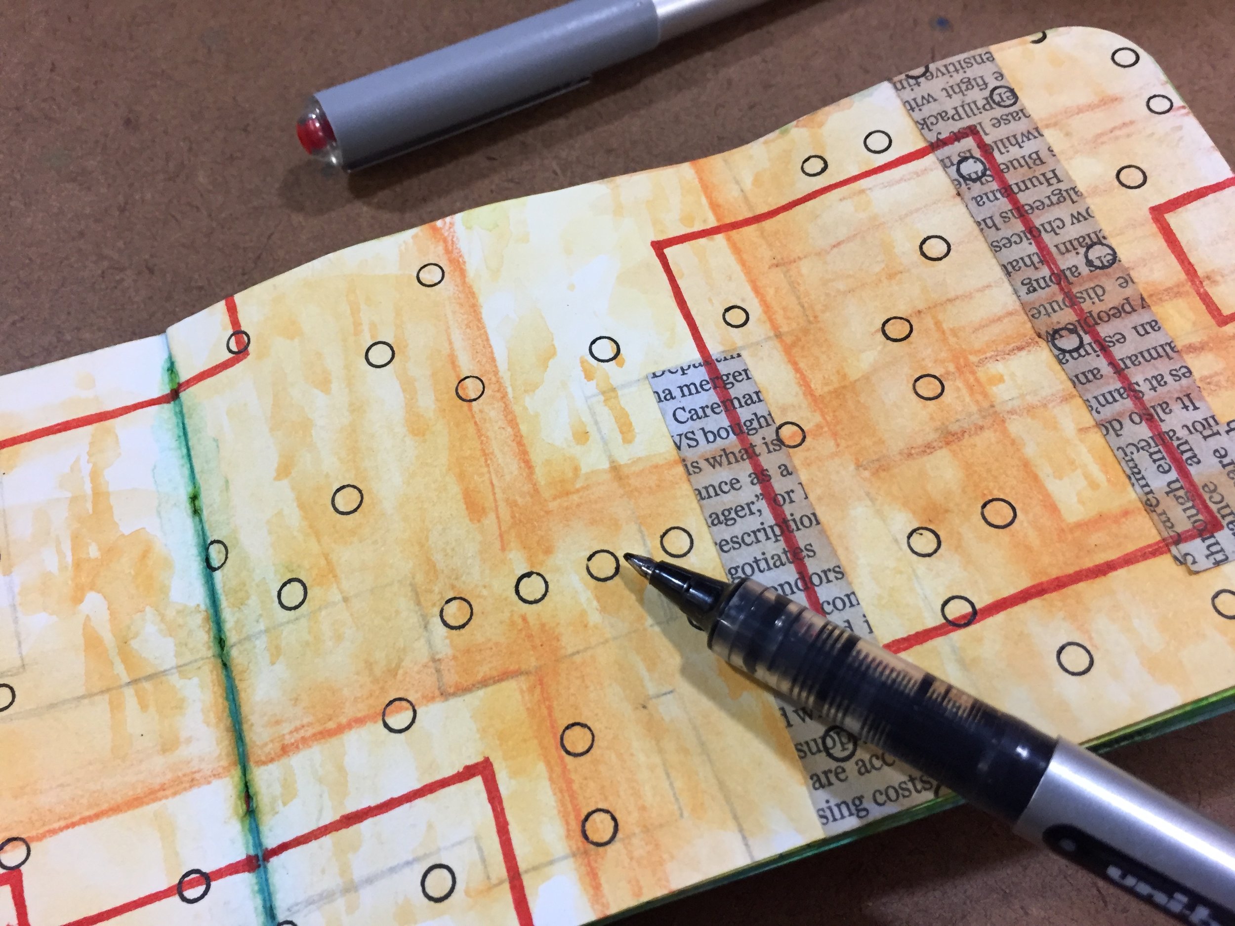
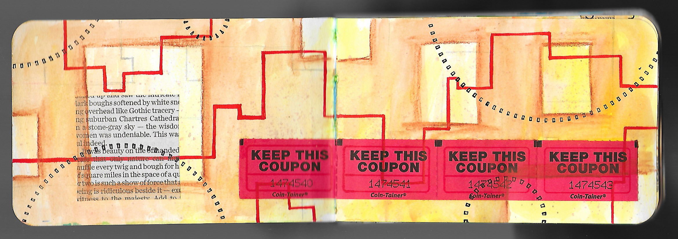
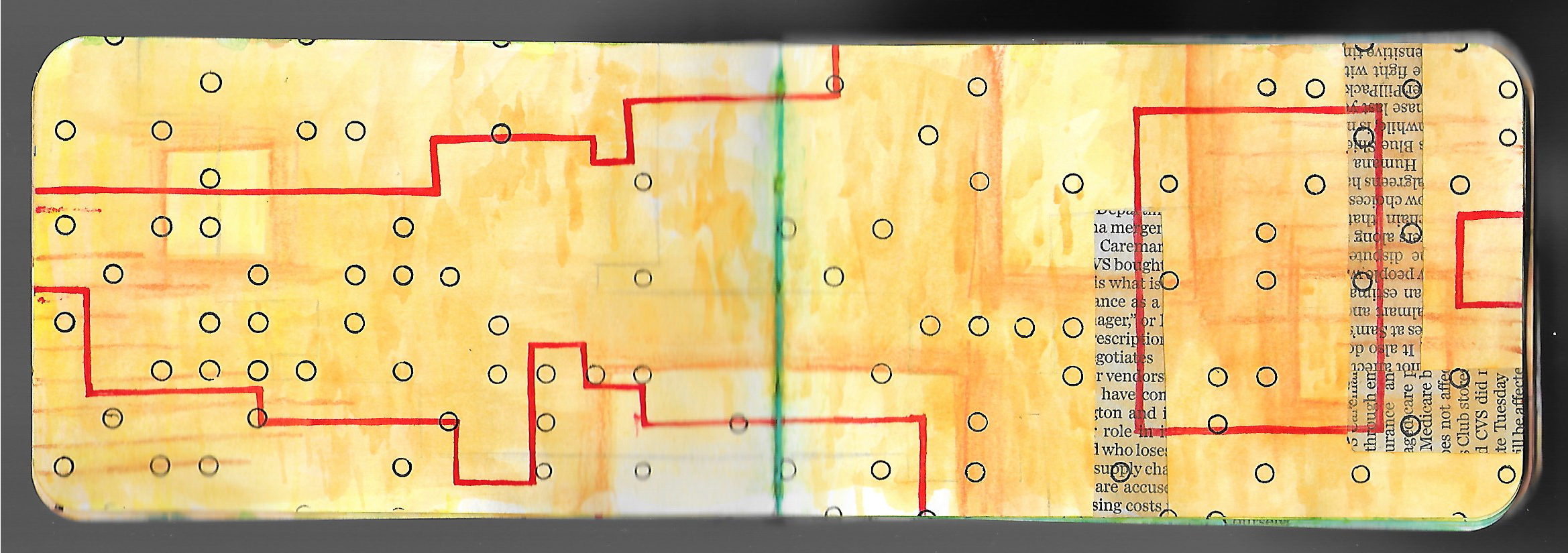
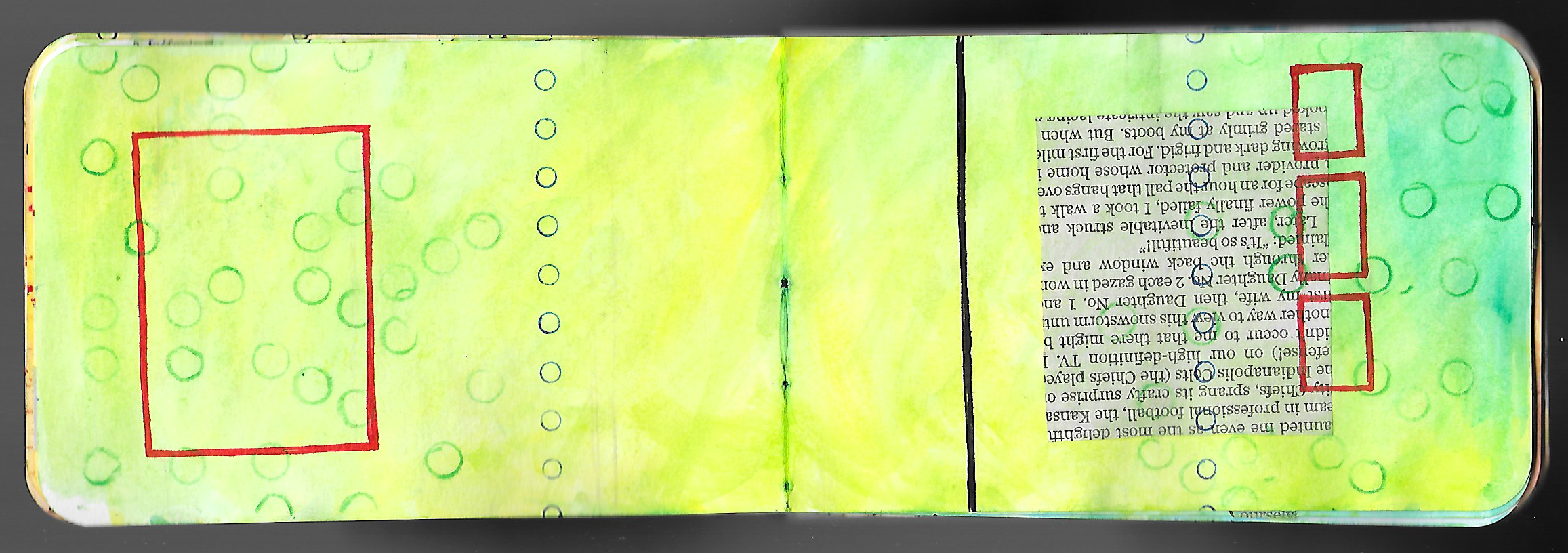
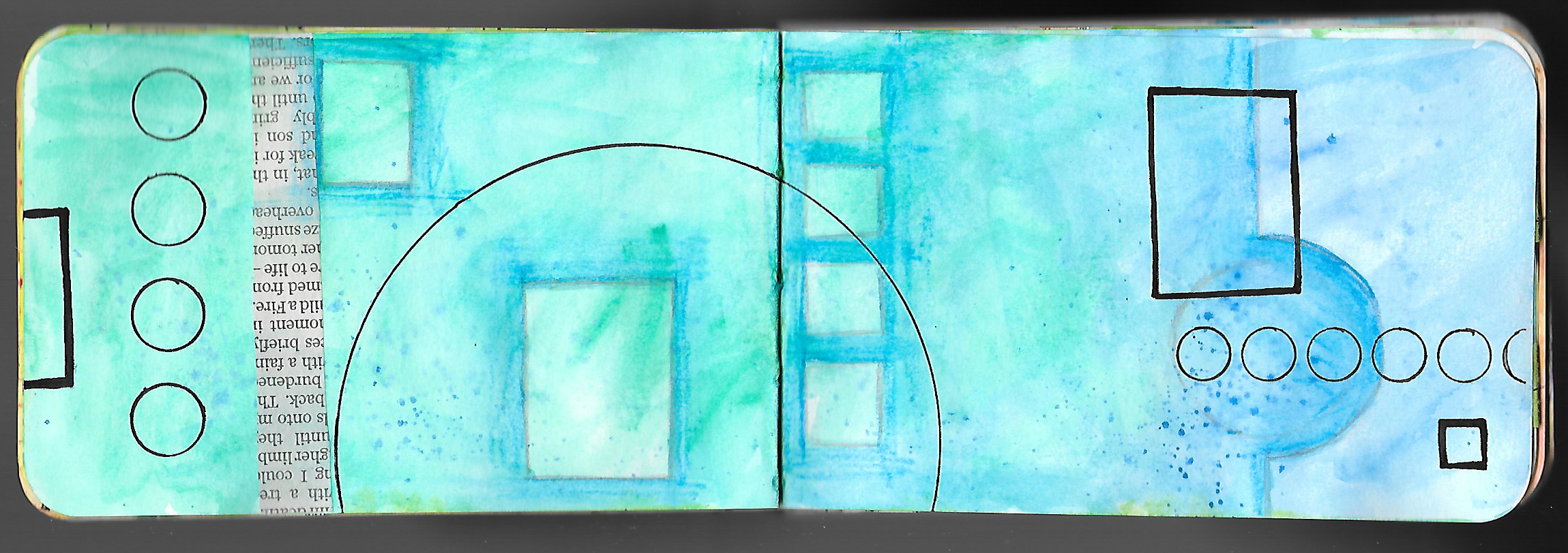
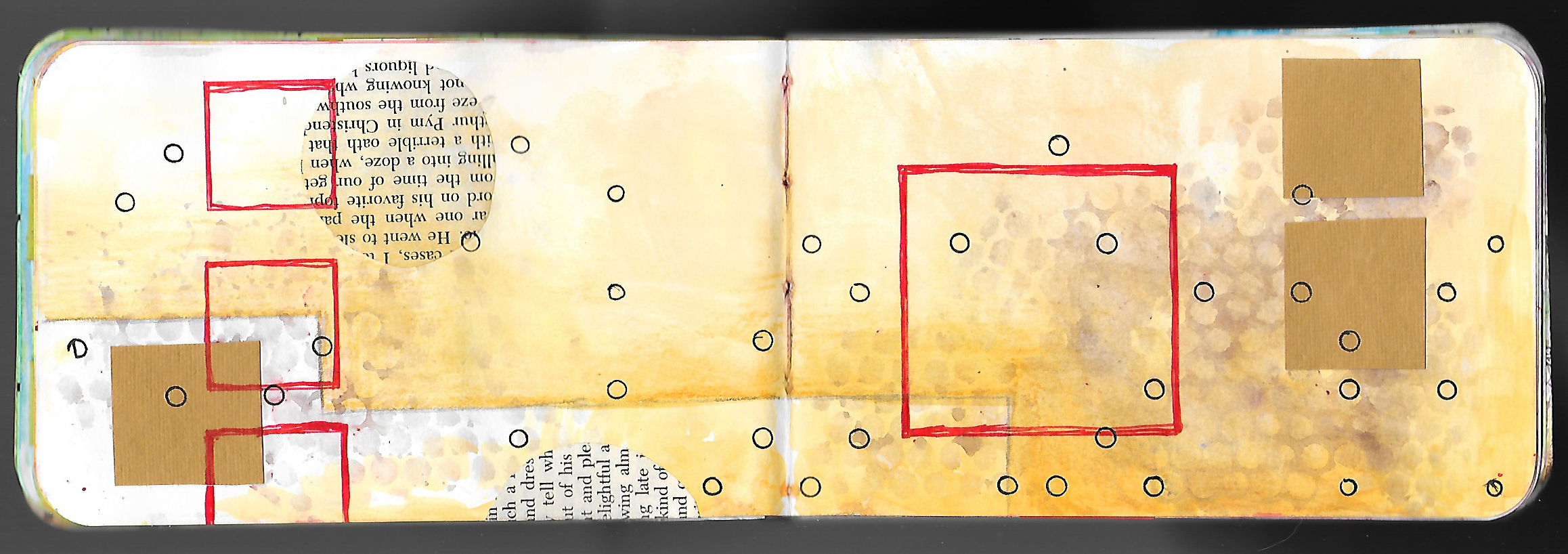
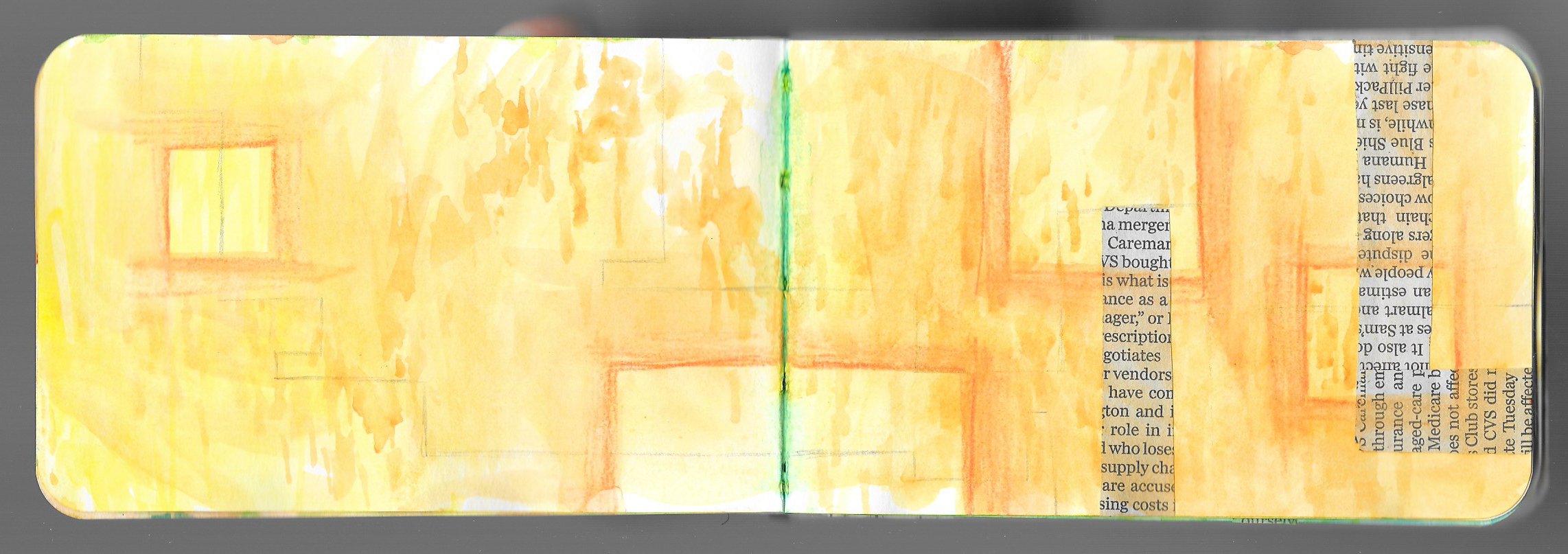
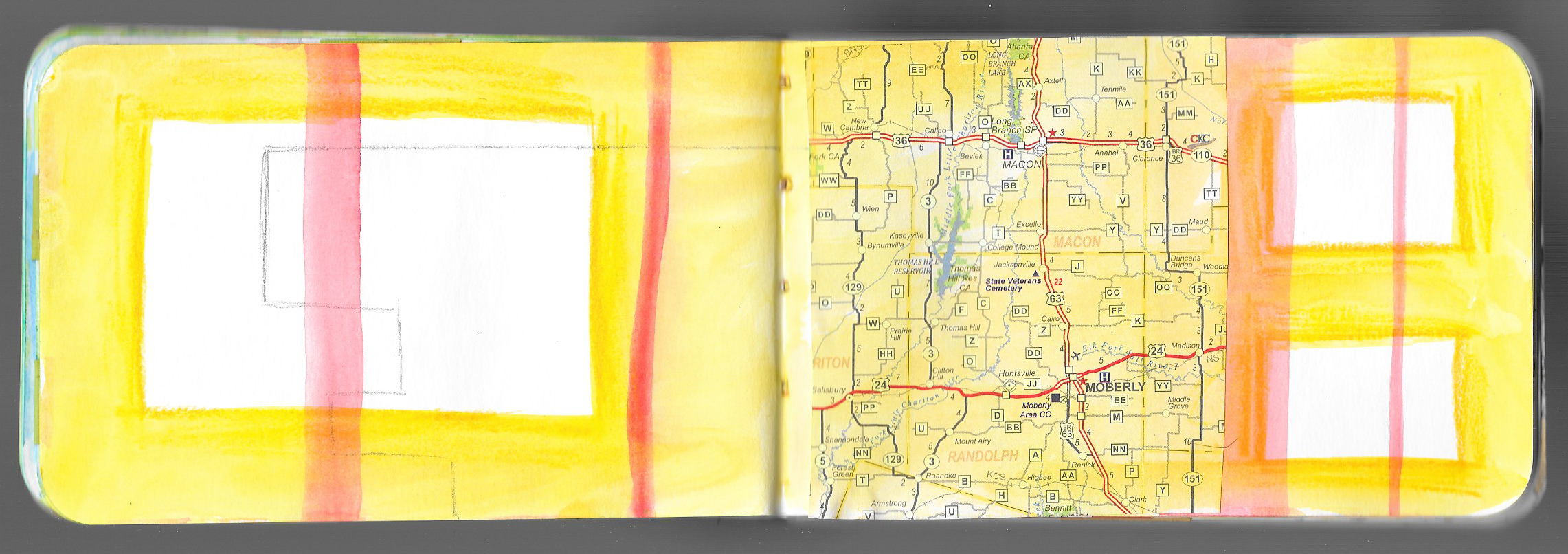
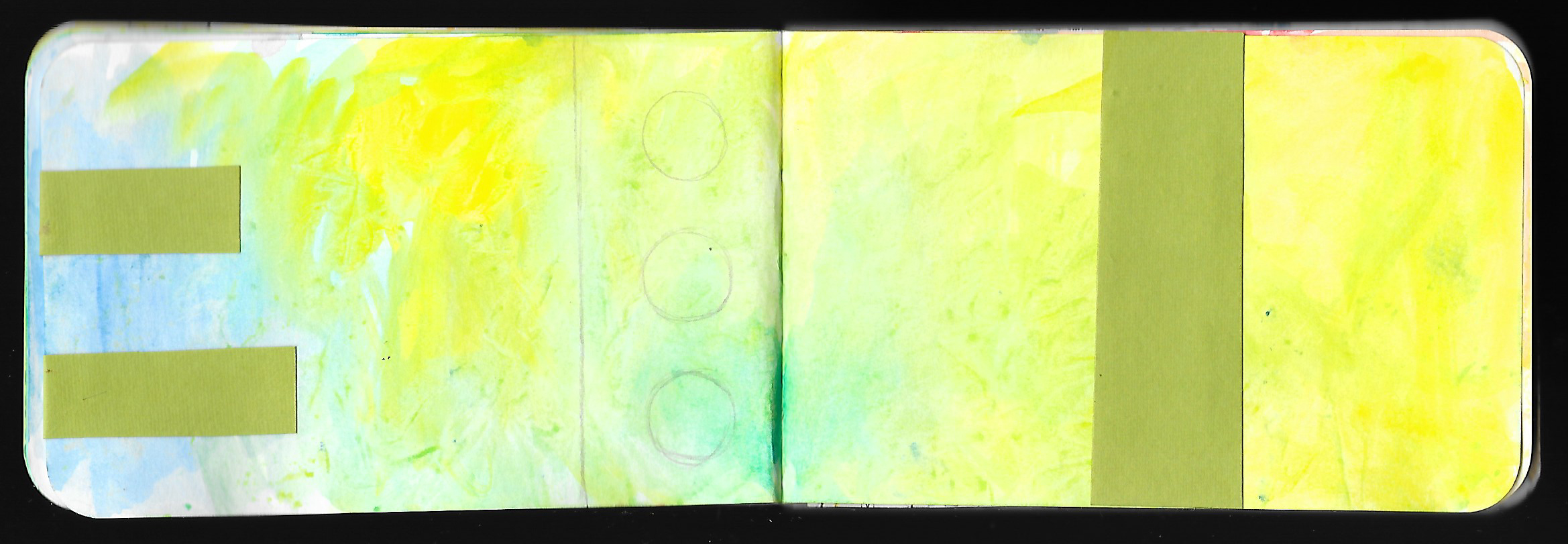
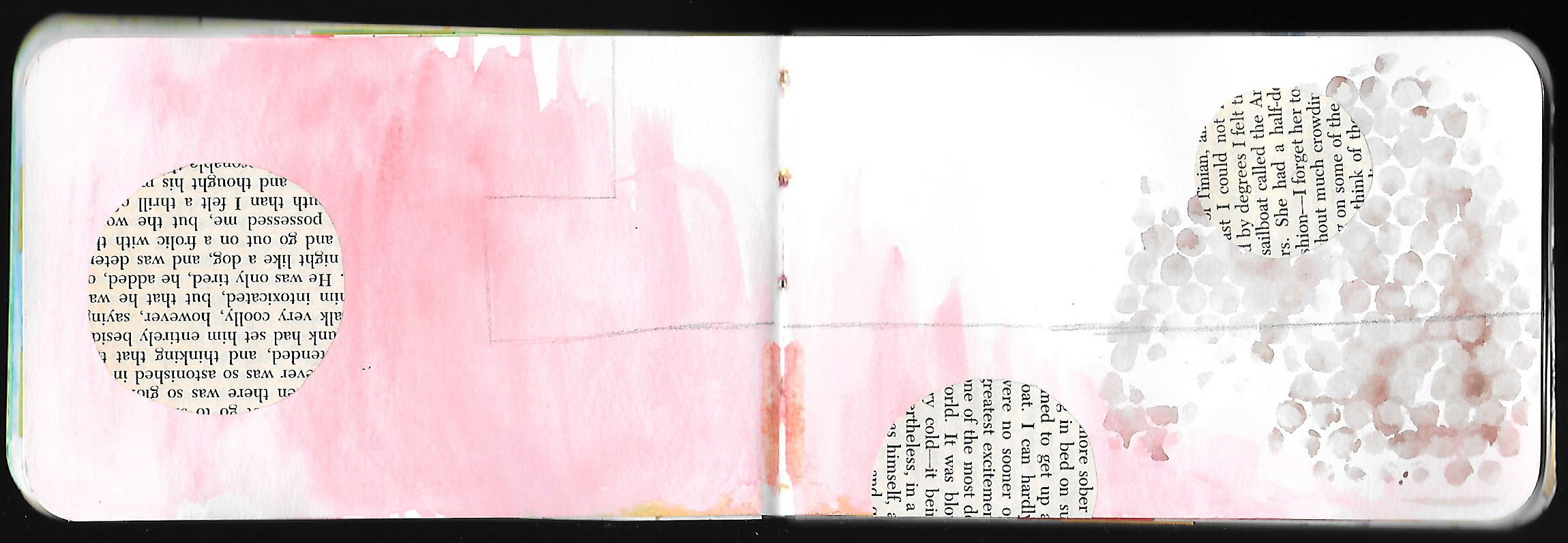
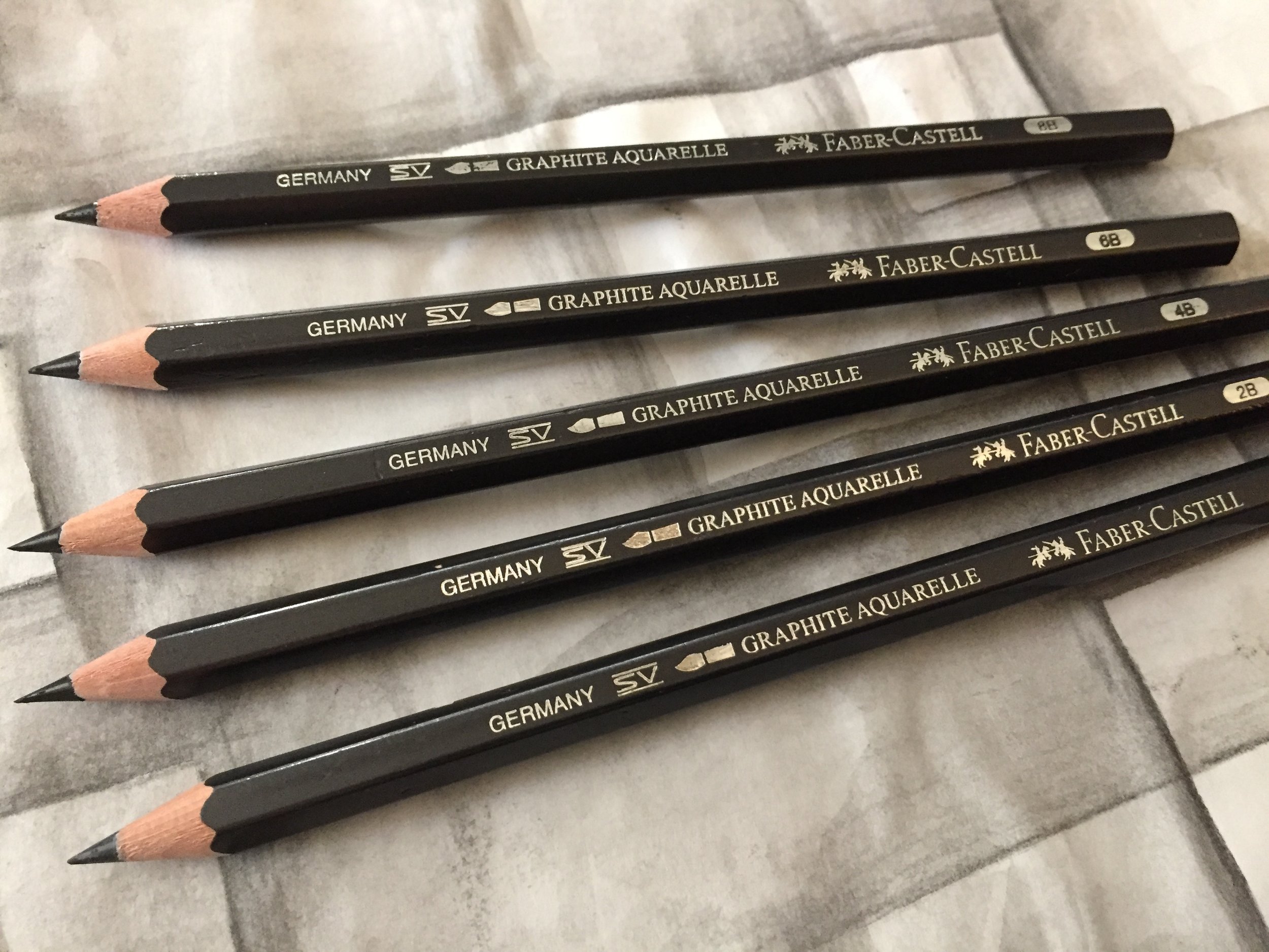
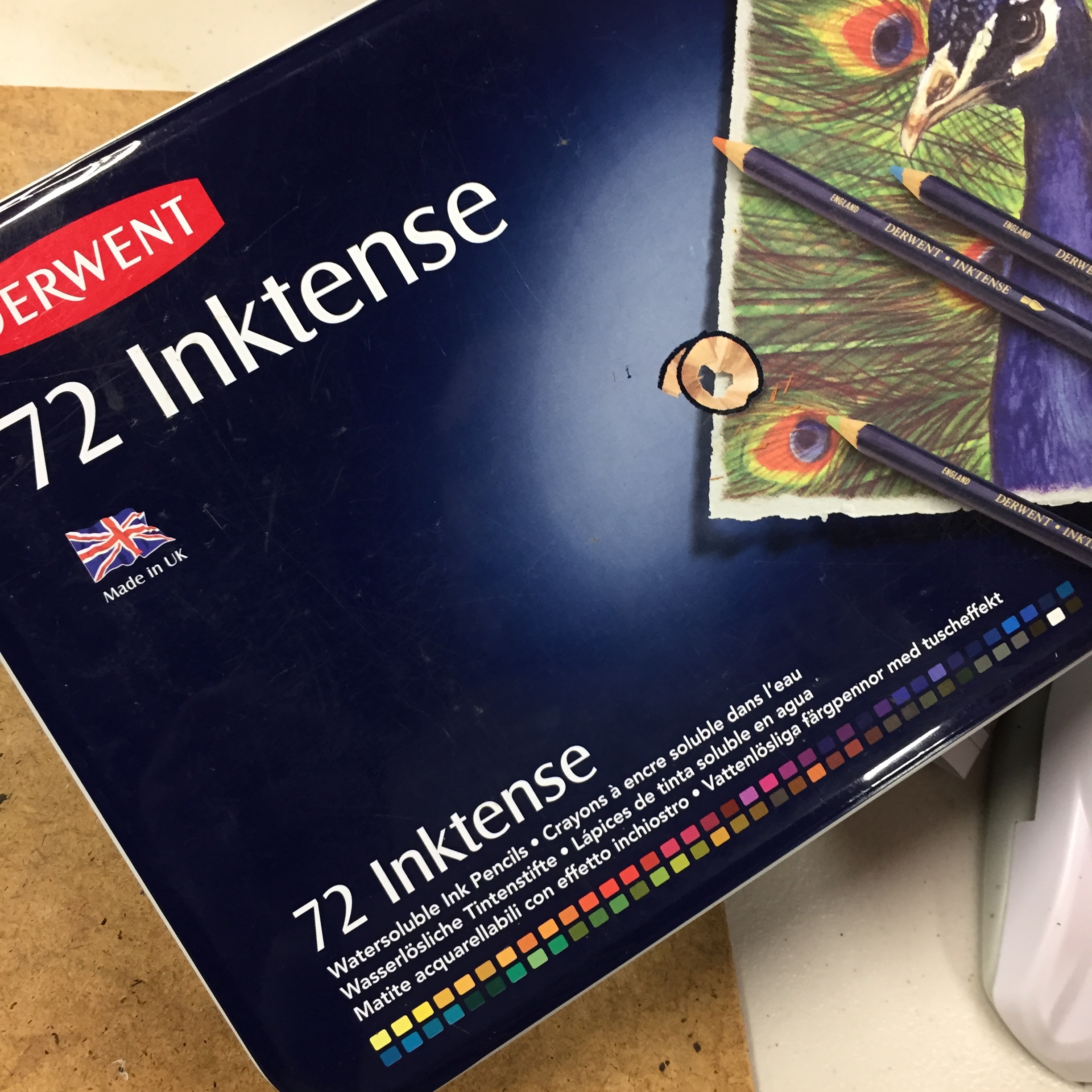
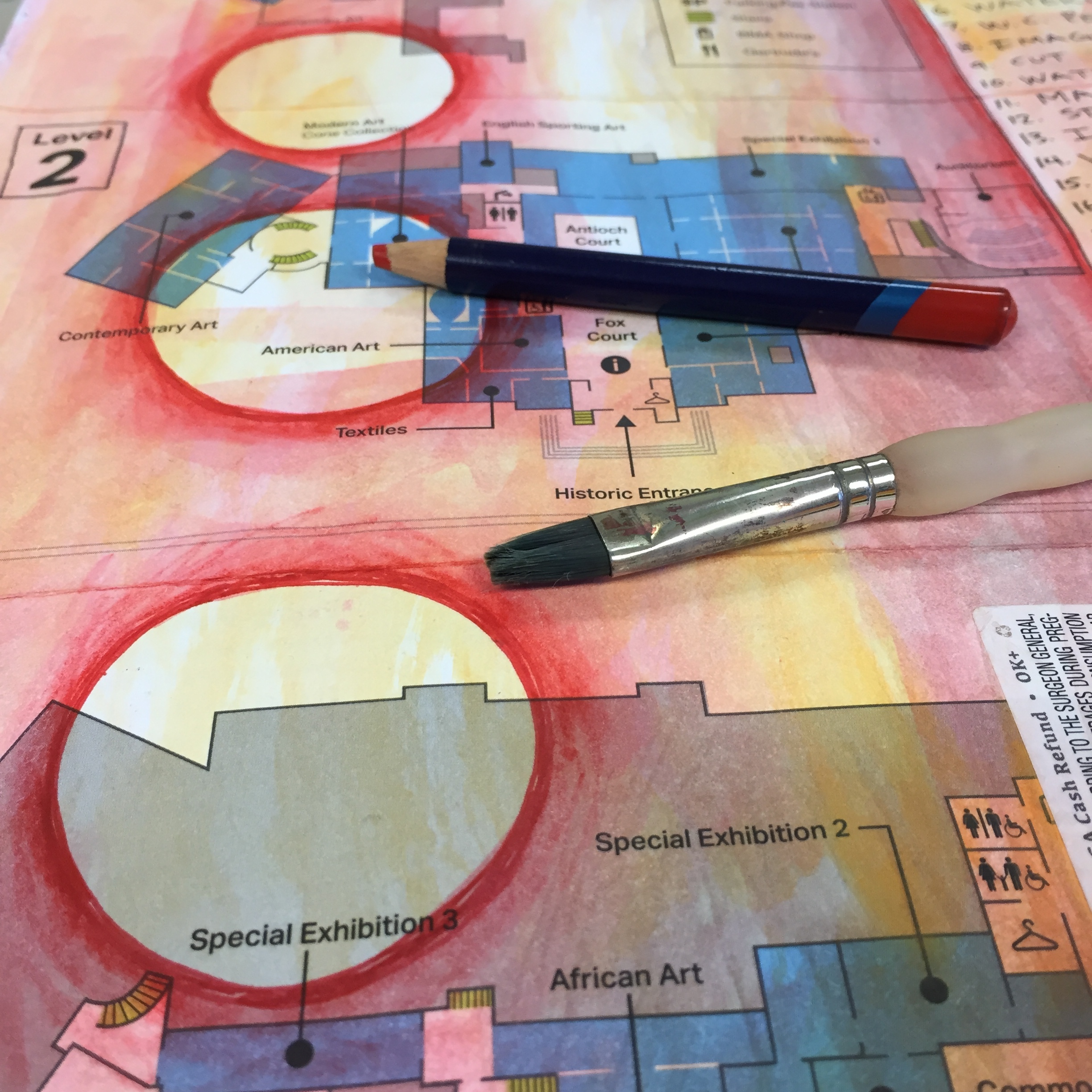
I’ve admitted my love of water-soluble pencils on the blog before, especially when I’ve discussed Prismacolor Watercolor Pencils and Faber-Castell Graphite Aquarelle Pencils. I use them a lot in my journal and in my stand alone, mixed media art to create layers. I truly appreciate the control of the pencil, but I love the painterly quality of the water-soluble material. So, today I want to share what is probably my favorite water-soluble pencil — Derwent Inktense Pencils. Although I refer to the Inktense as watercolor pencils, they are not really watercolor, and Derwent has a whole line of watercolor pencils. The Inktense are water-soluble ink pencils, and they are a high quality, professional material.


When someone first offered me an Inktense pencil to try, I didn’t really see any real difference to the Prismacaolor watercolor pencils that I had been using. And in fact, once I got a small set of Inktense pencils, I did a side-by-side test with them and the Prismacolor, and there really wasn’t a discernible difference in color intensity or coverage. Both pencils performed exceptionally well no matter what technique was used. So as far as quality and performance, they were pretty much on par with each other.

So, why did I switch to the Inktense pencils if they didn’t outperform the Prismacolor?

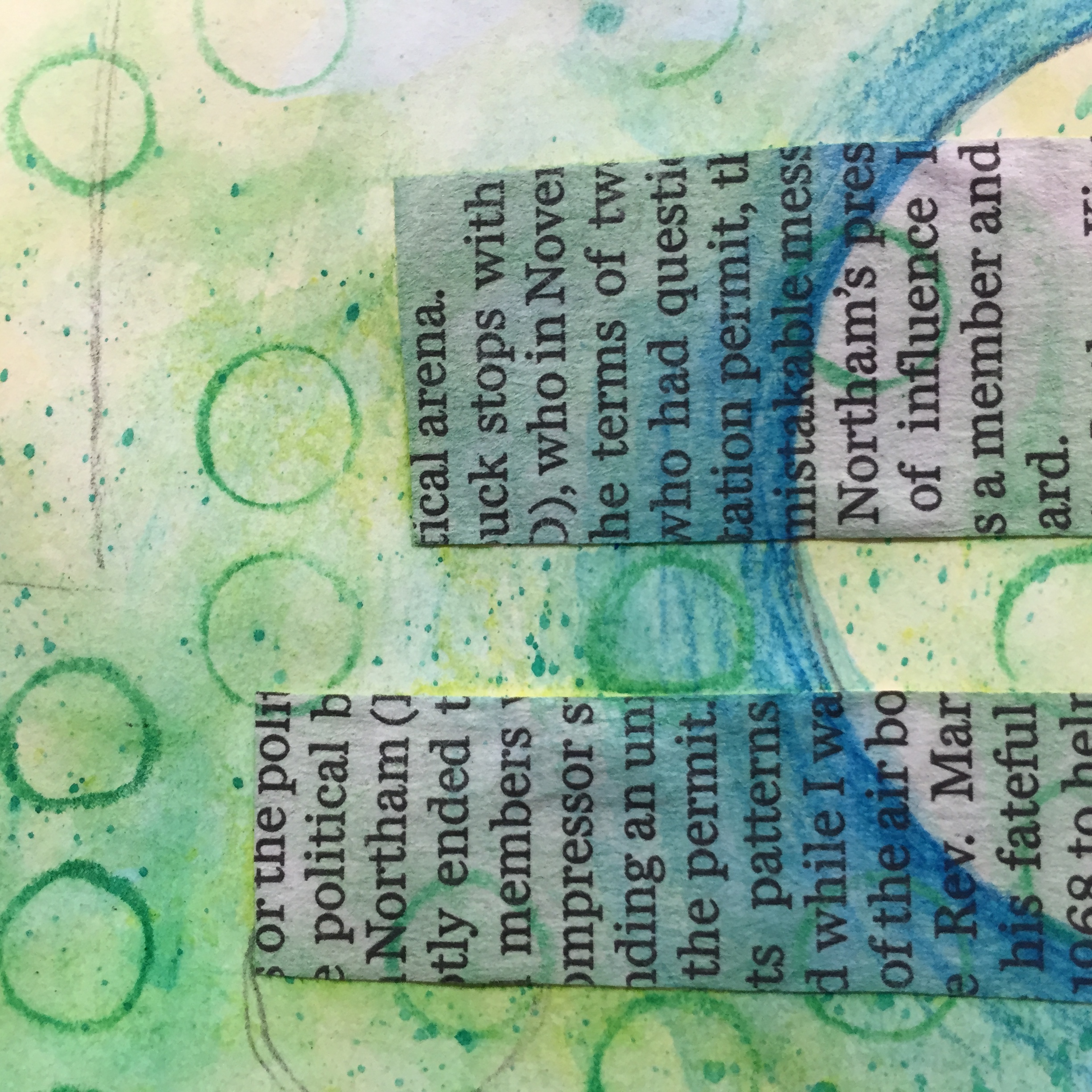
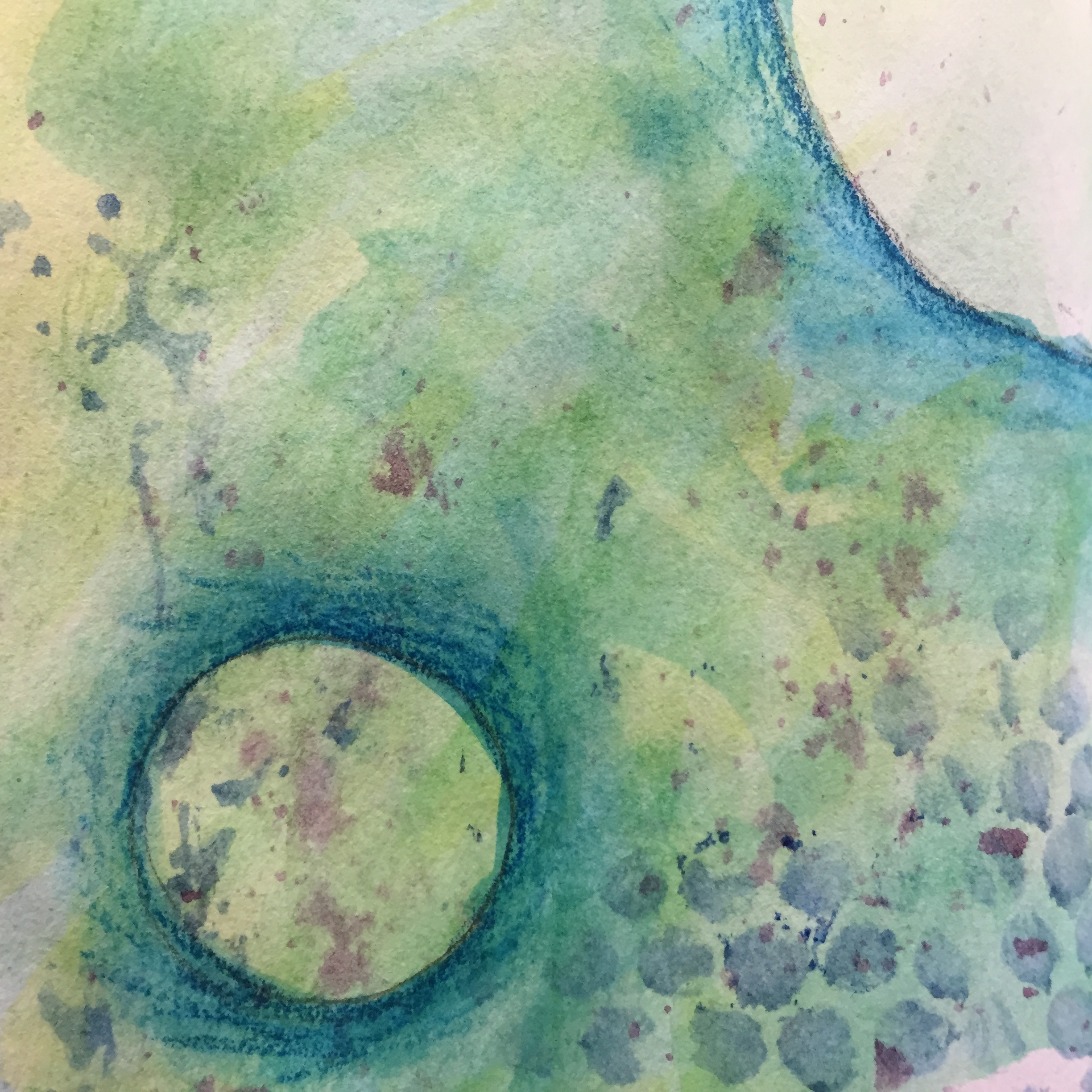
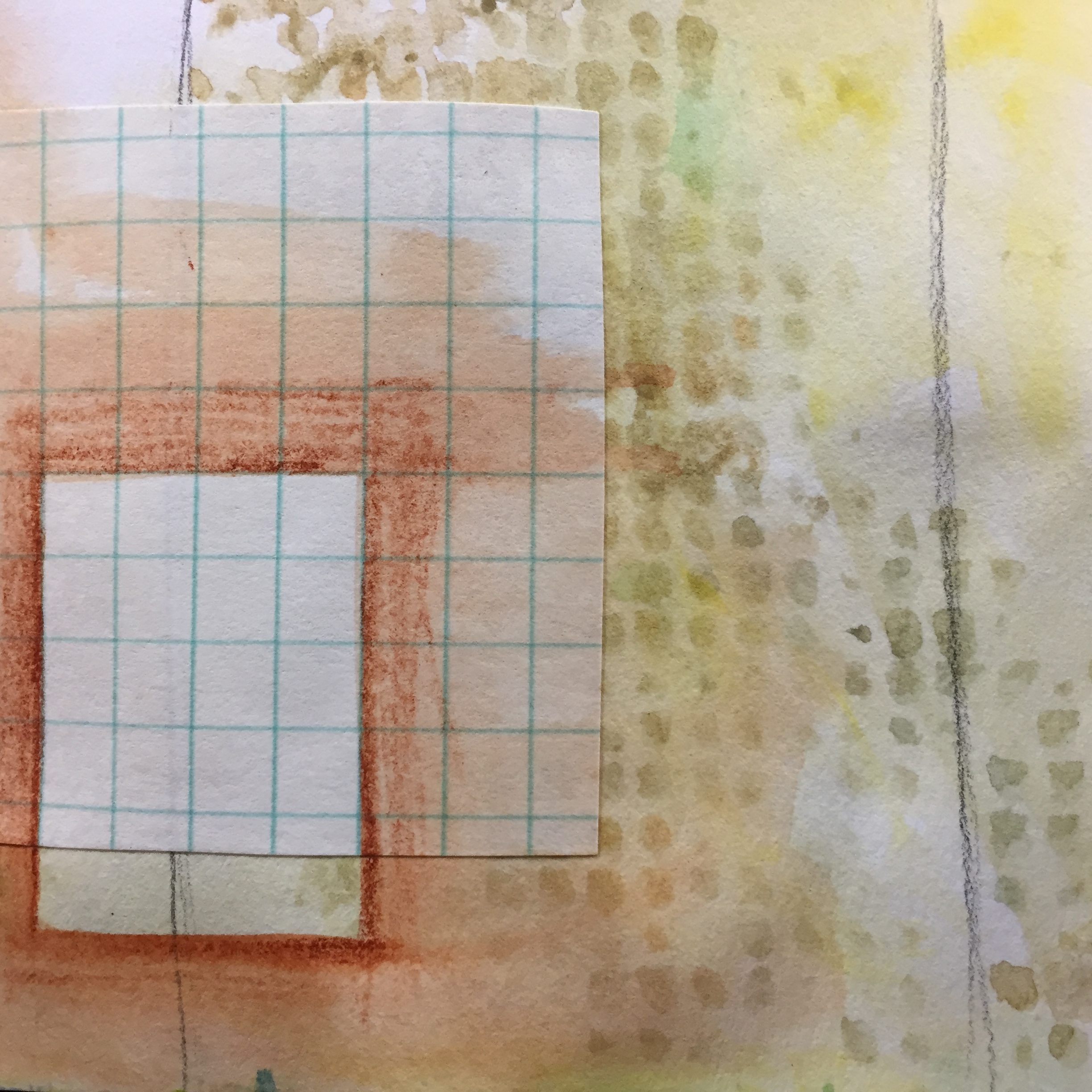
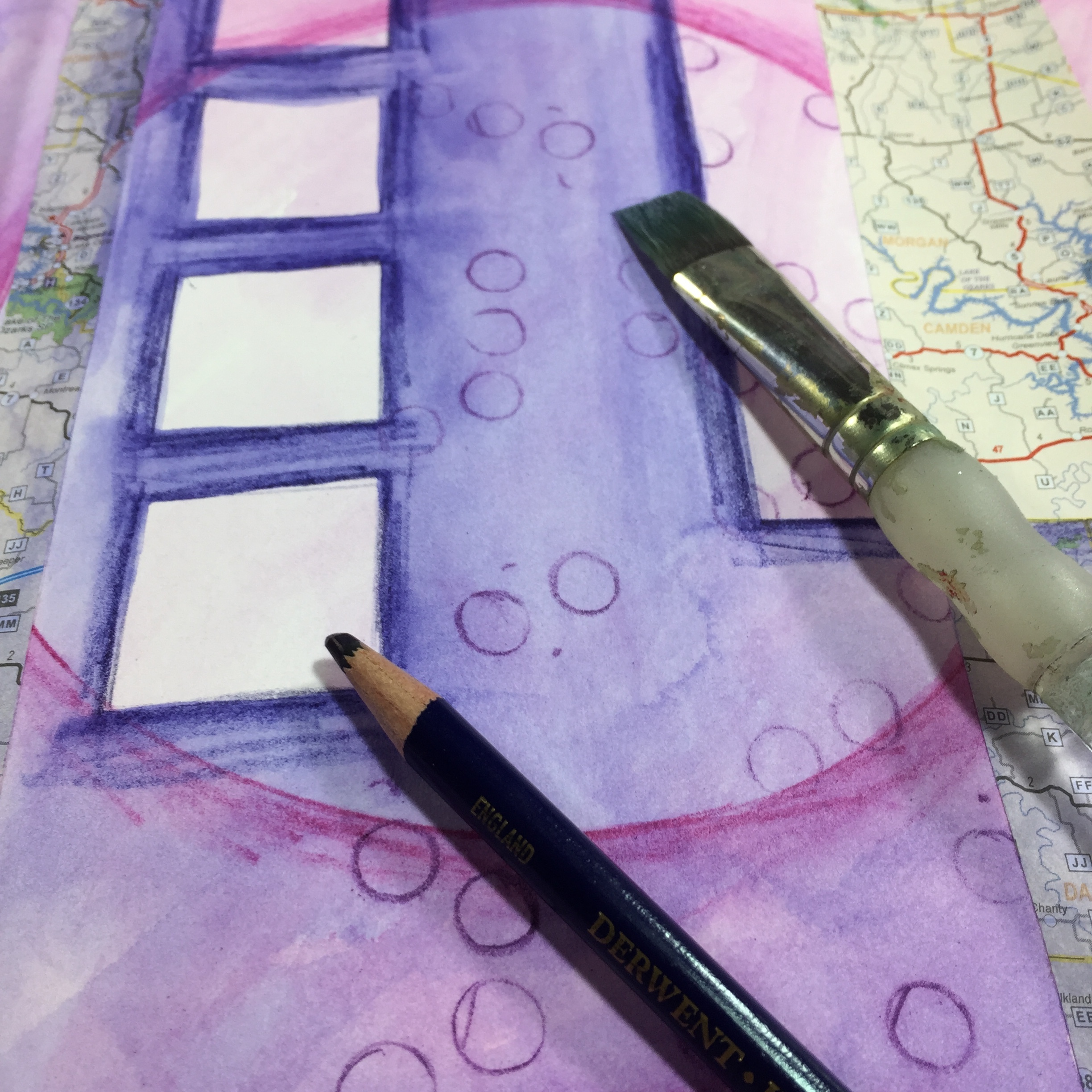
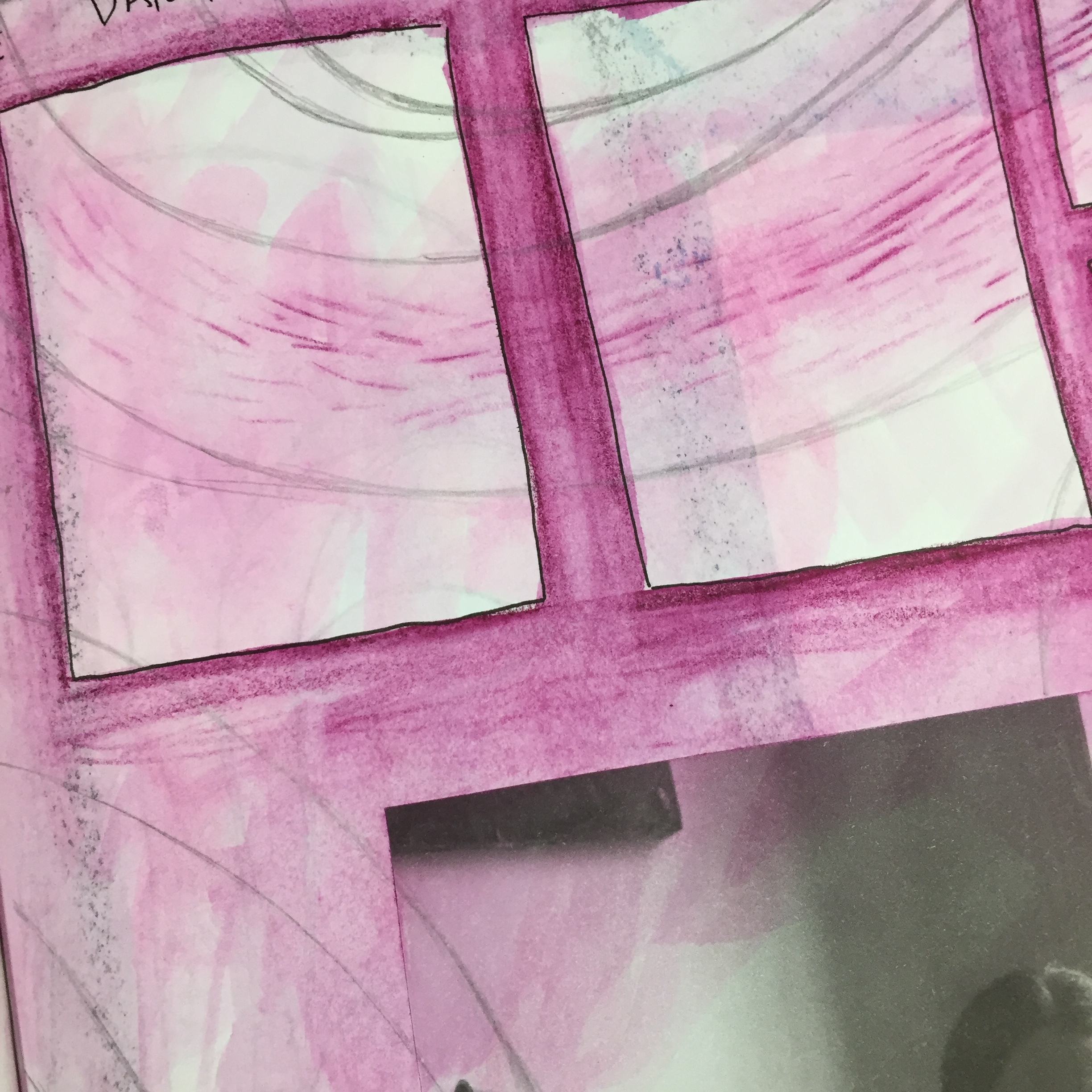
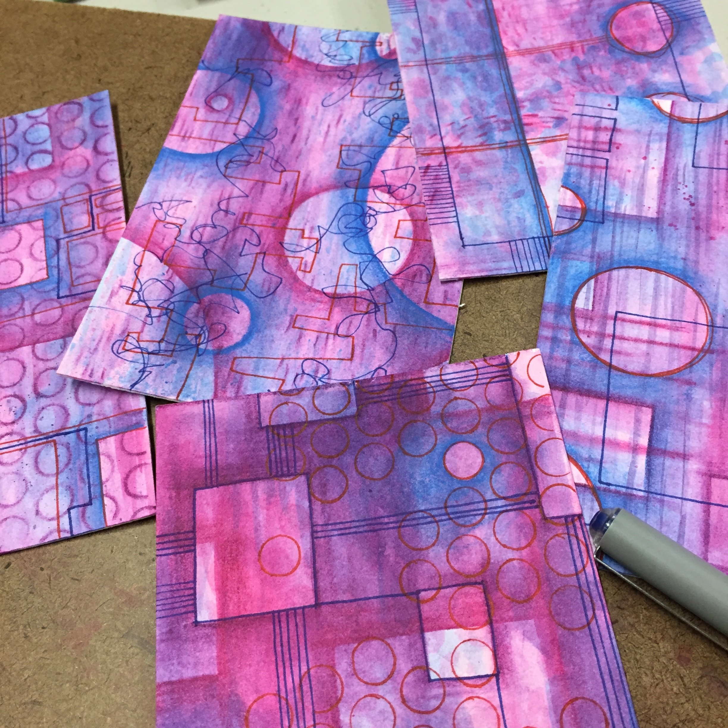
The answer is simply transparency. All of the Inktense pencils are transparent since they are a water-soluble ink. The Prismacolor offer a number of lighter colored pencil, but it appears that they get these pencils by adding white. The white creates a bit of opacity making the color look cloudy when applied, and I’ve never been a big fan of this cloudiness. These colors aren’t so good for layering, but that’s not the case with the Inktense. The only light colors of Inktense are colors that have yellow in them, so you won’t find a light pink or a light blue. Instead you find richer, more intense colors that you can lighten or darken by controlling how much pigment you color and shade onto the paper. This is much better for the type of layering that I like to do with the pencil, so I prefer the Inktense over the Prismacolor.

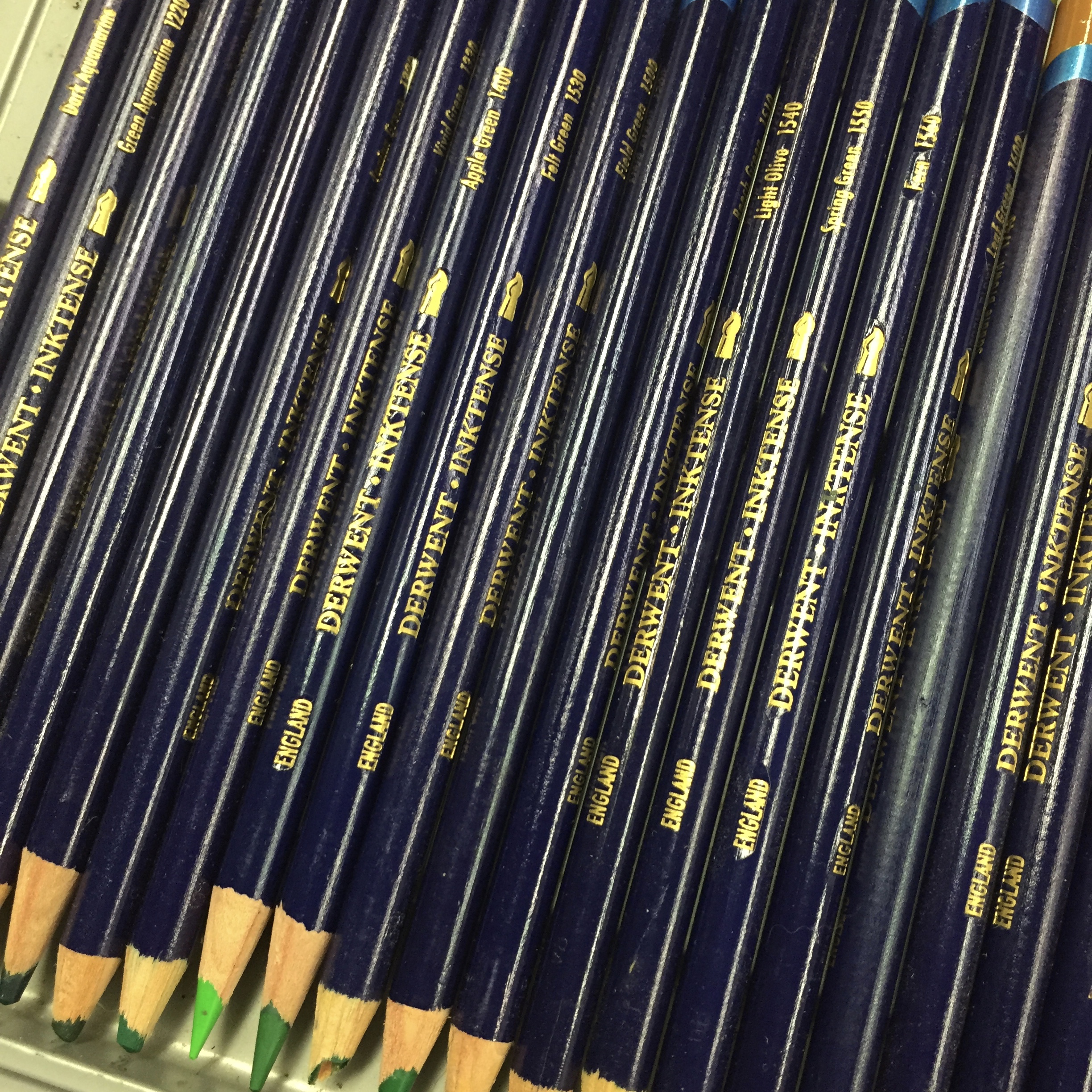
Another advantage that the Inktense has over the Prismacolor is that you can get a set of 72 in the Inktense, but only a set of 36 in the Prismacolor. There was a time when Prismacolor offered the watercolor pencils in larger sets, but they seem to have cut back on them. If you’re looking for a wide range of colors, Inktense is the way to go.

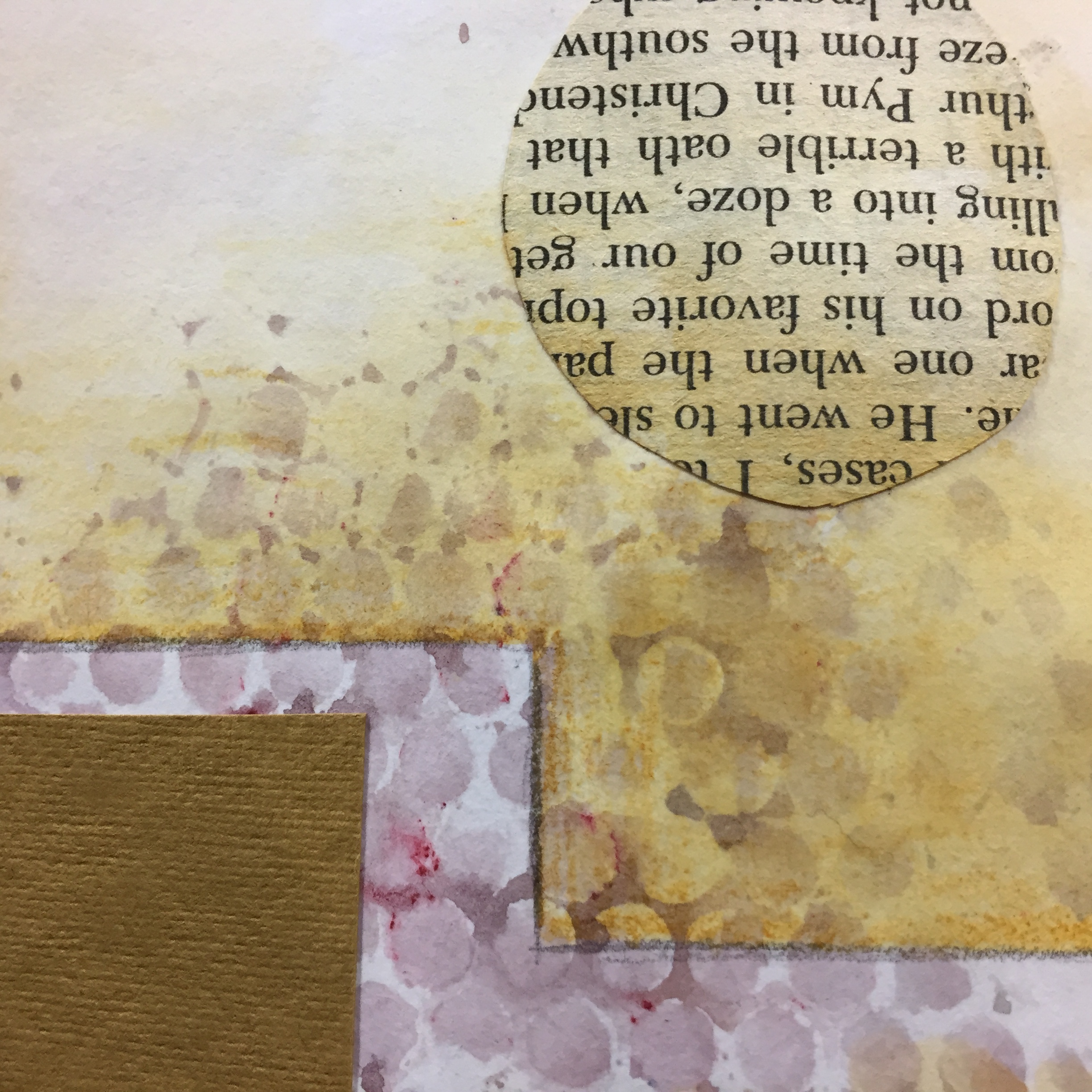
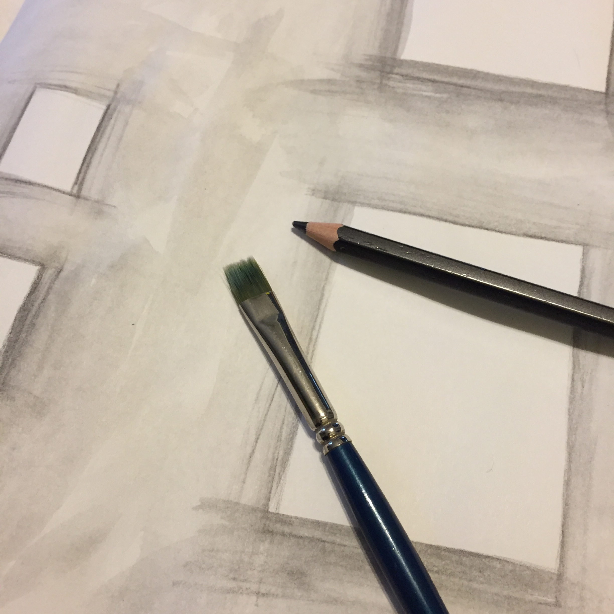
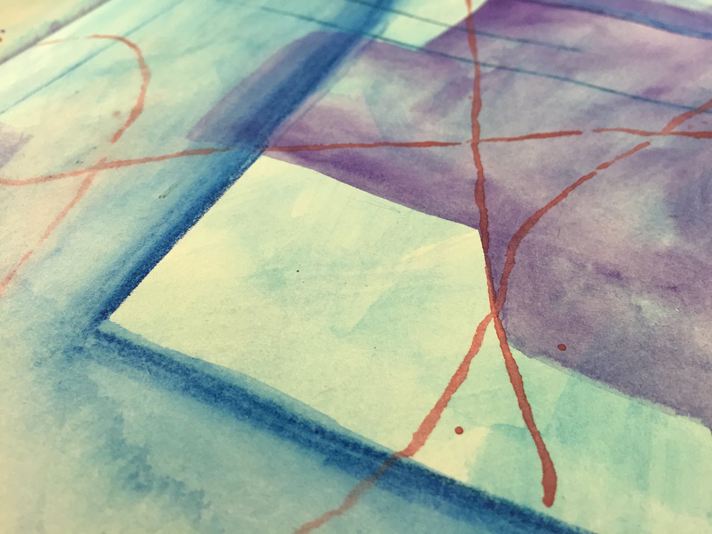
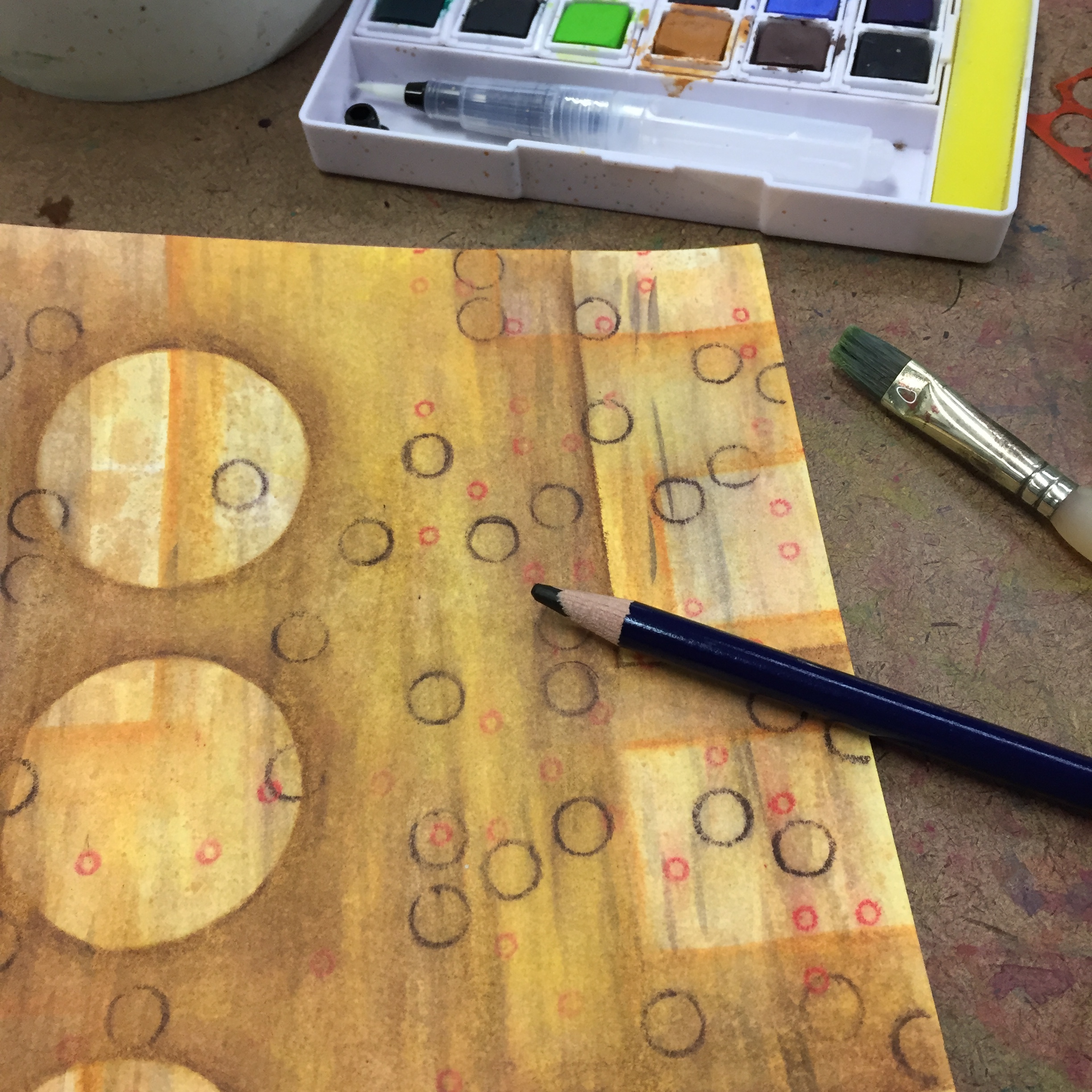
Now Inktense aren’t perfect, and there can be an issue when using them. The ink becomes fixed when it dries, and you can work over top of it with out disturbing the previous layers. Now this sounds like a major advantage, and it is, most of the time. It’s great for building up layers without smearing and obliterating previous layers, and this permanence also allows the Inktense to be used on silk and fabric, though I’ve never tried this. But the issue is that as you spread the pencil with a wet brush, areas can dry leaving hard-edged lines, which you can’t rewet and fade out. This isn’t all that great if you’re trying to get a smooth, even color. Though it’s an advantage most of the time, this permanence can be a bit of a nuisance in some instances.

The only other issue is price. The Derwent Inktense are a premium material, and so you pay a premium price. They can be quite a bit more expensive than the Prismacolor, but it’s something that I’m willing to pay in order to get the transparency that I want.

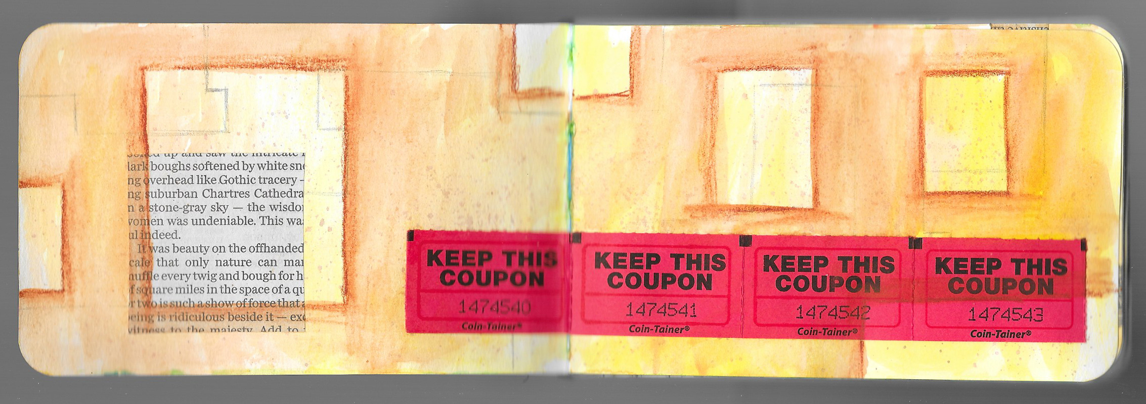
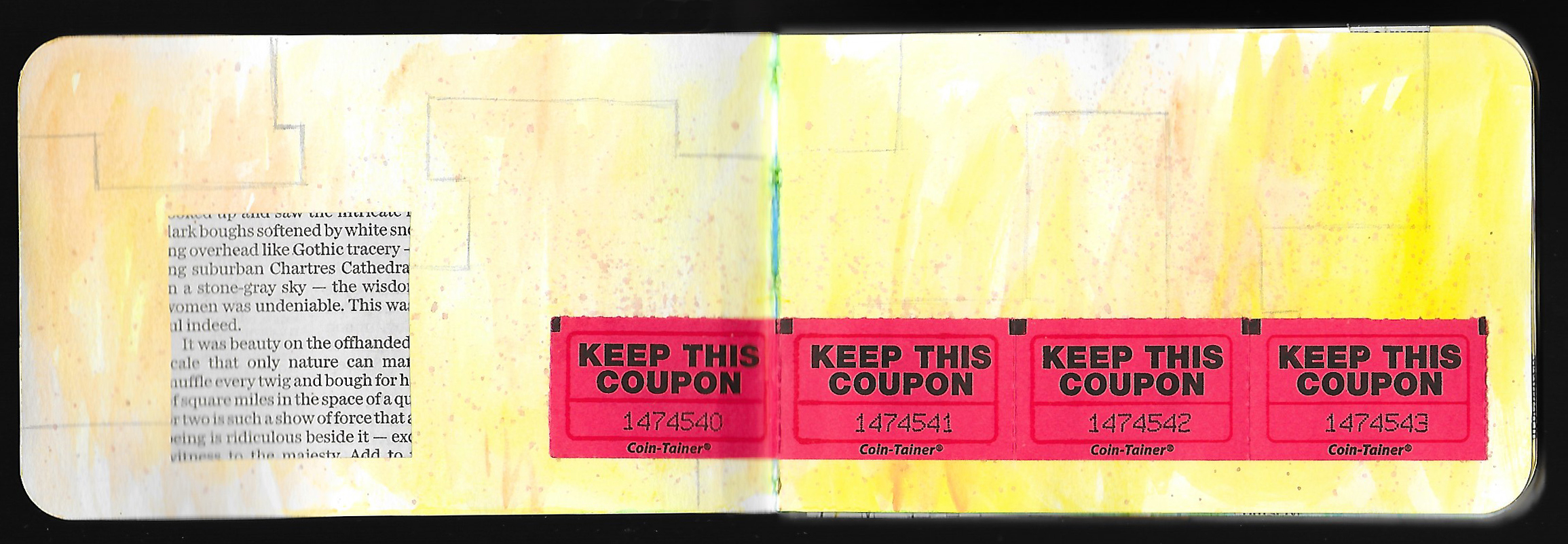
If you’re looking for an intense, high quality water-soluble material, you might want to try the Derwent Inktense Pencils, but maybe use one of these 40-50% coupons you can often get for your favorite arts and craft store to help save a bit on the cost.

As a reminder, that I am not being paid or compensated in anyway for these recommendations. These are simply things that I like to use in my own art.

Journal Friday #95: Layers with Inktense

 
IMG_4834.JPG
 

This week was all about small actions, and today I spent time working with my Derwent Inktense pencils. Similar to watercolor pencils, the Inktense are water-soluble ink, but they work the same way. I spent time adding to pages and building more layers. I love using water-soluble pencils to build layers, to create value, and to make areas POP.

I simply sat for a few hours today flipping through my large journal looking for spaces and shapes where I could add some color. I often use water-soluble pencil to shade around elements. This really makes these elements stand out and creates interesting layers.

It’s nothing too grand, but simple artistic acts combine to create rich pages and images with depth.

Creative Prayer Book: Ink - Lines, Shapes, and Textures

 
fullsizeoutput_1218.jpeg
 

The fourth lesson of the Creative Prayer Book is a quick lesson about using ink to add another layer or two to my pages. I turn to my favorite ink pens — my uni-ball Vision pens, and I make certain that they are waterproof. Since I may want to paint or use a wet material in a future lesson, I want to minimize bleeding. The ink may bleed and blend a little if I paint over it, but not a lot. I use the pens in three main ways — to connect pages, to create structure, and to add texture.


Connection

One of my goals with the Creative Prayer Book is to try to make it so that the pages feel connected, so I’ve been trying to make sure that colors, lines, and textures flow and repeat from page to page. I do the same with ink. I draw lines that act like threads that bridge and tie pages together. Two-page spreads are easy to connect, but in order to tie back-to-back pages together, I wrap the lines around the edge of the page so that they continue from one page to another. By extending these lines, I can tie together quite a few pages. Another way to connect pages is through repetition. By repeating lines, shapes, and textures, I can tie my pages together.

Structure

Another way that I use the ink pen is to draw lines and shapes to divide and break up the space of some of my pages. I use a lot of rectangles, squares, and straight lines to create structure and to create interesting spaces within my pages. I use big and little shapes to have some variety, and I thicken some of the lines so that they stand out. Some of the shapes might be filled in later with images and drawings, and others will be left as generic structural elements.

Texture

In the previous lesson, I used watercolor pencil to add texture to some of my pages, and I want to reinforce that with ink, so I use some of the punchinella, plastic mesh, and circle templates to trace patterns on some of my pages. This repeats some of the elements that I’ve already used, and creates some additional visual interest. The marks and shapes that I make are other small, and I try to spread them throughout my pages so that they don’t create too much emphasis.

CPB Ink 5.jpeg

With everything that I’ve done so far in my little book, I’ve been laying the foundation and slowly building layers. I’ve thought about what affirmations that I want to use, but I haven’t made any hard decisions about exactly which ones will go where. But I’m starting to think about it, and I’m looking forward to seeing how things will develop.

I hope that you’ll try experimenting a little with ink as you build in more layers into your book, and as always, Happy Creating!

Materials Monday: UHU Stic Glue Stick

fullsizeoutput_1215.jpeg

A good adhesive is essential for any mixed media endeavor like the visual journal, and there are a great number of glues and tapes on the market. If you’ve been following me or if you’ve seen some recent posts, you may already know that I definitely prefer UHU Stic, and it is my go to glue for my journal and much of my mixed media work. I’ve been using UHU exclusively since I started journalling nearly twenty years ago.

I know a lot of people really don’t like glue stick, and struggle with getting things to really stick to the page, but I like the convenience of a glue stick. When used effectively, it works well to adhere paper, photos, and more in the journal and in mixed media artwork. UHU is a high quality glue that is non toxic, acid free, and washable, and it comes in several sizes. I always get the jumbo size — the 1.41 oz size, and I like the blue colored glue stick. Though it’s a deep blue in the tube, it dries completely clear when applied. The blue color is great for ensuring the glue covers evenly. The have recently redesigned the label on the glue stick, but it’s the same old glue.

 
fullsizeoutput_1214.jpeg
 

The UHU is perfect for gluing in maps and movie tickets, newspaper and tracing paper, photocopies and magazine images, and a lot more. However, thick, glossy materials like postcards can be a little tricky, and it can take a little extra time and pressure to make certain that they stick. But it can be done. Like any glue stick, the UHU can be rather messy, and I always make certain to work on top of a scrap of paper when I spread the glue so that I don’t get glue all over my work surface or all over my pages. I find that the UHU is perfect for building layers of transparent media like watercolor, watercolor pencil, and marker. The only draw back is the glued pieces can sometimes lift up when they get wet, but almost any glue stick will do that. Many people like to use acrylic gel medium as an adhesive, but that’s best for mixed media that involves acrylic paints. I don’t use much acrylic in my journals, and the dried acrylic medium id difficult to layer on top of with watercolor and water-soluble pencil.

 
fullsizeoutput_1216.jpeg
 

Unfortunately, UHU Stic Glue Stick can be difficult to find in local shops, and many big arts and crafts retailers don’t carry UHU in their brick and mortar stores. It can even be hard to find in office supply sotore, so I buy mine online. I usually buy a half dozen or more, since I go through them pretty quickly.

If you’re looking for a good glue stick, I recommend UHU Stic. Just make certain to use it effectively!

Journal Friday #94: Prepping a New Journal!

 
fullsizeoutput_120f.jpeg
 

My current journal is getting rather full, and I have something started on every page. It’ll probably take another month or more to wrap it up, but I wanted to prep a new journal because there’s always a transition time when I’m basically working in both the old and new journal. So, I took time today to begin prepping a new Strathmore Hardbound Sketch Journal. There are several rituals that I go through to get a new book ready.

Stickers

I always have a stash of stickers, and they’re great for decorating the outside of my journal. I tend to collect them, especially when I travel, and the cover of my journal becomes a document of a specific period in my life with the diversity of stickers. Today, I dug through my stash and found a few stickers to start the cover. I left plenty of room so that I can add more stickers as I collect them.

 
IMG_4815.JPG
 

Inside Cover

After adding a few stickers to the outside, I turned to the inside front cover of the book. I like to put my contact information just in case I ever get separated from the journal. I also added the words “Initiated” and “Retired” so that I can add the dates of when I actually start working in the journal and when I retire the journal and stop carrying it around. I don’t like the word “Completed” because a journal is never really finished, and there are often pages that are left unresolved.

 
IMG_4817.JPG
 

Pocket

It’s always good to have a way to hold all of the fodder that I accumulate, so a pocket is always part of my ritual. There are a number of ways to create a pocket, but I used a separate piece of paper and folded tabs on the sides and the bottom. I attached it with glue stick. I usually make the pocket so it’s about half the size of a page, and glue it to the final page in the book. A pocket like this can hold a lot.

 
IMG_4816.JPG
 

Calendar

The final thing that I did to wrap up preparing the journal was to create a calendar in the back. I started on the front of the page that has the pocket and work backwards. That way I can add additional months as needed. I like to use highlighters to color code events and appointments. Despite using the calendar app on my phone, the calendar in my journal is my definitive one.

Besides working to prep a new journal, I worked on my Creative Prayer Book adding to pages using watercolor pencil. I love building rich layers in my journals.

Creative Prayer Book: More Layers

CPB WC Pencil 4.jpeg

Welcome to Lesson 3 of the Creative Prayer Book. So far, I’ve built a couple of initial layers using watercolor, pencil, and collage, and I’ve begun quite a number of pages in my small Stillman & Birn Alpha Series softcover journal.

Now I want to focus on creating some structure and texture using watercolor pencil, as a way to add more layers. I’m a big fan of using a variety of materials to create rich layered pages, and one of my favorite materials to use for this is watercolor pencil. The pencil gives me a lot of control, but with a little water, I get some nice painterly effects. Watercolor crayons can be used as well, and act in a similar manner.


Structure

I want to use the watercolor pencil in two main ways in my little book. The first is to create some structure using some simple geometric shapes — mostly squares and rectangles. Most people might think to color or shade in the shape, but I like to shade around the shape. This creates a “window” effect when I paint plain water over the pencil. I can use this technique on top of pages that already have something on them, but I could easily use the technique to start new pages. I could use watercolor paint or a water-based marker to activate the watercolor pencil, but I use them mostly use plain water. Feel free to experiment and explore the pencil.


Texture

The second way that I use the pencil is to create textures and patterns on top of my pages. I can trace stencils and items to create patterns, and I can use marks, dashes, dots, and more to create textures. Again I use water to activate the pencil, but I spread the water all over the marks to make them blend into the page.


As I work with the watercolor pencil, I also begin to think about the content that I want to include in my book. I’m envisioning my book as one of creative affirmations — words, phrases, and quotes that will be reminders and motivators for my creative journey.

I hope that you will experiment with watercolor pencils, and begin to think about the content, the prayers, the affirmations, the words that you want to include.

Happy creating!

Materials Monday: Metallic Sharpies

 
fullsizeoutput_1207.jpeg
 

Metallic markers and pens are a wonderful addition to any mixed media tool bag, and I feel that they’re pretty essential to the visual journal. Who doesn’t love adding some sparkling flair to their work?

I’ve used metallic ink for a long time to bring emphasis and focus to my journal pages, and it’s ideal for highlighting words, lines, and shapes. Over the years, I’ve used a lot of different metallic markers and pens, and some I’ve loved and some I’ve loathed. Even the best, though, can have problems of drying out, clogging up, and blobbing ink.

Over the past few years I’ve turned Metallic Sharpies. They’re relatively inexpensive, easy to find, and pretty reliable. Sharpie also makes metallic paint pens, but I’m talking about their metallic permanent markers. The ink isn’t as opaque and shiny as some others out there, and the markers won’t draw and write on top of every material, but they work on top of most materials that I use in the journal. They’re great for adding embellishments and a little bit of extra pop to elements on a journal page, and I always have a few in the studio and few in my travel art kit. I do find that they stand out more, if you draw or write on a dark surface, or if you outline the marker with a black pen.

One really nice thing about the Metallic Sharpies is that they are less messy then many other metallic pens and markers, especially paint markers. There’s nothing like trying to get a paint marker’s paint to flow and ending up with a huge, unwanted blob of paint on your page. There’s no worry about that with the Sharpie since it’s a plain, permanent marker with metallic ink — no shaking, no pressing down the tip to get the ink to flow. Another plus is that the metallic Sharpies come in three distinct colors — gold, silver, and bronze, and you can often find them in a convenient 3-pack. I did notice that Sharpie has three new metallic colors, as well — sapphire, ruby, and emerald, but I haven’t tried them.

There is one major drawback with the Metallic Sharpies. They must be stored with the tip down, and I’m thinking that this has something to do with the metallic ink inside. I’ve had some metallic Sharpies that were just kicking around inside my bag all willy-nilly, and after a while, they just don’t write or draw well. They’re just not very metallic, and the ink appears clear. I think that this is an issue of the ink separating inside the marker, and storing them tip down, makes this less likely. Also, there is a little bit of bleed through with these markers, but not like with regular sharpies. Any bleed through is nominal, and it’s something that I can live with. I don’t know how well they would hold up on stand alone work, but overall, I like using these Sharpies in my journal.

If your looking for an inexpensive, yet effective metallic marker to add to your stash, I recommend the Metallic Sharpies — just make certain to store them with the tip down!

Journal Friday #93

IMG_4785.JPG

I sat down this week, and took a look at a bunch of posts on Instagram with the hashtags #visualjournal and #visualjournaling. At first, I was struck by the sheer number of posts and the diversity, but then I was struck by how different my journaling approach is. That’s definitely not a bad thing, but unlike many people who use observational drawing or acrylic paint, I tend to use a lot of geometric shapes and transparent materials. Also, I tend to use mundane, personal fodder instead of magazine images or vintage ephemera. In the spread that I made today for the video, I used Derwent Inktense to build up layers of shapes and color, and I used lots personal fodder. I also used POSCA markers, which is a new material for me, and I’ve only been using them for a few weeks.

One interesting thing with the video, is that for some reason, the color was very off, and the purple Inktense pencils I used, look very blue. Oh well!

It’s always fun to make these videos.

Creative Prayer Book: Initial Layers

IMG_4780.JPG

Last week I eased into my Creative Prayer Book with a variety of techniques using watercolor paint, so this week in Lesson 2, I want to build some initial layers on top of the watercolor. I’m not too focused on the content of the pages yet, so I’m only using materials and techniques that will add some structure, color, pattern, or texture to the pages. I’m avoiding anything with a strong image or content, and this will allow me to build up the background before delving into the meaning making. I want to add some drawing with pencil and some simple collage as a way to begin building layers..

Just like with the watercolor paint, I’m focusing on allowing the pages to flow from one to another, so I want to use lines and shapes to transition from page to page, so I wrap some of the collage around the edges of pages and repeat some of the same shapes from page to page. This helps connect the pages together, and helps tie the pages into a cohesive whole.


Pencil Drawing
Adding simple lines and shapes with pencil is an easy way to add more to the background. The value of the pencil is subtle and doesn’t stand out too much, allowing my marks to fade into the page. I like to use geometric shapes and lines, and rectangles, and straight lines add a lot of structure and help divide up the space of the pages. Circles and curved lines, on the other hand, help to add some variety and visual interest to pages. Feel free to use any types of lines, shapes, or marks that you want. Perhaps avoid drawing representational images, and keep your mars on the decorative side.


Collage
Collage is a big part of my journal practice, and I always have a pretty big stash of ephemera to use. Just like the pencil drawing, I want the collage to be somewhat subtle, so I don’t have anything with imagery. Newspaper, book pages, raffle tickets, maps, and colored paper all add some color, pattern, or texture to the pages without hinting at content or meaning. UHU glue stick is my go-to adhesive. I know some people have issues with glue stick, but when used effectively it works great. Besides, glue stick is the most appropriate for the materials that I use. A lot of people use an acrylic medium as a glue, but watercolor and watercolor pencil just won’t stick to the acrylic. Dig through your stash of papers and materials and find things that you want to glue in.


Try experimenting with some drawing and collage to build some layers on your pages, and don’t worry yet about what the content will be. We’ll get to that in future lessons, so have some fun building some initial layers and using up some of your fodder stash. Just like with the watercolor, work on as many pages as you wish, and remember that you don’t have to include the drawing and collage on every page.

Happy creating!

Materials Monday: Faber-Castell Graphite Aquarelle Pencils

 
fullsizeoutput_11ff.jpeg
 

I must say that I am a big fan of water-soluble pencils, and I’ve already confessed my love of watercolor pencil here on the blog. So, it’s no wonder that I include water-soluble graphite as part of my artist’s tool bag. These pencils work very much like watercolor pencil, but the just do it with graphite instead of colored pigment. You can use them in a number of ways like watercolor pencils, but I mostly draw and shade with them first, and then brush water over the marks. The pencils give me a lot of control, but with a little water, I get a nice painterly effect.

IMG_4715.JPG

I’ve used many different brands of water-soluble pencils throughout the years, but I am currently using Faber-Castell’s Graphite Aquarelle Pencils. Faber-Castell is a maker of high quality pencils, colored pencils, pens, and markers, and the Graphite Aquarelles are no exception to this quality. They are a chunky pencil with a barrel that’s slightly larger than your average pencil allowing for a thicker graphite core. They blend beautifully with water, and come in five hardness grades — HB, 2B, 4B, 6B and 8B, allowing for a full range of value. Conveniently, you can get all five in a set, but if you were to get just one pencil, I’d recommend one of the darker pencils, either the 6B or 8B, since you can control the value by how hard you press.

Over the years, I’ve used water-soluble graphite in my journal and in stand alone mixed media work and  graphite drawings, and I’ve loved the effect in all instances. It’s easy to build up layers of graphite using all of the hardness grades, and this is one of my favorite ways to use them. I start with the lightest pencil — the HB, and establish a composition on mixed media paper painting over it with clean water. After it dries, I build up another layer with a darker pencil, and I continue with all the pencils to achieve dark, rich values. But the effect can be a little bit messy since painting over the graphite is never extremely precise, so I like to use regular graphite on top to make edges crisp and to even out values. The combination of water-soluble and regular graphite results in a rich piece. Of course, the Graphite Aquarelles work excellently in mixed media pieces as layers in with materials like pen, marker, and collage, and having the ability to spread and blend the graphite can lead to interesting effects. You can also combine the pencils with other materials, and the darker pencils are great to use with acrylic paint or medium as they will mix and blend with the wet acrylic.

Students experimenting with water-soluble graphite and white acrylic paint.

Overall, the Faber-Castell Aquarelle pencils are a versatile medium to use on it’s own or with other materials, and the selection of five hardness grades gives an advantage to Faber-Castell over some other brands that offer just one grade. The only downside that I can see is that by themselves, the pencils can be rather messy when brushing over them with water, but using them with regular graphite or other materials easily makes up for it. I never go anywhere without at least one tucked in my bag.

Please remember that I do not receive payment or any other benefits from the makers and manufactures of the materials that I share on Materials Mondays. These are materials that I personally use and enjoy!