Materials Monday: Faber-Castell Pitt Artist Pens

 
fullsizeoutput_1264.jpeg
 

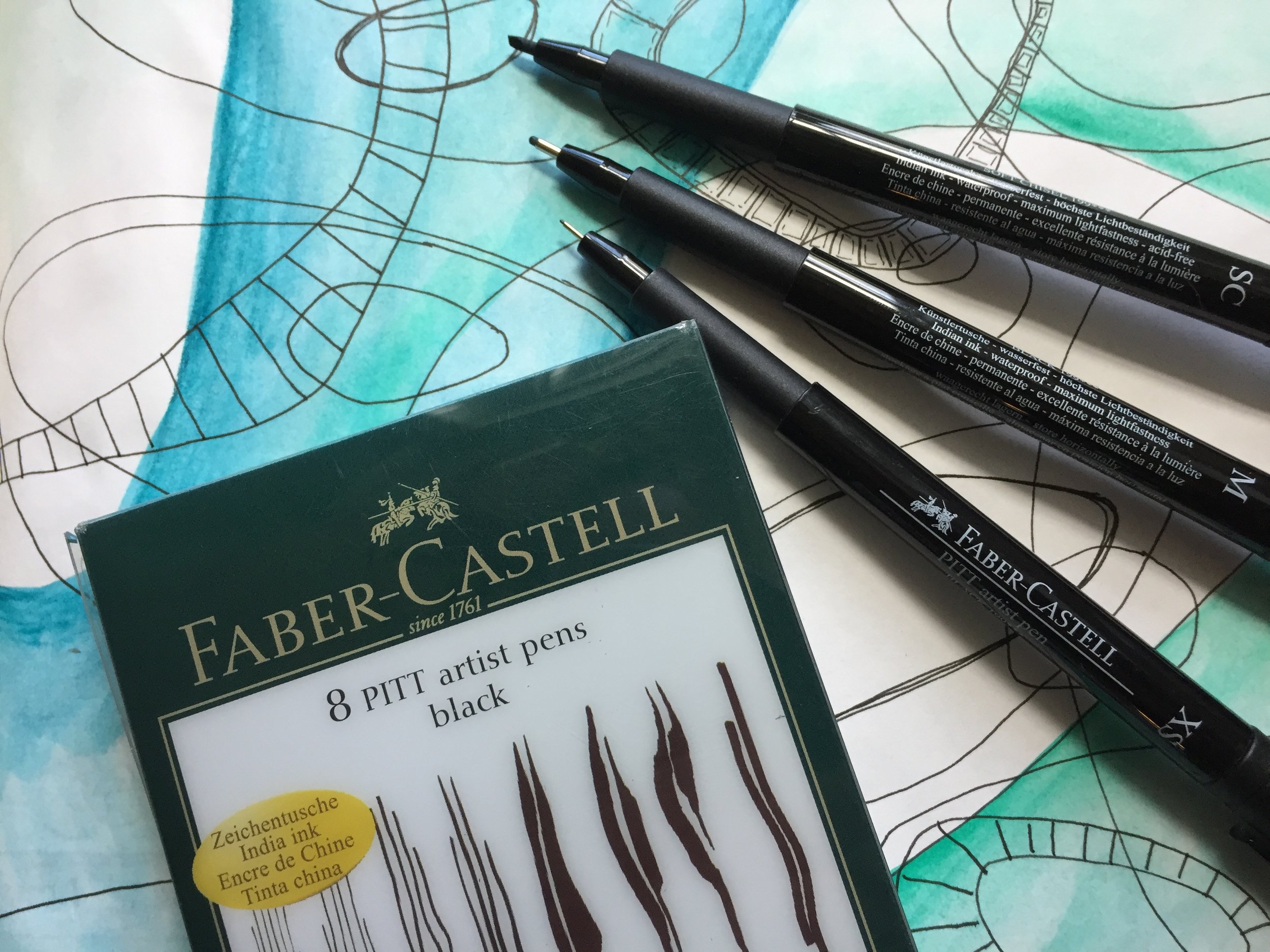
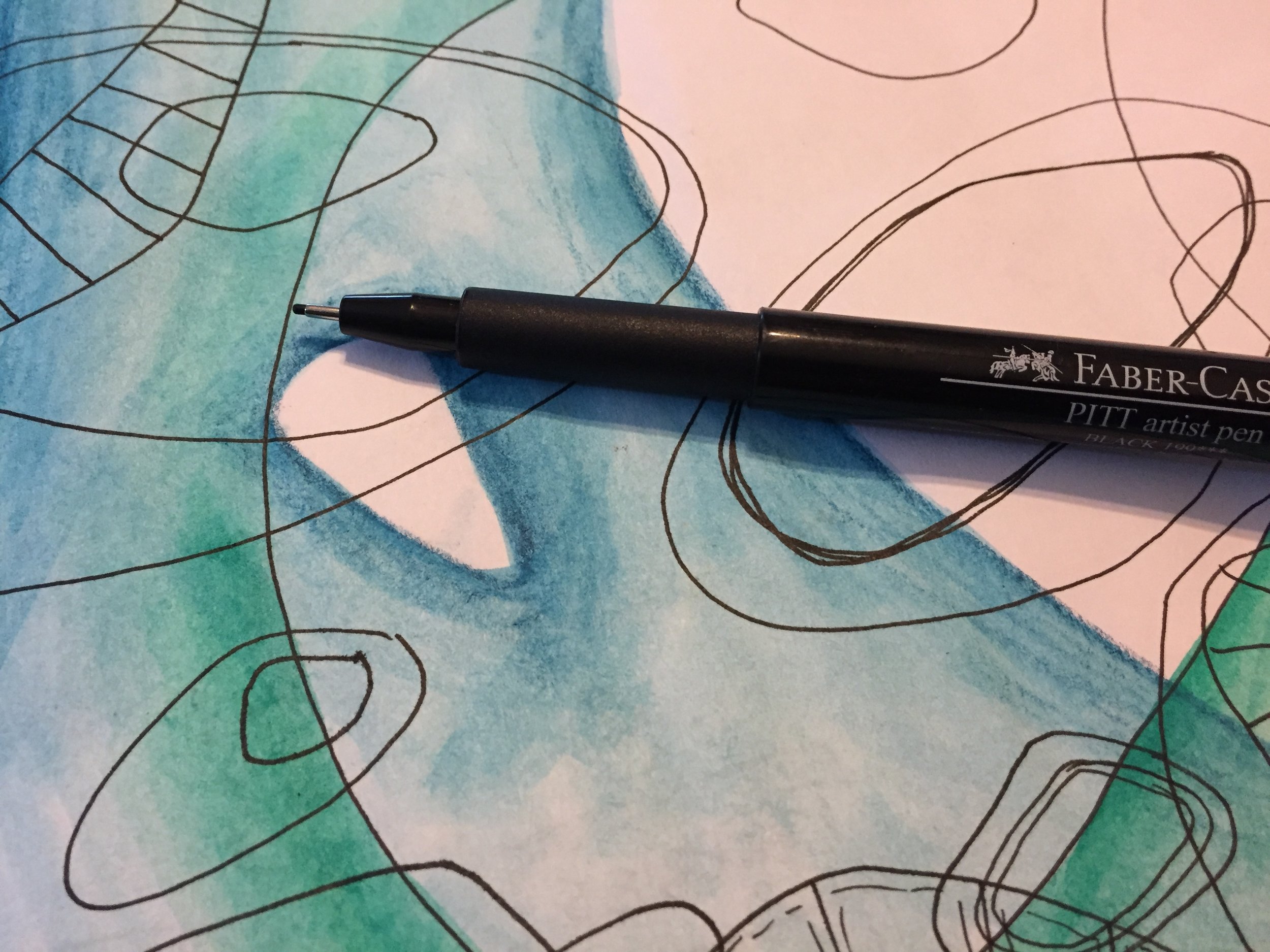
Like most visual journalists, I’m always on the lookout for a good pen, and having a variety of drawing pens in the journal kit is a must have for me. There are a wide variety of drawing pens out there with certain big names dominating the market. But I like the Faber-Castell Pitt Artist Pens. I’ve only used the black, so I can’t specifically speak about the multiple colors available in the product line, but I am a big fan of the black. However, I am dying to try some of the 58 colors they have.

The Pitt pens use India ink, and Faber-Castell claims that they are permanent and waterproof. I must say that the ink holds up well to the wet media that I use in my journal and my artwork. I have had issues with some other brands that have claimed to be permanent and waterproof, but the Pitt pens live up to the claim with little to no bleeding if given enough time to dry. However, like any waterproof pen, the more ink that you lay down in an area, the more likely some of the ink will lift and spread when painted over with wet media. But it has not been an issue at all.

One of the things that I love about the black Pitt pens is the range of tip sizes, and you can even buy a set that has eight different sizes and types of tips — everything from an Extra Superfine to a Soft Brush. This allows you to draw in small, thin details as well as fill in larger areas, and there is even a Big Brush pen that works like a big marker with a brush nib.

 
fullsizeoutput_1263.jpeg
 

I love the versatility of the uni-ball Vision pens, but there’s something about having a set of dedicated drawing pens and being able to add a wider range of marks, lines, and textures to pages and to artwork. These pens are my goto pens when I’m doing any kind of ink drawing, especially for many of my monster drawings. The range is perfect for creating thick outlines, as well, as small details like, stripes, spots, and bumps.

 
fullsizeoutput_1262.jpeg
 

I also like that the Pitt pens and airplane safe, and don’t have issues on flights. Many pens, the uni-ball Visions included, can have issues with leaks and globs because of the change in cabin pressure when flying. It’s such an annoyance to end up with blobs of ink all over a surface or all over your hands. There’s none of that with the Pitt Pens, and they have quickly become one of my favorite travel pens.

The only issue that I have is that most of the colors have a very limited nib size, and mostly come in a brush tip only. I’d love to have the colored ink in a wider selection of nibs, and it’s one of the main reasons that I haven’t really tried the colored ink. I’d even consider replacing my uni-ball Vision pens if I could get the colors I wanted in a Fine or Medium point. Maybe one day. Until then, the black Pitt pens are a great addition to my artistic arsenal, and I use them more and more as time goes by.

If you’re looking for a great set of black drawing pens that are waterproof and come in a wide variety of nibs, then I’d say to get yourself some Faber-Castell Pitt pens, and if you’ve used the colored pens, I’d love to know how you like them.

As always, I get no compensation for these recommendations, and I simple share the materials and the brands that I like and personally use.
Journal Friday #102

 
IMG_4958.JPG
 

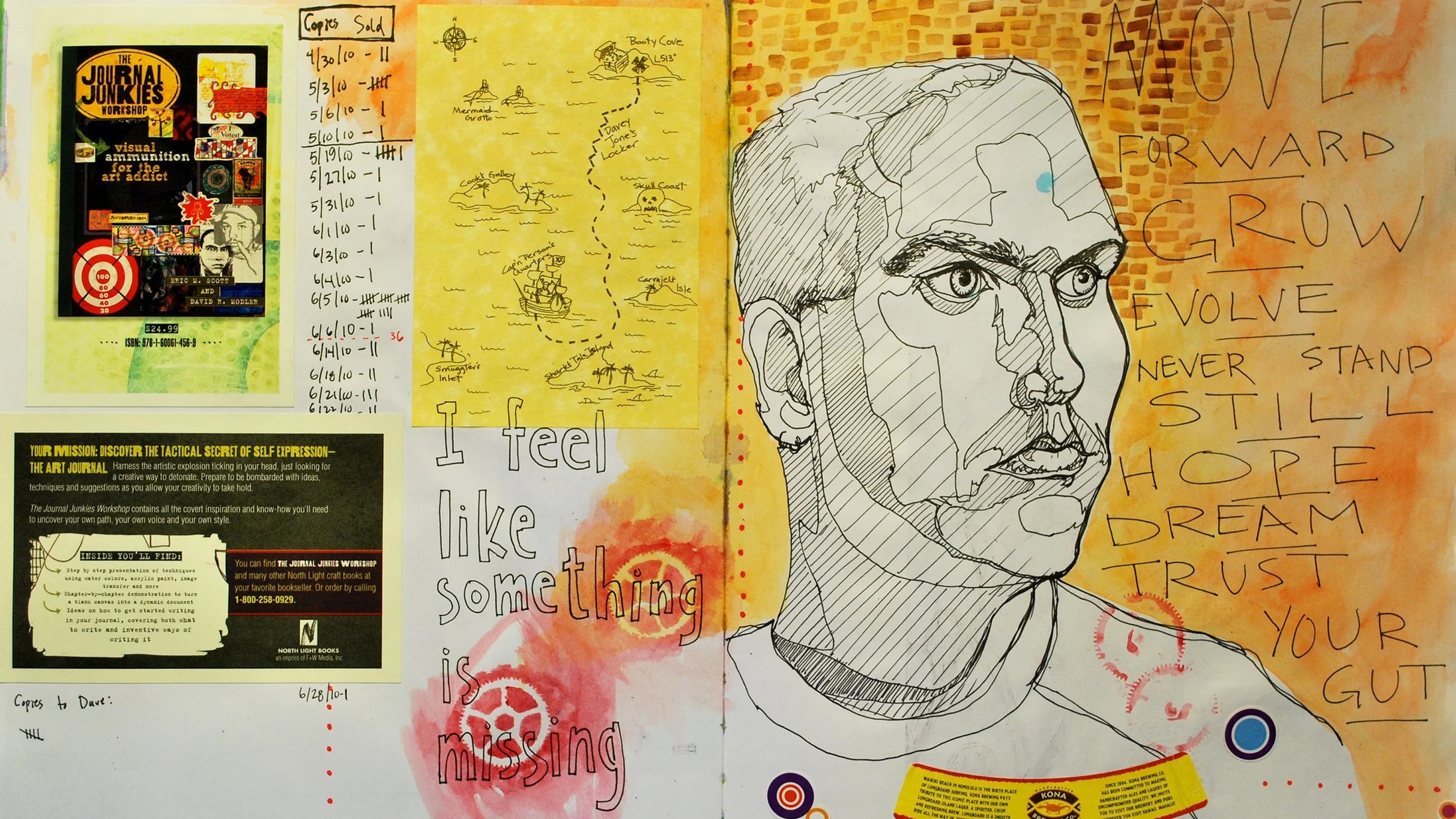
I completely forgot to post the last Journal Friday here, so I’m catching up now. I’ve already posted the video to social media, but I wanted to post it here as well.

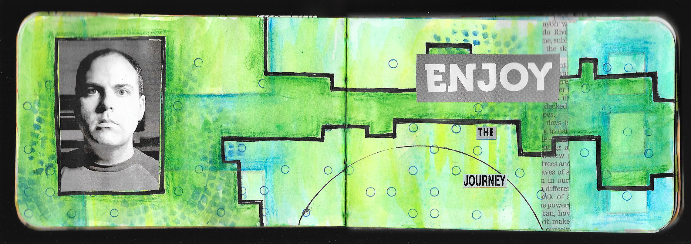
This spread really came out of nowhere, and I wasn’t of any of it when I started, except that I new that I wanted to start with collage. As I started the spread, I got a phone call from my brother saying that one of our uncles had passed away. It wasn’t unexpected. He had suffered a stroke a few months ago, and had been in the hospital ever since. He hadn’t really recovered, and I wasn’t surprised with the call. But still it was sad, and my heart hung heavy as I worked on the spread. The news did help dictate the direction of the page, and it became a way to process the feelings and emotions.

I did a variation on blackout poetry once I glued the book pages in, and I searched out rather heavy words as I began to string together phrases. But as I looked outside at the leaves beginning to bud on the bushes and trees, I knew I had to incorporate inspirations of spring despite the sad the news. As I worked through the page, I allowed my thoughts to churn and turn. Though the final spread seems to bear little to no semblance to the sad news, it was a great help in allowing me to process my feelings.

Creative Prayer Book: Embellishing

 
IMG_4949.JPG
 

Welcome to the twelfth and final lesson of the Creative Prayer Book. In this lesson, I try to wrap up my pages with some simple embellishments. Though I talked of embellishing text last week, this lesson is about adding a bit more to the pages in general, as a way to tie things together on a page, to fill in some empty areas, and to bring some emphasis to certain areas.

You can use any materials to embellish, but I like to use drawing materials like pens, paint markers, and colored pencils. There are also a large number of ways to embellish, but I’m keeping it rather simple as I bring a bit of polish to my pages.


Lines, Shapes, and Patterns

One of the simplest ways to add embellishments is to add lines, shapes, and patterns. These little touches can help fill in empty areas and add a final layer to pages. By grouping them closely together around elements you can bring a bit of emphasis and make the elements “pop”. I like to use my uni-ball Vision pens for much of this, but paint markers work great, as well, especially when drawing over glossy surfaces like magazines.

I like to use stripes, spirals, rectangles, and circles as I embellish, and I can even use stencils and tracers to add the embellishments.

Shading

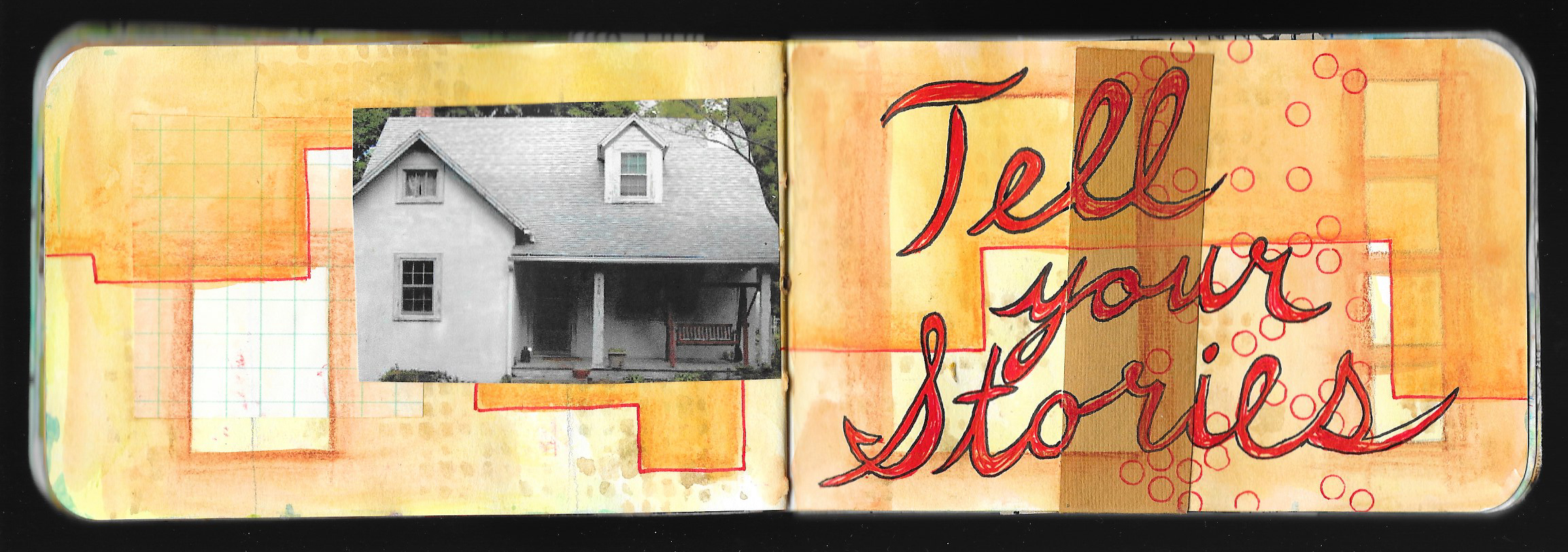
Colored pencil is perfect for adding a bit of depth to my pages as I use them to shade and color in areas. I use the colored pencils very much like I did the Inktense and watercolor pencils earlier on in the workshop and shade around elements. By applying a darker value around a shape or a letter, the shape or letter “pops” out from the page since the colored pencil acts like a shadow. I try to lighten up on my pressure so that the color fades into the background. I can be very neat and careful with this technique, or I can be a bit messy and give my page a bit of a rougher feel.

I also use the colored pencil to shade or color in areas and letters, and I like to use white colored pencil sometimes. The white doesn’t cover everything within the space, but it lightens it. This can bring a bit of contrast to the space making it stand out.

Shading is always a great way to add some final embellishment to a page.

As you work, try to think of various ways to decorate and embellish your pages. Try some of these ideas, and perhaps, try combining them. Or think of your own ways to wrap up your pages, and use any material that you like. Just remember that you’re just trying to add a bit of pizzazz to your pages on not completely reworking them.

I hope that you enjoyed these lessons, and I’ll be back next week to wrap up things. I’ll share a flip through my pages, and talk about the project, as well as share about what’s to come.

Thank you so much, and happy creating!

Creative Prayer Book: Embellishing Text

 
fullsizeoutput_125e.jpeg
 

Welcome to the eleventh lesson of the Creative Prayer Book. In this lesson, I work again with text, but this time, it’s all about embellishing the words that are already in the book. Though I’ve discussed embellishing text a little bit in a few of the recent lessons, today is about using a few simple techniques to make the words stand out using marker and pen.

Outlining

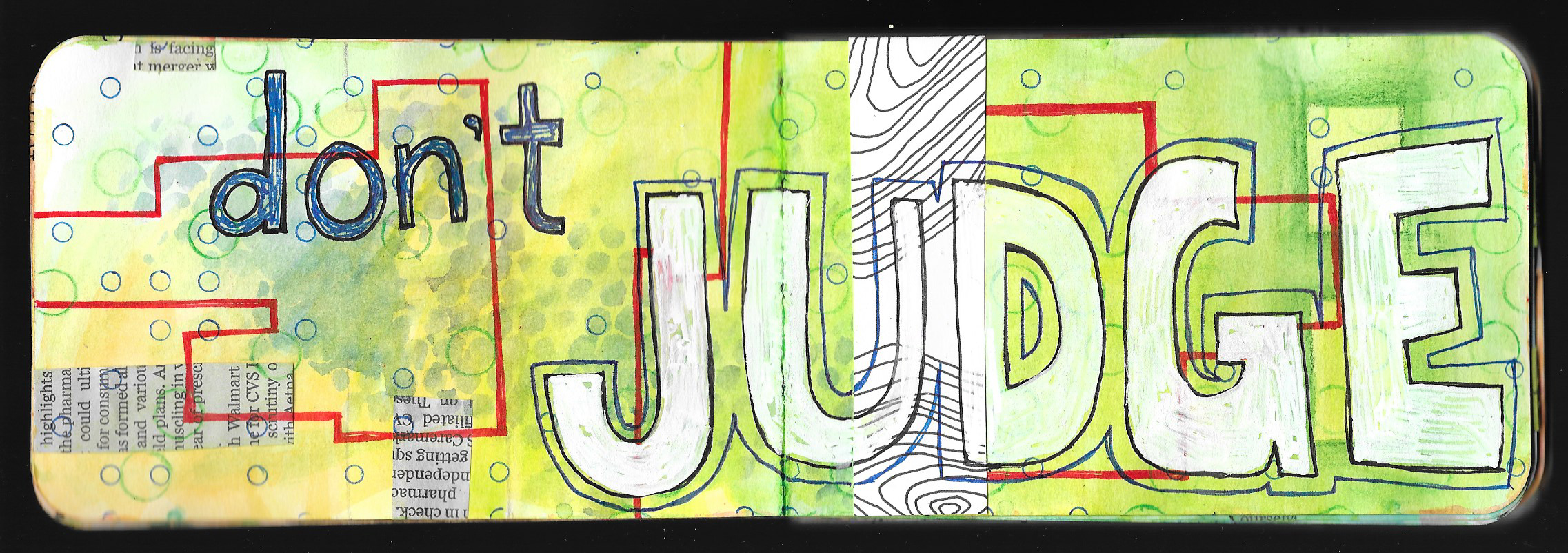
Besides coloring in the text with solid color, outlining is probably one of the most basic embellishing techniques. It’s easy enough to use a contrasting color, whether it’s white or black, to go around the edge of words and letters and create a bit of a “pop”. The outline creates a nice separation with the background, and the contrast really heightens the effect.

Box It In

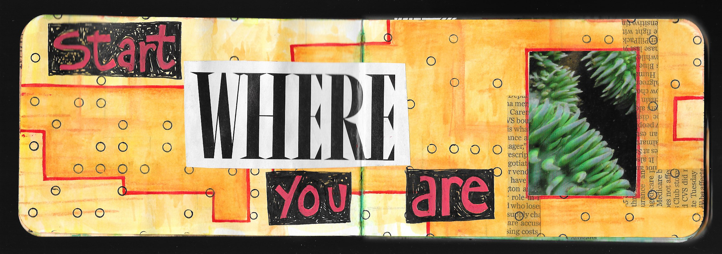
Sometimes creating a dark rectangle or box around a word can make it pop as well. I started off with Posca paint markers on the spread below to create the red letters, and then I used my black uni-ball Vision pen to create the rectangle. Unfortunately, this technique didn’t work out too great at first, and I had to add several layers of red to cover up the ink letters below. Sometimes things don’t go according to plan, but things can usually be salvaged.

CPB Embellish Text.jpeg

Offset Outlining

This is like a combination of the above techniques — outlining and boxing it in. By leaving a bit of a space between the letter and the outline, I can tie whole words together in a single outline, as I create a slightly different effect. I do try to make the outline rather thick and heavy so that it stands out.

Try to experiment with embellishing text in a variety of ways in order to make it stand out. Use any materials that you want, and try some of these techniques or come up with your own. Just think of ways to jazz up your words and writing.

Thanks for joining me once again, and happy creating!

Creative Prayer Book: Drawn Text

 
IMG_4939.JPG
 

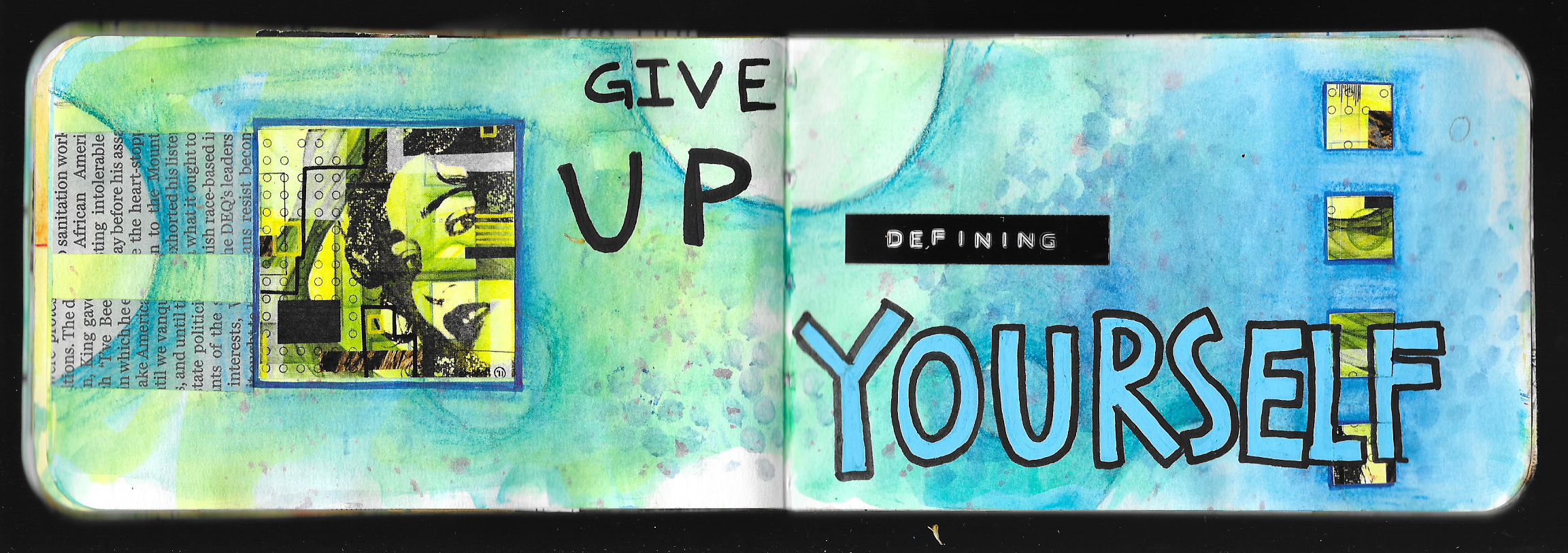
Welcome to the tenth lesson of the Creative Prayer Book. We’ve focused on stenciling letters and words, using our own handwriting, and using found text, so this quick lesson is about drawing text. You might think about those block and bubble letters that you used when you were in school, and they’re perfect for this. But don’t limit yourself to just these two ideas. You can also use drawn script, fancy fonts, and graffiti letters and words. So, experiment with a variety.


If you’re not comfortable with drawing letters and words, use a pencil first, and perhaps practice on a piece of scrap paper first. If you’re a complete novice, one technique uses your own printed letters as a skeleton for the larger, drawn letter. Using a pencil, lightly write your word or words. Then, draw in the letters around the thin lines. You can make thin and thick letters this way. Erase your original, guide letter.

Of course, you can simply draw in the letters as you go, but be careful and pay attention to spelling. That’s why I like having the words and phrases drawn on a separate paper so that I can make sure that I am spelling things correctly. As you draw your letters, think about the outer shape of the letter, and if needed, use a pencil to lightly sketch in the lines.

I like to draw my letters with a pen, and I don’t worry about using a pencils. But I’m pretty confident with drawing words, but I still make spelling and placement mistakes.

Give drawing letters words and phrases a go!

I plan on just two more lessons in this series, and we’re done with the text and words, so if you still have space, feel free to stencil, write, draw, or find your text to fill in the spaces.

Thank you for joining me again, and as always, Happy Creating!

Materials Monday: Derwent Inktense Paint Pan Travel Set

 
IMG_4938.JPG
 

Some how, It’s been nearly a month since I last posted a Materials Monday. It’s amazing how life gets busy, but it’s back today.

Like most artists I don’t just use one type or brand of a particular material, and I have different brands, often for different purposes. And so it goes with watercolor paint. I love using watercolor paint in my journal and in my mixed media art, and I’ve already shared my enthusiasm for the inexpensive Prang semi-moist watercolors. Unfortunately, Prang watercolors are not lightfast, meaning that they will fade over time when exposed to light, and they are not the best paint to use for pieces that will hang on the wall. Though they are portable in their tough plastic case, the larger 16-color set is a bit on the bulky side, and are not always convenient to take everywhere.

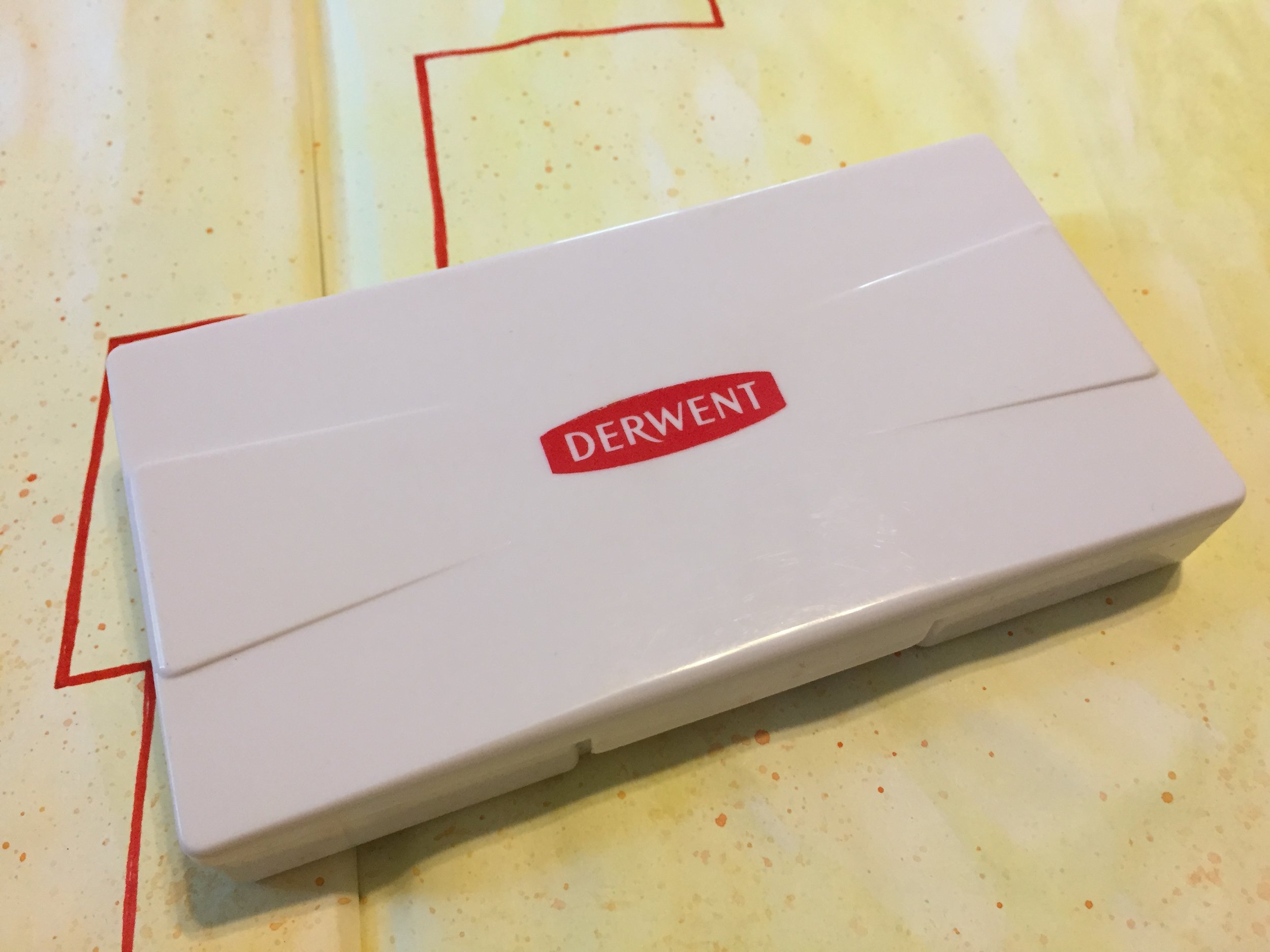
Over the past couple of years, I’ve been searching for a travel set of paints that were better quality, more lightfast, and something that wasn’t going to break the bank. Quality watercolor paints can be on the expensive side, so I became quite intrigued when Derwent announced that they were releasing their Inktense in the form of a travel paint pan set. I love the Inktense pencils, and I’ve used them for years, so I had to snatch up a set of the paints. Overall, I’m quite pleased, and they have announced that they are releasing a second set with different selection of colors.

First, I must say that technically, these paints are not watercolor paints, just as the Inktense pencils are not watercolor pencils. The pencils, blocks, and paints are all water-soluble ink. But the paint set acts just like watercolor paint with one exception. Like the Inktense pencils and blocks, the paint is more permanent and less likely to lift when painted over, and supposedly can be used on fabric, though I’ve never done that.

One of the main highlights of the Inktense paint pans is price. They are a good quality paint, at a very decent price, and they can often be found for under $25 in the US. They aren’t available everywhere, but they can be ordered online.

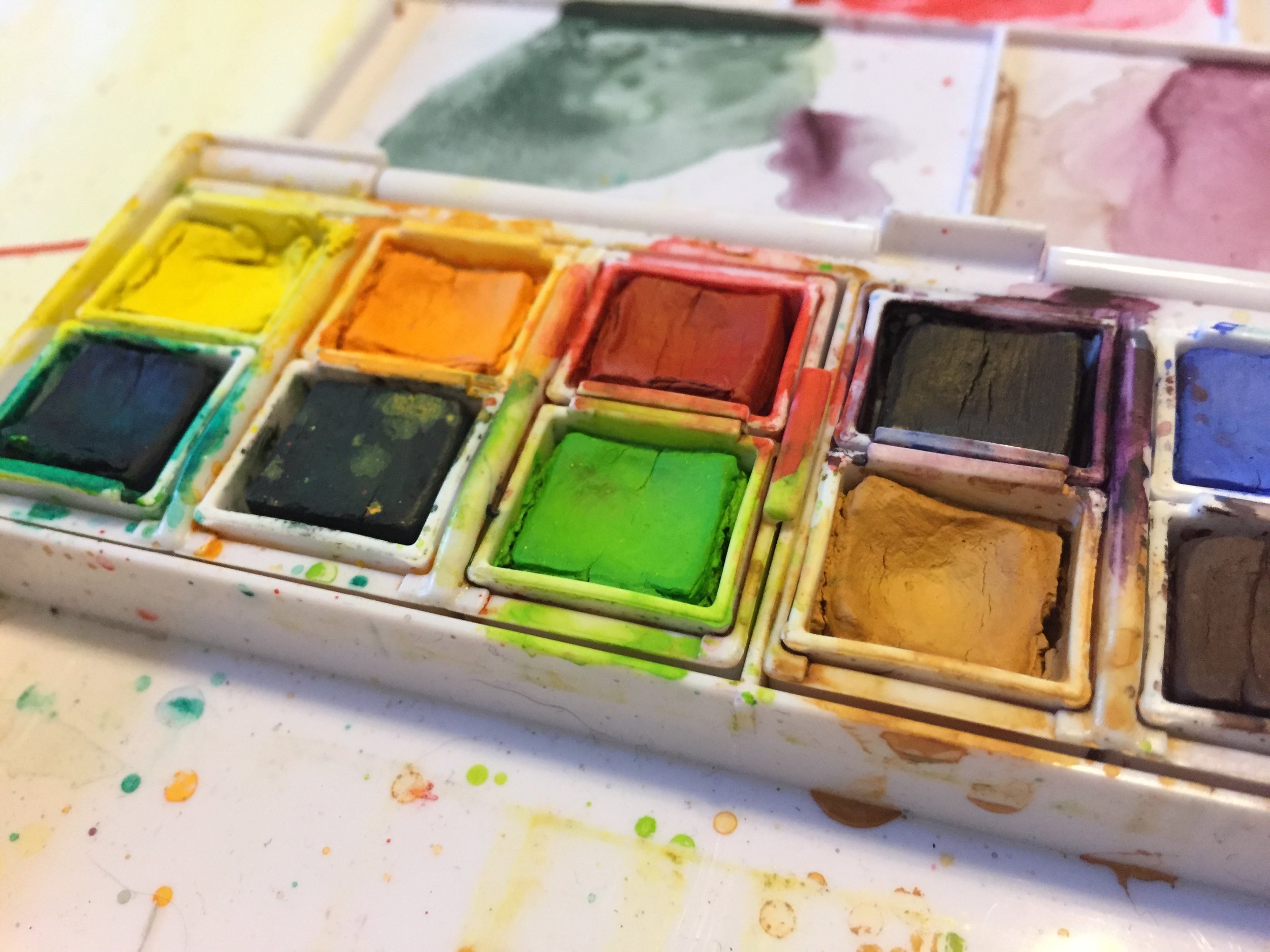
I am quite pleased with the Inktense paint. The set comes with 12 bright colors, and they are rich and intense like the pencils and cover well. The set is small and very compact making it a perfect travel size, but the pans are a bit smaller than normal half-pans, and unfortunately, I haven’t seen replacement pans available in the US, but it looks like they are available in the UK. The set comes with a small water brush and a sponge, neither of which I use. I got the set for the paint!
 
IMG_4748.JPG
 

The only real issue that I have with the paint is the selection of the colors, and it’s really more a matter of personal taste. Though the set has your basic colors, I wish that it had a crimson or a magenta. I’ve been getting into color schemes lately that include more pinks and purples, and the poppy red that is included is a very warm red making it difficult to get the pinks and purples that I want. The set also comes with a dark plum instead of a standard violet. Though the plum is great for blending into the blues and using as a complement to the yellow and the ochre, I again have gotten into these pink and purple color schemes, and I’d love a brighter violet.

 
fullsizeoutput_11f1.jpeg
 

I love the brightness of the colors, the quality of the paint, the compactness of the set, and the price. I’d just love a slightly different color selection. However, Derwent has recently announced that it is releasing a second set of the Inktense Paint Pans with 12 different colors including a scarlet and a fuchsia, though no bright violet, but for now it only appears to be available in the UK. I’m not sure when or if it’ll be available in the US, but in the meantime, I’ll make do with what I have.

So if you are looking for a compact and inexpensive set of lightfast paints, the Derwent Inktense Paint Pan Travel Set might be just the thing. Please remember that I am not receiving any kind of compensation for any of these reviews or recommendations. They are just the materials that I personally like to use.
Journal Friday #99: Text

 
Logo.jpg
 

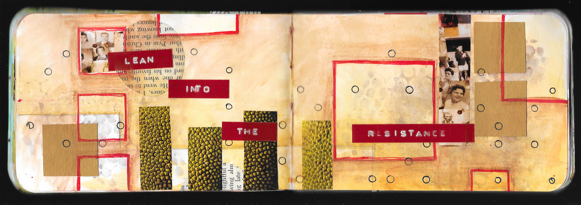
Words, text, and reflections are a big part of my journaling process, but there are times when I might not want the text to be so obvious, especially since I openly share my journal with others. So obscuring the words is a great way to include writing while making it hard to read.

Today I worked primarily with text using a General’s Sketch & Wash pencil (water-soluble graphite), Derwent Inktense pencils, and uni-ball Vision pens. I focused on using the text in a more graphic manner, and the reflective writing provided a textured background while the stenciled words created some big words that stand out. The smaller emphasized words provided a little visual pop. I see this as a good start, and I’ll most likely add more to this spread in the future.

I hope that you enjoy the video!

Creative Prayer Book: Found Text

 
IMG_4929.JPG
 

Welcome to the ninth lesson of the Creative Prayer Book. In this lesson, I continue to add text to my book. As I’ve said before, I’m creating a book of creative affirmations, but feel free to add hopes, wishes, dreams, prayers, or quotes to your book.

Over the past couple of weeks, I’ve been adding text using stencils and my own handwriting, but for today’s lesson, I want to add some found text — text from alternative sources. I’ll use some of my own handwriting in conjunction with this found text, but I want to find some of the words in other sources or create some of it in a different way. I turn to some readily available sources of text for my words today — magazines, stickers, and a label maker.


Magazine Text

Magazines are a great source for text, but I want to use big words, so I look for headlines and advertisements. I probably won’t be able to find very word in the phrase that I want to use, but I can probably find a a couple key words. I spend time flipping through magazines to find words that will work.

Newspapers are also a good source of headline text.

Stickers

Arts and craft stores often have sticker sets of words meant to be used in scrapbooking and mixed media art. I happen to have a set that I bought a long time ago in a stash of fodder in the studio. The words all deal with travel, and contain quite a few key words from a number of my affirmations.

Don’t feel like you need to make a special trip to the store of sticker words, but if you have some lying around, feel free to use them.

Label Maker

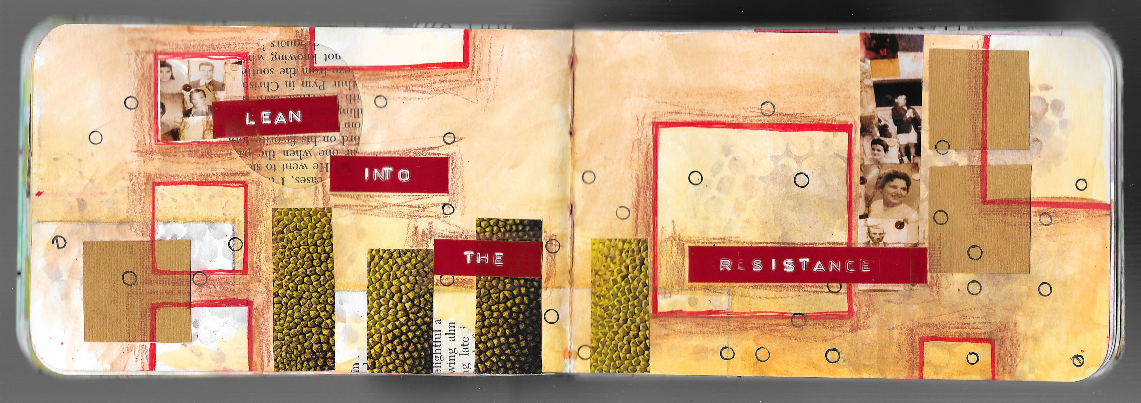
Label makers are great as an alternative source of text, and some electronic ones allow you to change the size and the font. I have an old embossing label maker from many years ago, and I think that it would be perfect for using for this lesson. This is the type that uses plastic tape and pushes the letters up into the plastic causing the letters to be raised and to turn white. I used to use it a lot when I first got into journaling, but I haven’t used it in quite a while. I use it to create whole phrases and to add key words.

Think about printing out words from the computer if you don’t have a label maker, but use one if you got it. I was surprised to see that Dymo still makes the embossing type of label maker similar to the one I have.

I do use my regular handwriting for some of the words that go with the magazine text and label maker, and if I wanted, I could thicken the letters like I did last week. But, I’ll wait because I have some ideas for embellishing the text in different ways, and I’ll save it for a future lesson.

Think about ways that you can use found text or words from alternative sources as you continue to add your affirmations, prayers, or quotes to your book, and until next time, Happy Creating!