Journal Friday #106: Legacy

IMG_5015.JPG

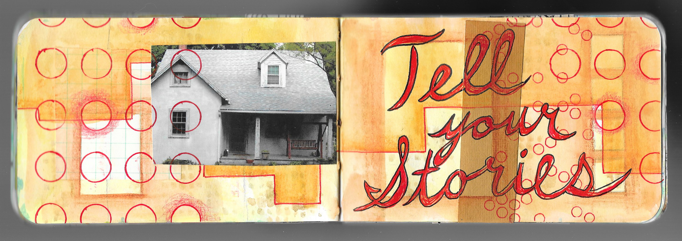
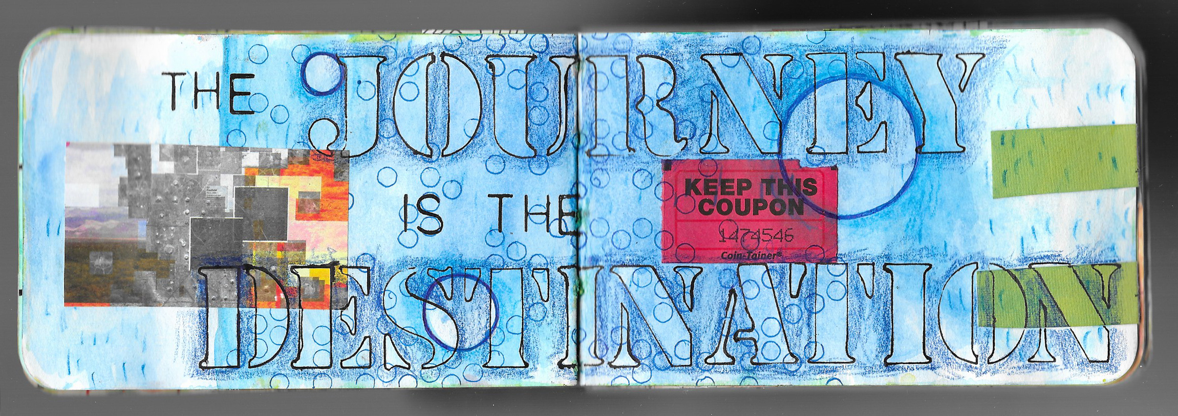
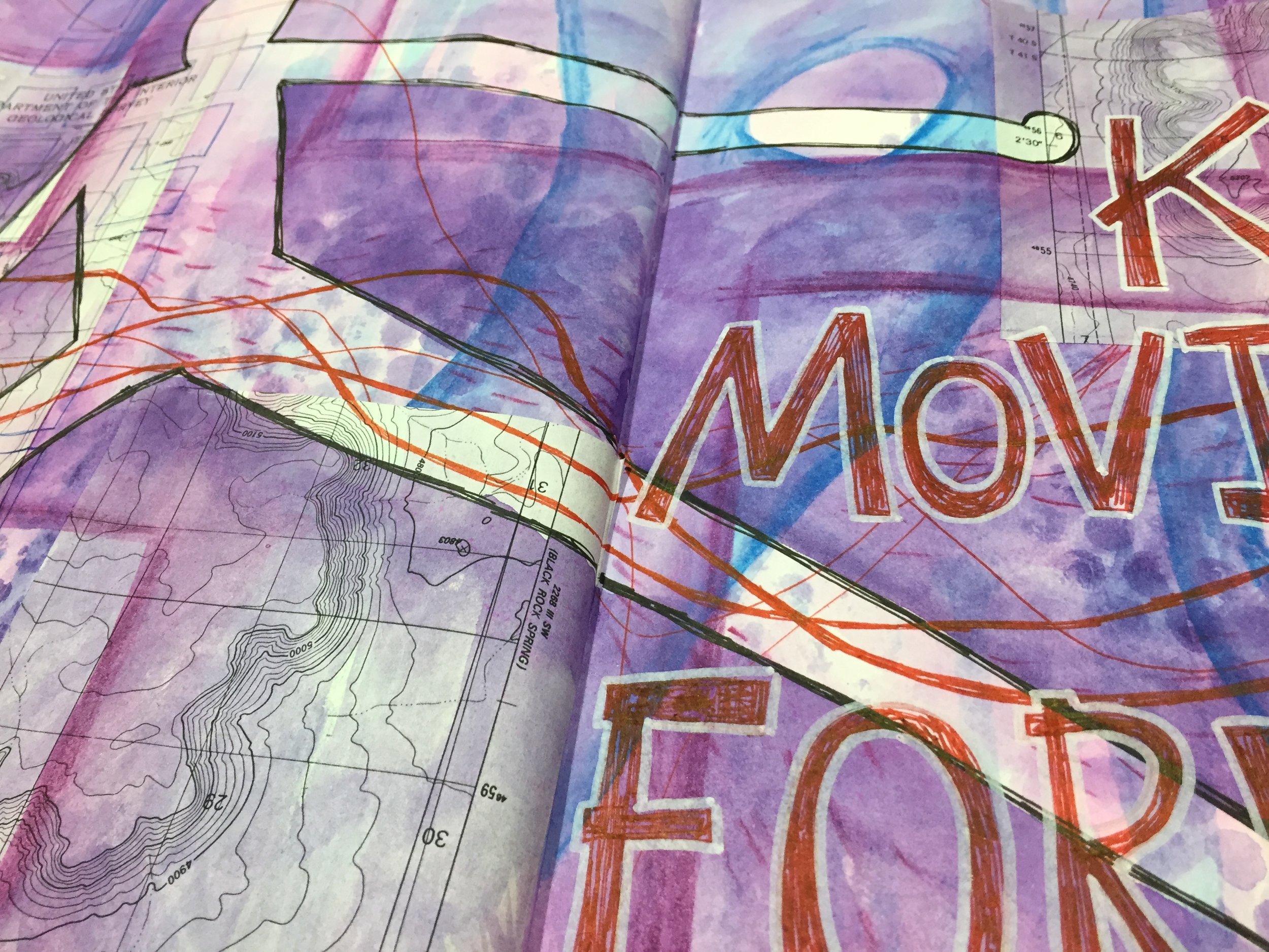
Today’s Journal Friday spread began with some collage, paint, and Inktense Pencils, but I quickly came to a point where I didn’t know what to do next. Then a line from a song that I was listening to hit me. “If I don’t know where I come from, how do I know where to go.” The song is Runaways by hip hop artist Sage Francis, and the line just resonated with me.

I’ve been feeling a bit stuck lately, dealing with some things from the past that seem to be holding me back, and I’m trying to find my feet and find a way forward. I love how journaling can help shine light into my thoughts and feelings.

Here’s to standing boldly and finding a way forward.

Journal Friday #105

 
IMG_5008.JPG
 

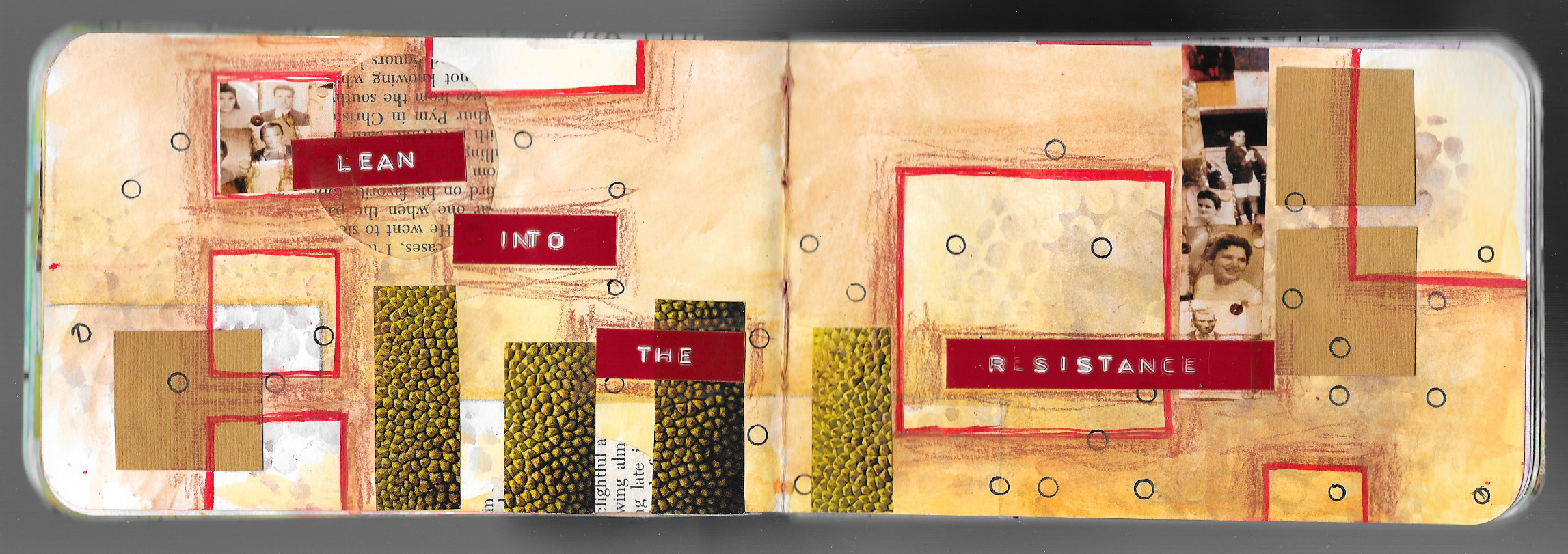
With today’s Journal Friday, I tried to limit myself to just a few materials and a red and black color scheme. I decided to use just a Faber-Castell Graphite Aquarelle pencil, a Derwent Inktense pencil, a Faber-Castell Pitt Artist Pen, a uni-ball Vision pen, and a UHU Glue stick.

For the words, I looked up random pages in a small spelling dictionary that I have. I then selected a word that resonated with me. There’s something a bit poetic about the random juxtaposition of the words.

Materials Monday: Dr. Ph. Martin's Hydrus Fine Art Watercolor

IMG_4975.JPG

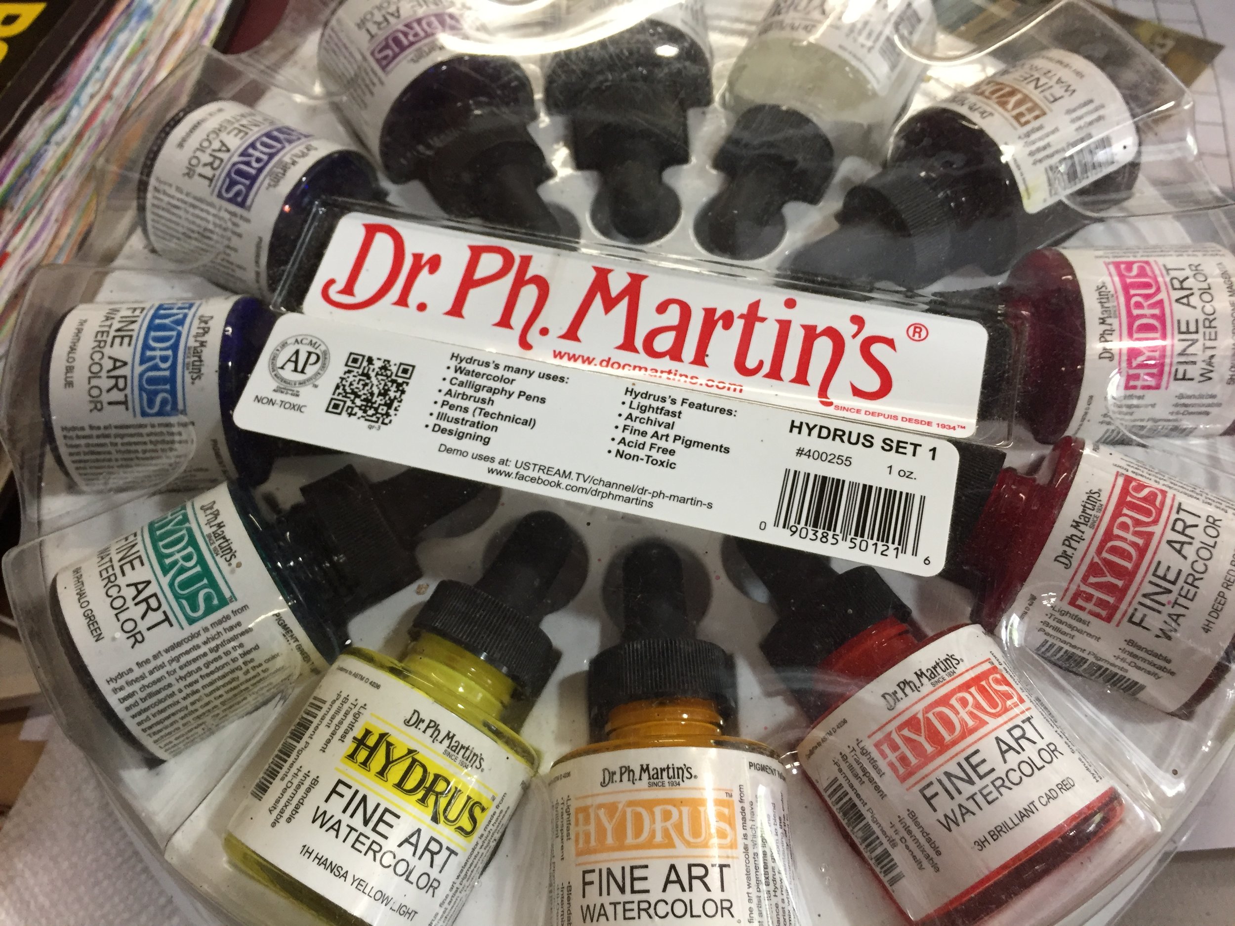
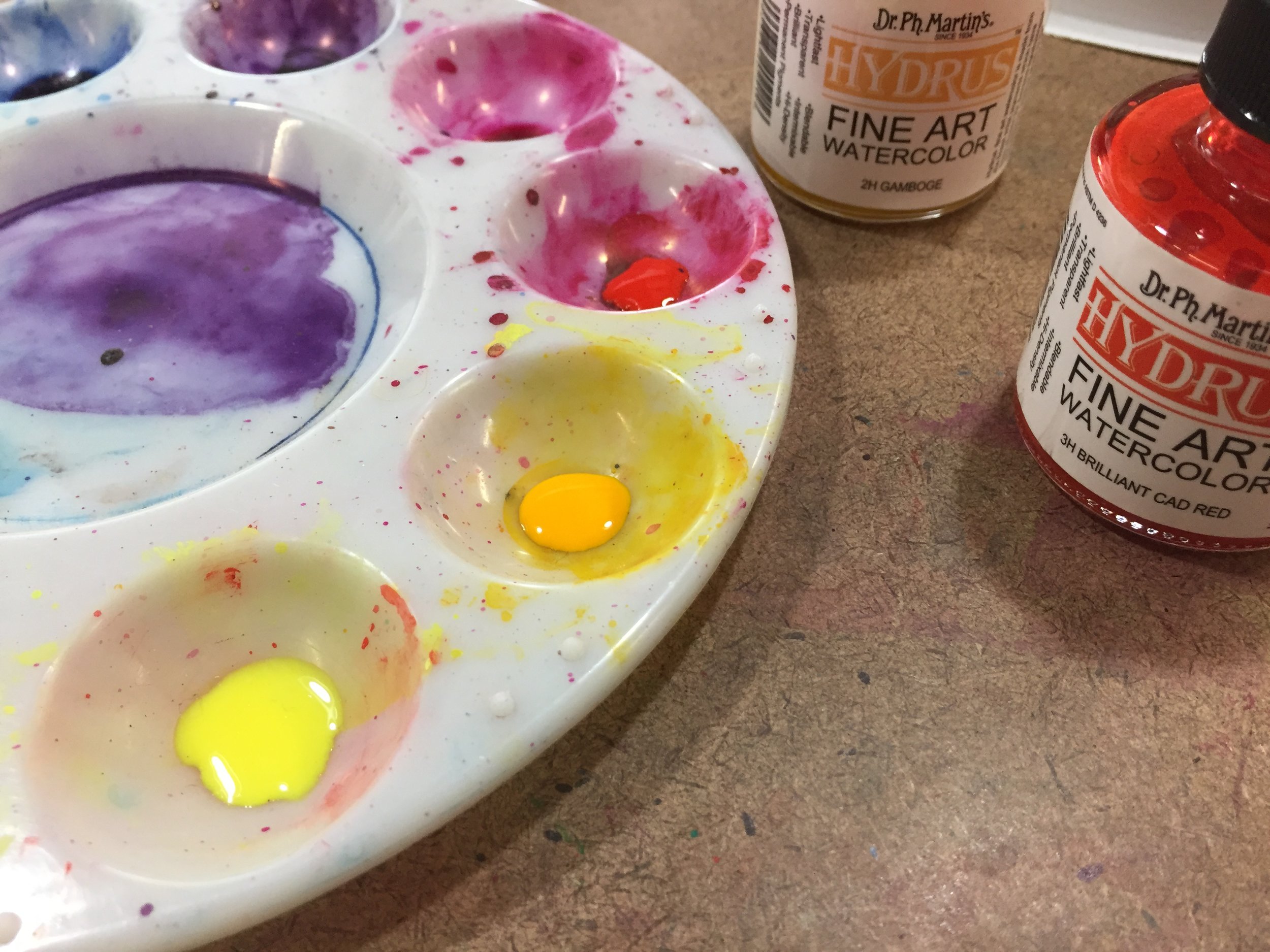
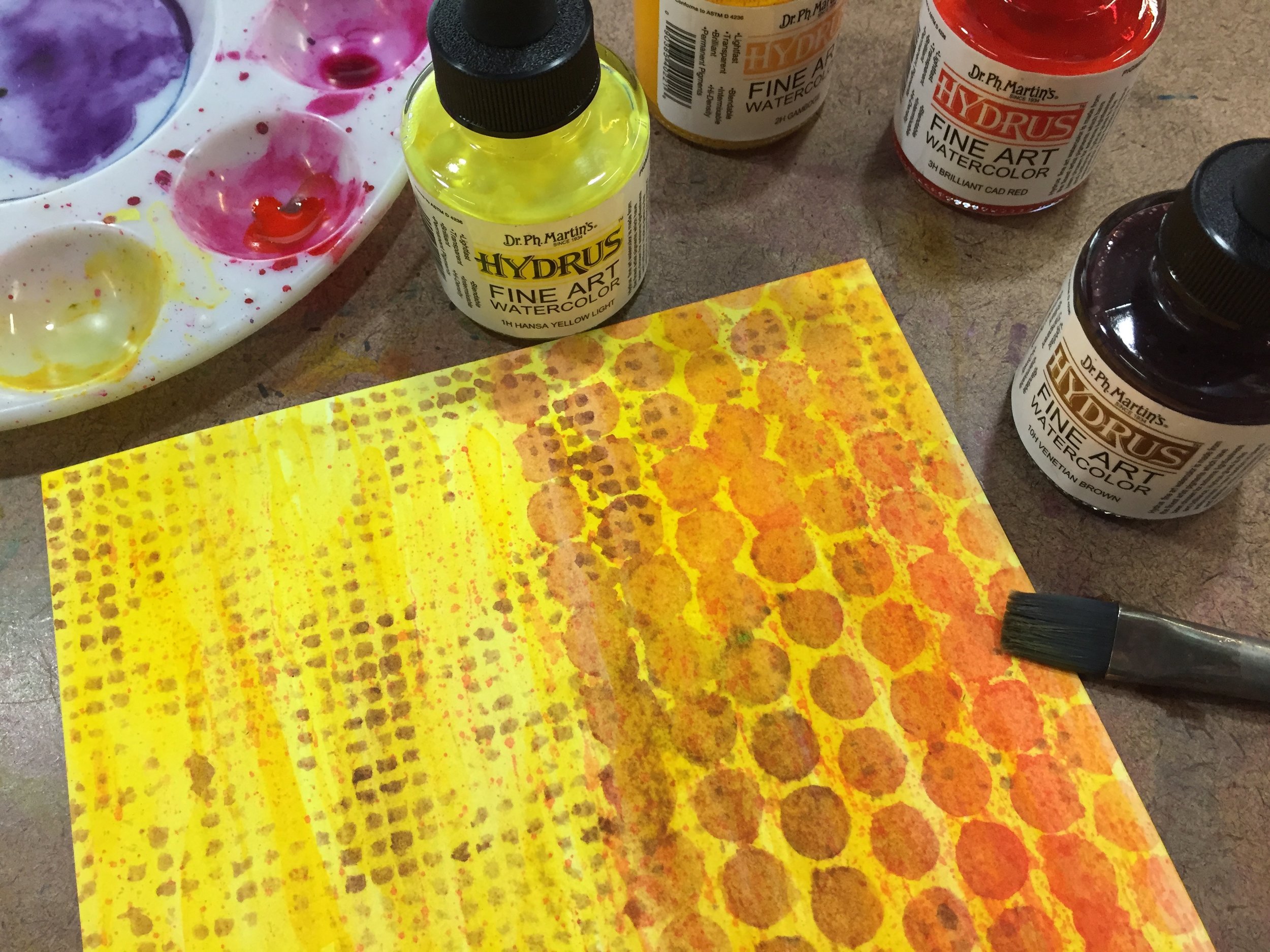
Up until now, I’ve focused mostly on materials that I use in both my journal and my mixed media works of art, but today I want to talk about a material that I use only for my stand alone pieces of art due to it’s quality. I’m talking about Dr. Ph. Martin's Hydrus Fine Art Watercolor. These high quality liquid watercolors are perfect for the type of mixed media that I like to do since they are transparent and lightfast. It’s easy to build up layers with the watercolor and the lightfastness means that they are less likely to fade in the light like lower quality paint.

 
IMG_4976.JPG
 

If you’re not familiar with liquid watercolor, I highly recommend experimenting with some. I first started using liquid watercolor when I taught in public schools using a student quality paint with both elementary and high school students. Even with the student quality, I was impressed with the intensity of the colors and the ease of building layers. But the student quality paint was not lightfast, and I wanted something that I could use in my art that would stand up over time. After a little searching I found the Hydrus watercolors. I instantly fell in love with them.

Dr. Ph. Martin's Hydrus Fine Art Watercolor come in 36 colors and are available in 0.5oz or 1oz glass bottles. They can be purchased individually or in three different sets. The color is bright and vivid, and I use only a few drops at a time diluting with water to control the intensity and the value of the color. Though the colors are intermixable, I normally use them straight and build up layers with individual colors. That are perfect for using alone, or with other materials like water-soluble pencil, collage, and ink. The paint can also be used with a variety of implements like technical pens, dip pens, and airbrush, though I’ve only used them with a brush. I only have Set 1, since it contains a variety of basic colors, but I’d love to supplement the set with a few more individual colors.

 
fullsizeoutput_1268.jpeg
 

The Hydrus watercolor is definitely a studio paint, especially with the glass bottles, and even the 0.5oz bottles are a bit bulky. I don’t recommend traveling with them. Also, these are high quality, fine arts paint, and as so are on the pricey side.  A twelve color set of 1oz bottles will put you back $100, though you can find them a bit cheaper at various online retailers. But a little goes a long way, so the paint will last. Because of the quality, I don’t routinely use the Hydrus watercolors in my journal, and I try to reserve them for my stand alone mixed media art or my monster paintings.

 
Scan 159.jpeg
 

If you’re looking for a high quality, liquid watercolor paint and don’t mind shelling out a bit of money, I highly recommend Dr. Ph. Martin's Hydrus Fine Art Watercolor. It’s a beautiful and versatile paint.

Journal Friday #103


I keep forgetting to post Journal Friday on Fridays! I did share the video on social media this past Friday, but I completely forget to share it here on the blog. So here it is a few days late.

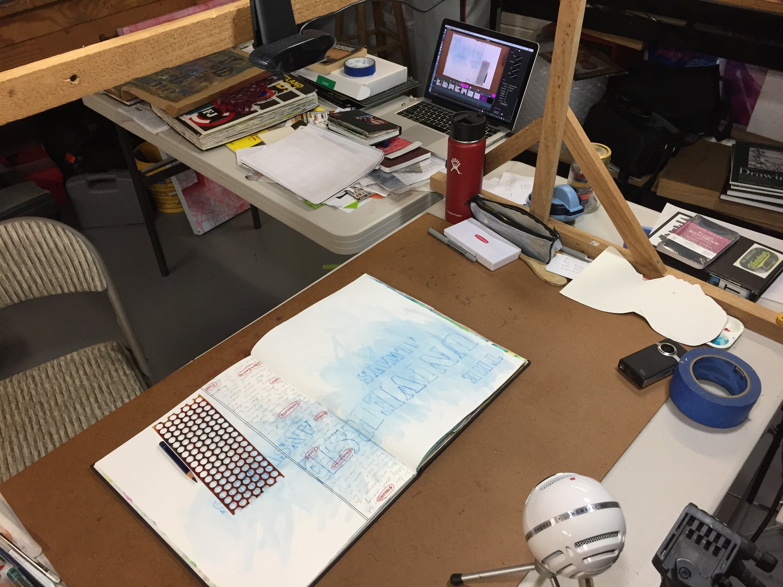
I’ve been trying to share different ideas with these videos, and not make them all the same, even though they use a lot of the same materials. I have been trying to push myself to approach each one in a slightly different way. With this spread, I began with a little reflective writing. Writing is a big component of my normal visual journaling, and I use it to clear my mind: reflect on life, events, and art: and to just figure things out. The initial writing in this spread dictated the direction for the pages, and I spent a lot of time working with letter stencils playing with the phrase, “The Universe Always Answers.”

I hope that you enjoy.

Creative Prayer Book: Wrap Up

EScott Creative Prayer 1.jpeg

Though I finished up the final lesson of the Creative Prayer Book last week, I wanted to share a wrap up of the project, and create a video that shows a flip through the pages.

I began this project several months ago, and I’ve been sharing a new lesson each week as I built up layers in a small Stillman & Birn journal to create a small book of creative affirmations. I am a long way from calling this project finished, and I only got about halfway through the book. I still have many more pages to fill, but I wanted to wrap up the lessons and finish the book on my own time. I plan to continue working over the coming months, and hopefully I’ll be able to share the filled journal fairly soon.

I want to thank everyone who has followed along on this journey, and who drew inspiration from my ideas, techniques, and methods. I am grateful for the positive comments and feedback that I’ve received over the months. It has been a good challenge to bring a new lesson to you each week, and I’m hoping to create a new project in the future.

So thank you all so very much, and as always, Happy Creating!

Materials Monday: Faber-Castell Pitt Artist Pens

 
fullsizeoutput_1264.jpeg
 

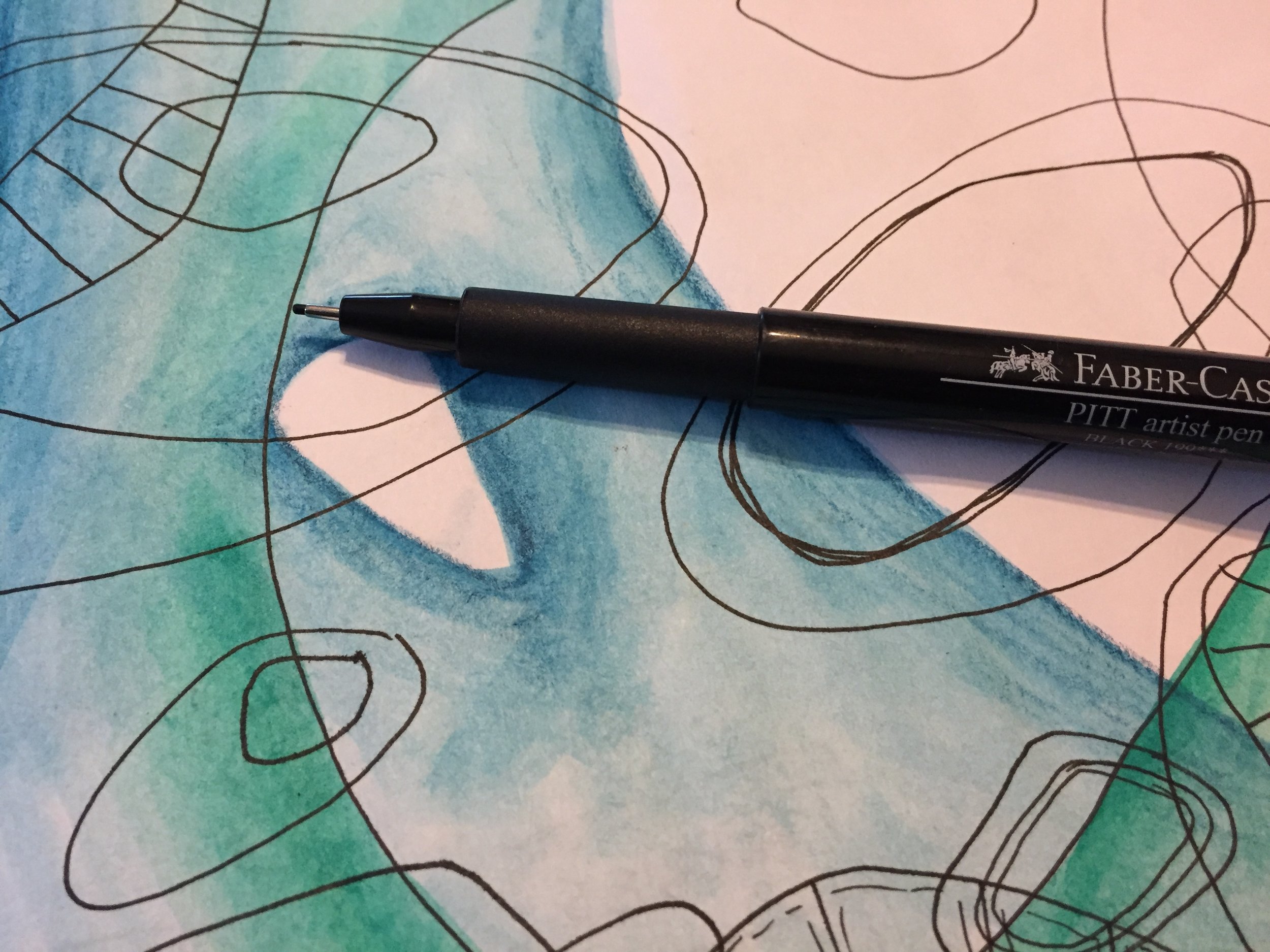
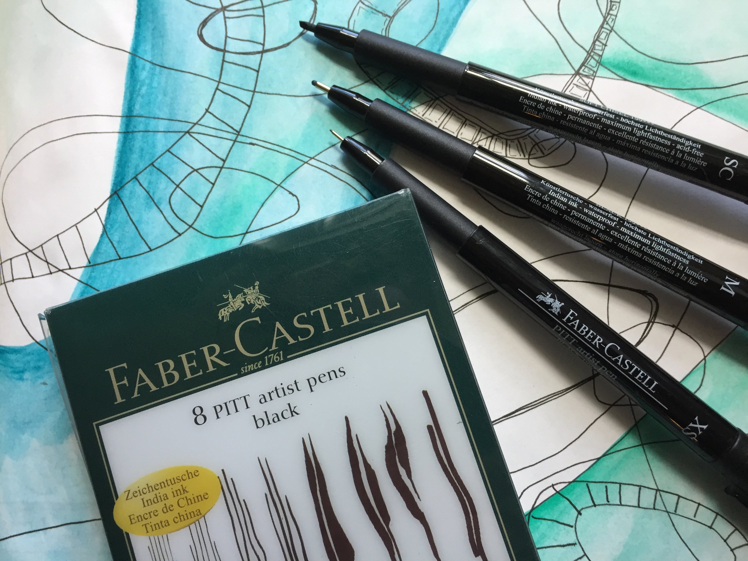
Like most visual journalists, I’m always on the lookout for a good pen, and having a variety of drawing pens in the journal kit is a must have for me. There are a wide variety of drawing pens out there with certain big names dominating the market. But I like the Faber-Castell Pitt Artist Pens. I’ve only used the black, so I can’t specifically speak about the multiple colors available in the product line, but I am a big fan of the black. However, I am dying to try some of the 58 colors they have.

The Pitt pens use India ink, and Faber-Castell claims that they are permanent and waterproof. I must say that the ink holds up well to the wet media that I use in my journal and my artwork. I have had issues with some other brands that have claimed to be permanent and waterproof, but the Pitt pens live up to the claim with little to no bleeding if given enough time to dry. However, like any waterproof pen, the more ink that you lay down in an area, the more likely some of the ink will lift and spread when painted over with wet media. But it has not been an issue at all.

One of the things that I love about the black Pitt pens is the range of tip sizes, and you can even buy a set that has eight different sizes and types of tips — everything from an Extra Superfine to a Soft Brush. This allows you to draw in small, thin details as well as fill in larger areas, and there is even a Big Brush pen that works like a big marker with a brush nib.

 
fullsizeoutput_1263.jpeg
 

I love the versatility of the uni-ball Vision pens, but there’s something about having a set of dedicated drawing pens and being able to add a wider range of marks, lines, and textures to pages and to artwork. These pens are my goto pens when I’m doing any kind of ink drawing, especially for many of my monster drawings. The range is perfect for creating thick outlines, as well, as small details like, stripes, spots, and bumps.

 
fullsizeoutput_1262.jpeg
 

I also like that the Pitt pens and airplane safe, and don’t have issues on flights. Many pens, the uni-ball Visions included, can have issues with leaks and globs because of the change in cabin pressure when flying. It’s such an annoyance to end up with blobs of ink all over a surface or all over your hands. There’s none of that with the Pitt Pens, and they have quickly become one of my favorite travel pens.

The only issue that I have is that most of the colors have a very limited nib size, and mostly come in a brush tip only. I’d love to have the colored ink in a wider selection of nibs, and it’s one of the main reasons that I haven’t really tried the colored ink. I’d even consider replacing my uni-ball Vision pens if I could get the colors I wanted in a Fine or Medium point. Maybe one day. Until then, the black Pitt pens are a great addition to my artistic arsenal, and I use them more and more as time goes by.

If you’re looking for a great set of black drawing pens that are waterproof and come in a wide variety of nibs, then I’d say to get yourself some Faber-Castell Pitt pens, and if you’ve used the colored pens, I’d love to know how you like them.

As always, I get no compensation for these recommendations, and I simple share the materials and the brands that I like and personally use.

Journal Friday #102

 
IMG_4958.JPG
 

I completely forgot to post the last Journal Friday here, so I’m catching up now. I’ve already posted the video to social media, but I wanted to post it here as well.

This spread really came out of nowhere, and I wasn’t of any of it when I started, except that I new that I wanted to start with collage. As I started the spread, I got a phone call from my brother saying that one of our uncles had passed away. It wasn’t unexpected. He had suffered a stroke a few months ago, and had been in the hospital ever since. He hadn’t really recovered, and I wasn’t surprised with the call. But still it was sad, and my heart hung heavy as I worked on the spread. The news did help dictate the direction of the page, and it became a way to process the feelings and emotions.

I did a variation on blackout poetry once I glued the book pages in, and I searched out rather heavy words as I began to string together phrases. But as I looked outside at the leaves beginning to bud on the bushes and trees, I knew I had to incorporate inspirations of spring despite the sad the news. As I worked through the page, I allowed my thoughts to churn and turn. Though the final spread seems to bear little to no semblance to the sad news, it was a great help in allowing me to process my feelings.

Creative Prayer Book: Embellishing

 
IMG_4949.JPG
 

Welcome to the twelfth and final lesson of the Creative Prayer Book. In this lesson, I try to wrap up my pages with some simple embellishments. Though I talked of embellishing text last week, this lesson is about adding a bit more to the pages in general, as a way to tie things together on a page, to fill in some empty areas, and to bring some emphasis to certain areas.

You can use any materials to embellish, but I like to use drawing materials like pens, paint markers, and colored pencils. There are also a large number of ways to embellish, but I’m keeping it rather simple as I bring a bit of polish to my pages.


Lines, Shapes, and Patterns

One of the simplest ways to add embellishments is to add lines, shapes, and patterns. These little touches can help fill in empty areas and add a final layer to pages. By grouping them closely together around elements you can bring a bit of emphasis and make the elements “pop”. I like to use my uni-ball Vision pens for much of this, but paint markers work great, as well, especially when drawing over glossy surfaces like magazines.

I like to use stripes, spirals, rectangles, and circles as I embellish, and I can even use stencils and tracers to add the embellishments.

Shading

Colored pencil is perfect for adding a bit of depth to my pages as I use them to shade and color in areas. I use the colored pencils very much like I did the Inktense and watercolor pencils earlier on in the workshop and shade around elements. By applying a darker value around a shape or a letter, the shape or letter “pops” out from the page since the colored pencil acts like a shadow. I try to lighten up on my pressure so that the color fades into the background. I can be very neat and careful with this technique, or I can be a bit messy and give my page a bit of a rougher feel.

I also use the colored pencil to shade or color in areas and letters, and I like to use white colored pencil sometimes. The white doesn’t cover everything within the space, but it lightens it. This can bring a bit of contrast to the space making it stand out.

Shading is always a great way to add some final embellishment to a page.

As you work, try to think of various ways to decorate and embellish your pages. Try some of these ideas, and perhaps, try combining them. Or think of your own ways to wrap up your pages, and use any material that you like. Just remember that you’re just trying to add a bit of pizzazz to your pages on not completely reworking them.

I hope that you enjoyed these lessons, and I’ll be back next week to wrap up things. I’ll share a flip through my pages, and talk about the project, as well as share about what’s to come.

Thank you so much, and happy creating!