I keep forgetting to actually post these on Friday when I make to video! Here’s the latest Journal Friday for June 21, 2019. It’s all about listening to what the universe is trying to tell me!
Journal Friday #109: Layers of Memories
Journal Friday has been on hiatus for the past couple of weeks — first, because of getting ready for the Western Loudoun Artists Studio Tour that I participated in the weekend of June 1st and 2nd, and then last week, I was on vacation and didn’t have time to post anything.
I’m back now with a new time-lapse video, and the spread is all about something that has been floating around in my mind for the past couple of weeks.
I’ve been feeling a bit lost with my art lately — feeling like I didn’t have a direction, like I was floating a bit aimlessly, but during my vacation, I had a bit of an epiphany. Travel for me is always cathartic, and my wife and I spent a whirlwind of a week in England seeing a lot of different things. But what struck me the most was the history. I remember the same feeling 25 years ago when I first visited England, and I felt it even stronger this time, especially with how it relates to my art. As we went place to place in England — from York to Alnwick, from London to the Cotswold, from Bath to Alton, there’s a real sense of history, and I came to really understand how places and people are both a culmination of experiences and memories, and as time goes by, different structures are imposed on top of one another. Much gets buried and covered up, but it’s still there influencing the character of the place to the person. People and places are an amalgamation of experiences, ideas, people, events, memories, thoughts, and so much more.
So I began to explore those ideas in this weeks Journal Friday spread. I haven’t come to any steadfast conclusions, but I am looking forward to exploring the ideas in my journal and in my art
Journal Friday 108: Manifest
As I’ve mentioned before, I’ve been feeling a bit stuck lately, and today’s Journal Friday spread for my latest time-lapse video was all about this feeling. I began by layering a few different watercolor techniques to create a background, and then I divided the space with ink and water-soluble pencil. At that point, I decided to do a bit of writing, and focused on my feelings of uncertainty. I chose some words and phrases from the writing that seemed to have some punch to them, and I wrote them down the left side of the spread. All the while the word “manifest” was going through my head, so I decided to stencil it in the middle of the spread.
I’m not completely happy with the spread, and I would love to build up more contrast around the word “manifest”, as well as, add some embellishments, but one of the challenges with these time-lapse videos is keeping them to a minute in length. Both Instagram and Twitter only accept minute-long videos, and I want to be able to share them across platforms. So there is a unique challenge in confining them to that length. In real time, I spent about two and a half hours on this spread, and it’s interesting to see what develops in that time.
I hope that you enjoy!
Journal Friday #107: Spheres of Influence
I completely forgot to share last week’s Journal Friday time-lapse video. I approached this spread a bit differently, and stuck to some map like imagery as I built up layers. As I began it, I didn’t have a plan, but I quickly decided to not use any really recognizable objects like faces. I also decided not to use any collage and stuck with watercolor, water-soluble pencil and paint markers.
As I worked on the spread a theme of boundaries and borders came to mind, and I focused on creating a variety of lines, shapes, and symbols that signified a variety of ways that we separate ourselves from others. I decided to not use any words as well, and left it completely symbolic.
Journal Friday #106: Legacy
Today’s Journal Friday spread began with some collage, paint, and Inktense Pencils, but I quickly came to a point where I didn’t know what to do next. Then a line from a song that I was listening to hit me. “If I don’t know where I come from, how do I know where to go.” The song is Runaways by hip hop artist Sage Francis, and the line just resonated with me.
I’ve been feeling a bit stuck lately, dealing with some things from the past that seem to be holding me back, and I’m trying to find my feet and find a way forward. I love how journaling can help shine light into my thoughts and feelings.
Here’s to standing boldly and finding a way forward.
Journal Friday #105
With today’s Journal Friday, I tried to limit myself to just a few materials and a red and black color scheme. I decided to use just a Faber-Castell Graphite Aquarelle pencil, a Derwent Inktense pencil, a Faber-Castell Pitt Artist Pen, a uni-ball Vision pen, and a UHU Glue stick.
For the words, I looked up random pages in a small spelling dictionary that I have. I then selected a word that resonated with me. There’s something a bit poetic about the random juxtaposition of the words.
Journal Friday #104
I completely forgot to share last week’s Journal Friday here on the blog, but I did share it on social media. So today will be a double dose of Journal Friday. So, here’s a time-lapse video for Journal Friday #104.
Materials Monday: Dr. Ph. Martin's Hydrus Fine Art Watercolor
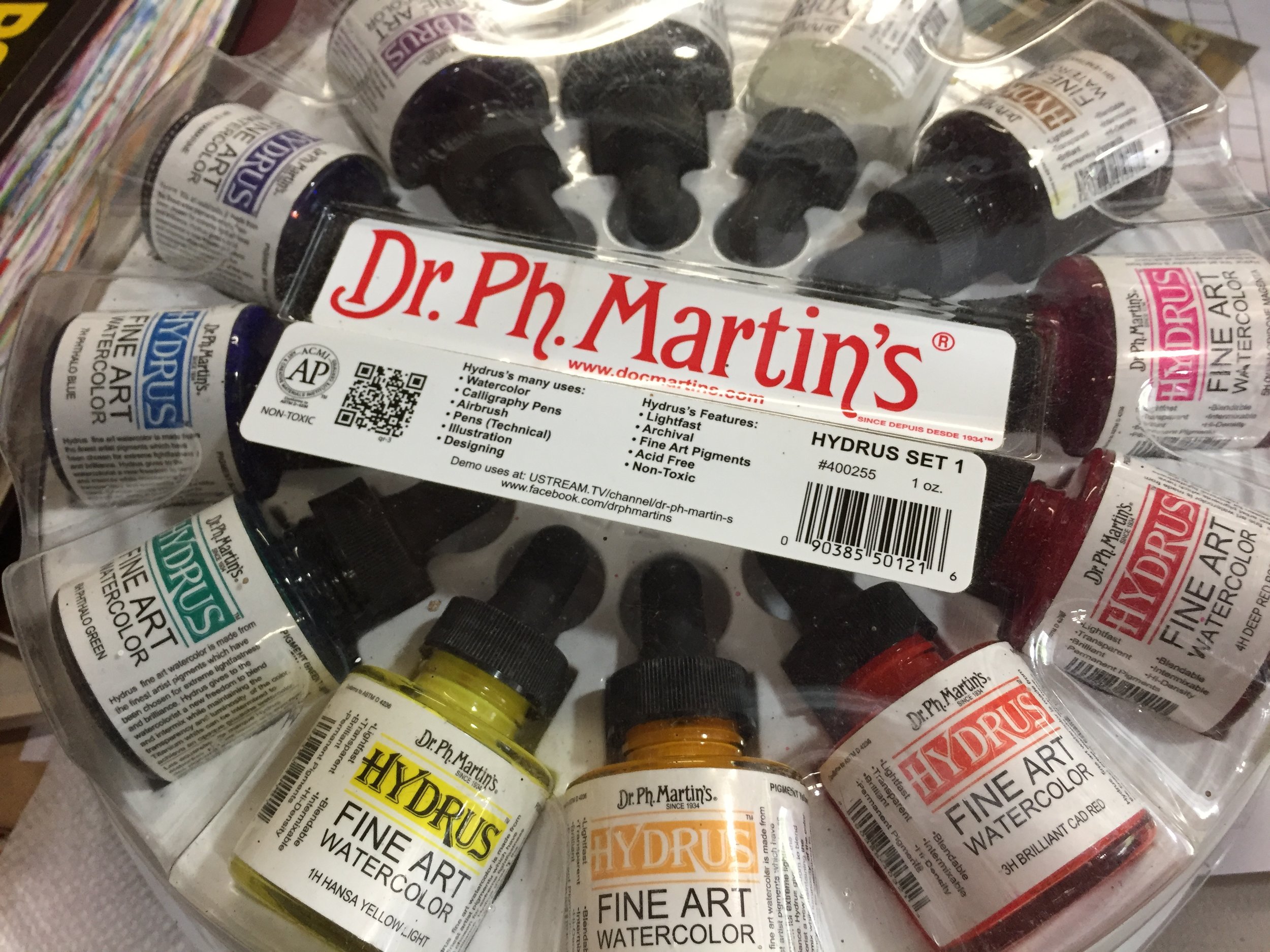
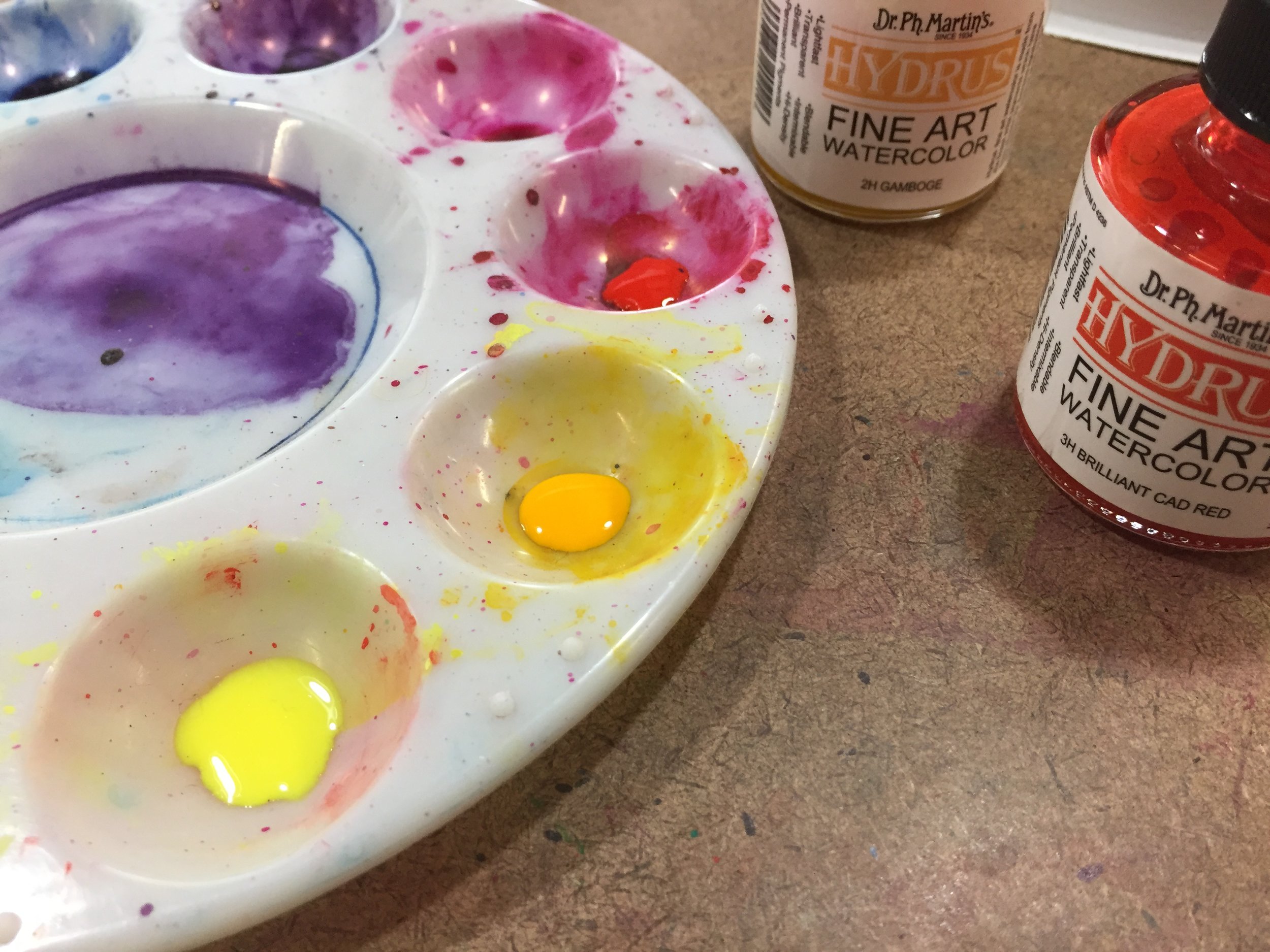
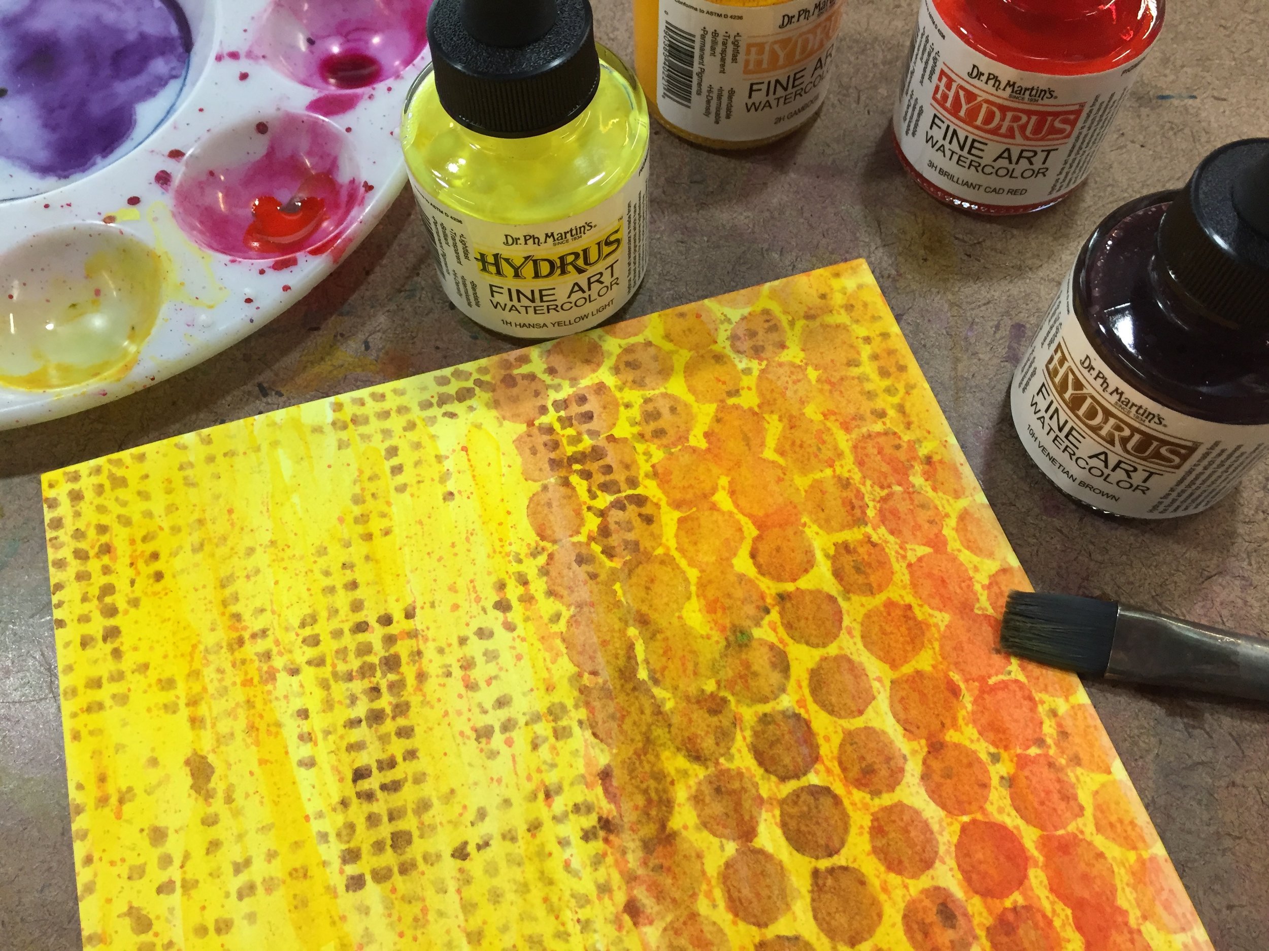
Up until now, I’ve focused mostly on materials that I use in both my journal and my mixed media works of art, but today I want to talk about a material that I use only for my stand alone pieces of art due to it’s quality. I’m talking about Dr. Ph. Martin's Hydrus Fine Art Watercolor. These high quality liquid watercolors are perfect for the type of mixed media that I like to do since they are transparent and lightfast. It’s easy to build up layers with the watercolor and the lightfastness means that they are less likely to fade in the light like lower quality paint.
If you’re not familiar with liquid watercolor, I highly recommend experimenting with some. I first started using liquid watercolor when I taught in public schools using a student quality paint with both elementary and high school students. Even with the student quality, I was impressed with the intensity of the colors and the ease of building layers. But the student quality paint was not lightfast, and I wanted something that I could use in my art that would stand up over time. After a little searching I found the Hydrus watercolors. I instantly fell in love with them.
Dr. Ph. Martin's Hydrus Fine Art Watercolor come in 36 colors and are available in 0.5oz or 1oz glass bottles. They can be purchased individually or in three different sets. The color is bright and vivid, and I use only a few drops at a time diluting with water to control the intensity and the value of the color. Though the colors are intermixable, I normally use them straight and build up layers with individual colors. That are perfect for using alone, or with other materials like water-soluble pencil, collage, and ink. The paint can also be used with a variety of implements like technical pens, dip pens, and airbrush, though I’ve only used them with a brush. I only have Set 1, since it contains a variety of basic colors, but I’d love to supplement the set with a few more individual colors.
The Hydrus watercolor is definitely a studio paint, especially with the glass bottles, and even the 0.5oz bottles are a bit bulky. I don’t recommend traveling with them. Also, these are high quality, fine arts paint, and as so are on the pricey side. A twelve color set of 1oz bottles will put you back $100, though you can find them a bit cheaper at various online retailers. But a little goes a long way, so the paint will last. Because of the quality, I don’t routinely use the Hydrus watercolors in my journal, and I try to reserve them for my stand alone mixed media art or my monster paintings.
If you’re looking for a high quality, liquid watercolor paint and don’t mind shelling out a bit of money, I highly recommend Dr. Ph. Martin's Hydrus Fine Art Watercolor. It’s a beautiful and versatile paint.
Journal Friday #103
I keep forgetting to post Journal Friday on Fridays! I did share the video on social media this past Friday, but I completely forget to share it here on the blog. So here it is a few days late.
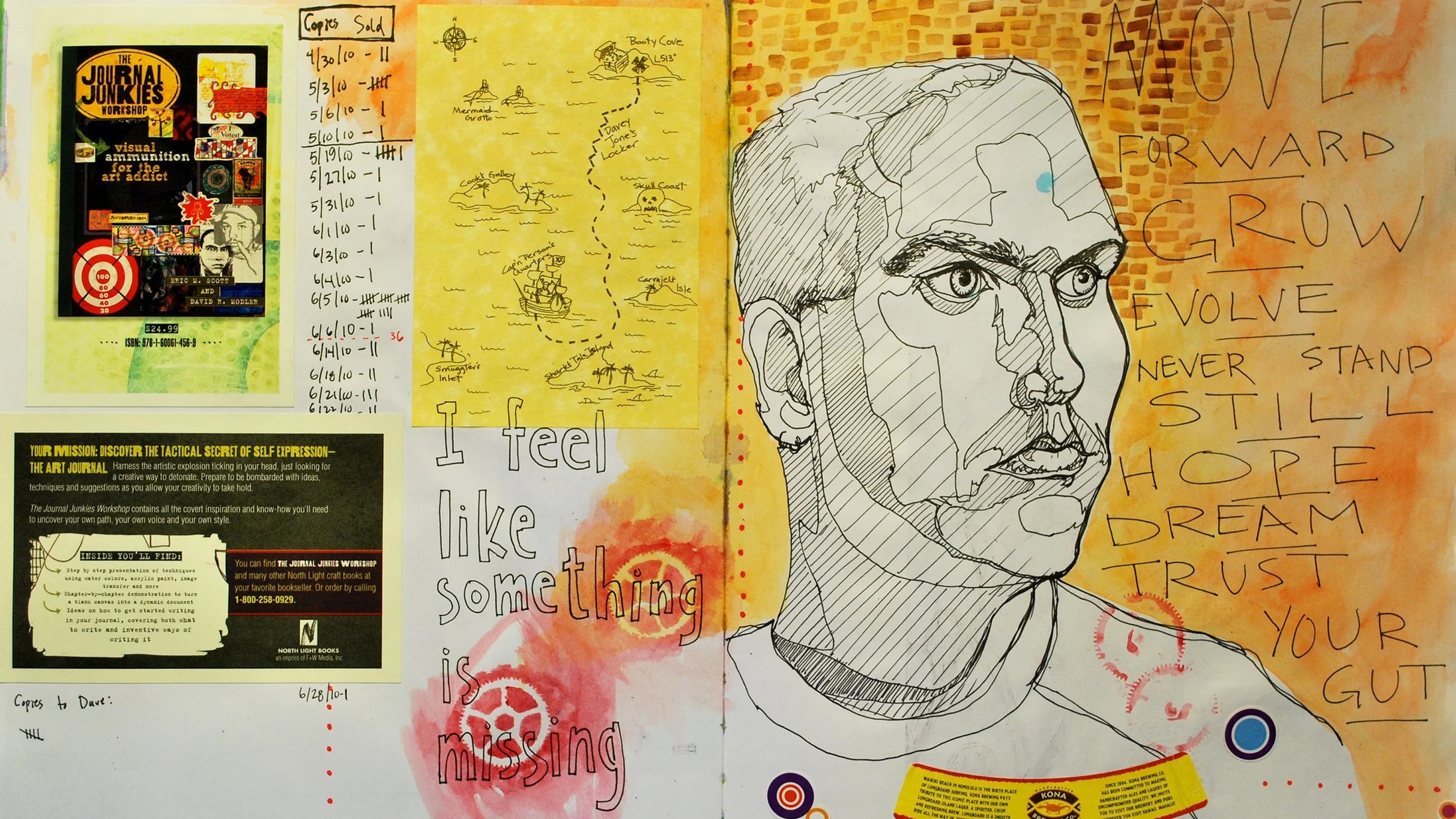
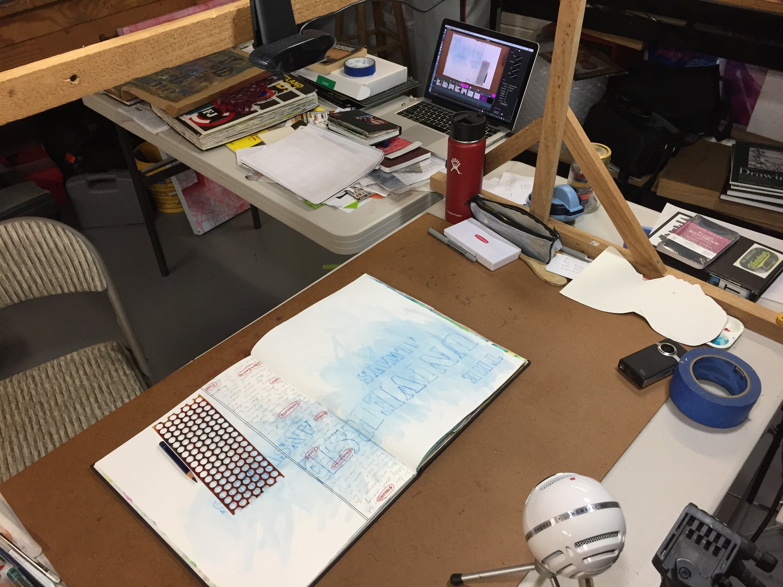
I’ve been trying to share different ideas with these videos, and not make them all the same, even though they use a lot of the same materials. I have been trying to push myself to approach each one in a slightly different way. With this spread, I began with a little reflective writing. Writing is a big component of my normal visual journaling, and I use it to clear my mind: reflect on life, events, and art: and to just figure things out. The initial writing in this spread dictated the direction for the pages, and I spent a lot of time working with letter stencils playing with the phrase, “The Universe Always Answers.”
I hope that you enjoy.
Creative Prayer Book: Wrap Up
Though I finished up the final lesson of the Creative Prayer Book last week, I wanted to share a wrap up of the project, and create a video that shows a flip through the pages.
I began this project several months ago, and I’ve been sharing a new lesson each week as I built up layers in a small Stillman & Birn journal to create a small book of creative affirmations. I am a long way from calling this project finished, and I only got about halfway through the book. I still have many more pages to fill, but I wanted to wrap up the lessons and finish the book on my own time. I plan to continue working over the coming months, and hopefully I’ll be able to share the filled journal fairly soon.
I want to thank everyone who has followed along on this journey, and who drew inspiration from my ideas, techniques, and methods. I am grateful for the positive comments and feedback that I’ve received over the months. It has been a good challenge to bring a new lesson to you each week, and I’m hoping to create a new project in the future.
So thank you all so very much, and as always, Happy Creating!
