Layers: A Tutorial: Part 4 - The Last Layer

I finally finished this layered piece. For the sixteenth and final layer I used acrylic paint to solidify and enhance a few more areas with in the swirling forms. I also used crimson paint to re-emphasize some of the red vellum I put in much earlier and to paint some thin red lines. I also used white paint marker to write some not so evident words and to draw in the lines and rectangles. I used black paint marker to draw more lines and to sign the piece. I am quite pleased with how it turned out.

Now I just need to decide how if should be displayed. I was thinking about mounting it on wood and framing it some how, but who knows.

Collaboration and Inspiration

I often find inspiration from my artist friends, and I couldn't resist using a recent post by Steve of Go Flying Turtle as a source of inspiration for the beginnings of a page. Steve recently posted about his splotches posting 100 different watercolor splotches on Flickr and calling for artists and bloggers to collaborate and use his splotches how they see fit. I decided to use the contour of the splotch below to create a line drawing for a new journal page. I actually cropped the original splotch in Photoshop allowing it to go off all four sides of the image. I then printed out the cropped image and drew the contour. I have no idea what this page will evolve into, but it's a start.

IF - Theater

For last Friday's Illustration Friday prompt "theater", I automatically thought of masks and roles. This page in my current journal actually began as planning (the writing and face sketches under all the other layers) for a project for one of my classes, but fit in perfectly into the topic.

The page plays off of something I remember from my sociology class in college - the dramaturgical perspective where behavior of an individual is analyzed as if it were a theatrical performance. The basic notion is that life is a stage and we are the players (wait that sounds familiar). But we have our role and our character that we play for the audience (society) when we are onstage, but we can step out of character - be our true selves when there is no audience (backstage). I've always liked this perspective and it fits well with my recent readings by Carl Jung and idea of the persona being the "mask" we present to people.

So this page explores these notions and how the characters and roles we play are the masks that we wear and present to people. We may play different roles to different people and may wear different masks, but what about the actor behind the role - behind the mask. Who ever really sees the true identity of another individual, and why are we so willing to lock ourselves and others up in the roles they play? These questions came to me as I worked, and I wondered why we fear revealing ourselves, why we hide, and what happens when we become trapped within the roles. How many of us have felt like phonies at sometime or another? How often do we fall into the roles either we create for ourselves or are created by others?

These are all thoughts that have been going through my mind lately. The page is far from being finished, but I wanted to share.

Layers: A Tutorial - Part 3

The changes in these three layers are not as pronounced as when I first started, but nearing completion, this piece has become very rich, very layered, and very complex with a lot of push and pull.

13. To bring back the word "sift" and the numbers that I stenciled in earlier in the process, I used water-soluble graphite pencil to shade in around the letters and the numbers. This darkened the negative spaces and allowed the letters and numbers to "pop". Instead of using water to blend the graphite, I used matte medium. The acrylic medium mixes with the water-soluble graphite and creates an interesting glazed effect. To strengthen and accentuate the letters and numbers even more, I use white colored pencil to fill them in. The white is somewhat opaque bringing a bit of solidity to the word and numbers. I then painted a layer of the matte medium over the entire surface. This does two things. It seems to make the colors a bit more saturated and it prepares the whole surface for acrylic paint by covering everything with a consistent layer.

14. I wanted other images in the piece so I used four packaging tape transfers. This simple technique worked on bits of maps from an old road atlas lying around the studio as well as a laser print of a tree image (which is by photographer Eugene Atget). With these types of image transfers, the image is stuck to the clear tape and the paper is removed to create a transparent image. I used glue stick to glue the images to the surface. I probably should have used acrylic medium. But I sealed the entire surface with more matte medium which took the glossy finish off the tape transfers.


15. I spent quite a while applying acrylic paint to the piece as a way to accentuate some of the lines and forms. The layers of matte medium provided a good surface on which to paint, and I carefully mixed, blended, and layered paint in a way to bring a lot of contrast to the upper right and to several other areas throughout the composition. I used an acrylic retarder to allow for more mixing and blending directly on the surface. After the acrylic thoroughly dried, I used an opaque paint marker to apply black lines. For the most part these lines reinforced lines that were put in previously.

So this piece is close to being finished. I'll probably apply more paint as a way to solidify a few more areas and to push the paint marker into the piece instead of allowing it to float on the surface.

I am quite pleased with this piece, and although I was more particular and meticulous with this piece than I would have been with a journal page, hopefully you can see how I layer and layer to get those rich pages. I'll post the finished image once it is completed.

Layers: A Tutorial - Part 2

The piece is slowly developing as I layer more and more into it. Here are the next four layers using Prismacolor watercolor pencil, collage, uni-ball Vision Needle pen, and Prismacolor colored pencil.

9. For this layer, I used Dark Umber watercolor pencil to enhance many elements with in the piece and bring more contrast to the forms. I darkened around the three rectangles as well as bringing more definition to the spiraling forms. As a result the rectangles begin to "pop" more and there is a greater sense of shallow space.


10. Next I collaged in three different types of paper. First I cut and glued down the red flowered paper which is the wrapper from a bar of rose-scented Flower & Bee soap. I then tore some translucent white paper and glued it in three of the corners, and I cut a rectangular piece of the same paper and glued it over the rectangle in the lower left. Finally I cut and glued down pieces of red vellum. The transparency of the vellum is a great layer allowing previous layers to show through.


11. I then added more rectilinear elements with black waterproof ink. I used a template (stencil) to draw the repeating squares throughout. I added some larger rectangles as well with the pen. I tend not to use a ruler and prefer, instead, to free-hand it. I also used ink to define the facial features as well since the face did not transfer well in Layer 8. The repeating rectangles, squares, and colors bring a structure to the piece that keeps it balanced and unified.


12. Using a variety of colored pencil, mostly shades of brown, I enhanced and accentuated many of the forms. With careful shading and blending, I was able to create some shallow depth especially around the spiral and the rectangle in the upper left.

This piece is coming along nicely. I do feel that I've gotten a bit tight and fickle with it, but I usually do with smaller pieces. I still plan on layering acrylic and other image transfers into this piece, as well as re-emphasizing the word "sift" that has now become lost in the lower right corner.

Layers: A Tutorial - Part 1

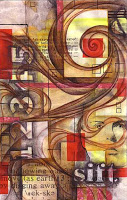
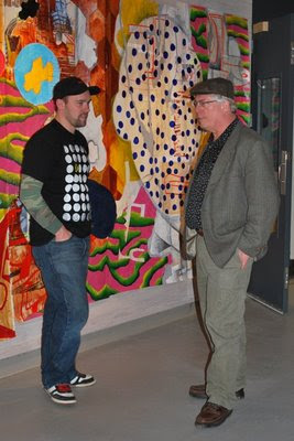
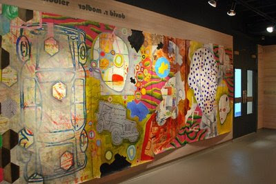
A common question that I get asked is "How do you create the layers on your pages?" I thought that I would take the opportunity to share how I slowly build up layers in my journal. Now not every page is built up in this way and this slowly, but for those rich, pages with depth and transparency, the process is gradual. With this post, I'll share the first eight layers, and I'll share subsequent layers in future posts.

For this piece (which incidentally is not in my journal, but a small experiment using a different kind of drawing paper - but the result is the same), I used Prismacolor watercolor pencil, Winsor and Newton watercolor, graphite, and solvent transfers. I am including the specific names of the colors in case some are wondering, but I am in no way saying that this is the only way to create layers. This is simply a look at a particular process of mine to give people an idea of how I do it. I strongly encourage people to experiment with the process, the colors, and the media.

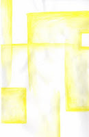
1. I usually try to start with the lightest color, but not always. With this piece, I began with some random rectilinear elements using Canary Yellow watercolor pencil by pressing firmly and shading a lot of pigment. As I applied water, I was very conscious about not simply spreading water all over the paper. I paid very particular attention to the hard edges, and by applying more water, I allowed the pigment to fade into the white of the paper where I did not want hard edges. I allowed this to dry completely before adding the next layer. I find it helpful to have several pieces or pages going at one time so I can rotate among the pieces as things need to dry.


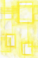
2. I completely ignored the first layer and then added three rectangles and the two set of strips using Spanish Orange which is a slightly darker yellow-orange color. By ignoring the layer before, this layer begins to create a transparency effect. As I applied the pigment, I made certain to press firmly and to shade down a lot so the color would be rich and saturated. I applied the water so that rectangles would maintain their hard edges. As with the first layer, I allowed this layer to dry completely before I moved on.


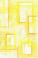
3. Using Goldenrod watercolor pencil, I added the next layer by again ignoring the layers underneath and continuing with the rectilinear elements. This build up of vertical and horizontal lines and rectangles begins to create an informal grid providing the underlying structure of the work. I allowed this layer to dry completely before adding the next.


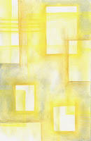
4. Using blue watercolor (I believe it was a Prussian Blue), I accentuated and enhanced some of the rectilinear elements. This also added some contrast as the cool blue plays against the warm yellows. By alternating the ignoring and enhancing of the previous layers, I can begin to create transparency and a shallow sense of depth as the layers begin to build. I find that I do this consistently throughout the process.


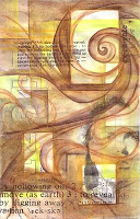
5. I next added some contrasting linear elements using Terra Cotta watercolor pencil. The rectilinear elements provide the structure, but the curving, spiraling forms will create a dynamic composition full of contrast. I ignored the underlying layers as I applied the pigment, and I was careful when I applied the water so the pigment did not spread all over the piece. As with the other layers, this one was allowed to dry completely.


6. As not to lose the rectangles, I placed in layer 3, I used Burnt Umber watercolor paint to darken the space around them. I also darkened corners. The first layers of the watercolor pencil often resist the layers of watercolor paint due to their waxy nature and often create unexpected textures and effects. I allowed the layer to dry completely.


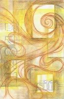
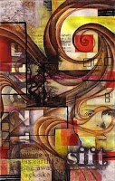
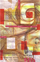
7. Taking a break from the wet media, I switched to graphite for this layer. I stenciled the word "sift" at the bottom and the numbers along the left side. I also added some shading around some of the rectangles to enhance and accentuate them, and I added some grid lines to create more structure. I find using a particular medium throughout the piece allows things to stay very balanced and unified as it shows consideration for the entire piece. And that way the entire piece gets built up at the same pace.


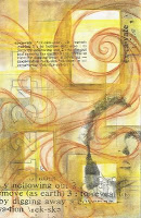
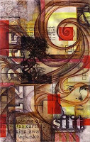
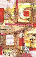
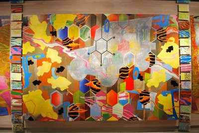
8. I've been thinking a lot lately about how my work is an excavation of sorts - how even though it is layered, it is more like digging into the surface, not building on top of it. So as a way to explore this concept, I scanned and laser-printed the definition to the word "excavate" from a dictionary, and I printed a black and white self-portrait photo as well. Since a laser printer uses a toner-based process, I was able to transfer the the images using a solvent called xylene - found in the graffiti remover, Goof-Off. I made a couple different sizes of the definition image and made certain to flip the images so that the words would be correctly oriented once transferred. Using the Goof-Off in a well-ventilated area, I transferred the toner based images to the piece. The self-portrait did not transfer as clearly as I would have liked, and it covered up much of the word "sift". But that is part of the process, and I'll have to figure out how to enhance the portrait and the word as I work with subsequent layers.

So, this piece is far from being finished even after 8 layers. I plan on using more layers of watercolor pencil, and I also plan on using ink, collage, and acrylic paint. But at this point I'm not certain where this piece will go. I'll just make certain to keep scanning every layer. Who knows, I may end up with 20 or 30 layers by the time that I am done. It's all part of the excavaiton. I never know what I'll discover as I dig.
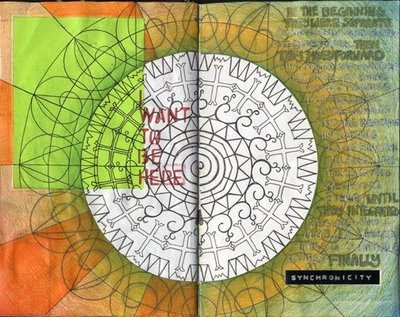
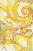
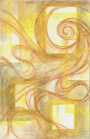
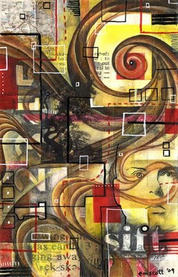
Time...

It has been nearly a month since I've had the time to sit down and formulate a post. For the entire month of March, I was entrenched with completing my National Boards Portfolio. For those non-educators, National Boards is a rigorous certification program that educators voluntarily put themselves through as a way to demonstrate that they are highly qualified. Don't let the word portfolio fool you either. It is a copious amount of very specific writing that analyzes and reflects upon your teaching practice. But the portfolio is finished, and now I just have to complete one more part by mid June and wait for the results.

But time does pass so quickly, and Dave is finishing up his 3-year MFA program at James Madison University in Harrisonburg, VA. His MFA exhibit wraps up tomorrow, and he defends his thesis today. In a month he'll graduate. Time flies...

Last Friday, I was able to make it to the exhibit's opening reception at Sawhill Gallery in Duke Hall at JMU. Titled Transitional Markers, the show features work made predominantly over the last year and a half and covers nearly every inch of the gallery. Created primarily of acrylic paint on paper, cardboard, and canvas, the work wraps around the gallery and consumes the viewer. Below is a photograph of Dave standing in the gallery with his journal in tow.

In the photograph above, Dave explains his work to his dad John who came down with his mom and grandmother for the opening.

In the photo above Sam (on left) and Brian (on right) discuss art, life and teaching. Sam is a current MFA student from Greensboro, NC and a former art educator we met a year ago at NCCAT. Brian is my colleague at the high school where I teach and a friend of Dave's. All the photos below depict the exhibit in 360 fashion. I photographed the show using a tripod in the middle of the gallery snapping off eight photos to document the exhibition.


It has been amazing to see the work that Dave has produced over the last three years. He is such a source of inspiration for me, and I am glad that I had the chance to witness the journey. He has definitely created an incredible body of work.

An Everything Book

A conversation that I had last night with Bean got me thinking about how people use the visual journal, and I think that many times people pigeon-hole themselves into a certain way of working in the journal - which is perfectly ok, and the journal needs to be what it needs to be for people - but often we need to give ourselves permission to do something different in our journals. Often times artists get caught up feeling like every page needs to be a finished work of art. Writers get caught up feeling like they need to have only their best writing in the journal, and everyone gets caught up in their habits and their way of working. For Dave and myself, the journal is an everything book. It is a place to create art, a place to capture memories and thoughts, a place to experiment with images, words, and media, a place to take notes and work out ideas. In short it is - to steal a Keri Smith quote - "A Portable Life Museum". To that end I wanted to say something about documenting our daily journey through this world, and give people permission to include the mundane in their journal.

Fodder is a great way to document our daily lives - even the mundane elements of our lives. Collecting paper menus, business cards, maps, and even chewing gum packs or a to-do list is a great way to document and remember our lives. The above image is a photo of my open journal with fodder already glued in and it's all about the recent Cincinnati trip. So, there is the boarding pass for the flight from DC to Cinci, the LaRosa's Pizzeria comment card, the Lost Coast Brewery coaster from Dewey's, the airline luggage barcode sticker, and finally under the Extra gum pack is the spiralling tree cutout that I made of Bean's tree she drew in my journal - which is appropriate since she grew up in Cincinnati right around the area where the publisher's offices are. On top is a bunch of loose fodder waiting to be glued in throughout the journal.

So, these items may not have any significance to others, but every time I see them, I'll remember bowling at the Strikes and Spares Bowling Lanes, or trekking over to the Kroger grocery store, or paying 90 bucks for an overweight bag at the airport because I had six large journals in my luggage on the way back.

So give yourself permission to include the mundane or make something ugly or just to be human and make mistakes. But in the end, it is you who will need to decide how to use the journal, and it will become what it needs to become.

Collaborative Journal

When I returned from Cincinnati, a pleasant surprise awaited me - the collaborative journal that I am doing with Bean. I eagerly opened it and was once again blown away by what she had done in it. So, I had to scan a few of the spreads to share. The spread above has evolved since I first posted it back in January. I am really liking the layers on this page and the solidity of the "vines".


This spread was started by Bean stamping the blue-green circles near the center with what appears to be a wine cork. When I had the journal in January, I added to it by tracing my hand, collaging in the map of Asheville, NC and the Burt's Bees package, and writing a bit. She then added to it by tracing her hand, writing, adding the color, and collaging as well. Since I have gotten it back, I've added a bit of red and black ink.


I started this two page spread by tracing the circle, and cutting the left half so now the left half is a door the opens onto the next page. I then collaged in the neon green paper, stenciled the words "I want to be here" in red ink, and stuck on the word "synchronicity". The rest was all Bean as she meticulously drew in the radiating design, added the color which appears to be watercolor pencil and colored pencil, and added the writing with pen and gel pen.

I am enjoying the collaborative process so much, and I am astonished with how our two styles are meshing. I like the comfort and permission to add to a page someone else has started - to look for those places that "speak" to me.

Once again, I thank Bean for her work, dedication, and inspiration.

JFJ Return From Cincinnati

Dave and I arrived safely back at Dulles International Airport on Saturday, and slowly we've been getting back into the routine. Cincinnati was great, and things for the photo shoot went smoothly. Working with editor Liz and photographer Christine made the process very easy and very fun. It's always nice to meet people who can appreciate our sense of humor.

But the week was a good behind the scenes look at the publishing industry. We met with sales, marketing, and design people and got a clearer idea of the publishing process and a clearer vision for our book. The next step in the process is to write captions for the photos we took and to finish up the manuscript.

So we thank F&W Media and specifically North Light Crafts for the opportunity to publish our book, and we thank Liz and Christine for all their hard work last week and for basically putting up with us.

The above photo by Christine Polomsky is our concept for our author photos. It is just so us.

Spring 2010 is when the book will be released. We'll keep you updated.